
A little about Bootstrap 5 popover
A popover is like a tooltip that displays as a pop-up box without disrupting the page layout. A popover is different from a tooltip in that it may contain more content than tooltips.
Bootstrap 5 enables adding popover anywhere, with any element in your web pages.
Earlier versions of Bootstrap used jQuery, however, in Bootstrap 5, it is no more required.
You can learn more about popovers in Bootstrap 4.
First, let us have a look at a few examples and then we will explain how to create popover using BS 5 framework.
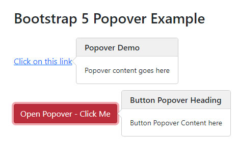
In the first example, we have a red button. This is to toggle popover i.e. if you first press it, it will open the popover. Upon clicking it again, it closes the popover. Have a look at the code and output:
<!DOCTYPE html>
<html>

<head>

<link href="https://cdn.jsdelivr.net/npm/bootstrap@5.0.1/dist/css/bootstrap.min.css" rel="stylesheet" integrity="sha384-+0n0xVW2eSR5OomGNYDnhzAbDsOXxcvSN1TPprVMTNDbiYZCxYbOOl7+AMvyTG2x" crossorigin="anonymous">

<script src="https://cdn.jsdelivr.net/npm/bootstrap@5.0.2/dist/js/bootstrap.bundle.min.js"></script>

</head>

<body>

<div class="container m-5">

<h3>Bootstrap 5 Popover Example</h3>

<br><br>

<a href="#" title="Popover Demo" data-bs-toggle="popover" data-bs-content="Popover content goes here">Click on this link</a>

<br><br><br><br>

  <button type="button" class="btn btn-danger" data-bs-toggle="popover" title="Button Popover Heading" data-bs-content="Button Popover Content here">

    Open Popover - Click Me

  </button>

</div>
<script>

var popoverTriggerList = [].slice.call(document.querySelectorAll('[data-bs-toggle="popover"]'))

var popoverList = popoverTriggerList.map(function (popoverTriggerEl) {

  return new bootstrap.Popover(popoverTriggerEl)

})

</script>

</div>
</body>

</html>
Output:
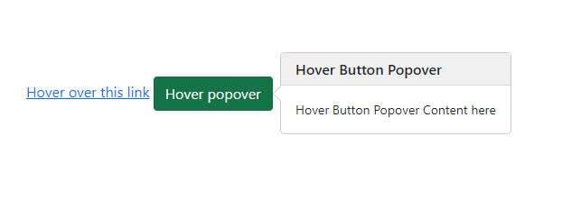
Displaying popover on hover state
If you wish to display the popover as the mouse is over the element, this is quite easier to do.
In the example below, we have a button and a link. As you bring the mouse over the button/link, it will display the popover and it disappears you take mouse away from the element.
Online demo and code
<!DOCTYPE html>
<html>

<head>

<link href="https://cdn.jsdelivr.net/npm/bootstrap@5.0.1/dist/css/bootstrap.min.css" rel="stylesheet" integrity="sha384-+0n0xVW2eSR5OomGNYDnhzAbDsOXxcvSN1TPprVMTNDbiYZCxYbOOl7+AMvyTG2x" crossorigin="anonymous">

<script src="https://cdn.jsdelivr.net/npm/bootstrap@5.0.2/dist/js/bootstrap.bundle.min.js"></script>
</head>

<body>

<div class="container m-5">

<h3>Bootstrap 5 Popover Hover Example</h3>

<br><br><br><br>

<a href="#" title="Hover State Demo" data-bs-toggle="popover" data-bs-trigger="hover" data-bs-content="Popover content goes here">Hover over this link</a>

<button type="button" class="btn btn-success" data-bs-trigger="hover" data-bs-toggle="popover" title="Hover Button Popover" data-bs-content="Hover Button Popover Content here">

   Hover popover

</button>

</div>

<script>

var popoverTriggerList = [].slice.call(document.querySelectorAll('[data-bs-toggle="popover"]'))

var popoverList = popoverTriggerList.map(function (popoverTriggerEl) {

  return new bootstrap.Popover(popoverTriggerEl)

})

</script>

</div>
</body>

</html>
So, how popover element works in Bootstrap 5?
- Poppers are dependent on the js library. This is a third-party library, so you have to include this separately before bootstrap.js file.
- Alternatively, you may use the bundle file i.e. bootstrap.bundle.min.js / bootstrap.bundle.js
- BS5 popover also requires tooltip plug-in as dependency. If you are using bootstrap.js, bootstrap.min.js, OR bootstrap.bundle.min.js / bootstrap.bundle.js then you are done.
- You have to initialize popovers yourself.
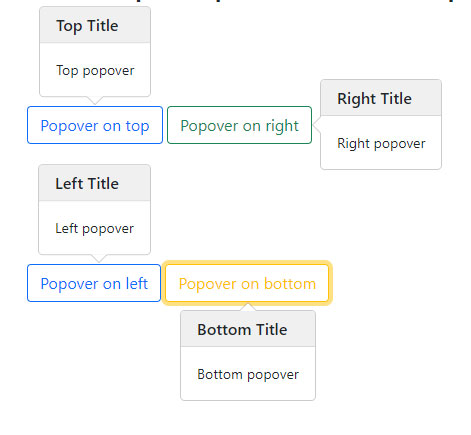
An example of popovers in all directions
You may also set the direction of popovers to which side of element it should appear (thanks to popper.js library).
You may set the following positions:
- Top
- Right
- Bottom
- Left
Online demo and code
<!DOCTYPE html>
<html>

<head>

<link href="https://cdn.jsdelivr.net/npm/bootstrap@5.0.1/dist/css/bootstrap.min.css" rel="stylesheet" integrity="sha384-+0n0xVW2eSR5OomGNYDnhzAbDsOXxcvSN1TPprVMTNDbiYZCxYbOOl7+AMvyTG2x" crossorigin="anonymous">

<script src="https://cdn.jsdelivr.net/npm/bootstrap@5.0.2/dist/js/bootstrap.bundle.min.js"></script>

</head>

<body>

<div class="container m-5">

<h3>Bootstrap 5 Popover All Directions</h3>

<br><br><br><br>

<button type="button" class="btn btn-outline-primary" title="Top Title" data-bs-container="body" data-bs-toggle="popover" data-bs-placement="top" data-bs-content="Top popover">

  Popover on top

</button>

<button type="button" class="btn btn-outline-success" title="Right Title" data-bs-container="body" data-bs-toggle="popover" data-bs-placement="right" data-bs-content="Right popover">

  Popover on right

</button>

<br><br><br><br><br><br>

<button type="button" class="btn btn-outline-primary" title="Left Title" data-bs-container="body" data-bs-toggle="popover" data-bs-placement="left" data-bs-content="Left popover">

  Popover on left

</button>

<button type="button" class="btn btn-outline-warning" title="Bottom Title" data-bs-container="body" data-bs-toggle="popover" data-bs-placement="bottom" data-bs-content="Bottom popover">

  Popover on bottom

</button>


<script>

var popoverTriggerList = [].slice.call(document.querySelectorAll('[data-bs-toggle="popover"]'))

var popoverList = popoverTriggerList.map(function (popoverTriggerEl) {

  return new bootstrap.Popover(popoverTriggerEl)

})

</script>
</div>
</body>

</html>
Closing popover by clicking anywhere on webpage
In all the above examples, the popover is closed as you click on the button or link again – after you opened the popover (except hover example). However, it does not close automatically as you click somewhere else.
For closing the popover by clicking anywhere on the webpage (not the button itself), you may use the focus trigger.
In the example below, the data attribute data-bs-trigger=”focus” is used with a button and link:
Online demo and code
<!DOCTYPE html>
<html>

<head>

<link href="https://cdn.jsdelivr.net/npm/bootstrap@5.0.1/dist/css/bootstrap.min.css" rel="stylesheet" integrity="sha384-+0n0xVW2eSR5OomGNYDnhzAbDsOXxcvSN1TPprVMTNDbiYZCxYbOOl7+AMvyTG2x" crossorigin="anonymous">

<script src="https://cdn.jsdelivr.net/npm/bootstrap@5.0.2/dist/js/bootstrap.bundle.min.js"></script>
</head>

<body>

<div class="container m-5">

<h3>Popover Close Anywhere</h3>

<br><br>

<a href="#" title="Popover Demo" data-bs-trigger="focus" data-bs-toggle="popover" data-bs-content="Popover content goes here">Click on this link</a>

<br><br><br><br>

  <button type="button" class="btn btn-danger" data-bs-trigger="focus" data-bs-toggle="popover" title="Button Popover Heading" data-bs-content="Button Popover Content here">

    Open Popover - Click Me

  </button>

</div>

<script>

var popoverTriggerList = [].slice.call(document.querySelectorAll('[data-bs-toggle="popover"]'))

var popoverList = popoverTriggerList.map(function (popoverTriggerEl) {

  return new bootstrap.Popover(popoverTriggerEl)

})

</script>

</div>
</body>

</html>
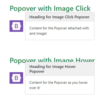
An example of popover with image
As mentioned earlier, you may use popover with various elements including images.
The following example uses popover with an image. Click on the image and it displays the popover.
<!DOCTYPE html>
<html>

<head>

<link href="https://cdn.jsdelivr.net/npm/bootstrap@5.0.1/dist/css/bootstrap.min.css" rel="stylesheet" integrity="sha384-+0n0xVW2eSR5OomGNYDnhzAbDsOXxcvSN1TPprVMTNDbiYZCxYbOOl7+AMvyTG2x" crossorigin="anonymous">

<script src="https://cdn.jsdelivr.net/npm/bootstrap@5.0.2/dist/js/bootstrap.bundle.min.js"></script>

</head>

<body>

<div class="container m-5">

<h3 class="text-success">Popover with Image Click</h3>

<br>

<img src="images/Bootstrap-logo.png" title="Heading for Image Click Popover" data-bs-container="body" data-bs-toggle="popover" data-bs-placement="bottom" data-bs-content="Content for the Popover attached with and image!">

<br><br><br><br><br>

<h3 class="text-success">Popover with Image Hover</h3>

<br>

<img src="images/Bootstrap-logo.png" title="Heading for Image Hover Popover" data-bs-container="body" data-bs-trigger="hover" data-bs-toggle="popover" data-bs-placement="bottom" data-bs-content="Content for the Popover as you hover over it!">

<script>

var popoverTriggerList = [].slice.call(document.querySelectorAll('[data-bs-toggle="popover"]'))

var popoverList = popoverTriggerList.map(function (popoverTriggerEl) {

  return new bootstrap.Popover(popoverTriggerEl)

})

</script>

</div>

</body>

</html>
Similarly, you may attach the popover to the HTML table’s <tr>, <td>, <th> tags etc.
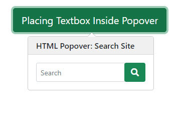
Placing HTML content inside popover example
You may also customize the popover for placing more content than just simple text. This includes formatted content, and form fields as well. However, it requires some workaround.
This solution from codepin used jQuery for placing HTML content like a textbox field in the popover.
Have a look at this code and credit link at the bottom:
<!doctype html>

<html>

    <head>

        <meta charset='utf-8'>

        <title>Mgregchi: Snippet - Bootstrap popover</title>

        <meta name='viewport' content='width=device-width, initial-scale=1'>

        <meta name='author' content="Mgregchi">

        <meta name="email" content="mgregchi@gmail.com">

        <link href='https://cdn.jsdelivr.net/npm/bootstrap@5.0.1/dist/css/bootstrap.min.css' rel='stylesheet'>

        <link href='https://use.fontawesome.com/releases/v5.7.2/css/all.css' rel='stylesheet'>

    </head>

    <body>

    <div class="container mt-4"


        <section class="center">

            <div hidden >

                <div data-name="popover-content">

                    <div class="input-group">

                    <input type="text" class="form-control form-control-sm" placeholder="Search" name="search">

                    <div class="input-group-btn">

                        <button class="btn btn-success" type="submit">

                        <i class="bi bi-search fa fa-search"></i>

                        </button>

                    </div>

                    </div>

                </div>

            </div>


            <a id="example" tabindex="0" class="btn btn-lg btn-success" role="button" data-bs-toggle="popover" title="HTML Popover: Search Site" >Placing Textbox Inside Popover</a>

        </section>

  </div>

            <script type='text/javascript' src='https://cdnjs.cloudflare.com/ajax/libs/jquery/3.2.1/jquery.min.js'></script>

            <script type='text/javascript' src='https://cdn.jsdelivr.net/npm/bootstrap@5.0.1/dist/js/bootstrap.bundle.min.js'></script>

<script>
    $(document).ready(function() {
                    var options = {
                        html: true,

                        title: "Optional: HELLO(Will overide the default-the inline title)",

                        content: $('[data-name="popover-content"]')

                    }

                    var exampleEl = document.getElementById('example')

                    var popover = new bootstrap.Popover(exampleEl, options)

                })
</script>
</body>

</html>
Credit: https://codepen.io/mgregchi/pen/XWaJrmM