
Progress bar in Bootstrap 5
The progress bar is a useful component that can be used for showing the users the progress of a process. For example, saving records in the database, downloading some resources, checkout process progress, etc.
Bootstrap 5 makes it quite easier for the front-end designing/usage of the progress bars.
See the section below for examples of each and more with code and output.
Creating simple progress bars
In the example below, five progress bars are created. Have a look at the code and output. Below is explained how the progress bar is created:
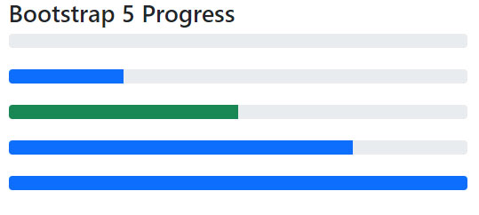
<!DOCTYPE html>
<html>
<head>

<link href="https://cdn.jsdelivr.net/npm/bootstrap@5.0.1/dist/css/bootstrap.min.css" rel="stylesheet" integrity="sha384-+0n0xVW2eSR5OomGNYDnhzAbDsOXxcvSN1TPprVMTNDbiYZCxYbOOl7+AMvyTG2x" crossorigin="anonymous">
</head>

<body>
 <div class="container">

<h2>Bootstrap 5 Progress</h2>

<div class="progress">

  <div class="progress-bar" role="progressbar" aria-valuenow="0" aria-valuemin="0" aria-valuemax="100"></div>

</div>

<br>

<div class="progress">

  <div class="progress-bar" role="progressbar" style="width: 25%" aria-valuenow="25" aria-valuemin="0" aria-valuemax="100"></div>

</div>

<br>

<div class="progress">

  <div class="progress-bar bg-success" role="progressbar" style="width: 50%" aria-valuenow="50" aria-valuemin="0" aria-valuemax="100"></div>

</div>

<br>

<div class="progress">

  <div class="progress-bar" role="progressbar" style="width: 75%" aria-valuenow="75" aria-valuemin="0" aria-valuemax="100"></div>

</div>

<br>

<div class="progress">

  <div class="progress-bar" role="progressbar" style="width: 100%" aria-valuenow="100" aria-valuemin="0" aria-valuemax="100"></div>

</div>
</div>

</body>

</html>
How did it work?
- The outer <div> is given the progress class that indicates the max value of the progress bar.
- The inner <div> is given the progress-bar. This is used to show the progress so far.
- You may also see a little inline CSS e.g. style=”width: 25%”. You may also use custom CSS or utility class there. In that case, with more value of the width, more progress is visible to the user by default or other bg-background colors.
Creating various color progress bars
By using Bootstrap 5 background color classes, you may change the fill color to show the progress that matches your website theme.
See the example where we utilized various background classes:
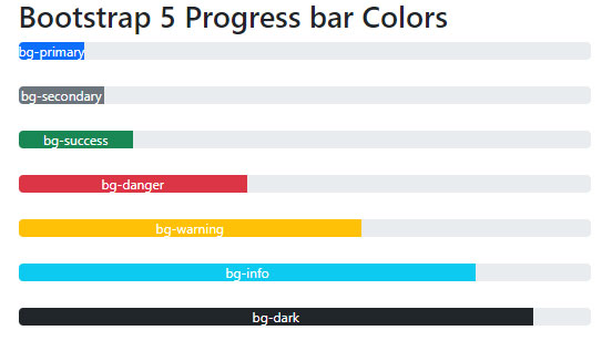
<!DOCTYPE html>
<html>
<head>

<link href="https://cdn.jsdelivr.net/npm/bootstrap@5.0.1/dist/css/bootstrap.min.css" rel="stylesheet" integrity="sha384-+0n0xVW2eSR5OomGNYDnhzAbDsOXxcvSN1TPprVMTNDbiYZCxYbOOl7+AMvyTG2x" crossorigin="anonymous">

</head>

<body>

 <div class="container">

<h2>Bootstrap 5 Progress bar Colors</h2>
<div class="progress">

  <div class="progress-bar bg-primary" role="progressbar" aria-valuenow="3" aria-valuemin="0" aria-valuemax="100">bg-primary</div>

</div>

<br>

<div class="progress">

  <div class="progress-bar bg-secondary" role="progressbar" style="width: 15%" aria-valuenow="15" aria-valuemin="0" aria-valuemax="100">bg-secondary</div>

</div>

<br>

<div class="progress">

  <div class="progress-bar bg-success" role="progressbar" style="width: 20%" aria-valuenow="20" aria-valuemin="0" aria-valuemax="100">bg-success</div>

</div>

<br>

<div class="progress">

  <div class="progress-bar bg-danger" role="progressbar" style="width: 40%" aria-valuenow="40" aria-valuemin="0" aria-valuemax="100">bg-danger</div>

</div>

<br>

<div class="progress">

  <div class="progress-bar bg-warning" role="progressbar" style="width: 60%" aria-valuenow="60" aria-valuemin="0" aria-valuemax="100">bg-warning</div>

</div>

<br>

<div class="progress">

  <div class="progress-bar bg-info" role="progressbar" style="width: 80%" aria-valuenow="80" aria-valuemin="0" aria-valuemax="100">bg-info</div>

</div>

<br>

<div class="progress">

  <div class="progress-bar bg-dark" role="progressbar" style="width: 90%" aria-valuenow="90" aria-valuemin="0" aria-valuemax="100">bg-dark</div>

</div>

</div>

</body>

</html>
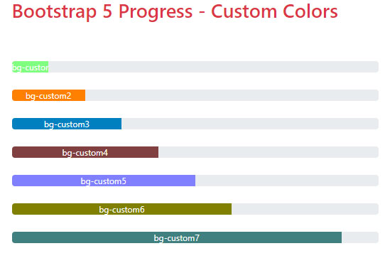
Setting Custom Color and width in style
This example shows setting the progress bar colors of your own choice – beyond the default available. Besides, we will set the on-page width of progress bars (under the style section before </head> tag).
<!DOCTYPE html>
<html>
<head>

<link href="https://cdn.jsdelivr.net/npm/bootstrap@5.0.1/dist/css/bootstrap.min.css" rel="stylesheet" integrity="sha384-+0n0xVW2eSR5OomGNYDnhzAbDsOXxcvSN1TPprVMTNDbiYZCxYbOOl7+AMvyTG2x" crossorigin="anonymous">
<style>

  .bg-custom1{

    background-color: #80FF80;

    width:10%;

  }

  .bg-custom2{

    background-color: #FF8000;

    width:20%;

  }

  .bg-custom3{

    background-color: #0080C0;

    width:30%;

  }

  .bg-custom4{

    background-color: #804040;

    width:40%;

  }

  .bg-custom5{

    background-color: #8080FF;

    width:50%;

  }

  .bg-custom6{

    background-color: #808000;

    width:60%;

  }

  .bg-custom7{

    background-color: #408080;

    width:90%;

  }

</style>

</head>
<body>

 <div class="container">

<h2 class="text-danger">Bootstrap 5 Progress - Custom Colors</h2><br><br>
<div class="progress">

  <div class="progress-bar bg-custom1" role="progressbar" aria-valuenow="3" aria-valuemin="0" aria-valuemax="100">bg-custom1</div>

</div>

<br>

<div class="progress">

  <div class="progress-bar bg-custom2" role="progressbar" aria-valuenow="15" aria-valuemin="0" aria-valuemax="100">bg-custom2</div>

</div>

<br>

<div class="progress">

  <div class="progress-bar bg-custom3" role="progressbar" aria-valuenow="20" aria-valuemin="0" aria-valuemax="100">bg-custom3</div>

</div>

<br>

<div class="progress">

  <div class="progress-bar bg-custom4" role="progressbar" aria-valuenow="40" aria-valuemin="0" aria-valuemax="100">bg-custom4</div>

</div>

<br>

<div class="progress">

  <div class="progress-bar bg-custom5" role="progressbar" aria-valuenow="60" aria-valuemin="0" aria-valuemax="100">bg-custom5</div>

</div>

<br>

<div class="progress">

  <div class="progress-bar bg-custom6" role="progressbar"  aria-valuenow="80" aria-valuemin="0" aria-valuemax="100">bg-custom6</div>

</div>

<br>

<div class="progress">

  <div class="progress-bar bg-custom7" role="progressbar" aria-valuenow="90" aria-valuemin="0" aria-valuemax="100">bg-custom7</div>

</div>
</div>
</body>

</html>
You can see seven classes in the <style> section before </head> tag.
There we set the background color as well as the width of the progress bar.
An example of striped progress bars
Just add the built-in progress-bar-striped class to .progress-bar and BS 5 will apply stripe via CSS gradient over the progress bar background color.
First, see the striped progress bar with BS 5 background color classes:
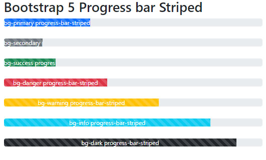
<html>
<head>
<link href="https://cdn.jsdelivr.net/npm/bootstrap@5.0.1/dist/css/bootstrap.min.css" rel="stylesheet" integrity="sha384-+0n0xVW2eSR5OomGNYDnhzAbDsOXxcvSN1TPprVMTNDbiYZCxYbOOl7+AMvyTG2x" crossorigin="anonymous">

</head>
<body>

 <div class="container">

<h2>Bootstrap 5 Progress bar Striped</h2>
<div class="progress">

  <div class="progress-bar bg-primary progress-bar-striped" role="progressbar" aria-valuenow="3" aria-valuemin="0" aria-valuemax="100">bg-primary progress-bar-striped</div>

</div>

<br>

<div class="progress">

  <div class="progress-bar bg-secondary progress-bar-striped" role="progressbar" style="width: 15%" aria-valuenow="15" aria-valuemin="0" aria-valuemax="100">bg-secondary  progress-bar-striped</div>

</div>

<br>

<div class="progress">

  <div class="progress-bar bg-success progress-bar-striped" role="progressbar" style="width: 20%" aria-valuenow="20" aria-valuemin="0" aria-valuemax="100">bg-success  progress-bar-striped</div>

</div>

<br>

<div class="progress">

  <div class="progress-bar bg-danger progress-bar-striped" role="progressbar" style="width: 40%" aria-valuenow="40" aria-valuemin="0" aria-valuemax="100">bg-danger  progress-bar-striped</div>

</div>

<br>

<div class="progress">

  <div class="progress-bar bg-warning progress-bar-striped" role="progressbar" style="width: 60%" aria-valuenow="60" aria-valuemin="0" aria-valuemax="100">bg-warning  progress-bar-striped</div>

</div>

<br>

<div class="progress">

  <div class="progress-bar bg-info progress-bar-striped" role="progressbar" style="width: 80%" aria-valuenow="80" aria-valuemin="0" aria-valuemax="100">bg-info  progress-bar-striped</div>

</div>

<br>

<div class="progress">

  <div class="progress-bar bg-dark progress-bar-striped" role="progressbar" style="width: 90%" aria-valuenow="90" aria-valuemin="0" aria-valuemax="100">bg-dark  progress-bar-striped</div>

</div>

</div>
</body>

</html>
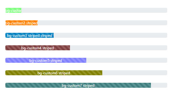
Striped progress with custom colors
Similarly, you may create a striped progress bar for custom colors. Again, just add the progress-bar-striped. See an example and output:
<!DOCTYPE html>
<html>
<head>

<link href="https://cdn.jsdelivr.net/npm/bootstrap@5.0.1/dist/css/bootstrap.min.css" rel="stylesheet" integrity="sha384-+0n0xVW2eSR5OomGNYDnhzAbDsOXxcvSN1TPprVMTNDbiYZCxYbOOl7+AMvyTG2x" crossorigin="anonymous">
<style>

  .bg-custom1{

    background-color: #80FF80;

    width:10%;

  }

  .bg-custom2{

    background-color: #FF8000;

    width:20%;

  }

  .bg-custom3{

    background-color: #0080C0;

    width:30%;

  }

  .bg-custom4{

    background-color: #804040;

    width:40%;

  }

  .bg-custom5{

    background-color: #8080FF;

    width:50%;

  }

  .bg-custom6{

    background-color: #808000;

    width:60%;

  }

  .bg-custom7{

    background-color: #408080;

    width:90%;

  }

</style>

</head>

<body>

 <div class="container">

<h2 class="text-danger">Bootstrap 5 Progress - Custom Colors</h2><br><br>
<div class="progress">

  <div class="progress-bar bg-custom1 progress-bar-striped" role="progressbar" aria-valuenow="3" aria-valuemin="0" aria-valuemax="100">bg-custom1   striped</div>

</div>

<br>

<div class="progress">

  <div class="progress-bar bg-custom2 progress-bar-striped" role="progressbar" aria-valuenow="15" aria-valuemin="0" aria-valuemax="100">bg-custom2  striped</div>

</div>

<br>

<div class="progress">

  <div class="progress-bar bg-custom3 progress-bar-striped" role="progressbar" aria-valuenow="20" aria-valuemin="0" aria-valuemax="100">bg-custom3  striped   striped</div>

</div>

<br>

<div class="progress">

  <div class="progress-bar bg-custom4 progress-bar-striped" role="progressbar" aria-valuenow="40" aria-valuemin="0" aria-valuemax="100">bg-custom4  striped</div>

</div>

<br>

<div class="progress">

  <div class="progress-bar bg-custom5 progress-bar-striped" role="progressbar" aria-valuenow="60" aria-valuemin="0" aria-valuemax="100">bg-custom5   striped</div>

</div>

<br>

<div class="progress">

  <div class="progress-bar bg-custom6 progress-bar-striped" role="progressbar"  aria-valuenow="80" aria-valuemin="0" aria-valuemax="100">bg-custom6  striped</div>

</div>

<br>

<div class="progress">

  <div class="progress-bar bg-custom7 progress-bar-striped" role="progressbar" aria-valuenow="90" aria-valuemin="0" aria-valuemax="100">bg-custom7  striped</div>

</div>

</div>
</body>

</html>
An animated striped progress bar example
For giving CSS 3 animation from left to right to the striped progress bar, add the progress-bar-animated class.
Online demo and code
<html>
<head>
<link href="https://cdn.jsdelivr.net/npm/bootstrap@5.0.1/dist/css/bootstrap.min.css" rel="stylesheet" integrity="sha384-+0n0xVW2eSR5OomGNYDnhzAbDsOXxcvSN1TPprVMTNDbiYZCxYbOOl7+AMvyTG2x" crossorigin="anonymous">

</head>
<body>

 <div class="container">

<h2>Bootstrap 5 Progress bar Striped</h2>

<div class="progress">

  <div class="progress-bar bg-primary progress-bar-striped progress-bar-animated" role="progressbar" aria-valuenow="3" aria-valuemin="0" aria-valuemax="100">bg-primary progress-bar-striped + progress-bar-animated</div>

</div>

<br>

<div class="progress">

  <div class="progress-bar bg-secondary progress-bar-striped progress-bar-animated" role="progressbar" style="width: 15%" aria-valuenow="15" aria-valuemin="0" aria-valuemax="100">bg-secondary  progress-bar-striped + progress-bar-animated</div>

</div>

<br>

<div class="progress">

  <div class="progress-bar bg-success progress-bar-striped progress-bar-animated" role="progressbar" style="width: 20%" aria-valuenow="20" aria-valuemin="0" aria-valuemax="100">bg-success  progress-bar-striped + progress-bar-animated</div>

</div>

<br>

<div class="progress">

  <div class="progress-bar bg-danger progress-bar-striped progress-bar-animated" role="progressbar" style="width: 40%" aria-valuenow="40" aria-valuemin="0" aria-valuemax="100">bg-danger  progress-bar-striped + progress-bar-animated</div>

</div>

<br>

<div class="progress">

  <div class="progress-bar bg-warning progress-bar-striped progress-bar-animated" role="progressbar" style="width: 60%" aria-valuenow="60" aria-valuemin="0" aria-valuemax="100">bg-warning  progress-bar-striped + progress-bar-animated</div>

</div>

<br>

<div class="progress">

  <div class="progress-bar bg-info progress-bar-striped" role="progressbar" style="width: 80%" aria-valuenow="80" aria-valuemin="0" aria-valuemax="100">bg-info  progress-bar-striped</div>

</div>

<br>

<div class="progress">

  <div class="progress-bar bg-dark progress-bar-striped" role="progressbar" style="width: 90%" aria-valuenow="90" aria-valuemin="0" aria-valuemax="100">bg-dark  progress-bar-striped</div>

</div>

</div>
</body>

</html>
To see the difference, we kept the last two progress bars unanimated.
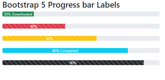
How to add labels in progress bar?
Though we used it in our above examples, just to show it separately, this is how you will add the labels in the progress bar. For example, showing the percentage of progress to the users.
For that, simply add the text to the .progress-bar.
In the examples above and below, we write text before </div> tag:
<html>
<head>
<link href="https://cdn.jsdelivr.net/npm/bootstrap@5.0.1/dist/css/bootstrap.min.css" rel="stylesheet" integrity="sha384-+0n0xVW2eSR5OomGNYDnhzAbDsOXxcvSN1TPprVMTNDbiYZCxYbOOl7+AMvyTG2x" crossorigin="anonymous">

</head>
<body>

 <div class="container">

<h2>Bootstrap 5 Progress bar Labels</h2>


<div class="progress">

  <div class="progress-bar bg-success" role="progressbar" style="width: 20%" aria-valuenow="20" aria-valuemin="0" aria-valuemax="100">20% Downloaded</div>

</div>

<br>

<div class="progress">

  <div class="progress-bar bg-danger progress-bar-striped" role="progressbar" style="width: 40%" aria-valuenow="40" aria-valuemin="0" aria-valuemax="100">40%</div>

</div>

<br>

<div class="progress">

  <div class="progress-bar bg-warning progress-bar-striped progress-bar-animated" role="progressbar" style="width: 60%" aria-valuenow="60" aria-valuemin="0" aria-valuemax="100">60%</div>

</div>

<br>

<div class="progress">

  <div class="progress-bar bg-info" role="progressbar" style="width: 80%" aria-valuenow="80" aria-valuemin="0" aria-valuemax="100">80% Completed</div>

</div>

<br>

<div class="progress">

  <div class="progress-bar bg-dark progress-bar-striped" role="progressbar" style="width: 90%" aria-valuenow="90" aria-valuemin="0" aria-valuemax="100">90%</div>

</div>

</div>
</body>

</html>
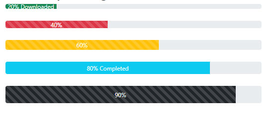
Making progress bar thicker or thinner (changing height)
In order to change the default height of the progress bar, you may use the inline style CSS.
See the example where different height is assigned to five press bars.
<html>
<head>

<link href="https://cdn.jsdelivr.net/npm/bootstrap@5.0.1/dist/css/bootstrap.min.css" rel="stylesheet" integrity="sha384-+0n0xVW2eSR5OomGNYDnhzAbDsOXxcvSN1TPprVMTNDbiYZCxYbOOl7+AMvyTG2x" crossorigin="anonymous">

</head>
<body>

 <div class="container">

<h2>Bootstrap 5 Progress bar Height</h2>


<div class="progress" style="height: 10px;">

  <div class="progress-bar bg-success" role="progressbar" style="width: 20%" aria-valuenow="20" aria-valuemin="0" aria-valuemax="100">20% Downloaded</div>

</div>

<br>

<div class="progress" style="height: 15px;">

  <div class="progress-bar bg-danger progress-bar-striped" role="progressbar" style="width: 40%" aria-valuenow="40" aria-valuemin="0" aria-valuemax="100">40%</div>

</div>

<br>

<div class="progress" style="height: 20px;">

  <div class="progress-bar bg-warning progress-bar-striped progress-bar-animated" role="progressbar" style="width: 60%" aria-valuenow="60" aria-valuemin="0" aria-valuemax="100">60%</div>

</div>

<br>

<div class="progress" style="height: 25px;">

  <div class="progress-bar bg-info" role="progressbar" style="width: 80%" aria-valuenow="80" aria-valuemin="0" aria-valuemax="100">80% Completed</div>

</div>

<br>

<div class="progress" style="height: 35px;">

  <div class="progress-bar bg-dark progress-bar-striped" role="progressbar" style="width: 90%" aria-valuenow="90" aria-valuemin="0" aria-valuemax="100">90%</div>

</div>

</div>
</body>

</html>
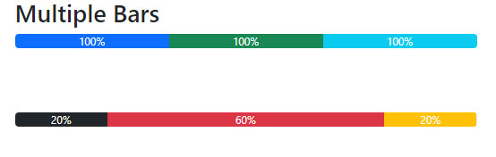
An example of multiple progress bar (stacked)
You can create one progress with multiple progress bars inside it. Each progress bar in hat progress can have its 100% width. So, you may use this for showing multiple processes/progresses etc.
See an example of a multiple progress bar below:
<html>
<head>
<link href="https://cdn.jsdelivr.net/npm/bootstrap@5.0.1/dist/css/bootstrap.min.css" rel="stylesheet" integrity="sha384-+0n0xVW2eSR5OomGNYDnhzAbDsOXxcvSN1TPprVMTNDbiYZCxYbOOl7+AMvyTG2x" crossorigin="anonymous">

</head>
<body>

 <div class="container">

<h2>Multiple Bars</h2>


<div class="progress">

  <div class="progress-bar" role="progressbar" style="width: 100%" aria-valuenow="15" aria-valuemin="0" aria-valuemax="100">100%</div>

  <div class="progress-bar bg-success" role="progressbar" style="width: 100%" aria-valuenow="30" aria-valuemin="0" aria-valuemax="100">100%</div>

  <div class="progress-bar bg-info" role="progressbar" style="width: 100%" aria-valuenow="20" aria-valuemin="0" aria-valuemax="100">100%</div>

</div>

<br><br><br>

<div class="progress">

  <div class="progress-bar bg-dark" role="progressbar" style="width: 20%" aria-valuenow="20" aria-valuemin="0" aria-valuemax="20">20%</div>

  <div class="progress-bar bg-danger" role="progressbar" style="width: 60%" aria-valuenow="60" aria-valuemin="0" aria-valuemax="60">60%</div>

  <div class="progress-bar bg-warning" role="progressbar" style="width: 20%" aria-valuenow="20" aria-valuemin="0" aria-valuemax="20">20%</div>

</div>
</div>

</body>

</html>
Reference: https://getbootstrap.com/docs/5.0/components/progress/