
A pop-up box based on the Bootstrap 4 framework can be created by using the popover built-in plug-in. You may attach the popover to any HTML element that opens as that element is clicked or optionally in the hovering state.
The popover requires including the tooltip.js plug-in. If you have included bootstrap.js or bootstrap.min.js then you do not need to include the other plug-in separately.
One other requirement in Bootstrap 4 popovers is including the popper.js (or popper.min.js) before the reference of Bootstrap JS file. It is required for the positioning of popovers.
The following section shows how to create popovers and display them in various directions.
How to create Bootstrap popover?
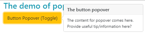
For creating a popover, use the data-toggle=”popover” attribute in the element like a button, link, etc. See the following example where I created a button with that attribute.
You have to initiate the popover in jQuery in order to popover work. Have a look:
Complete code for this example:
<!DOCTYPE html>
<html>
<head>
<link rel="stylesheet" href="https://maxcdn.bootstrapcdn.com/bootstrap/4.0.0-beta.3/css/bootstrap.min.css" integrity="sha384-Zug+QiDoJOrZ5t4lssLdxGhVrurbmBWopoEl+M6BdEfwnCJZtKxi1KgxUyJq13dy" crossorigin="anonymous">

  <script src="https://ajax.googleapis.com/ajax/libs/jquery/3.2.1/jquery.min.js"></script>
  <script src="https://cdnjs.cloudflare.com/ajax/libs/popper.js/1.12.6/umd/popper.min.js"></script>
  <script src="https://maxcdn.bootstrapcdn.com/bootstrap/4.0.0-beta.3/js/bootstrap.min.js"></script>
</head>
<body>
<div class="container">
<h3 class="text-info">The demo of popover</h3>

<button type="button" id="btn-popover" class="btn btn-warning " data-toggle="popover" title="The button popover"
 data-content="The content for popover comes here. Provide useful tip/information here?">Button Popover (Toggle)
</button>
<script>
$(document).ready(function(){
    $('#btn-popover').popover();

});
</script>
</div>
</body>
</html>
- The title of the popover is set in the button tag along with data-content attribute where you may use the content to display in the popover.
- In the script section, the ID of the button is used with .popover for initiating the Bootstrap popover.
- The popover is toggleable. If you click the button, it displays the popover. Upon pressing the button again, the popover is closed.
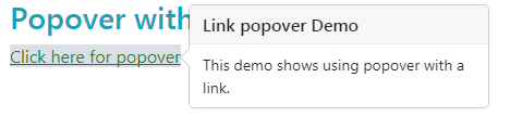
Associating a popover with a link example
The following example shows using a popover with <a> tag. Just like the button, the popover is toggleable:
The code:
<div class="container">

<h3 class="text-info">Popover with a link</h3>


<a href="#" id="link-popover" class="text-success bg-light" data-toggle="popover" title="Link popover Demo"

 data-content="This demo shows using popover with a link.">Click here for popover

</a>

</div>

<script>

$(document).ready(function(){

    $('#link-popover').popover();


});

</script>
The demo of popover in all directions
You may use the data-placement attribute in the element where you are creating a popover for setting the direction. The following values can be used in data-placement attribute:
- top
- bottom
- left
- right
See the following where all values are used for creating the popover in four directions. For that, the <a> tag is used with button classes.

The markup:
<!DOCTYPE html>
<html>
<head>
<link rel="stylesheet" href="https://maxcdn.bootstrapcdn.com/bootstrap/4.0.0-beta.3/css/bootstrap.min.css" integrity="sha384-Zug+QiDoJOrZ5t4lssLdxGhVrurbmBWopoEl+M6BdEfwnCJZtKxi1KgxUyJq13dy" crossorigin="anonymous">

  <script src="https://ajax.googleapis.com/ajax/libs/jquery/3.2.1/jquery.min.js"></script>
  <script src="https://cdnjs.cloudflare.com/ajax/libs/popper.js/1.12.6/umd/popper.min.js"></script>
  <script src="https://maxcdn.bootstrapcdn.com/bootstrap/4.0.0-beta.3/js/bootstrap.min.js"></script>
</head>
<body>
<div class="container">
  <h3>Popover Example</h3>
  <a href="#" title="Right Popover Title" class="btn btn-primary" data-toggle="popover" data-placement="right" data-content="Info about popover">Right Popover</a>
  <a href="#" title="Left Popover Title" class="btn btn-primary" data-toggle="popover" data-placement="left" data-content="Info about popover">Left Popover</a>
  <a href="#" title="Top Popover Title" class="btn btn-primary" data-toggle="popover" data-placement="top" data-content="Info about popover">Top Popover</a>
  <a href="#" title="Bottom Popover Title" class="btn btn-primary" data-toggle="popover" data-placement="bottom" data-content="Info about popover">Bottom Popover</a>

</div>

<script>
$(document).ready(function(){
    $('[data-toggle="popover"]').popover();
});
</script>
</body>
</html>
Rather than using the ID of the element, this time I simply used the data-toggle=”popover” for initializing all popovers at the single call.
Closing the popover by clicking anywhere
In each of the above examples, you might notice that the popover can be closed by clicking the button or link after it is opened. If you click somewhere else after opening the popover, it is not closed.
In this demo, the popover will be closed by clicking anywhere except the button element that contains the popover. So, open the popover after clicking the button and close it by clicking somewhere else on the demo page:
See online demo and code
The script:
<script>

$('#btn-popover').popover({

  trigger: 'focus'

})

</script>
See the complete code on the example page.
Trigger the popover on hover state
You may use the data attribute data-trigger=”hover” in the element or “hover” value in the jQuery code for opening the popover on mouse hover state rather than clicking the element.
In this demo, the “hover” value is used in the jQuery code for “trigger” option of popover. Bring the mous the over button to see the popover opening:
Just use this script:
<script>

$('#btn-popover').popover({

  trigger: 'hover'

})

</script>
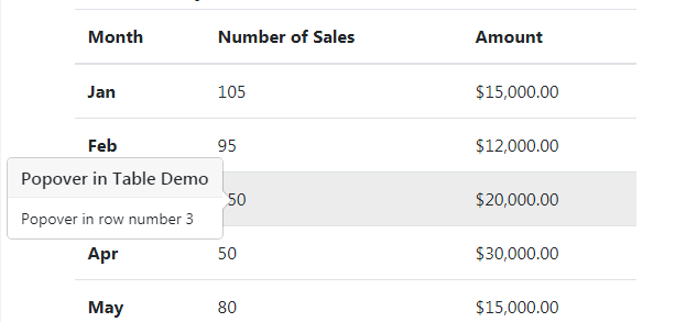
An example of using popover in Bootstrap 4 table
As mentioned earlier, you may create popovers with any element even HTML tables. This can be useful if you require showing further information in a row or table data level etc.
See this demo where every a popover is created for every other row and it is triggered on mouse hover state.
See online demo and code
The code:
<div class="container">

  <h3>Bootstrap 4 Table Demo</h2>


<table class="table table-hover">

  <thead>

    <tr>

      <th>Month</th>

      <th>Number of Sales</th>

      <th>Amount</th>

    </tr>

  </thead>

  <tbody>

    <tr data-toggle="popover" data-trigger="hover" title="Popover in Table Demo"  data-content="Popover in row number 1">

      <th scope="row">Jan</th>

      <td>105</td>

      <td>$15,000.00</td>

    </tr>

    <tr>

      <th scope="row">Feb</th>

      <td>95</td>

      <td>$12,000.00</td>

    </tr>

    <tr data-toggle="popover" data-trigger="hover" title="Popover in Table Demo"  data-content="Popover in row number 3">

      <th scope="row">Mar</th>

      <td>150</td>

      <td>$20,000.00</td>

    </tr>

    <tr>

      <th scope="row">Apr</th>

      <td>50</td>

      <td>$30,000.00</td>

    </tr>

    <tr data-toggle="popover" data-trigger="hover" title="Popover in Table Demo"  data-content="Popover in row number 5">

      <th scope="row">May</th>

      <td>80</td>

      <td>$15,000.00</td>

    </tr>

    <tr>

      <th scope="row">Jun</th>

      <td>110</td>

      <td>$22,000.00</td>

    </tr>

  </tbody>

</table>

</div>
The script:
<script>

$(document).ready(function(){

$('[data-toggle="popover"]').popover({

})

});

</script>
You can see, the data attribute is used for opening the popover on mouse hover.