
Creating lists in your projects based on Bootstrap 4 is easy by using the HTML list tags, <a>s, <button>s, and built-in Bootstrap CSS classes.
You may create ordered or unordered lists, and definition lists by using Bootstrap 4 list classes. Keep reading the next section for live demos of basic to more complex lists.
A simple list example using Bootstrap 4
A basic list can be created by using <ul> with <li> tag and using the .list-group and .list-group-item classes as shown below. The list contains items without any links or buttons, no mouse over effect; just the borders around the whole list and between list elements. Have a look:
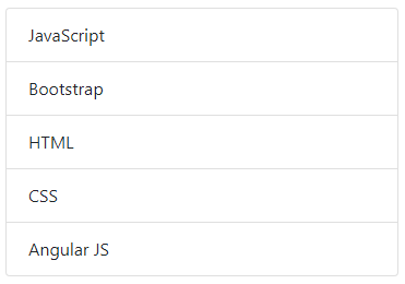
The code for this basic list:
<!DOCTYPE html>
<html>
<head>
<link rel="stylesheet" href="https://maxcdn.bootstrapcdn.com/bootstrap/4.0.0-beta.3/css/bootstrap.min.css" integrity="sha384-Zug+QiDoJOrZ5t4lssLdxGhVrurbmBWopoEl+M6BdEfwnCJZtKxi1KgxUyJq13dy" crossorigin="anonymous">

</head>
<body>
<div class="container">
<h3>A Demo of Bootstrap List Group</h3>
<ul class="list-group">
  <li class="list-group-item">JavaScript</li>
  <li class="list-group-item">Bootstrap</li>
  <li class="list-group-item">HTML</li>
  <li class="list-group-item">CSS</li>
  <li class="list-group-item">Angular JS</li>
</ul>
</div>

</body>
</html>
Adding active class for standing out a specific item
Suppose, your list contains menu items that point to various pages on your website. You want the current page highlighted in the list menu. For that, simply use the .active class for the <li> along with .list-group-item class. This adds the default blue color as shown in the example below:
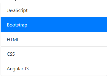
The markup:
<ul class="list-group">

  <li class="list-group-item">JavaScript</li>

  <li class="list-group-item active">Bootstrap</li>

  <li class="list-group-item">HTML</li>

  <li class="list-group-item">CSS</li>

  <li class="list-group-item">Angular JS</li>

</ul>
Want to display some other color than blue for the active item?
One of the ways of changing the default blue color of the active item is to override the .active class of BS4. You may create your own CSS class and refer it to the <li> for distinguishing it. In the demo below, I overrode the default .active class in the <style> section as follows:
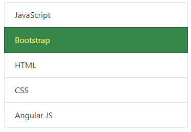
The following CSS is used after the reference of the Bootstrap 4 CSS file:
<style>

.list-group-item.active {

  z-index: 2;

  color: #FFFF79;

  background-color: #38874A;

  border-color: #255A31;

}

</style>
Basically, the .list-group-item.active class defines the style of the active item in BS4.
Creating actionable Bootstrap list groups
For creating the actionable lists e.g. links to other web pages, opening a section with a short description for respective list item,s etc. you may use the <a> tags with <div> along with list classes of Bootstrap.
See the following example of list group that uses <a> tags with .list-group-item and .list-group-item-action classes while the <div> containing these <a>s is assigned the .list-group class.
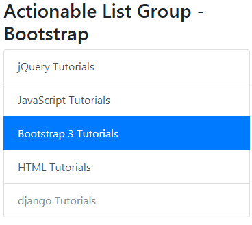
The markup:
<div class="container">

<h3>Actionable List Group - Bootstrap</h3>

<div class="list-group">

  <a href="https://www.jquery-az.com/jquery-tips/" class="list-group-item list-group-item-action">jQuery Tutorials</a>

  <a href="https://www.jquery-az.com/javascript-tutorials/" class="list-group-item list-group-item-action">JavaScript Tutorials</a>

  <a href="https://www.jquery-az.com/bootstrap-tips-tutorials/" class="list-group-item list-group-item-action active">

    Bootstrap 3 Tutorials

  </a>

  <a href="https://www.jquery-az.com/html-tutorials/" class="list-group-item list-group-item-action">HTML Tutorials</a>

  <a href="#" class="list-group-item list-group-item-action disabled">django Tutorials</a>

</div>

</div>
You may notice a few things in this list Bootstrap 4:
- It looks the same as we have seen in the above examples with <ul>, <li> tags.
- In the first three examples, I assigned .list-group class to <ul> and in this example, it is assigned to a <div> tag.
- Similarly, the .list-group-item class is assigned to <a>s rather <li> tags.
- The .active class is used in the third item just like the above example. You may override this class to change the CSS properties as you want.
- All the list items have a hover effect with a change in background color.
- The .disabled class is used in last item to make it look disabled. However, only its appearance is “disabled”, it is still clickable. You may actually disable the link by using jQuery/JavaScript.
You may also use the <button> tags with list classes in Bootstrap for creating the list groups. In that case, the .disabled class or disabled attribute of button actually disables the list item.
The markup:
<div class="list-group">

  <button type="button" class="list-group-item list-group-item-action">jQuery Tutorials</button>

  <button type="button" class="list-group-item list-group-item-action">JavaScript Tutorials</button>

  <button type="button" class="list-group-item list-group-item-action disabled" >

    Bootstrap 3 Tutorials

  </button>

  <button type="button" class="list-group-item list-group-item-action active">HTML Tutorials</button>

  <button type="button" class="list-group-item list-group-item-action">django Tutorials</button>

</div>
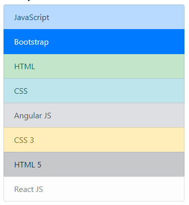
The example of using list contextual classes
The list context classes can be used for coloring the list items. You may use the standard context classes with <ul> and <li> based lists or list created by using <a>s and <button>s.
Have a look at the demo of using contextual classes with <ul> and <li> tags:
The markup:
<ul class="list-group">

  <li class="list-group-item list-group-item-primary">JavaScript</li>

  <li class="list-group-item list-group-item-danger active">Bootstrap</li>

  <li class="list-group-item list-group-item-success">HTML</li>

  <li class="list-group-item list-group-item-info">CSS</li>

  <li class="list-group-item list-group-item-secondary">Angular JS</li>

  <li class="list-group-item list-group-item-warning">CSS 3</li>

  <li class="list-group-item list-group-item-dark">HTML 5</li>

  <li class="list-group-item list-group-item-light">React JS</li>

</ul>
The example of Bootstrap inline list
You may use the list-inline class in the <ul> tag along with list-inline-item class in the <li> tags for creating inline lists in Bootstrap 4. It will remove the bullets in list and adds some margin.
See the following demo where I created an inline list by using above-mentioned classes along with contextual classes to distinguish list items:
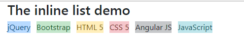
The markup for an inline list:
<div class="container">

<h3>The inline list demo</h3>

<ul class="list-inline">

  <li class="list-inline-item list-group-item-primary">jQuery</li>

  <li class="list-inline-item list-group-item-success">Bootstrap</li>

  <li class="list-inline-item list-group-item-warning" >HTML 5</li>

  <li class="list-inline-item list-group-item-danger" >CSS 5</li>

  <li class="list-inline-item list-group-item-dark" >Angular JS</li>

  <li class="list-inline-item list-group-item-info" >JavaScript</li>


</ul>

</div>
Similarly, these contextual classes can be used in the list groups created by using the <div> and <a> tags:
The code:
<div class="list-group">

  <a href="https://www.jquery-az.com/jquery-tips/" class="list-group-item list-group-item-action list-group-item-primary">jQuery Tutorials</a>

  <a href="https://www.jquery-az.com/javascript-tutorials/" class="list-group-item list-group-item-action list-group-item-danger">JavaScript Tutorials</a>

  <a href="https://www.jquery-az.com/bootstrap-tips-tutorials/" class="list-group-item list-group-item-action list-group-item-success">

    Bootstrap 3 Tutorials

  </a>

  <a href="https://www.jquery-az.com/html-tutorials/" class="list-group-item list-group-item-action list-group-item-info">HTML Tutorials</a>

  <a href="#" class="list-group-item list-group-item-action list-group-item-secondary disabled">django Tutorials</a>

</div>
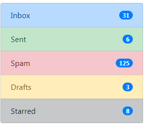
An example of using badges in lists
By using available utility classes in Bootstrap 4, you may create lists with badges. For examples, showing number of emails in the inbox, number of sent items, spam numbers etc.
See this example where I used badges in a list created with <ul> and <li> along with using contextual classes:
The HTML code:
<div class="container">

<h3>List Group with badges demo</h3>

<ul class="list-group">

  <li class="list-group-item d-flex justify-content-between align-items-center list-group-item-primary">

    Inbox

    <span class="badge badge-primary badge-pill">31</span>

  </li>

  <li class="list-group-item d-flex justify-content-between align-items-center list-group-item-success">

    Sent

    <span class="badge badge-primary badge-pill">6</span>

  </li>

  <li class="list-group-item d-flex justify-content-between align-items-center list-group-item-danger">

    Spam

    <span class="badge badge-primary badge-pill">125</span>

  </li>

  <li class="list-group-item d-flex justify-content-between align-items-center list-group-item-warning">

    Drafts

    <span class="badge badge-primary badge-pill">3</span>

  </li>

  <li class="list-group-item d-flex justify-content-between align-items-center list-group-item-dark">

    Starred

    <span class="badge badge-primary badge-pill">8</span>

  </li>

</ul>

</div>
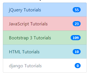
Using badges in <a> list example
Similarly, badges can be added to the actionable list created by using <div> and <a> tags. For example, we have a list menu with technology tutorials. The badges show number of tutorials for each web technology/framework. See the example online with the code:
The code:
<div class="container">

<h3>Actionable List Group with badges</h3>

<div class="list-group">

  <a href="https://www.jquery-az.com/jquery-tips/" class="list-group-item d-flex justify-content-between align-items-center list-group-item-action list-group-item-primary">jQuery Tutorials

  <span class="badge badge-primary badge-pill">55</span>

  </a>

  <a href="https://www.jquery-az.com/javascript-tutorials/" class="list-group-item d-flex justify-content-between align-items-center list-group-item-action list-group-item-danger">JavaScript Tutorials

  <span class="badge badge-primary badge-pill">23</span>

  </a>

  <a href="https://www.jquery-az.com/bootstrap-tips-tutorials/" class="list-group-item d-flex justify-content-between align-items-center list-group-item-action list-group-item-success">

    Bootstrap 3 Tutorials

    <span class="badge badge-primary badge-pill">109</span>

  </a>

  <a href="https://www.jquery-az.com/html-tutorials/" class="list-group-item d-flex justify-content-between align-items-center list-group-item-action list-group-item-info">HTML Tutorials

  <span class="badge badge-primary badge-pill">10</span>

  </a>

  <a href="#" class="list-group-item d-flex justify-content-between align-items-center list-group-item-action list-group-item-secondary disabled">django Tutorials

  <span class="badge badge-primary badge-pill">0</span>

  </a>

</div>

</div>
Going beyond headings or links in grouped lists
You may create lists with custom content; so it may contain a header, a short description, a link, or any HTML by using the flexbox utilities of Bootstrap 4 Framework.
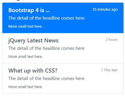
The code:
<!DOCTYPE html>
<html>
<head>
<link rel="stylesheet" href="https://maxcdn.bootstrapcdn.com/bootstrap/4.0.0-beta.3/css/bootstrap.min.css" integrity="sha384-Zug+QiDoJOrZ5t4lssLdxGhVrurbmBWopoEl+M6BdEfwnCJZtKxi1KgxUyJq13dy" crossorigin="anonymous">
</head>
<body>
<div class="container">
<h3>List Group with content demo</h3>
<div class="list-group">
  <a href="#" class="list-group-item list-group-item-action flex-column align-items-start active">
    <div class="d-flex w-100 justify-content-between">
      <h5 class="mb-1">Bootstrap 4 is ...</h5>
      <small>35 minutes ago</small>
    </div>
    <p class="mb-1">The detail of the headline comes here</p>
    <small>More small text here.</small>
  </a>
  <a href="#" class="list-group-item list-group-item-action flex-column align-items-start">
    <div class="d-flex w-100 justify-content-between">
      <h5 class="mb-1">jQuery Latest News</h5>
      <small class="text-muted">2 hours</small>
    </div>
    <p class="mb-1">The detail of the headline comes here</p>
    <small>More small text here.</small>
  </a>
  <a href="#" class="list-group-item list-group-item-action flex-column align-items-start">
    <div class="d-flex w-100 justify-content-between">
      <h5 class="mb-1">What up with CSS?</h5>
      <small class="text-muted">1 Day ago</small>
    </div>
    <p class="mb-1">The detail of the headline comes here</p>
    <small>More small text here.</small>
  </a>
</div>
</div>

</body>
</html>
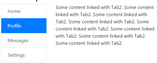
Using tab component with list group example
You may link the list group items with a piece of content by using the tab plug-in on Bootstrap 4. For that, you need to include the Bootstrap JS file along with jQuery. For more idea, have a look at the demo below:
See online demo and code
The markup for the demo:
<div class="container">

<h3>List Group with Tab content demo</h3>

<div class="row">

  <div class="col-4">

    <div class="list-group" id="list-tab" role="tablist">

      <a class="list-group-item list-group-item-action active" id="bootstrap-list-item" data-toggle="list" href="#bootstrap-list" role="tab" aria-controls="bootstrap">Bootstrap</a>

      <a class="list-group-item list-group-item-action" id="jquery-list-item" data-toggle="list" href="#jquery-list" role="tab" aria-controls="jquery">jQuery</a>

      <a class="list-group-item list-group-item-action" id="html-list-item" data-toggle="list" href="#html-list" role="tab" aria-controls="html">HTML</a>

      <a class="list-group-item list-group-item-action" id="css-list-item" data-toggle="list" href="#css-list" role="tab" aria-controls="css">CSS</a>

    </div>

  </div>

  <div class="col-8">

    <div class="tab-content" id="nav-tabContent">

      <div class="tab-pane fade show active" id="bootstrap-list" role="tabpanel" aria-labelledby="bootstrap-list-item">Some content linked with 1. </div>

      <div class="tab-pane fade" id="jquery-list" role="tabpanel" aria-labelledby="jquery-list-item">Some content linked with Tab2. </div>

      <div class="tab-pane fade" id="html-list" role="tabpanel" aria-labelledby="html-list-item">Some content linked with Tab3. </div>

      <div class="tab-pane fade" id="css-list" role="tabpanel" aria-labelledby="css-list-item">Some content linked with Tab4. </div>

    </div>

  </div>

</div>

</div>
If you want to display the tab content without a fading effect then simply remove the .fade class.
In the markup for list items, you need to use the data-toggle=”list” attribute. The link items and tabbed content pane is linked by IDs. For example, href=”#bootstrap-list” is matched with the id=”bootstrap-list” of tab content.
For making a default link item selected and its tabbed content visible, use the .active class in the linked list and .show + .active classes in the tabbed panel. See this example where second linked list item is selected by default with its content visible on page load:
See online demo and code
You might also notice, the tabbed content is displayed without a fading effect as .fade class is removed.
Get the complete code from the demo page.