
Create CSS3 animations in DOM element
The CSSAnimate.js is a small jQuery plug-in for creating animations by using the CSS3 transitions. You may create different types of animations like skew, scale, rotate, etc. in DOM elements.
If CSS3 is not supported by the browser then it will provide the fallback to the default animate method of jQuery.
Developer page Download plug-in
How to use the CSSAnimate plug-in?
After downloading the package, include the CSSAnimate.js file after jQuery:
<script type=”text/javascript” src=”js/CSSAnimate/jquery.mb.CSSAnimate.js”></script>
Make sure to place this line after the jQuery library.
Use the markup, CSS3, and call the plug-in as shown in the demos below.
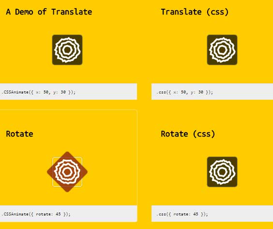
A demo of scale, skew, rotate and translate animations
In this example, the translate, skew, rotate and scale animations are created. In the wrapper element, the values for data attributes onmouseenter and onmouseleave are provided. See the complete code and output by clicking the link or image below:
Complete code:
<!DOCTYPE html>
<html>
<head>
    <link href='https://fonts.googleapis.com/css?family=Ubuntu+Mono' rel='stylesheet' type='text/css'>
    <style>

        body{
            margin: 0;
            white-space: inherit;
            background: #ffcc00;
            font: 16px/19px 'Ubuntu Mono', sans-serif;
            overflow-x: hidden;
            overflow-y: scroll;


        }

        #wrapper, #links{
            position: relative;
            margin: auto;
            width:900px;
        }
        h1{
            margin-top: 80px;
            padding:50px 0;
        }
        a{
            color: white;
            text-decoration: none;
        }
        a:hover{
            color: #000000;
            text-decoration: none;
        }

        .test{
            width: 250px;
            padding: 20px;
            display: inline-block;
            margin: 0 20px 20px 0;
            border-radius: 5px;
            border:1px solid rgba(255,255,255,0);
        }
        .test:hover{
            border:1px solid rgba(255,255,255,.4);
        }

        .test .area{
            width: auto;
            height: 100px;
            margin: 10px 0;
            position: relative;
        }


        .test pre{
            font-family: menlo, monospace;
            font-size: 7pt;
            padding: 10px;
            background: #eee;
            margin: 20px -20px -20px -20px;
            border-top: solid 1px #ddd;
            white-space: pre-wrap;
            line-height: 1.5;
        }


        .test .box,   .test .ghost{
            position: absolute;
            top: 50%;
            left: 50%;
            margin: -30px 0 0 -30px;
            width: 60px;
            height: 60px;
            line-height: 60px;
            text-align: center;
            z-index: 2;
            color: #ddd;
            border-radius: 5px;
            box-shadow: 0 0 1px rgba(0,0,0,0.5);
        }

        .test .box{
            border: 1px solid transparent;
            background: rgba(0,0,0,0.7) url("images/bg.png");
            background-position: center center;
            background-size: cover;
        }

        .test:hover .box{
            background: rgba(125, 14, 18, 0.7) url("images/bg.png");
            background-size: cover;
            background-position: center center;
        }

        .test .ghost{
            border: 1px solid #ffffff;
        }
    </style>

    <script type="text/javascript" src="https://ajax.googleapis.com/ajax/libs/jquery/3.0.0/jquery.min.js"></script>
    <script type="text/javascript" src="js/CSSAnimate/jquery.mb.browser.min.js"></script>
    <script type="text/javascript" src="js/CSSAnimate/jquery.mb.CSSAnimate.js"></script>
    <script type="text/javascript">

        $(function(){
            if (self.location.href == top.location.href){
                var logo=$("<a href='https://pupunzi.com' style='position:absolute;top:10px;left:10px;z-index:1000'><img id='logo' border='0' src='https://pupunzi.com/images/logo.png' alt='mb.ideas.repository'></a>");
                $("body").append(logo);
            }
        });

    </script>
</head>
<body>
<div id="wrapper">
    <h1>jquery.mb.CSSAnimate demo</h1>
    <div id="links">
        <div class="test" id="test-0" onmouseenter="$('.box',this).CSSAnimate({x:-50, y:-30})" onmouseleave="$('.box',this).CSSAnimate({x:0, y:0})">
            <h3>A Demo of Translate</h3>
            <div class="area">
                <div class="ghost"></div>
                <div class="box"></div>
            </div>
            <pre class="code">.CSSAnimate({ x: 50, y: 30 });</pre>
        </div>
        <div class="test" id="test-0-1"  onmouseenter="$('.box',this).css3({x:-50, y:-30})" onmouseleave="$('.box',this).css3({x:0, y:0})">
            <h3>Translate (css)</h3>
            <div class="area">
                <div class="ghost"></div>
                <div class="box"></div>
            </div>
            <pre class="code">.css({ x: 50, y: 30 });</pre>
        </div>
        <br>

        <div class="test" id="test-1"  onmouseenter="$('.box',this).CSSAnimate({rotateZ:45 })" onmouseleave="$('.box',this).CSSAnimate({rotateZ:0})">
            <h3>Rotate</h3>
            <div class="area">
                <div class="ghost"></div>
                <div class="box"></div>
            </div>
            <pre class="code">.CSSAnimate({ rotate: 45 });</pre>
        </div>
        <div class="test" id="test-1-1" onmouseenter="$('.box',this).css3({rotateZ:45 })" onmouseleave="$('.box',this).css3({rotateZ:0})">
            <h3>Rotate (css)</h3>
            <div class="area">
                <div class="ghost"></div>
                <div class="box"></div>
            </div>
            <pre class="code">.css({ rotate: 45 });</pre>
        </div>
        <br>

        <div class="test" id="test-2" onmouseenter="$('.box',this).CSSAnimate({scale:2},'default')" onmouseleave="$('.box',this).CSSAnimate({scale:1},'default',0,'easeInBack')">
            <h3>Scale</h3>
            <div class="area">
                <div class="ghost"></div>
                <div class="box"></div>
            </div>
            <pre class="code">.CSSAnimate({ scale: 2 });</pre>
        </div>
        <div class="test" id="test-2-1" onmouseenter="$('.box',this).css3({scale:2})" onmouseleave="$('.box',this).css3({scale:1})">
            <h3>Scale (css)</h3>
            <div class="area">
                <div class="ghost"></div>
                <div class="box"></div>
            </div>
            <pre class="code">.css({ scale: 2 });</pre>
        </div>
        <br>

        <div class="test" id="test-3" onmouseenter="$('.box',this).CSSAnimate({skew:-50})" onmouseleave="$('.box',this).CSSAnimate({skew:0})">
            <h3>skew</h3>
            <div class="area">
                <div class="ghost"></div>
                <div class="box"></div>
            </div>
            <pre class="code">.CSSAnimate({ skew: -50 });</pre>
        </div>
        <div class="test" id="test-3-1" onmouseenter="$('.box',this).css3({skew:-50})" onmouseleave="$('.box',this).css3({skew:0},'default',0,'easeInBack')">
            <h3>skew (css)</h3>
            <div class="area">
                <div class="ghost"></div>
                <div class="box"></div>
            </div>
            <pre class="code">.css({ skew: -50 });</pre>
        </div>


        <div class="test" id="test-4" onmouseenter="$('.box',this).CSSAnimate({skew:-50}).CSSAnimate({rotate:-120})" onmouseleave="$('.box',this).CSSAnimate({skew:0})">
            <h3>skew - rotate (queue)</h3>
            <div class="area">
                <div class="ghost"></div>
                <div class="box"></div>
            </div>
            <pre class="code">.CSSAnimate({ skew: -50 })<br>.CSSAnimate({rotate:-120});</pre>
        </div>
        <div class="test" id="test-5"
             onmouseenter="$('.box',this).CSSAnimate({marginLeft:-50}).CSSAnimate({marginTop:-50})"
             onmouseleave="$('.box',this).CSSAnimate({marginLeft:-30}).CSSAnimate({marginTop:-30})">
            <h3>skew - rotate (queue)</h3>
            <div class="area">
                <div class="ghost"></div>
                <div class="box"></div>
            </div>
            <pre class="code">.CSSAnimate({ marginLeft: -50 })<br>.CSSAnimate({marginTop:-50});</pre>
        </div>

    </div>

</div>


</body>
</html>
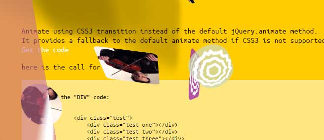
Creating full-page animations that float around the page
See another demo where different elements float around the page. This can be an interesting demonstration for animating without using the flash or other heavy solutions. See the animation and code on the demo page:
The code:
<!DOCTYPE html>
<html>
<head>
<link href='https://fonts.googleapis.com/css?family=Ubuntu+Mono' rel='stylesheet' type='text/css'>
<style type="text/css">
body{
margin: 0;
white-space: inherit;
background: #ffcc00;
font: 16px/19px 'Ubuntu Mono', sans-serif;
overflow-x: hidden;
overflow-y: scroll;
}
#wrapper, #links{
position: relative;
margin: auto;
width:900px;
z-index: 1;
}
h1{
margin-top: 80px;
padding:50px 0;
}
a{
color: white;
text-decoration: none;
}
a:hover{
color: #000000;
text-decoration: none;
}
.elements{
top:0;
left:0;
position:fixed;
width:100%;
height:100%;
box-sizing: border-box;
z-index: 10;
}
.test{
top:0;
left:0;
position:absolute;
z-index: 1000;
width:10px;
height:10px;
/*box-shadow: inset 0 0 5px rgba(0,0,0,0.5);*/
border-radius:10px;
box-sizing: border-box;
background: #fff url("images/bg.png");
background-size: cover;
background-position: center center;
}
.test.one{
background: url("images/michael.jpg");
background-size: cover;
background-position: center center;
}
pre{
overflow: auto;
width: 100%;
font: 12px/14px 'Ubuntu Mono', sans-serif;
background: rgba(255,255,255,.5);
margin: 0;
padding: 0;
}
</style>
<script type="text/javascript" src="https://ajax.googleapis.com/ajax/libs/jquery/3.0.0/jquery.min.js"></script>
<script type="text/javascript" src="js/CSSAnimate/jquery.mb.browser.min.js"></script>
<script type="text/javascript" src="js/CSSAnimate/jquery.mb.CSSAnimate.js"></script>
<script type="text/javascript">
function setUnit(i, units) {
if ((typeof i === "string") && (!i.match(/^[\-0-9\.]+$/))) {
return i;
} else {
return "" + i + units;
}
}
var shadow = setUnit((Math.floor(Math.random() * 180)),"px") + " " + setUnit((Math.floor(Math.random() * 180)),"px") + " " + setUnit(10 + (Math.floor(Math.random() * 20)),"px") +" rgba(0,0,0,0.2)";
$.fn.test = function() {
var cH = $(window).height();
var cW = $(window).width();
return this.each(function() {
var el = $(this);
var w = 50 + (5 * Math.floor((Math.random() * 20)));
var h = 50 + (5 * Math.floor((Math.random() * 20)));
var t = 10 + (Math.floor(Math.random() * (cH-h)));
var l = 10 + (Math.floor(Math.random() * (cW-w)));
var r = Math.floor(Math.random() * 360);
var duration = 1000 + Math.floor((Math.random() * 5000));
//here is the CSSAnimate :-)
el.CSSAnimate({
y: t,
x: l,
width: w,
height: h,
skewX: r/10,
perspective: setUnit(Math.random() * 800,"px"),
boxShadow: shadow,
borderRadius: Math.floor(Math.random() * el.width()),
rotate: r,
rotateX: r/3,
transformOrigin: Math.floor(Math.random() * 100)+"% "+Math.floor(Math.random() * 100)+"%",
backgroundColor: "rgba("+Math.floor(Math.random() * 255)+","+Math.floor(Math.random() * 255)+","+Math.floor(Math.random() * 255)+","+(.6+Math.random()*.4)+")"
}, duration, 0, "linear", function() {
el.test();
})
})
};
$.fn.printHTML=function(){
return this.each(function(){
var $el = $(this);
var content=$el.html();
content=content.replace(/</g,"<");
content=content.replace(/>/g,">");
$el.html(content);
})
};
$(function(){
if (self.location.href == top.location.href){
var logo=$("<a href='https://pupunzi.com' style='position:absolute;top:10px;left:10px;z-index:1000'><img id='logo' border='0' src='https://pupunzi.com/images/logo.png' alt='mb.ideas.repository'></a>");
$("body").append(logo);
$("#logo").fadeIn();
}
$(".elements .test").test();
$("[data-code=true]").printHTML();
});
</script>
</head>
<body>
<a href="https://github.com/pupunzi"><img style="width:100px; position: absolute; top: 20px; right: 20px; border: 0;" src="https://upload.wikimedia.org/wikipedia/commons/b/b3/GitHub.svg" alt="Fork me on GitHub"></a>
<div class="elements">
<div class="test one"></div>
<div class="test two"></div>
<div class="test three"></div>
<div class="test one"></div>
<div class="test two"></div>
<div class="test three"></div>
<div class="test one"></div>
<div class="test two"></div>
<div class="test three"></div>
</div>
<div id="wrapper">
<h1>jquery.mb.CSSAnimate demo</h1>
<div id="links">
<p>
Animate using CSS3 transition instead of the default jQuery.animate method.<br>
It provides a fallback to the default animate method if CSS3 is not supported by the browser.
<br>
<a href="inc/jquery.mb.CSSAnimate.js" target="_blank"> Get the code</a>
</p>
<p>here is the call for this example:
<pre>
<code>
<b>the "DIV" code:</b>
<div data-code=true>
<div class="test">
<div class="test one"></div>
<div class="test two"></div>
<div class="test three"></div>
<div class="test one"></div>
<div class="test two"></div>
<div class="test three"></div>
<div class="test one"></div>
<div class="test two"></div>
<div class="test three"></div>
<div class="test one"></div>
<div class="test two"></div>
<div class="test three"></div>
</div>
</div>
<b>the function:</b>
$.fn.test = function() {
var cH = $(window).height();
var cW = $(window).width();
return this.each(function() {
var el = $(this);
var w = 10 + (5 * Math.floor((Math.random() * 15)));
var h = 10 + (5 * Math.floor((Math.random() * 15)));
var t = 10 + (Math.floor(Math.random() * (cH-h)));
var l = 10 + (Math.floor(Math.random() * (cW-w)));
var r = Math.floor(Math.random() * 360);
var duration = 1000 + Math.floor((Math.random() * 5000));
//here is the CSSAnimate :-)
el.CSSAnimate({
y: t,
x: l,
width: w,
height: h,
skew: r/3,
"border-radius": Math.floor(Math.random() * el.width()),
"rotate": r,
"transform-origin": Math.floor(Math.random() * 100)+"% "+Math.floor(Math.random() * 100)+"%",
"background-color": "rgba("+Math.floor(Math.random() * 255)+","+Math.floor(Math.random() * 255)+","+Math.floor(Math.random() * 255)+","+(.6+Math.random()*.4)+")"
}, duration, 0, "linear", function() {
el.test();
})
})
};
$(".test").test();
</code>
</pre>
</p>
<p>back to <a href="https://pupunzi.github.com">pupunzi experiments</a></p>
</div>
</div>
</body>
</html>
See how the math formula is used in JavaScript for creating that continuous animation. Read more about this plug-in by its maker by following the link in the above part.