
Create tooltips based on pure CSS
The hint.css is a library for creating the tooltips on your web pages. No JavaScript or jQuery is required rather it uses HTML5 data attributes. The CSS3 transitions are also used for creating effects.
You may customize the tooltips like changing the colors, height, width, etc. by using the built-in classes. Various directions can also be set by using the specified classes while tooltip content is given by using the aria-label attribute.
Developer’s page Download library
How to include this library in your website?
You may install the library by npm or Bower.
npm: npm install –save hint.css
Bower: bower install hint.css
Or download the zipped file by above link and find the hint.css or hint.min.css file. Include the reference in the <head> section of the webpage as per your directory structure:
<link rel=”stylesheet” href=”css/toolip-hint/hint.css”>
Create the markup of the elements where you want to place the tooltips and use data attributes as shown in the demos and code below.
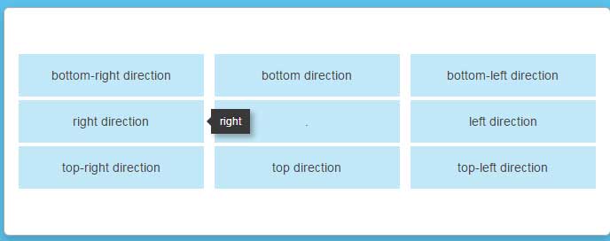
A demo of displaying CSS tooltips in different directions
In this example, the tooltips based on pure CSS are displayed in all available directions. The following directions can be set by using the respective CSS class:
- top-left (hint–top-left)
- top-right (hint—top)
- top (hint–top-right)
- left (hint–left)
- right (hint–right)
- bottom-left (hint–bottom-left)
- bottom (hint–bottom)
- bottom-right (hint–bottom-right)
So, for a particular direction, use the “hint–“ prefix and the direction.
In the demo, you can see text with the directions. Bring the mouse over any cell and you will see tooltip appearing in that direction:
Online demo and code
The markup used for this example:
<div class="content">

  <div class="position-grid">

    <div class="tooltip-demo-grid__cell"><a href="#" aria-label="bottom-right" class="hint--bottom-right">bottom-right direction</a></div>

   <div class="tooltip-demo-grid__cell"><a href="#" aria-label="bottom" class="hint--bottom">bottom direction</a></div>

     <div class="tooltip-demo-grid__cell"><a href="#" aria-label="bottom-left" class="hint--bottom-left">bottom-left direction</a></div>

   <div class="tooltip-demo-grid__cell"><a href="#" aria-label="right" class="hint--right">right direction</a></div>

    <div class="tooltip-demo-grid__cell"><a>.</a></div>

     <div class="tooltip-demo-grid__cell"><a href="#" aria-label="left" class="hint--left">left direction</a></div>

   <div class="tooltip-demo-grid__cell"><a href="#" aria-label="top-right" class="hint--top-right">top-right direction</a></div>

     <div class="tooltip-demo-grid__cell"><a href="#" aria-label="top" class="hint--top">top direction</a></div>

    <div class="tooltip-demo-grid__cell"><a href="#" aria-label="top-left" class="hint--top-left">top-left direction</a></div>

 </div>


</div>
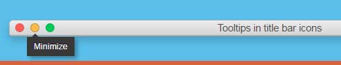
A demo of displaying tooltips in a title bar
In this example, the tooltips are displayed towards the bottom right of the tiny icons in a title bar. Hover the mouse over any icon and see the tooltips appearing:
See online demo and code
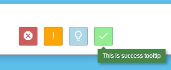
Creating various color tooltips
You may specify the colors of the tooltips as well by using the color specific classes:
- hint–error (For red color)
- hint–warning
- hint–info (For light blue color)
- hint–success (Green color)
See this example online with code:
See online demo and code
You may specify the color where direction class is given. For example:
<p>

 <a class="status-icon  hint--bottom-right  hint--error" style="background:indianred" aria-label="Red for error">

    Red color

 </a>

 <a class="status-icon  hint--bottom-right  hint--warning" style="background:orange" aria-label="Orange for warning">

    Orange for warning

  </a>

  <a class="status-icon  hint--bottom-left  hint--info" style="background:lightblue" aria-label="blue for ingo">

    Light blue for info

  </a>

  <a class="status-icon  hint--bottom-right  hint--success" style="background:#00EC00" aria-label="Green color for success">Green for success

  </a>

</p>
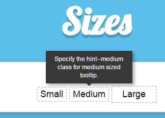
Various sized tooltips demo
By using the size related classes of the tooltip CSS library, you may create various sized tooltips. The classes are:
- hint–small
- hint–medium
- hint–large
Have a look at this demo where all these classes are used:
See online demo and code
The markup:
<h3>Size variations</h3>
<p>

  <a class="hint--top  hint--small" style="border: 1px dashed #A4A4A4;padding:3px 6px;;color:#000;" data-hint="Specify the hint--small class for small sized tooltip.">

  Small

  </a>


   <a class="hint--top  hint--medium" style="border: 1px dashed #A4A4A4;padding:3px 6px;4px;color:#000;" data-hint="Specify the hint--medium class for medium sized tooltip.">

  Medium

  </a>


  <a class="hint--top  hint--large" style="border: 1px dashed #A4A4A4;padding:5px 20px;color:#000;" data-hint="Specify the hint--large class for large sized tooltip.">

   Large

  </a>

</p>
See the complete code on the demo page.
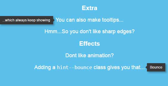
Adding effects in the tooltip
You may animate the tooltips by using the hint–bounce class. If no animation is desired then use the hint–no-animate class. The demo also shows a tooltip that is always displayed by using the hint–always class. Have a look:
See online demo and code
See the complete code from the demo page.
To learn more about this awesome tooltip library, visit the developer’s page.