
In today’s world, more people are using smart-phones than desktop computers. So, making images responsive that sets with the user screens is very important for a good user experience.
In this tutorial, we will how to set the image size by using CSS properties. I will also show you ways of making the images responsive – so as the screen gets smaller (from the computer desktop to smartphone) the image resizes itself by using CSS.
How to set image size using CSS?
First, let us look at the basics – setting the image dimensions in CSS. For that, I used the same image twice in the example below. The first image is the original size whereas the second image is given a CSS class. Have a look:
See online demo and code
<!DOCTYPE html>
<html>
<head>
<style>
.imgsize {
width: 800px;
height: 800px;
}
</style>
</head>
<body>
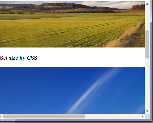
<h3>Original size</h3>
<img src="images/css-image-size.jpg" />
<h3>Set size by CSS</h3>
<img class="imgsize" src="images/css-image-size.jpg" />
</body>
</html>
In the second img tag, you can see a CSS class (imgsize). There, we provided the width and height in pixels. However, if you resize the window or look at the example in the smartphone, there should be scroll bars while images should be of the same sizes as in the bigger screen.
First, have a look at sizing the images in percentage and then I will show you how to make those images responsive.
The example of image size by percentage
The example below shows using the % for setting the image size. In the example, the first image is the original size, second is 50% of the container while the third is 150%:
See online demo and code
<!DOCTYPE html>

<html>

<head>

<style>

.imgsize1 {

  width: 50%;

  height: 50%;

}

.imgsize2 {

  width: 150%;

  height: 150%;

}


</style>


</head>

<body>

<h3>Original size</h3>

<img src="images/css-image-size.jpg" />


<h3>50% of original image</h3>

<img class="imgsize1" src="images/css-image-size.jpg" />


<h3>150% of original image</h3>

<img class="imgsize2" src="images/css-image-size.jpg" />


</body>

</html>
How to make an image responsive using CSS?
There are certain tricks that let you make the images responsive as using CSS. It depends on the requirement – for example allowing the image to be responsive for any height and width as it changes. Similarly, you want to make the image responsive for a certain width or height etc.
The first example below shows making an image responsive as the screen size varies – no limit is set for this. Have a look and try resizing your screen and see how image adjusts without scroll bars:
See online demo and code
<html>

<head>

<style>

.imgresp {

  width: 100%;

  height: auto;

}

</style>


</head>

<body>


<img class="imgresp" src="images/css-image-size.jpg" />


</body>

</html>
So, create a CSS class and just specify the width 100% and height value is auto. Apply this class to the img tag for image that you want to make responsive.
Setting the maximum height and width for responsive image example
You may want to specify the maximum height and width of the image in order to keep the quality of the image for the responsive image. The above example keeps on increasing the image dimensions with screen height and width.
For setting the max height/width, you may use the max-height and max-width properties of CSS as shown in the example below:
See online demo and code
<html>

<head>

<style>

.imgresp {

  max-width: 800px;

  width: 100%;

  height: auto;

  max-height: 300px;

}

</style>


</head>

<body>


<img class="imgresp" src="images/css-image-size.jpg" />


</body>

</html>
Similarly, you may set the min-height and min-width properties.
Make images responsive by srcset and sizes attribute
If you are not satisfied with automatic responsive images as shown in the above examples – that used one image and adjusted the size according to the device then you may use another technique that gives you more control.
By this technique, you may specify different images for various devices/dimensions of the screen. So, you may resize the images yourself by using tools like Photoshop. You will be able to direct which image is used for a particular device.
The tags for this technique are srcset and size attribute that is used in the HTML img tag. See an example below:
See online demo and code
<!DOCTYPE html>

<html>

<head>


</head>

<body>


<img srcset="images/banana.jpg 480w,

                     images/BS4-slide-2.jpg 800w"

             sizes="(max-width: 600px) 480px,

                    800px"

             src="images/BS4-slide-2.jpg" alt="an imgsrc demo">


</body>

</html>
For clarity purpose, I used two different images (the one in the above demos and a banana.jpg). In live sites, you may want to use the same images by resizing yourself.
Also, the above demo works for two screen sizes i.e. 480 and 800px. You may specify more width as per the need.
For learning more about srcset, go to its tutorial here.
Responsive images by using Bootstrap
If your project is based on the Bootstrap framework then making images responsive is pretty simple. All you have to do is using the responsive class:
- .img-fluid
An example of a responsive image by using Bootstrap 4 is given below:
See online demo and code
<!DOCTYPE html>

<html>

<head>

<link rel="stylesheet" href="https://maxcdn.bootstrapcdn.com/bootstrap/4.0.0-beta.3/css/bootstrap.min.css" integrity="sha384-Zug+QiDoJOrZ5t4lssLdxGhVrurbmBWopoEl+M6BdEfwnCJZtKxi1KgxUyJq13dy" crossorigin="anonymous">

</head>

<body>


<img src="images/css-image-size.jpg" class="img-fluid" alt="A Bootstrap based responsive image demo">


</body>

</html>
Resize the screen and you can see image adjusting itself.