
- The text-shadow property, as the name shows, is used to give shadows in the text of the web pages.
- Normally, you will use text shadows in headings or any other text to make it prominent.
- You may also add animation based on CSS to the shadows to even stand out more.
- I will show you demos of using shadows in this tutorial, so keep reading.
- You may also add animation based on CSS to the shadows to even stand out more.
How to use CSS text-shadow property?
The simple syntax to use the text-shadow property is:
Where the horizontal and vertical shadow values are required while blur and color are optional.
An example of text-shadow property
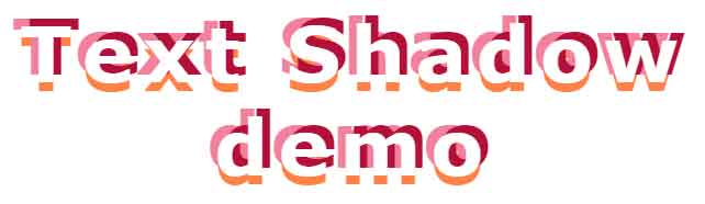
In this demo, the text-shadow property is used twice for defining the shadow of text in the div element. For proper text-shadow, a few other CSS properties like background color, font-size, font weight, etc. are also used. The first set of values in text-shadow applies the shadow on top, have a look:

The CSS:
.text-shadow-demo {

  width:auto;

  background-color: #6B7DE2;

  color: #e0eff2;

  font-family: Georgia, Serif;

  font-weight: 700;

  font-style: italic;

  font-size: 80px;

  text-shadow: -4px 3px 0 #408080, -14px 7px 0 #0a0e27;

}
The markup:
<div class="text-shadow-demo">

  Text Shadow demo

</div>
Style number 2 for text-shadow
In this demo, the CSS shadow property is used many times for creating the shadow. That way, you may provide different colors at different points, have a look:

The CSS:
.text-shadow-demo2 {

  color: #376F6F;

  font-family: Arial, Serif;

  font-weight: 700;

  font-style: italic;

  font-size: 80px;


  text-shadow:

     0 1px #00BFBF,-1px 0 #98B5B8,-1px 2px #00BFBF,-2px 1px #98B5B8,-2px 3px #00BFBF,-3px 2px #98B5B8,-3px 4px #00BFBF,-4px 3px #98B5B8,

    -4px 5px #00BFBF,-5px 4px #98B5B8,-5px 6px #00BFBF,-6px 5px #98B5B8, -6px 7px #00BFBF,-7px 6px #98B5B8,-7px 8px #00BFBF,-8px 7px #98B5B8;

}
Style number 3 of the shadow effect
See this shadow effect where text looks broken or in dashed way by using the white color for the color property and different colors for the shadow property:
The CSS:
.text-shadow-demo3 {

    font-size:60px;

    font-family: verdana;

    letter-spacing: .18em;

    color:#fff;

    text-shadow:  0.45rem -0.45rem #B41039, -0.45rem -0.45rem #F3819D, 0 0.5rem rgba(255, 88, 9, 0.75);

}
Text shadow style number 4 using RGB
In this example, the RGB color codes are used in the shadow CSS property. See the code and output by clicking the image or link below:

HTML and CSS
<!DOCTYPE html>
<html>
<head>

<style>
.text-shadow-demo3 {
  text-align: center;
  font-family: Georgia, Serif;
  font-weight: 800;
  font-style: italic;
  font-size: 70px;
  padding: 40px 0;
  letter-spacing:1px;
  color: #92a5de;

  text-shadow:0px 0px 0 rgb(137,156,213),1px 1px 0 rgb(129,148,205),2px 2px 0 rgb(120,139,196),3px 3px 0 rgb(111,130,187),4px 4px 0 rgb(103,122,179),5px 5px 0 rgb(94,113,170),6px 6px 0 rgb(85,104,161),7px 7px 0 rgb(76,95,152),8px 8px 0 rgb(68,87,144),9px 9px 0 rgb(59,78,135),10px 10px 0 rgb(50,69,126),11px 11px 0 rgb(42,61,118),12px 12px 0 rgb(33,52,109),13px 13px 0 rgb(24,43,100),14px 14px 0 rgb(15,34,91),15px 15px 0 rgb(7,26,83),16px 16px 0 rgb(-2,17,74),17px 17px 0 rgb(-11,8,65),18px 18px 0 rgb(-19,0,57),19px 19px 0 rgb(-28,-9,48), 20px 20px 0 rgb(-37,-18,39),21px 21px 20px rgba(0,0,0,1),21px 21px 1px rgba(0,0,0,0.5),0px 0px 20px rgba(0,0,0,.2);
}

</style>

</head>
<body>

<div class="text-shadow-demo3">
  Text Shadow demo
</div>


</body>
</html>