
Creating arrows based on CSS
The arrows in websites can be required for different purposes including showing the next, previous pages or sections, checkout steps, etc. or many other real-world stuff where arrows are used.
In this tutorial, I am going to share with you creating the arrows based on pure CSS.
The CSS arrows are using the transform property with rotate values along with other properties.
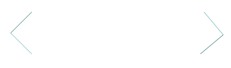
A demo of left and right arrows
In this demo, the arrows CSS are created for the left and right directions. In the markup section, links are used that are assigned CSS classes, have a look:
The CSS:
* {

  box-sizing: border-box;

}


body {

  text-align: center;

  padding-top: 100px;

  width: 400px;

  position: relative;

  margin: 0 auto;

}


.demo-arrow-cls {

  display: inline-block;

  position: absolute;

  width: 60px;

  height: 60px;

  background: transparent;

  text-indent: -9999px;

  border-top: 1px solid #408080;

  border-left: 1px solid #72B8B8;

  transition: all .3s ease-in-out;

  text-decoration: none;

  color: transparent;

}

.demo-arrow-cls:hover {

  border-color: #800000;

  border-width: 2px;

}

.demo-arrow-cls:before {

  display: block;

  height: 200%;

  width: 200%;

  margin-left: -50%;

  margin-top: -50%;

  content: "";

  transform: rotate(45deg);

}

.demo-arrow-cls.back {

  transform: rotate(-45deg);

  left: 0;

}

.demo-arrow-cls.forward {

  transform: rotate(140deg);

  right: 0;

}
The markup:
<a href="#" class="demo-arrow-cls back">« Back</a> <a href="#" class="demo-arrow-cls forward">Forward » </a>
So how is it done?
The demo-arrow-cls CSS class defines a few properties including the transition that uses ease-in-out value for the arrow. There, the border-top and border-left define the color and lining of the arrow. You may use dashed, dotted lining as well (see next example).
The demo-arrow-cls.back class is assigned the CSS transform property with rotate at 45 degrees. The demo-arrow-cls.forward is given the transform property as well with 140 degrees in rotate value.
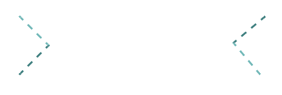
Another demo with a different arrow style
In this demo, a few properties are changed like border colors. The top and left borders are given the dashed lining with 3px. The transition is linear unlike ease-in-out used in above example. The direction is set opposite to the above example:
The CSS and markup:
<!DOCTYPE html>
<html>
<head>

<style>
* {
  box-sizing: border-box;
}

body {
  text-align: center;
  padding-top: 100px;
  width: 400px;
  position: relative;
  margin: 0 auto;
}

.demo-arrow-cls {
  display: inline-block;
  position: absolute;
  width: 60px;
  height: 60px;
  background: transparent;
  text-indent: -9999px;
  border-bottom: 3px dashed #408080;
  border-right: 3px dashed #72B8B8;
  transition: all .3s linear;
  text-decoration: none;
  color: transparent;
}
.demo-arrow-cls:hover {
  border-color: #FF8000;
  border-width: 3px;
}
.demo-arrow-cls:before {
  display: block;
  height: 200%;
  width: 200%;
  margin-left: -50%;
  margin-top: -50%;
  content: "";
  transform: rotate(45deg);
}
.demo-arrow-cls.back {
  transform: rotate(-45deg);
  left: 0;
}
.demo-arrow-cls.forward {
  transform: rotate(140deg);
  right: 0;
}

</style>

</head>
<body>

<a href="#" class="demo-arrow-cls back">« Back</a>
<a href="#" class="demo-arrow-cls forward">Forward » </a>

</body>
</html>
In the demo, instead of top and left borders the bottom and right borders are used.
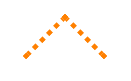
A demo of up direction arrow
In this example, an up arrow is created by changing the angle to 135 degrees instead of 45 degrees. See the output and code below:
The CSS in this example:
* {

  box-sizing: border-box;

}


body {

  text-align: center;

  padding-top: 100px;

  width: 400px;

  position: relative;

  margin: 0 auto;

}


.demo-arrow-cls {

  display: inline-block;

  position: absolute;

  width: 60px;

  height: 60px;

  background: transparent;

  text-indent: -9999px;

  border-bottom: 5px dotted #FF8000;

  border-right: 5px dotted #FF8000;

  transition: all .2s ease;

  text-decoration: none;

  color: transparent;

}

.demo-arrow-cls:hover {

  border-color: #804040;

  border-width: 4px;

}

.demo-arrow-cls:before {

  display: block;

  height: 200%;

  width: 200%;

  margin-left: -50%;

  margin-top: -50%;

  content: "";

  transform: rotate(45deg);

}

.demo-arrow-cls.up {

  transform: rotate(-135deg);

  left: 0;

}
Credit: bronsrobin