
In web pages, the buttons are generally used in forms to submit data.
The HTML buttons are also used as separate elements e.g. for navigation (next, previous), etc. in websites.
The button can be created by using two ways in HTML:
By using the button tag
This is how you may create a simple button by using the <button> tag:
<button type="button">Button text</button>
By using the input tag
You can create buttons for the HTML forms by using the <input> tag and specify the type, for example:
<input type=””submit” value=”Save Info”>
Also:
<input type=””reset” value=”Reset Default”>
The scope of this tutorial is not to explain how to create buttons and where to use them. In this tutorial, I will show you how to style the buttons by using the latest Bootstrap framework that uses CSS. Also, I will show you demos of creating and styling buttons by CSS properties.
In the following example, the <button> tag is used to create a button, and a CSS class is given which is placed in the <style> section under the <head> tag.
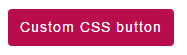
The following CSS class is used in the button:
.btncls{

background-color:#B80C4D;

border: #2e6da4;

font-family: Arial, Geneva, Arial, Helvetica,  sans-serif;

font-size: 15px;

color: #fff;

letter-spacing: 1px;

padding: 8px 12px;

font-size: 14px;

font-weight: normal;


border-radius: 4px;

line-height: 1.5;

text-decoration:none

}
In the above example, the buttons remained the same as the mouse is over any button. You may add a hover effect and use different CSS properties to show users some effects.
See the following demo:
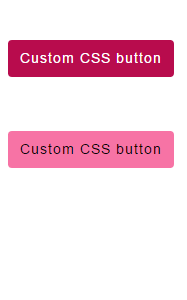
By using the :hover selector with the button class, the background color and text color are changed.
Complete code for this example:
<!DOCTYPE html>
<html>
<head>
<style>
.btncls{
    background-color:#B80C4D;
    border: #2e6da4;
  	font-family: Arial, Geneva, Arial, Helvetica,  sans-serif;
	font-size: 15px;
    color: #fff;
    letter-spacing: 1px;
    padding: 8px 12px;
    font-size: 14px;
    font-weight: normal;

    border-radius: 4px;
    line-height: 1.5;
    text-decoration:none;
}
.btncls:hover{
    background-color:#F773A5;
    border: #2e6da4;
  	font-family: Arial, Geneva, Arial, Helvetica,  sans-serif;
	font-size: 15px;
    color: #000;
    letter-spacing: 1px;
    padding: 8px 12px;
    font-size: 14px;
    font-weight: normal;

    border-radius: 4px;
    line-height: 1.5;
    text-decoration:none;
}
</style>
</head>

<body>
<div class="container">
<h1>HTML buttons by Custom CSS</h1>
<p>Custom CSS button</p>
<p>
<button class="btncls">Custom CSS button with hover</button>
</p>


   </div>
</body>
</html>
You can see, the button used different CSS and CSS 3 properties including border-radius.
Use the CSS transition property to add some effect on the button, as the mouse is brought over. Copy/paste the code below and see the effect yourself by bringing the mouse over the button:
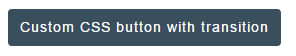
The following CSS code is used for transition:
.btncls{

background-color:#3A4F5E;

border: #2e6da4;

font-family: Arial, Geneva, Arial, Helvetica,  sans-serif;

font-size: 15px;

color: #fff;

letter-spacing: 1px;

padding: 8px 12px;

font-size: 14px;

font-weight: normal;


border-radius: 4px;

line-height: 1.5;

text-decoration:none;


-webkit-transition: All 0.5s ease;

-moz-transition: All 0.5s ease;

-o-transition: All 0.5s ease;

-ms-transition: All 0.5s ease;

transition: All 0.5s ease;

}
In this example, a button is created by using the <input> tag and specifying the type=”submit”. The submit and reset buttons are used in HTML forms. As you click the submit button, the information in the HTML form is submitted to the server.
As for as styling the submit or reset buttons, there is no difference. You simply need to refer the CSS class/id just as in the case of <button> tag.
See this example online where the “Submit” and “Reset” buttons are created with CSS style.
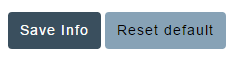
The buttons code is:
<input type="submit" value="Save Info" class="btncls1" />

<input type="reset" value="Reset default" class="btncls2" />
Complete code of the example:
<!DOCTYPE html>
<html>
<head>
<style>
.btncls1{
    background-color:#3A4F5E;
    border: #2e6da4;
  	font-family: Arial, Geneva, Arial, Helvetica,  sans-serif;
	font-size: 15px;
    color: #fff;
    letter-spacing: 1px;
    padding: 8px 12px;
    font-size: 14px;
    font-weight: normal;
    border-radius: 4px;
    line-height: 1.5;
    text-decoration:none;
}
.btncls2{
    background-color:#87A2B6;
    border: #2e6da4;
  	font-family: Arial, Geneva, Arial, Helvetica,  sans-serif;
	font-size: 15px;
    color: #000;
    letter-spacing: 1px;
    padding: 8px 12px;
    font-size: 14px;
    font-weight: normal;
    border-radius: 4px;
    line-height: 1.5;
    text-decoration:none;

}
</style>
</head>

<body>
<div class="container">
<h1>HTML buttons by Custom CSS</h1>
<p>Custom CSS Submit and Reset buttons</p>
<p>
<input type="submit" value="Save Info" class="btncls1" />
<input type="reset" value="Reset default" class="btncls2" />
</p>


   </div>
</body>
</html>
If you have no or little idea, Bootstrap is a web framework which is used to create websites that are mobile-friendly. It has built-in CSS classes that you can use for creating different elements including HTML buttons.
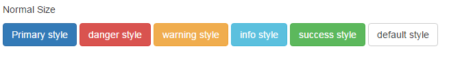
In this example, I have created different buttons by using the built-in CSS classes in Bootstrap framework. The buttons are normal sized and created by using the <button> tag:
For creating buttons by using Bootstrap, you have to include its CSS library. See the <head> section in code below.
<!DOCTYPE html>
<html>
<head>
    <link rel="stylesheet" href="https://maxcdn.bootstrapcdn.com/bootstrap/3.3.6/css/bootstrap.min.css" integrity="sha384-1q8mTJOASx8j1Au+a5WDVnPi2lkFfwwEAa8hDDdjZlpLegxhjVME1fgjWPGmkzs7" crossorigin="anonymous">
    <meta name="viewport" content="width=device-width, initial-scale=1.0">

</head>

<body>
<div class="container">
<h1>HTML buttons by Bootstrap CSS classes</h1>
<p>Normal Size</p>
<p>
  <button type="button" class="btn btn-primary">Primary style</button>
  <button type="button" class="btn btn-danger">danger style</button>
  <button type="button" class="btn btn-warning">warning style</button>
  <button type="button" class="btn btn-info">info style</button>
  <button type="button" class="btn btn-success">success style</button>
  <button type="button" class="btn btn-default">default style</button>
</p>


   </div>
</body>
</html>
You can see, that to create a normal-sized button, the main btn class along with another class like btn-primary, btn-danger are specified. The other class should be used according to the context where button is used. For example, if an alert or message is shown to the user, you can use btn-info class.
For a critical action, like removing an account permanently by pressing a button, you may use a red button with btn-danger class and so on.
In this example, large sized buttons are created by using the btn-lg class along with two classes that are used in above example.

You can see that the large-sized buttons are created by using the btn-lg class:
  <button type="button" class="btn btn-primary btn-lg">HTML button 1</button>

<button type="button" class="btn btn-danger btn-lg">Red theme</button>

<button type="button" class="btn btn-warning btn-lg">warning theme HTML button</button>

<button type="button" class="btn btn-info btn-lg">information</button>

<button type="button" class="btn btn-success btn-lg">A success message</button>
Sometimes, you need as large buttons as the container holding it. For example, a <div> tag with more width than normal or large-sized buttons that contains a <form>.
By using Bootstrap CSS classes, this is how you can create block-level buttons:
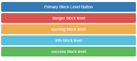
By using the btn-block class along with main btn and context-specific class, you can create block level buttons in HTML by using Bootstrap. This is how, HTML block level buttons are created in demo:
  <button type="button" class="btn btn-primary btn-block">Primary Block Level Button</button>

<button type="button" class="btn btn-danger btn-block">danger block level</button>

<button type="button" class="btn btn-warning btn-block">warning block level</button>

<button type="button" class="btn btn-info btn-block">info block level</button>

<button type="button" class="btn btn-success btn-block">success block level</button>
Use the .btn-sm class to create small buttons in web page. See the following demo:
Markup:
<body>
<div class="container">
<h1>HTML buttons by Bootstrap CSS classes</h1>
<p>Small Size</p>
<p>
  <button type="button" class="btn btn-primary btn-sm">Primary small button</button>
  <button type="button" class="btn btn-danger btn-sm">danger small button</button>
  <button type="button" class="btn btn-warning btn-sm">warning small button</button>
  <button type="button" class="btn btn-info btn-sm">info small button</button>
  <button type="button" class="btn btn-success btn-sm">success small button</button>
  <button type="button" class="btn btn-default btn-sm">default small button</button>
</p>


   </div>
</body>
Similarly, you can create extra small buttons by using the btn-xs class.
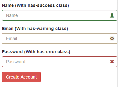
In this example, a form is created with a few textbox input fields. A submit button is used, “Create Account”, that uses Bootstrap built-in CSS class.
See the demo and complete code online:
Code:
<!DOCTYPE html>
<html>
<head>
    <link rel="stylesheet" href="https://maxcdn.bootstrapcdn.com/bootstrap/3.3.5/css/bootstrap.min.css" integrity="sha512-dTfge/zgoMYpP7QbHy4gWMEGsbsdZeCXz7irItjcC3sPUFtf0kuFbDz/ixG7ArTxmDjLXDmezHubeNikyKGVyQ==" crossorigin="anonymous">
    <meta name="viewport" content="width=device-width, initial-scale=1.0">

</head>

<body>
<div class="container">
<h1>Bootstrap Form demo</h1>
<form>
  <div class="form-group has-success has-feedback">
    <label for="Name">Name (With has-success class)</label>
    <input type="name" class="form-control" id="Name" placeholder="Name" aria-describedby="Success2Status">
  <span class="glyphicon glyphicon-user form-control-feedback" aria-hidden="true"></span>
  <span id="Success2Status" class="sr-only">(success)</span>
  </div>
  <div class="form-group has-warning has-feedback">
    <label for="Email1">Email (With has-warning class)</label>
    <input type="email" class="form-control" id="Email1" placeholder="Email" aria-describedby="Warning2Status">
    <span class="glyphicon glyphicon-envelope form-control-feedback" aria-hidden="true"></span>
    <span id="Warning2Status" class="sr-only">(warning)</span>
      </div>
  <div class="form-group has-error has-feedback">
    <label for="Password1">Password (With has-error class)</label>
    <input type="password" class="form-control" id="Password1" placeholder="Password" aria-describedby="Error2Status">
    <span class="glyphicon glyphicon-remove form-control-feedback" aria-hidden="true"></span>
    <span id="Error2Status" class="sr-only">(error)</span>
  </div>

  <button type="submit" class="btn btn-danger">Create Account</button>
</form>
</div>
</body>
</html>
The other form controls are also assigned built-in CSS classes.
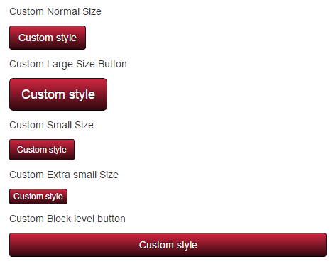
You may also customize the colors and other properties of these buttons that retain certain other built-in properties.
In this example, the buttons are customized with CSS3 properties along with assigning a few built-in CSS classes in Bootstrap.
The code:
<!DOCTYPE html>
<html>
<head>
<title>Bootstrap Button demo</title>
    <link rel="stylesheet" href="https://maxcdn.bootstrapcdn.com/bootstrap/3.3.6/css/bootstrap.min.css" integrity="sha384-1q8mTJOASx8j1Au+a5WDVnPi2lkFfwwEAa8hDDdjZlpLegxhjVME1fgjWPGmkzs7" crossorigin="anonymous">
    <meta name="viewport" content="width=device-width, initial-scale=1.0">
<style>
.btn-danger
{

  background-color: hsl(351, 68%, 11%) !important;
  background-repeat: repeat-x;
  background-image: -o-linear-gradient(top, #d12741, #2f080e);
  background-image: linear-gradient(#d12741, #2f080e);
  border-color: #2f080e #2f080e hsl(351, 68%, 1.5%);
  color: #fff !important;
  text-shadow: 0 -1px 0 rgba(0, 0, 0, 0.62);
}
.btn-danger:hover, .btn-danger:focus, .btn-danger:active, .btn-danger.active, .open .dropdown-toggle.btn-danger {

  background-color: hsl(360, 68%, 60%) !important;
  background-repeat: repeat-x;
  background-image: linear-gradient(#fbeded, #de5353);
  border-color: #de5353 #de5353 hsl(360, 68%, 51%);
  color: #333 !important;
  text-shadow: 0 1px 1px rgba(255, 255, 255, 0.59);
 }
</style>
</head>

<body>
<div class="container">
<h1>Bootstrap Button demo</h1>
<p>Custom Normal Size</p>
<p>
  <button type="button" class="btn btn-danger">Custom style</button>
</p>

<p>Custom Large Size Button</p>
<p>
  <button type="button" class="btn btn-danger btn-lg">Custom style</button>
</p>

<p>Custom Small Size</p>
<p>
  <button type="button" class="btn btn-danger btn-sm">Custom style</button>
</p>

<p>Custom Extra small Size</p>
<p>
  <button type="button" class="btn btn-danger btn-xs">Custom style</button>
</p>

<p>Custom Block level button</p>
<p>
  <button type="button" class="btn btn-danger btn-block">Custom style</button>
</p>


   </div>
</body>
</html>
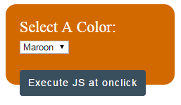
In this example, I will show you how you can execute JavaScript code at the click event of the button. The click event occurs as a button is clicked.
See online demo and code
To execute the onclick event, choose a color from the HTML dropdown and press the button. The JS code will execute and it will apply selected color to the document.
This is how onclick event is called as button is clicked:
<button class="btncls" onclick="clkdemo()">Execute JS at onclick</button>
After the onclick keyword, a JS function is specified in the button tag. Similarly, you may use other events like dblclick (for double click) etc.
Complete code:
<!DOCTYPE html>
<html>

<head>

<script type="text/javascript">
function clkdemo() {
var seltheme = document.getElementById("selecttheme").value;


    if(seltheme == "Maroon"){

        document.body.style.backgroundColor = "Maroon";

    }
    else if (seltheme == "Green"){
        document.body.style.backgroundColor = "Green";
    }

    else if (seltheme == "Blue"){
        document.body.style.backgroundColor = "Blue";
    }
    else if (seltheme == "Red"){
        document.body.style.backgroundColor = "Red";
    }
    else if (seltheme == "Yellow"){
        document.body.style.backgroundColor = "Yellow";
    }

    else{
        document.body.style.backgroundColor = "White";
    }
}
</script>

<style>
.selcolor {
  background: #D26900;
  height: 75px;
  width:200px;
  border-radius: 15px;
  padding:20px;
  font-size:22px;
  color:#fff;
}
.btncls{
    background-color:#3A4F5E;
    border: #2e6da4;
  	font-family: Arial, Geneva, Arial, Helvetica,  sans-serif;
	font-size: 15px;
    color: #fff;
    letter-spacing: 1px;
    padding: 8px 12px;
    font-size: 14px;
    font-weight: normal;

    border-radius: 4px;
    line-height: 1.5;
    text-decoration:none;

      /*Transition*/
  -webkit-transition: All 0.5s ease;
  -moz-transition: All 0.5s ease;
  -o-transition: All 0.5s ease;
  -ms-transition: All 0.5s ease;
  transition: All 0.5s ease;
}
.btncls:hover{
    background-color:#87A2B6;
    border: #2e6da4;
  	font-family: Arial, Geneva, Arial, Helvetica,  sans-serif;
	font-size: 15px;
    color: #000;
    letter-spacing: 1px;
    padding: 8px 12px;
    font-size: 14px;
    font-weight: normal;

    border-radius: 4px;
    line-height: 1.5;
    text-decoration:none;

}
</style>

</head>

<body>
<div class="selcolor">
<label>Select A Color: </label><select id="selecttheme">
    <option value="Maroon">Maroon</option>
    <option value="Green">Green</option>
    <option value="Yellow">Yellow</option>
    <option value="Blue">Blue</option>
    <option value="Red">Red</option>
    <option value="White">Other</option>
</select>

<p><button class="btncls" onclick="clkdemo()">Execute JS at onclick</button></p>
</div>
</body>

</html>
By using the disabled attribute in button tag, it cannot be clicked. In this example, three buttons are created. At the click event of all buttons, a JS function is called just like in above example. The function triggers an alert message.
The middle button, “Previous” is given the disabled attribute.
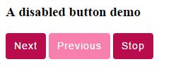
A separate class for the disabled attribute is created in the CSS section that makes it look different than the active buttons:
.btncls:disabled{

background-color:#F780AC;

border: #2e6da4;

font-family: Arial, Geneva, Arial, Helvetica,  sans-serif;

font-size: 15px;

…..

}
This is how button tags are created:
<button class="btncls" onclick="showalert()">Next</button>

<button class="btncls" onclick="showalert()" disabled>Previous</button>

<button class="btncls" onclick="showalert()">Stop</button>
Complete code for this example:
<!DOCTYPE html>
<html>
<head>
<script>
function showalert() {

    alert ("Button is clicked");
}
</script>
<style>
.btncls{
    background-color:#B80C4D;
    border: #2e6da4;
  	font-family: Arial, Geneva, Arial, Helvetica,  sans-serif;
	font-size: 15px;
    color: #fff;
    letter-spacing: 1px;
    padding: 8px 12px;
    font-size: 14px;
    font-weight: normal;

    border-radius: 4px;
    line-height: 1.5;
    text-decoration:none;
}
.btncls:disabled{
    background-color:#F780AC;
    border: #2e6da4;
  	font-family: Arial, Geneva, Arial, Helvetica,  sans-serif;
	font-size: 15px;
    color: #fff;
    letter-spacing: 1px;
    padding: 8px 12px;
    font-size: 14px;
    font-weight: normal;

    border-radius: 4px;
    line-height: 1.5;
    text-decoration:none;
}
</style>
</head>

<body>

<h1>HTML buttons by Custom CSS</h1>
<h3>A disabled button demo</h3>
<p>
<button class="btncls" onclick="showalert()">Next</button>
<button class="btncls" onclick="showalert()" disabled>Previous</button>
<button class="btncls" onclick="showalert()">Stop</button>
</p>

</body>
</html>