
The mdl-jquery-modal-dialog plug-in
The mdl-jquery-modal-dialog is used to create the modal dialogs and loading overlays that use jQuery and MDL (Modal Dialog Lite). This is really a light weight plug-in and requires a few lines of code with useful modal features.
You may present simple dialogs or with actionable buttons that can be closed by clicking anywhere on the screen or by pressing the buttons inside modals.
Developer’s page Download plug-in
Demo 1 Demo 2 Demo 3
How to set up this plug-in on your web site?
After downloading the plug-in from the given links, get the mdl-jquery-modal-dialog.js file and refer it after the jQuery and material.min.js libraries:
<script src=”//code.jquery.com/jquery-3.1.1.min.js”></script>
<script src=”//storage.googleapis.com/code.getmdl.io/1.2.1/material.min.js”></script>
<link rel=”stylesheet”
href=”https://storage.googleapis.com/code.getmdl.io/1.2.1/material.deep_orange-amber.min.css”/>
<link rel=”stylesheet”
href=”https://fonts.googleapis.com/css?family=Roboto:regular,bold,italic,thin,light,bolditalic,black,medium”>
<link rel=”stylesheet” href=”https://fonts.googleapis.com/icon?family=Material+Icons”>
<link rel=”stylesheet” href=”css/mdl-jquery-modal-dialog/mdl-jquery-modal-dialog.css”>
<script src=”js/mdl-jquery-modal-dialog/mdl-jquery-modal-dialog.js”></script>
The markup section
For launching the modal, you may create a button with a few classes and assign it an ID that is used in the jQuery code:
<button id="show-info" class="mdl-button mdl-js-button mdl-button--raised mdl-js-ripple-effect mdl-button--accent">

    Launch the Modal

</button>
Initiate the modal in jQuery with options
<script>

    var lorem = 'Lorem ipsum dolor sit amet, consetetur sadipscing elitr, sed diam nonumy eirmod tempor invidunt ut labore et dolore magna aliquyam erat, sed diam voluptua.';

    $('#show-info').click(function () {

        showDialog({

            title: 'Information',

            text: lorem

        })

    });

</script>
See a few demos below for creating modals that you may see online along with the complete code.
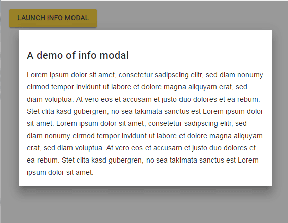
A demo of information modal dialog
In this demo, only the information is displayed in a modal without any action buttons. The modal will close as a user clicks anywhere on the screen. Click the button in the demo page to launch the modal:
See online demo and code
See the modal in action along with the complete code on the demo page.
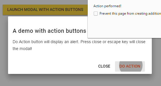
In this demo, two buttons are used in the modal window. If you press the “Do Action”, an alert will display. This is where you may perform a certain action depending on the scenario.
Pressing the Cancel button or escape key will close the modal. Experience this now:
See online demo and code
The markup used in the demo:
<button id="action-modal-demo" class="mdl-button mdl-js-button mdl-button--raised mdl-js-ripple-effect mdl-button--accent">

    Launch modal with action buttons

</button>
The script with different plug-in options:
<script>

    $('#action-modal-demo').click(function () {

        showDialog({

            title: 'A demo with action buttons',

            text: 'Do Action button will display an alert. Press close or escape key will close the modal!',

            negative: {

                title: 'Close'

            },

            positive: {

                title: 'Do Action',

                onClick: function (e) {

                    alert('Action performed!');

                }

            }

        });

    });


</script>
A modal with loading example
As you press the button, the modal will launch with the “loading” where in the background you may load certain content like a video or large image etc. In the demo, the modal will close itself after 2.5 seconds which is set by using the hideLoading() function.
See online demo and code
Grab the code from the demo page.
Read more about the all available options on the developer’s page.