
The Materialize CSS has a built-in modal component that you may use easily for creating dialog boxes or presenting important content to the visitors where underlying content becomes inactive until the modal window is closed.
The modal can be closed by clicking anywhere outside the modal window or using the close button within the modal. So, you may also use modal for the confirmation messages.
Creating materialize modal is easy and require a few line of codes of HTML and jQuery. In order to modal component work, you need to include the reference to materialize.min.js along with jQuery on the web page.
The following section shows how to create modal using materialize framework with live demo and code snippets.
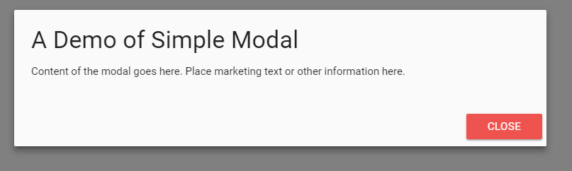
The example of simple modal
A basic modal contains content and footer. The modal-content class is referred to the main div where you may provide the header and content for the modal.
Use the modal-footer class in another div where close button along with other action buttons can be used. Have a look at the markup, jQuery code and working modal by clicking the link or image below:
Online Demo
The markup for the modal:
<div class="container">

<h3>A Demo of Modal</h3>

<!-- Modal Trigger -->

  <a class="waves-effect waves-light btn pink darken-1 modal-trigger" href="#demo-modal">Launch Modal</a>


  <!-- Modal Structure -->

  <div id="demo-modal" class="modal">

    <div class="modal-content">

      <h4>A Demo of Simple Modal</h4>

      <p>Content of the modal goes here. Place marketing text or other information here.</p>

    </div>

    <div class="modal-footer">

      <a href="#!" class="modal-action modal-close waves-effect waves-red btn red lighten-1">Close</a>

    </div>

  </div>

</div>
A little script for initializing the plug-in:
<script>

$(document).ready(function(){

    $('.modal').modal();

  })

</script>
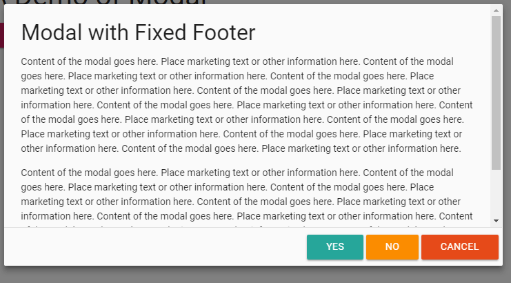
In above modal example, if your content is bigger then footer positions down according to the content. For the large content in modal, you may create the footer with action buttons that are fixed. For creating the fixed footer modal, use the modal-fixed-footer class along with the modal class in the main container element.
Have a look at this demo where I used long demo text in the content section of modal and you can see three buttons in the footer remain fixed.
The markup and script:
<!DOCTYPE html>
<html>
 <head>
  <link rel="stylesheet" href="https://cdnjs.cloudflare.com/ajax/libs/materialize/0.100.2/css/materialize.min.css">

  <link href="https://fonts.googleapis.com/icon?family=Material+Icons" rel="stylesheet">
  <script type = "text/javascript" src = "https://code.jquery.com/jquery-2.1.1.min.js"></script>
  <script src="https://cdnjs.cloudflare.com/ajax/libs/materialize/0.100.2/js/materialize.min.js"></script>

 </head>

<body>
<div class="container">
<h3>A Demo of Modal</h3>
<!-- Modal Trigger -->
  <a class="waves-effect waves-light btn pink darken-1 modal-trigger" href="#demo-modal-fixed-footer">Launch Fixed Footer Modal</a>

  <!-- Modal Structure -->
  <div id="demo-modal-fixed-footer" class="modal modal-fixed-footer">
    <div class="modal-content">
      <h4>Modal with Fixed Footer</h4>
      <p>Content of the modal goes here. Place marketing text or other information here.
      Content of the modal goes here. Place marketing text or other information here.
      ...................
      Content of the modal goes here. Place marketing text or other information here.

      </p>

    </div>
    <div class="modal-footer">
      <a href="#!" class="modal-action modal-close btn teal lighten-1">Yes</a>
      <a href="#!" class="modal-action modal-close btn orange darken-1">No</a>
      <a href="#!" class="modal-action modal-close btn deep-orange darken-2">Cancel</a>
    </div>
  </div>
</div>
<script>
$(document).ready(function(){
    $('.modal').modal();
  })
</script>
</body>
</html>
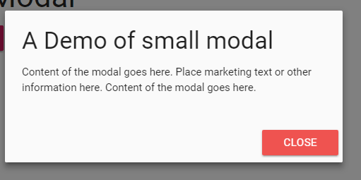
How to change the size of the modal window?
By default, the width of the modal window is set 55% of the screen size. The max-width is set to 70%. You may require changing the size of the modal as per the need of your project.
For changing the width of the modal, you may extract the modal class from the materialize CSS and change the width as you want. Make sure placing the modal class after the reference to materialize CSS file; either in your own external CSS file or in the <style> section within the web page.
See the example below where I set the size of the modal to 35%.
The CSS:
<style>

.modal {

  left: 0;

  right: 0;

  background-color: #fafafa;

  padding: 0;

  max-height: 40%;

  width: 35%;

  will-change: top, opacity;

}

</style>
Full code:
<!DOCTYPE html>
<html>
 <head>
  <link rel="stylesheet" href="https://cdnjs.cloudflare.com/ajax/libs/materialize/0.100.2/css/materialize.min.css">

  <link href="https://fonts.googleapis.com/icon?family=Material+Icons" rel="stylesheet">
  <script type = "text/javascript" src = "https://code.jquery.com/jquery-2.1.1.min.js"></script>
  <script src="https://cdnjs.cloudflare.com/ajax/libs/materialize/0.100.2/js/materialize.min.js"></script>

<style>
.modal {
  left: 0;
  right: 0;
  background-color: #fafafa;
  padding: 0;
  max-height: 40%;
  width: 35%;
  will-change: top, opacity;
}
</style>
 </head>

<body>
<div class="container">
<h3>A Demo of Modal</h3>
<!-- Modal Trigger -->
  <a class="waves-effect waves-light btn pink darken-1 modal-trigger" href="#demo-modal">Small Modal window</a>

  <!-- Modal Structure -->
  <div id="demo-modal" class="modal">
    <div class="modal-content">
      <h4>A Demo of small modal</h4>
      <p>Content of the modal goes here. Place marketing text or other information here.
      </p>

    </div>
    <div class="modal-footer">
      <a href="#!" class="modal-action modal-close waves-effect waves-red btn brown darken-3">Close</a>
    </div>
  </div>
</div>
<script>
$(document).ready(function(){
    $('.modal').modal();
  })
</script>
</body>
</html>
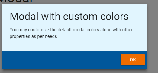
How to change the default look of modal?
Just like the size of the modal, you may also customize the default colors of complete modal or content body and footer separately.
As you have seen, the default colors are whitish for complete modal. For changing the colors, you may get the modal class for content body and modal-footer class for the footer section of the modal in Materialize CSS and replace the background-color values by new color codes.
Have a look at this example where I changed both section’s colors:
The CSS for this example:
<style>

.modal {

  left: 0;

  right: 0;

  background-color: #e1f5fe;

  padding: 0;

  max-height: 40%;

  width: 35%;

  will-change: top, opacity;

}


.modal .modal-footer {

  border-radius: 0 0 2px 2px;

  background-color: #01579b;

  padding: 4px 6px;

  height: 60px;

  width: 100%;

  text-align: right;

}

</style>
The markup:
<div class="container">

<h3>A Demo of Modal</h3>

<!-- Modal Trigger -->

  <a class="waves-effect waves-light btn pink darken-1 modal-trigger" href="#demo-modal-custom">Load Custom Modal</a>


  <!-- Modal Structure -->

  <div id="demo-modal-custom" class="modal">

    <div class="modal-content">

      <h4>Modal with custom colors</h4>

      <p>You may customize the default modal colors along with other properties as per needs

      </p>


    </div>

    <div class="modal-footer">

      <a href="#!" class="modal-action modal-close waves-effect waves-red btn orange darken-3">OK</a>

    </div>

  </div>

</div>

<script>

$(document).ready(function(){

    $('.modal').modal();

  })

</script>
In all above examples, the modal can be closed by clicking anywhere outside the modal area. Besides, you may close the modal by pressing the button within the modal.
In certain scenarios, you may want allowing the visitors closing the modal only by clicking the “Close”, “Ok”, “Cancel” button etc. within the modal.
For doing that, you may use the dismissible option in JavaScript as initializing the modal plug-in. The default value for the dismissible option is true, so modal can be closed by clicking anywhere outside of the modal.
Set the dismissible = false for disabling that feature. See the demo and code below, especially script section for using this option. In the demo page, you will see, the modal will be closed only by pressing the button within the modal.
The script:
<script>

$(document).ready(function(){

  $('.modal').modal({

      dismissible: false, // Modal cannot be closed by clicking anywhere outside

    }

  );

  })

</script>
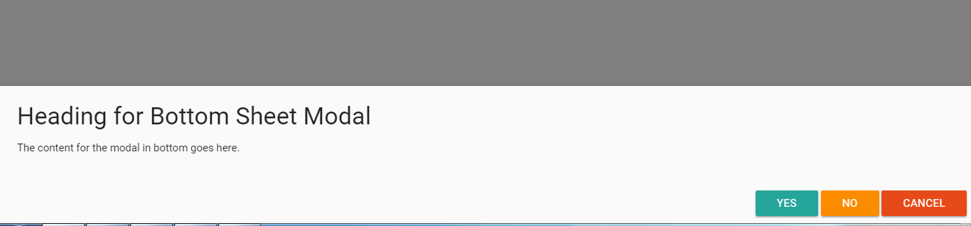
The example of bottom sheet modal
You may also create modals that display to the bottom of the user’s screen rather than the middle. The content with action features can be displayed. The bottom sheet modal acts just like the normal modal that can be closed by clicking anywhere on the screen as well as using the button inside that modal.
For that, use the bottom-sheet class along with the modal class in the <div> container. Just like above modal examples, use the modal-content and modal footer classes with required content for bottom sheet modals as shown in the example below:
Online demo and code
The markup:
<div class="container">

<h3>A Demo of Modal</h3>

<!-- Modal Trigger -->

  <a class="waves-effect waves-light btn modal-trigger" href="#modal1">Launch Modal Sheet Modal</a>


  <!-- Modal Structure -->

  <div id="modal1" class="modal bottom-sheet">

    <div class="modal-content">

      <h4>Heading for Bottom Sheet Modal</h4>

      <p>The content for the modal in bottom goes here.</p>

    </div>

    <div class="modal-footer">

      <a href="#!" class="modal-action modal-close btn teal lighten-1">Yes</a>

      <a href="#!" class="modal-action modal-close btn orange darken-1">No</a>

      <a href="#!" class="modal-action modal-close btn deep-orange darken-2">Cancel</a>

    </div>

  </div>


<script>

$(document).ready(function(){

    // the "href" attribute of the modal trigger must specify the modal ID that wants to be triggered

    $('#modal1').modal();

  });

</script>
Grab the complete code from the example page.