
The Bulma modal component enables you to overlay a small element over the website. The modal component may contain any content that is required – simple text, buttons, form, images etc.
How to create modal in Bulma?
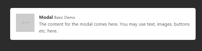
The example below creates a basic modal with text content and an option to close the modal overlay. Have a look and then it is explained how it is created:
See online demo and code
<!DOCTYPE html>

<html>

<head>

<link rel="stylesheet" href="https://cdn.jsdelivr.net/npm/bulma@0.8.0/css/bulma.min.css">

<script src = "https://ajax.googleapis.com/ajax/libs/jquery/2.1.1/jquery.min.js"></script>

</head>

<body>

<div id="modal" class="modal">

  <div class="modal-background"></div>

  <div class="modal-content">

    <div class="box">

      <article class="media">

        <div class="media-left">

          <figure class="image is-64x64">

            <img src="https://bulma.io/images/placeholders/128x128.png" alt="Image">

          </figure>

        </div>

        <div class="media-content">

          <div class="content">

            <p>

              <strong>Modal</strong> <small>Basic Demo</small>

              <br>

              The content for the modal comes here. You may use text, images, buttons etc. here.

            </p>

          </div>

        </div>

      </article>

    </div>

  </div>

  <button class="modal-close is-large" aria-label="close"></button>

</div>

<button class="button is-danger is-large" id="lanuchModal">Show Modal</button>

<script>

$("#lanuchModal").click(function() {

  $(".modal").addClass("is-active");

});


$(".modal-close").click(function() {

   $(".modal").removeClass("is-active");

});

</script>

</body>
</html>
The modal structure consists of four elements:
- modal : This is the main container. In the above example, this is the first div element.
- modal-background: This is a transparent overlay. You may customize this by using the available variables (using Sass). This overlay can also be used to enable the users closing the modal window.
- modal-content: This is where the modal content is placed. You may place text, images, buttons etc. there.
- modal-close: A close button on the top right corner.
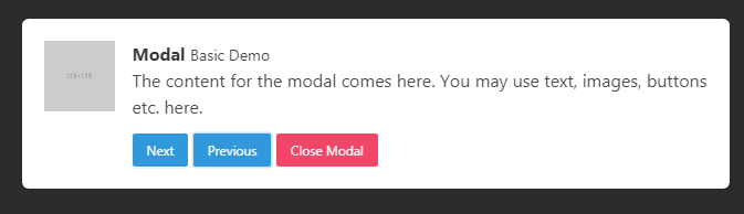
In the above example, there is only one option to close the modal i.e. using the top-right cross button. In this example, we have a “Close Modal” button within the content of the modal. I also added two more buttons just for the demo:
See online demo and code
<!DOCTYPE html>

<html>

<head>

<link rel="stylesheet" href="https://cdn.jsdelivr.net/npm/bulma@0.8.0/css/bulma.min.css">

<script src = "https://ajax.googleapis.com/ajax/libs/jquery/2.1.1/jquery.min.js"></script>

</head>

<body>

<div id="modal" class="modal">

  <div class="modal-background"></div>

  <div class="modal-content">

    <div class="box">

      <article class="media">

        <div class="media-left">

          <figure class="image is-64x64">

            <img src="https://bulma.io/images/placeholders/128x128.png" alt="Image">

          </figure>

        </div>

        <div class="media-content">

          <div class="content">

            <p>

              <strong>Modal</strong> <small>Basic Demo</small>

              <br>

              The content for the modal comes here. You may use text, images, buttons etc. here.

            </p>

          </div>

          <button class="button is-info is-small" id="next">Next</button>

          <button class="button is-info is-small" id="previous">Previous</button>

          <button class="button is-danger is-small" id="closebtn">Close Modal</button>

        </div>

      </article>

    </div>

  </div>

  <button class="modal-close is-large" aria-label="close"></button>

</div>

<button class="button is-danger is-large" id="lanuchModal">Show Modal</button>

<script>

$("#lanuchModal").click(function() {

  $(".modal").addClass("is-active");

});


$(".modal-close").click(function() {

   $(".modal").removeClass("is-active");

});


$("#closebtn").click(function() {

   $(".modal").removeClass("is-active");

});

</script>


</body>

</html>
You should notice the JavaScript section as well. There we dealt with closing the modal upon clicking the button. See this:
$("#closebtn").click(function() {

   $(".modal").removeClass("is-active");

});
Display the modal as web page loads example
The above two examples load the modal as you click on the button. You may want to display the modal as the web page loads. In that case, just place the “Launch Modal” button code in the document.ready function of jQuery and you are done.
The example below shows how! Just open the example page and you will see the modal:
See online demo and code
This is the jQuery code used in the demo for loading the modal on page load.
$(document).ready(function(){

    $(".modal").addClass("is-active");

});
The rest of the code is the same as in the above example.
An example of image modal
The modal can be used for creating image galleries as well. The example below displays a modal with a full-sized image:
See online demo and code
The code:
<!DOCTYPE html>

<html>

<head>

<link rel="stylesheet" href="https://cdn.jsdelivr.net/npm/bulma@0.8.0/css/bulma.min.css">

<script src = "https://ajax.googleapis.com/ajax/libs/jquery/2.1.1/jquery.min.js"></script>

</head>

<body>


<div class="modal">

  <div class="modal-background"></div>

  <div class="modal-content">

    <p class="image is-4by3">

      <img src="images/banana.jpg" alt="">

    </p>

  </div>

  <button class="modal-close is-large" aria-label="close"></button>

</div>


</div>

<button class="button is-danger is-large" id="lanuchModal">Show Image Modal</button>

<script>

$(document).ready(function(){

    $(".modal").addClass("is-active");


$("#lanuchModal").click(function() {

  $(".modal").addClass("is-active");

});


$(".modal-close").click(function() {

   $(".modal").removeClass("is-active");

});


});

</script>


</body>

</html>
A modal with head, body, and foot
Use the modal-card class for creating a modal with header, body, and footer. The head part generally contains the headline. The body contains the content like text/images while the footer section may contain the actionable buttons/links etc.
The example below shows a modal with all these sections:

See online demo and code
The code:
<!DOCTYPE html>

<html>

<head>

<link rel="stylesheet" href="https://cdn.jsdelivr.net/npm/bulma@0.8.0/css/bulma.min.css">

<script src = "https://ajax.googleapis.com/ajax/libs/jquery/2.1.1/jquery.min.js"></script>

</head>

<body>


<div class="modal">

  <div class="modal-background"></div>

  <div class="modal-card">

    <header class="modal-card-head">

      <p class="modal-card-title">A Demo of Card Modal</p>

      <button class="delete" id="closetop" aria-label="close"></button>

    </header>

    <section class="modal-card-body">

    <div class="content">

      <h1>Modal Heading</h1>

      <p>The h1 headings content here</p>

      <h2>Sub heading</h2>

      <p>The h2 headings content here</p>

      <h3>Third heading</h3>

      <p>The h3 headings content here</p>

    <div>

    </section>

    <footer class="modal-card-foot">

      <button class="button is-info">Yes</button>

      <button class="button is-info">No</button>

      <button class="button is-danger" id="closebtn">Close</button>

    </footer>

  </div>


</div>


<button class="button is-danger is-large" id="lanuchModal">Show Card Modal</button>

<script>

$(document).ready(function(){

    $(".modal").addClass("is-active");


$("#lanuchModal").click(function() {

  $(".modal").addClass("is-active");

});


$(".modal-close").click(function() {

   $(".modal").removeClass("is-active");

});


$("#closebtn").click(function() {

   $(".modal").removeClass("is-active");

});

$("#closetop").click(function() {

   $(".modal").removeClass("is-active");

});

});

</script>


</body>

</html>
Creating various effects in Bulma modal by a plug-in
As Bulma getting popularity, the plug-ins are starting available to enhance or extend the available features. One such plug-in is “Bulma Modal fx” that can be used for creating modals with CSS transitions and animations easily.
The plug-in is available to download here (in GitHub).
An example of fadeInScale effect modal
As you click the “Launch Modal with effect” button, it opens the modal with fadeInScale effect. See the complete code with CDN links in the demo page:
See online demo and code
The code:
<!DOCTYPE html>

<html>

<head>

<link rel="stylesheet" href="https://cdn.jsdelivr.net/npm/bulma@0.8.0/css/bulma.min.css">

<script src = "https://ajax.googleapis.com/ajax/libs/jquery/2.1.1/jquery.min.js"></script>


<link rel="stylesheet" href="https://unpkg.com/bulma-modal-fx/dist/css/modal-fx.min.css" />

<script type="text/javascript" src="https://unpkg.com/bulma-modal-fx/dist/js/modal-fx.min.js"></script>

</head>

<body>

<span class="button is-danger is-large modal-button" data-target="lanuchModal" id="lanuchModal">Launch Modal with effect</span>


<div id="modal-fadeInScale-fs" class="modal modal-fx-fadeInScale">

    <div class="modal-content modal-card">

        <header class="modal-card-head">

            <p class="modal-card-title">Modal with fadeInScale</p>

            <button class="modal-button-close delete" id="closecross" aria-label="close"></button>

        </header>

        <section class="modal-card-body">

          <div class="content">

              <h1>fadeInScale Effect</h1>

              <p>The h1 headings content here</p>

        <div>

        </section>

        <footer class="modal-card-foot">

            <button class="modal-button-close button is-success">Yes</button>

            <button class="modal-button-close button" id="closebtn">Close</button>

        </footer>

    </div>

</div>


<script>


$("#lanuchModal").click(function() {

  $(".modal").addClass("is-active");

});


$(".modal-close").click(function() {

   $(".modal").removeClass("is-active");

});


$("#closebtn").click(function() {

   $(".modal").removeClass("is-active");

});

$("#closecross").click(function() {

   $(".modal").removeClass("is-active");

});


</script>

</body>

</html>
The example of newspaper effect
Use the value newsPaper for its effect as in the demo below:
See online demo and code
The code:
<div id=”modal-newsPaper-fs” class=”modal modal-fx-newsPaper”>
You only need to change the value in a div as shown in the above line.
Other effect values
Similarly, you may use other values for a specific effect as listed below:
- normal
- slideRight
- lideLeft
- slideTop
- slideBottom
- fall
- sideFall
- 3dFlipVertical
- 3dFlipHorizontal
- 3dSign
- 3dSignDown
- superScaled
- 3dSlit
- 3dRotateFromBottom
- 3dRotateFromLeft
See live demo in this page for all these effects and more info.