
Changing Bootstrap 3 modal size properties
In order to increase or decrease the modal window height and width properties of Bootstrap, you need to get the modal related classes and use desired values either in the <style> section or in your external CSS file.
In either case, you have to use it after the reference of Bootstrap CSS file. In this tutorial, I will show you how you may change the width and height of the modal window.
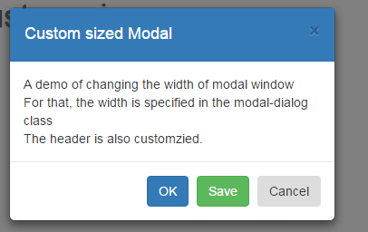
A demo of changing the width of modal window
For this demo, the .modal-dialog class which is the built-in class of Bootstrap framework for the modal window is used in the <style> tag.
There, I simply specified the width of 360px that will override the default value. Besides, I have also changed the default header properties to change the look:
See online demo and code
The CSS used in demo:
.modal-dialog {

          width: 360px;

        }

.modal-header {

    background-color: #337AB7;

    padding:16px 16px;

    color:#FFF;

    border-bottom:2px dashed #337AB7;

 }
The markup:
<div class="container">

<h1>Bootstrap Modal with custom size</h1>


<!-- Button trigger modal -->

<button type="button" class="btn btn-primary btn-lg" data-toggle="modal" data-target="#myModal">

  Launch Modal window

</button>


<!-- Modal -->

<div class="modal fade" id="myModal" tabindex="-1" role="dialog" aria-labelledby="myModalLabel">

  <div class="modal-dialog" role="document">

    <div class="modal-content">

      <div class="modal-header">

        <button type="button" class="close" data-dismiss="modal" aria-label="Close"><span aria-hidden="true">×</span></button>

        <h4 class="modal-title" id="myModalLabel">Custom sized Modal</h4>

      </div>

      <div class="modal-body">

        A demo of changing the width of modal window <br />

        For that, the width is specified in the modal-dialog class <br />

        The header is also customzied.


      </div>

      <div class="modal-footer">

        <button type="button" class="btn btn btn-primary" data-dismiss="modal">OK</button>

        <button type="button" class="btn btn btn-success" data-dismiss="modal">Save</button>

        <button type="button" class="btn btn-orange" data-dismiss="modal">Cancel</button>

      </div>

    </div>

  </div>

</div>
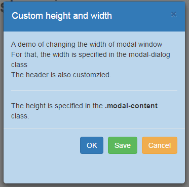
A demo of customizing the height and width of modal window
In this demo, the height of the modal window is also changed along with the width. For that, the .modal-content class is used where I defined the height in percentage.
The code:
<!DOCTYPE html>
<html>
<head>
    <title>A simple Bootstrap modal example</title>
    <link rel="stylesheet" href="https://maxcdn.bootstrapcdn.com/bootstrap/3.3.5/css/bootstrap.min.css">
    <meta name="viewport" content="width=device-width, initial-scale=1.0">
    <script src="https://ajax.googleapis.com/ajax/libs/jquery/1.10.2/jquery.min.js"></script>
    <script src="https://maxcdn.bootstrapcdn.com/bootstrap/3.3.5/js/bootstrap.min.js"></script>
<style>
.modal-dialog {
          width: 360px;
          height:600px !important;
        }
.modal-content {
    /* 80% of window height */
    height: 60%;
    background-color:#BBD6EC;
}
.modal-header {
    background-color: #337AB7;
    padding:16px 16px;
    color:#FFF;
    border-bottom:2px dashed #337AB7;
 }

</style>
</head>
<body>
<div class="container">
<h1>Bootstrap Modal with custom size</h1>

<!-- Button trigger modal -->
<button type="button" class="btn btn-primary btn-lg" data-toggle="modal" data-target="#myModal">
  Launch Modal window
</button>

<!-- Modal -->
<div class="modal fade" id="myModal" tabindex="-1" role="dialog" aria-labelledby="myModalLabel">
  <div class="modal-dialog" role="document">
    <div class="modal-content">
      <div class="modal-header">
        <button type="button" class="close" data-dismiss="modal" aria-label="Close"><span aria-hidden="true">�</span></button>
        <h4 class="modal-title" id="myModalLabel">Custom height and width</h4>
      </div>
      <div class="modal-body">
        A demo of changing the width of modal window <br />
        For that, the width is specified in the modal-dialog class <br />
        The header is also customzied.<br /><hr />
        The height is specified in the <strong>.modal-content</strong> class.


      </div>
      <div class="modal-footer">
        <button type="button" class="btn btn btn-primary" data-dismiss="modal">OK</button>
        <button type="button" class="btn btn btn-success" data-dismiss="modal">Save</button>
        <button type="button" class="btn btn-warning" data-dismiss="modal">Cancel</button>
      </div>
    </div>
  </div>
</div>

</body>

</html>
The markup is almost the same as in the above example.
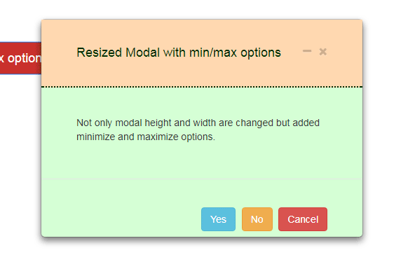
Change Bootstrap modal height and width with min/max icons
In this example, the jQuery code is used for creating a modal with min/max options. As minimize icon is clicked, the modal will resize towards the left bottom.
Along with this, the modal height and width properties are also changed than default. This is again done by using the .modal-dialog class where width and height of the overall modal are set.
Besides, the .modal-content class is also used for setting the content area. Have a look at the demo and code:
You will need to adjust the height property in .modal-content class as per the content in the modal.
How to set up this modal for your website?
In order to set up this modal with modified height and width, follow these steps.
Step 1:
Place the dependency file in the <head> section of the web page:
<link rel=”stylesheet” href=”https://maxcdn.bootstrapcdn.com/bootstrap/3.3.5/css/bootstrap.min.css”>
<script src=”https://ajax.googleapis.com/ajax/libs/jquery/1.11.3/jquery.min.js”></script>
<script src=”https://maxcdn.bootstrapcdn.com/bootstrap/3.3.5/js/bootstrap.min.js”></script><!– font Awesome 4.5.0 –>
<link href=”css/modal-minimize-and-maximize/font-awesome.css” rel=”stylesheet” type=”text/css” />
Step 2:
The CSS for this demo:
/*Classes dealing with min/max options*/
.modal-header .btnGrp{
position: absolute;
top: 8px;
right: 10px;
}

.min-modal{
width: 250px;
height: 35px;
overflow: hidden !important;
padding: 0px !important;
margin: 0px;

float: left;
position: static !important;
}

.min-modal .modal-dialog, .min .modal-content{
height: 100%;
width: 100%;
margin: 0px !important;
padding: 0px !important;
}

.min-modal .modal-header{
height: 100%;
width: 100%;
margin: 0px !important;
padding: 3px 5px !important;
}

.display-none{display: none;}

button .fa{
font-size: 16px;
margin-left: 10px;
}

.min-modal .fa{
font-size: 14px;
}

.min-modal .menuTab{display: none;}

button:focus { outline: none; }

.optminmaxCon{
height: 35px;
bottom: 1px;
left: 1px;
position: fixed;
right: 1px;
z-index: 9999;
}
/*Properties for setting height and width of modal */
.modal-dialog {
width: 460px;
height:650px !important;
}
.modal-content {
height: 48%;
background-color:#D5FFD5;
}

.modal-header {
background-color: #FFD8B0;
padding:16px 16px;
color:#003500;
border-bottom:2px dotted #002200;
}
Step 3:
The HTML
<div class="container">

<h2>A demo of modal</h2>
<!-- Trigger the modal with a button -->
<button type="button" class="btn btn-danger btn-lg launchModal" data-target="#minmax-modal-1" >Open resized modal with min/max options</button>

<!-- Modal -->
<div class="modal fade modal-demo" id="minmax-modal-1" role="dialog">
<div class="modal-dialog">

<!-- Modal content-->
<div class="modal-content">
<div class="modal-header" style="padding:35px 50px;">
<button type="button" class="close" data-dismiss="modal"> <i class='fa fa-times'></i> </button>

<button class="close demo-modMinimize"> <i class='fa fa-minus'></i> </button>

<h4 class="modal-title">Resized Modal with min/max options</h4>
</div>

<div class="modal-body" style="padding:40px 50px;">
<p>Not only modal height and width are changed but added minimize and maximize options.</p>
</div>

<div class="modal-footer" style="padding:40px 50px;">
<button type="button" class="btn btn btn-info" data-dismiss="modal">Yes</button>
<button type="button" class="btn btn btn-warning" data-dismiss="modal">No</button>
<button type="button" class="btn btn-danger" data-dismiss="modal">Cancel</button>
</div>

</div>
</div>
</div>
<div class="optminmaxCon"></div>
Step 4:
Finally, place this jQuery code above the </body> tag:
<script>

$(document).ready(function(){

var $content, $modal, $modalData, $modalCon;

$content = $(".min-modal");


//To fire modal

$(".launchModal").click(function(e){

e.preventDefault();

var $id = $(this).attr("data-target");

    $($id).modal({backdrop: false, keyboard: false});

});


$(".demo-modMinimize").on("click", function(){

      $modalCon = $(this).closest(".modal-demo").attr("id");

      $modalData = $(this).closest(".modal-demo");

      $modal = "#" + $modalCon;

      $(".modal-backdrop").addClass("display-none");

      $($modal).toggleClass("min-modal");

        if ( $($modal).hasClass("min-modal") ){

            $(".optminmaxCon").append($modalData);

            $(this).find("i").toggleClass( 'fa-minus').toggleClass( 'fa-clone');

          }

          else {

                  $(".container").append($modalData);

                  $(this).find("i").toggleClass( 'fa-clone').toggleClass( 'fa-minus');

                };

      });


$("button[data-dismiss='modal']").click(function(){

    $(this).closest(".modal-demo").removeClass("min-modal");

    $(".container").removeClass($modalData);

    $(this).next('.modalMinimize').find("i").removeClass('fa fa-clone').addClass( 'fa fa-minus');

  });

});

</script>
Learn more about this plug-in with other demos in its tutorial by following this link: Minimize/maximize Bootstrap modal.
So, even if you are using a third party modal that is based on the Bootstrap framework, you may still change the size of modals by overriding the properties mentioned in this tutorial.