
What is a jQuery dialog?
The dialog box is a great way to present some useful information to your website visitors. It is a window that floats over the main content with a title bar and content area where you can include text, images, and videos. The dialog box may also contain an option to close the window by using “X” icon.
jQuery UI dialog widget makes it quite easier to design and place dialog boxes in your web pages. In this tutorial, I will show you creating simple yet elegant dialog alerts. I will use the default style as well as you will learn customizing dialog boxes according to your website theme.
By using the Modal option of dialog widget you can make other content of the web page disabled or not allowing visitors to interact with other content unless dialog box is closed.
List of dialog boxes with different styles
Following is the list of different jQuery dialog boxes with different styles and effects. For our demos I am using files as provided by jQueryui.com as follows:
- jquery-1.10.2.js: As such jquery-ui works on top of the jQuery library, so we have to include this.
- jquery-ui.js: jQuery-ui library
- jquery-ui.css: This is the stylesheet provided by jQuery-ui, that contains styles including different widgets.
- dialog-ui.css: This will be customized CSS that only includes CSS classes related to the dialog box. This will override classes provided by jquery-ui to our own style.
You can look at the demos and code by clicking the link with each dialog box below.
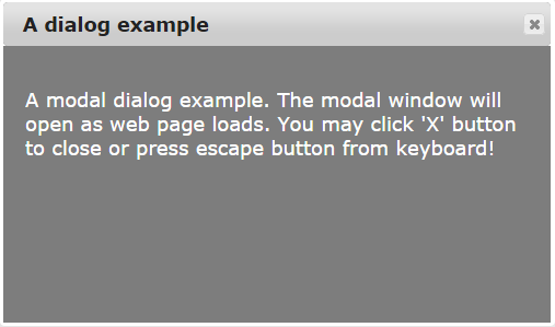
Following is a simple dialog jQuery with a title bar and close button. The dialog will appear as the web page loads. The content inside the dialog is simply some information in a paragraph element. The dialog type is modal, i.e. you cannot interact with other elements of the web page unless dialog box is closed.
The effect of displaying dialog is using slide value while it will be closed with fade effect at given time in milliseconds.
See online demo & code
The markup:
<div id="j_dialog" title="A dialog example">
<p>A modal dialog example. The modal window will open as web page loads. You may click 'X' button to close or press escape button from keyboard!</p>
</div>

<div>Some text! Some text!Some text!Some text!Some text!Some text!</div>
The jQuery code:
<script>
$(function() {
$( "#j_dialog" ).dialog({
autoOpen: true,
modal: true,
width: 500,
height: 300,
show: {
effect: "slide",
duration: 1500
},
hide: {
effect: "fade",
duration: 1000
}
});
});
$( ".selector" ).dialog({
closeOnEscape: false
});
</script>
You may get the complete code and view live demo by clicking the above image or link.
Following is a jQuery message alert box that has a title bar along with a close button. Then we have the content area, where a message is shown to the visitor and at the button an Ok button.
The effect used is Bounce while displaying the dialog box After pressing the close or escape key or Ok button, the alert will be closed using fade effect.
See online demo & code

The jQuery code used in this example:
<script>
$(function() {
$( "#j_dialog" ).dialog({
autoOpen: true,
modal: true,
width: 350,
height: 300,

buttons: {
Ok: function() {
$( this ).dialog( "close" );
}
},
show: {
effect: "bounce",
duration: 1500
},
hide: {
effect: "fade",
duration: 1000
}

});
});
$( ".selector" ).dialog({
closeOnEscape: false
});
</script>
In the demo, I have kept this dialog in jQuery as Modal. You can remove this line to keep other content active or change its value to false.
modal: false
A jQuery confirmation dialog with highlight effect
In this confirmation dialog box, a user is given two options to choose from. You can perform different actions based on selection by the user. In this demo, we have used “Are you sure you want to proceed to example.com?” with Yes and Cancel options.
As this dialog appears, it has highlighted effect while upon selecting Yes or Cancel the dialog will disappear with puff effect.
See online demo & code

The markup:
<div id="j_dialog" title="">
<p>Are you sure you want to proceed to example.com?</p>
</div>

<div>Some text!</div>
The CSS:
.ui-dialog {
top: 0;
left: 0;
padding: .2em;
border:1px;

}
.ui-dialog .ui-dialog-titlebar {
border:1px;
display: none;
}
.ui-dialog .ui-dialog-content {
border: 0;
padding: 20px;
font-size:18px;
color:#CAAD75;
background-color: #FDF8E4;
overflow: auto;
}
.ui-dialog .ui-dialog-buttonpane {
text-align: left;
border-width: 1px 0 0 0;
background-image: none;
margin-top: .5em;
padding: .3em 1em .5em .4em;
background-color: #846733;
}
.ui-dialog .ui-dialog-buttonpane .ui-dialog-buttonset {
float: right;

}
.ui-dialog .ui-dialog-buttonpane button {
margin: .5em .4em .5em 0;
cursor: pointer;

}
.ui-dialog .ui-resizable-se {
width: 12px;
height: 12px;
right: -5px;
bottom: -5px;
background-position: 16px 16px;

}
.ui-draggable-handle {
-ms-touch-action: none;
touch-action: none;
}
jQuery code:
<script>
$(function() {
$( "#j_dialog" ).dialog({

autoOpen: true,
modal: true,
width: 350,
height: 300,

buttons: {
"Yes": function() {
$( this ).dialog( "close" );
},
Cancel: function() {
$( this ).dialog( "close" );
}
},
show: {
effect: "highlight",
duration: 1500
},
hide: {
effect: "fade",
duration: 1000
}
});
});
$( ".selector" ).dialog({
closeOnEscape: false
});
</script>
I have used in-page CSS for this demo. The dialog classes in our internal CSS will override the default CSS classes. The dialog box is without a title bar and close button, which is made hidden by using:
display: none;
CSS property at ui-dialog .ui-dialog-titlebar class.
A modal dialog that closes by clicking anywhere outside
In the above demo, we have seen jquery UI dialogs are closed only by clicking on ‘x’ button or pressing the escape key in the keyboard. Also, you can close it by clicking on Ok or Cancel buttons.
The following jQuery modal dialog alert will be closed as you click anywhere outside the dialog box as well as using above mentioned options.
See online demo & code

The jQuery code:
<script>
$(function() {
$( "#j_dialog" ).dialog({
autoOpen: true,
modal: true,
width: 350,
height: 300,
open: function() {
jQuery('.ui-widget-overlay').on('click', function() {
jQuery('#j_dialog').dialog('close');
})
},

buttons: {
Ok: function() {
$( this ).dialog( "close" );
}
},
show: {
effect: "bounce",
duration: 1500
},
hide: {
effect: "fade",
duration: 1000
}

});
});
$( ".selector" ).dialog({
closeOnEscape: false
});
</script>
The task to hide or close the dialog box by clicking anywhere is accomplished in open: function() part of the script where I used jQuery On method.
In this dialog box, I am using different colors than default by using the ui-dialog-buttonset class in the internal CSS. You can change colors and other properties as per the need of your theme quite easily.
The dialog uses two buttons, Yes and Cancel. Upon clicking both will show an alert, where you can place your code for intended action. Also, this is a non-modal dialog box.
See online demo & code

Also see: