
The simple and light-weight (1K) responsive-navigation jQuery plug-in enables creating responsive menus for your website. It uses font-awesome icons with the menu item and also creates sub menu that is adaptive to the user’s screen.
Developer’s page Download plug-in
You need to include the 1Kb main.js file before the body closing tag (after jQuery library).
<script src="https://ajax.googleapis.com/ajax/libs/jquery/3.1.1/jquery.min.js"></script>

<script src="js/responsive-navigation/main.js"></script>
Also include the style.css and font-awesome CSS file in the <head> section:
<link rel=”stylesheet” href=”css/responsive-navigation/style.css”>
<link href=”//maxcdn.bootstrapcdn.com/font-awesome/4.2.0/css/font-awesome.min.css” rel=”stylesheet”>
The markup contains the <nav> tag with <ul>, <li>, and <a> tags as shown in the demo below.
For the demo, a few top menu and sub-menu items are created. The font-awesome icons are used for the top menu items. The main items with submenu contain a down arrow that distinguishes it from the items without submenu. Have a look at the demo and code:
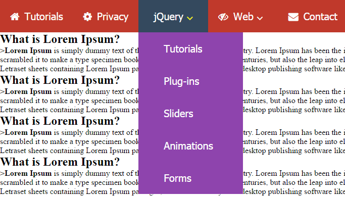
See online demo and code
The markup for this example for creating the navigation bar:
<!-- header starts -->

<header>

  <!-- responsive nav bar -->

  <div class="nav-bar">

      <a href=""><i class="fa fa-bars"></i><span>Menu</span></a>

   </div>

   <!-- navigation -->

   <nav>

    <ul>

       <li><a href="https://www.jquery-az.com/"><i class="fa fa-home"></i>Tutorials</a></li>

       <li><a href="https://www.jquery-az.com/privacy-policy/"><i class="fa fa-cog"></i>Privacy</a></li>

        <li class="sub-menu">

        <a href="https://www.jquery-az.com/jquery-tips/"><i class="fa fa-street-view"></i>jQuery <i class="fa fa-angle-down"></i></a>

    <!-- children nav -->

         <ul class="children">

         <li><a href="https://www.jquery-az.com/tag/modals/"><span>-</span> Tutorials</a></li>

        <li><a href="https://www.jquery-az.com/tag/table/"><span>-</span> Plug-ins</a></li>

          <li><a href="https://www.jquery-az.com/tag/sliders/"><span>-</span> Sliders</a></li>

         <li><a href="https://www.jquery-az.com/tag/animations/"><span>-</span> Animations</a></li>

         <li><a href="https://www.jquery-az.com/tag/forms/"><span>-</span> Forms</a></li>

        </ul>

      </li>

      <li class="sub-menu"><a href="#"><i class="fa fa-eye-slash"></i>Web <i class="fa fa-angle-down"></i></a>

          <ul class="children">

        <li><a href="https://www.jquery-az.com/css-tutorials/"><span>-</span> CSS</a></li>

        <li><a href="https://www.jquery-az.com/html-tutorials/"><span>-</span> HTML</a></li>

         <li><a href="https://www.jquery-az.com/bootstrap-tips-tutorials/"><span>-</span> Bootstrap</a></li>

        <li><a href=""><span>-</span> </a></li>

       </ul>

      </li>

      <li><a href="https://www.jquery-az.com/contact/"><i class="fa fa-envelope"></i>Contact</a></li>

   </ul>

  </nav> <!-- navigation end -->

</header> <!-- header end -->
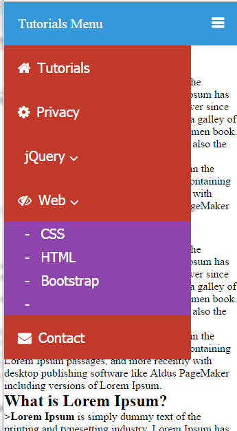
If you notice at the first div, this is for responsive or small devices like smartphones. Try resizing your screen and this is how it should look:
The plug-in comes up with a style.css file that specifies the colors and other properties of the navigation bar.
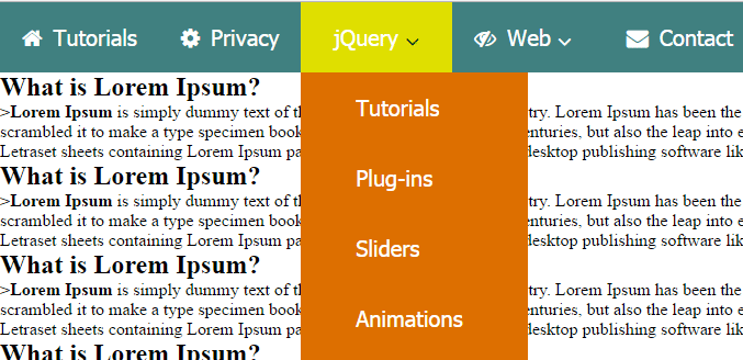
You may modify the CSS easily and customize the navigation colors, text properties etc. See this demo where I have changed a few properties of CSS to change the look of it:
See online demo and code
Only the reference to the style file is changed in above demo from style.css to style2.css.
I have changed only a few classes for illustration that include:
header nav {

                background: #408080;

                z-index: 1000;

                width:100%;

                margin:auto;

}

header nav ul li:hover{

                background: #DFDF00;

}

header nav ul li:hover i{

                color:#004000;

}
Just play with it and apply the style, font etc as you need.