
Just like Bootstrap 3 alerts, version 4 of Bootstrap also has classes specific to creating contextual alerts in your web project.
The alerts are triggered by various user actions e.g., a user entered the wrong account information for login. Similarly, displaying an alert for the record deletion in red. Before deleting that record, displaying a warning alert in orange color.
The account creation alert can be displayed as green. Unlike the typical JavaScript or jQuery-based alerts the Bootstrap alerts (3 or 4) are non-modal. That means a user may interact with other sections of the web page as the alert is displayed.
A user may close the alert by using a cross button or you may write a script for hiding the alert automatically in JavaScript.
A simple alert example in Bootstrap
If you are familiar with the Bootstrap 3 alerts then no learning curve is required in Bootstrap 4. Use the same classes i.e. .alert and alert-[contextual class] for creating an alert.
The only difference is that a couple of classes are added in the latest release. See the example below where alerts are created by using all eight contextual classes:
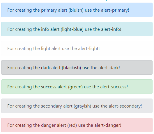
Complete code for alerts:
<!DOCTYPE html>
<html>
<head>
<link rel="stylesheet" href="https://maxcdn.bootstrapcdn.com/bootstrap/4.0.0-beta.3/css/bootstrap.min.css" integrity="sha384-Zug+QiDoJOrZ5t4lssLdxGhVrurbmBWopoEl+M6BdEfwnCJZtKxi1KgxUyJq13dy" crossorigin="anonymous">

</head>
<body>
<div class="container">
<h3 class="text-info">A demo of alerts in Bootstrap 4</h3>
<div class="alert alert-primary" role="alert">
  For creating the primary alert (bluish) use the alert-primary!
</div>
<div class="alert alert-info" role="alert">
  For creating the info alert (light-blue) use the alert-info!
</div>
<div class="alert alert-light" role="alert">
  For creating the light alert use the alert-light!
</div>
<div class="alert alert-dark" role="alert">
  For creating the dark alert (blackish) use the alert-dark!
</div>
<div class="alert alert-success" role="alert">
  For creating the success alert (green) use the alert-success!
</div>
<div class="alert alert-secondary" role="alert">
  For creating the secondary alert (grayish) use the alert-secondary!
</div>
<div class="alert alert-danger" role="alert">
  For creating the danger alert (red) use the alert-danger!
</div>
<div class="alert alert-warning" role="alert">
  For creating the warning alert (orange) use the alert-warning!
</div>

</div>
</body>
</html>
Making dismissible alerts example
Generally, you will require closing the alerts by user action like using the ‘X’ symbol or automatically closing the alert after a certain interval.
For allowing visitors to close the alerts by ‘X’ symbol, you may include the alert plug-in or if the Bootstrap.js file is included already, this will work.
After that, add the .alert-dismissible class in the container with alert class. You also require including a button element with ‘close’ class and data-dismiss=“alert” attribute. Have a look at an example below:
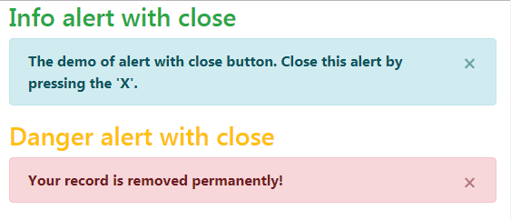
The markup for this demo
<div class="container"> <h3 class="text-success">Info alert with close</h3> <div class="alert alert-info alert-dismissible fade show" role="alert"> <strong>The demo of alert with close button. Close this alert by pressing the 'X'. <button type="button" class="close" data-dismiss="alert" aria-label="Close"> <span aria-hidden="true">×</span> </button> </div> <h3 class="text-warning">Danger alert with close</h3> <div class="alert alert-danger alert-dismissible show" role="alert"> <strong>Your record is removed permanently! <button type="button" class="close" data-dismiss="alert" aria-label="Close"> <span aria-hidden="true">×</span> </button> </div> </div>
You can also see, the first alert uses the fade and show classes. This class adds the fading effect as you press the close button. On the other hand, the second alert is closed with a jerk.
The example of closing an alert automatically
The following example shows closing an alert automatically by using jQuery code. The three-second interval is given for closing all eight alerts that we used in the first example.
A few alerts are given fade and show classes, so you may see the difference between closing in a jerk and with a fading effect.
See online demo and code
The markup:
<div class="container">

<h3 class="text-info">Closing alerts automatically</h3>

<div class="alert alert-primary fade show" role="alert">

  For creating the primary alert (bluish) use the alert-primary!

</div>

<div class="alert alert-info" role="alert">

  For creating the info alert (light-blue) use the alert-info!

</div>

<div class="alert alert-light fade show" role="alert">

  For creating the light alert use the alert-light!

</div>

<div class="alert alert-dark" role="alert">

  For creating the dark alert (blackish) use the alert-dark!

</div>

<div class="alert alert-success fade show" role="alert">

  For creating the success alert (green) use the alert-success!

</div>

<div class="alert alert-secondary" role="alert">

  For creating the secondary alert (grayish) use the alert-secondary!

</div>

<div class="alert alert-danger fade show" role="alert">

  For creating the danger alert (red) use the alert-danger!

</div>

<div class="alert alert-warning" role="alert">

  For creating the warning alert (orange) use the alert-warning!

</div>


</div>
The script for this example:
<script>

$(document).ready(function() {

    setTimeout(function() {

        $(".alert").alert('close');

    }, 3000);

});

</script>
Using link classes in alerts example
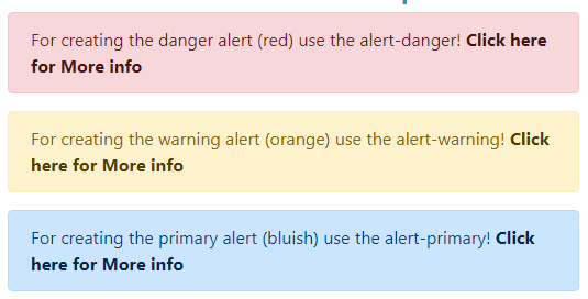
There are chances that the alerts created with Bootstrap 4 contain links to other resources. Bootstrap has taken care of those links by providing contextual link classes with respect to the alert context classes.
You simply need to use one class in the links within alert i.e. .alert-link and it will make the link a similar color (a little darker) as the color of contextual alert.
See this example where I used alert-link class in various alerts:
The markup:
<body>
<div class="container">
<h3 class="text-info">A demo of alerts in Bootstrap 4</h3>
<div class="alert alert-danger" role="alert">
  For creating the danger alert (red) use the alert-danger! <a href="https://www.jquery-az.com" class="alert-link">Click here for More info</a>
</div>
<div class="alert alert-warning" role="alert">
  For creating the warning alert (orange) use the alert-warning! <a href="https://www.jquery-az.com" class="alert-link">Click here for More info</a>
</div>
<div class="alert alert-primary" role="alert">
  For creating the primary alert (bluish) use the alert-primary! <a href="https://www.jquery-az.com" class="alert-link">Click here for More info</a>
</div>
<div class="alert alert-info" role="alert">
  For creating the info alert (light-blue) use the alert-info! <a href="https://www.jquery-az.com" class="alert-link">Click here for More info</a>
</div>
<div class="alert alert-light" role="alert">
  For creating the light alert use the alert-light! <a href="https://www.jquery-az.com" class="alert-link">Click here for More info</a>
</div>
<div class="alert alert-dark" role="alert">
  For creating the dark alert (blackish) use the alert-dark! <a href="https://www.jquery-az.com" class="alert-link">Click here for More info</a>
</div>
<div class="alert alert-success" role="alert">
  For creating the success alert (green) use the alert-success! <a href="https://www.jquery-az.com" class="alert-link">Click here for More info</a>
</div>
<div class="alert alert-secondary" role="alert">
  For creating the secondary alert (grayish) use the alert-secondary! <a href="https://www.jquery-az.com" class="alert-link">Click here for More info</a>
</div>


</div>
</body>
Another style of alert with more content
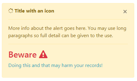
The alerts Bootstrap 4 may contain more content with different elements. You may include headings, dividers, paragraphs, etc. as the content in an alert. This is particularly useful where you have long information to display with various distinctive and detailed parts.
See the example below where I used heading, paragraph, span tags, separators, and font-awesome icons in an alert with different built-in text classes for coloring the text.
The code:
<div class="container"> <h3 class="text-info">More content in alert</h3> <div class="col-sm-5 col-md-5"> <div class="alert alert-warning"> <button type="button" class="close" data-dismiss="alert" aria-label="Close"> <span aria-hidden="true">×</span> </button> <i class="fa fa-spinner" aria-hidden="true"></i> <strong>Title with an icon</strong> <hr class="message-inner-separator"> <p> More info about the alert goes here. You may use long paragraphs so full detail can be given to the use. </p> <hr class="message-inner-separator"> <h3 class="text-danger">Beware <i class="fa fa-exclamation-triangle" aria-hidden="true"></i></h3> <p class="text-info">Doing this and that may harm your records!</p> </div> </div> </div>