
The Bootstrap 4 card is a content container with a variety of options for presenting information about your products or services or other information on the website. This is a bordered container where you may use text, images, links, buttons, etc. with a number of styles easily created by utilizing built-in contextual classes.
In this cards tutorial, I will show you basic to nicely styled cards with different layouts by using the Bootstrap grid system, so keep reading below.
A basic example of card in Bootstrap 4
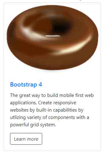
Let us start with a card with different content types i.e. an image, title, text, and a button to have an idea of what this is all about. Have a look at the demo online and then let me explain how it is created:
See online demo and code
The markup for this basic card template:
<div class="card" style="width: 20rem;">

  <img class="card-img-top" src="images/donut.png" alt="the image alt text here">

  <div class="card-body">

    <h5 class="card-title text-primary">Bootstrap 4</h5>

    <p class="card-text">The great way to build mobile first web applications. Create responsive websites by built-in capabilities by utlizing

    variety of components with a powerful grid system.

    </p>

    <a href="#" class="btn btn-outline-dark">Learn more</a>

  </div>

</div>
The card has no specific width, so it is specified by using the inline CSS, otherwise, it takes the space of parent container. The main <div> element is given the .card class.
For placing an image on top of the card, use the .card-img-top. This is followed by using .card-body class in another div element. There, a heading (h5) is used and a paragraph of text is given. In the last, a button with various built-in classes is used.
As mentioned earlier, the card enables us using a variety of content. You may even create list groups there.
Display more cards in a row by grid markup
Generally, you will be required to display more than one card for presenting the information. You may manage more cards by using Bootstrap 4 grid markup or using card groups.
In this demo, the cards are enclosed in the main wrapper which is a div with row class. This is followed by using the col-sm-4 in the inner div. Three div elements are created with col-sm-4 class and each contains the markup for the card with its information.
Have a look at the demo online where cards may be cluttered due to less space. For viewing three cards in a row, copy the complete code in your IDE and execute the code. Do not forget to adjust the image path as per your directory structure:
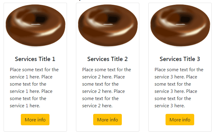
The markup for three cards in the same row:
<div class="container">

<h3>A demo of Bootstrap Card</h3>

<div class="row">

  <div class="col-sm-4">

    <div class="card">

    <img class="card-img-top" src="images/donut.png" alt="the image alt text here">

      <div class="card-body text-center">

        <h5 class="card-title">Services Title 1</h5>

        <p class="card-text text-left">Place some text for the service 1 here. </p>

        <a href="#" class="btn btn-warning">More info</a>

      </div>

    </div>

  </div>

  <div class="col-sm-4">

    <div class="card">

    <img class="card-img-top" src="images/donut.png" alt="the image alt text here">

      <div class="card-body text-center">

        <h5 class="card-title">Services Title 2</h5>

        <p class="card-text text-left">Place some text for the service 2 here. </p>

        <a href="#" class="btn btn-warning">More info</a>

      </div>

    </div>

  </div>

  <div class="col-sm-4">

    <div class="card">

    <img class="card-img-top" src="images/donut.png" alt="the image alt text here">

      <div class="card-body text-center">

        <h5 class="card-title text-center">Services Title 3</h5>

        <p class="card-text text-left">Place some text for the service 3 here. </p>

        <a href="#" class="btn btn-warning text-right">More info</a>

      </div>

    </div>

  </div>

</div>

</div>
Styling the cards by utility classes for background and text
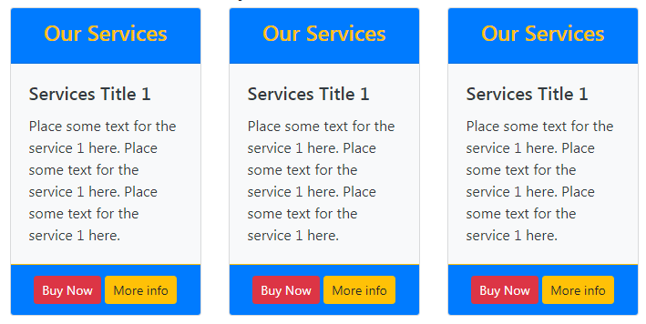
Until now, we have created simple cards without any background colors. Now let me show you how to style cards by using built-in Bootstrap 4 classes for background and text.
In the following example, the grid markup is used for creating three cards again with background and color classes. Along with this, the header and footer for the cards are also used. I will explain how to create header and footer after the code of this example:
The markup:
<div class="container">

<h3>A demo of Bootstrap Card</h3>

<div class="row">

  <div class="col-sm-4">

    <div class="card text-dark bg-light">

    <div class="card-header bg-primary text-center text-warning"><h4>Our Services</h4></div>

      <div class="card-body ">

        <h5 class="card-title">Services Title 1</h5>

        <p class="card-text text-left">Place some text for the service 1 here. Place some text for the service 1 here. </p>

      </div>

      <div class="card-footer bg-primary border-warning text-center">

      <a href="#" class="btn btn-danger btn-sm">Buy Now</a> <a href="#" class="btn btn-warning btn-sm">More info</a>

      </div>

    </div>

  </div>

  <div class="col-sm-4">

    <div class="card text-dark bg-light">

    <div class="card-header bg-primary text-center text-warning"><h4>Our Services</h4></div>

      <div class="card-body ">

        <h5 class="card-title">Services Title 1</h5>

        <p class="card-text text-left">Place some text for the service 1 here. .</p>

      </div>

      <div class="card-footer bg-primary border-warning text-center">

      <a href="#" class="btn btn-danger btn-sm">Buy Now</a> <a href="#" class="btn btn-warning btn-sm">More info</a>

      </div>

    </div>

  </div>

  <div class="col-sm-4">

    <div class="card text-dark bg-light">

    <div class="card-header bg-primary text-center text-warning"><h4>Our Services</h4></div>

      <div class="card-body ">

        <h5 class="card-title">Services Title 1</h5>

        <p class="card-text text-left">Place some text for the service 1 here. </p>

      </div>

      <div class="card-footer bg-primary border-warning text-center">

      <a href="#" class="btn btn-danger btn-sm">Buy Now</a> <a href="#" class="btn btn-warning btn-sm">More info</a>

      </div>

    </div>

  </div>

</div>

</div>
You can see in the above example that the .card-header class is used in a <div> for creating the header with .bg-primary background and text-warning for specifying the text in the header.
Similarly, .card-footer class is used for creating a footer in the card. This is where links in button styles are used.
You may align the content in header, footer and content body of the card as per your wish by using text utility classes e.g. text-center, text-right etc.
Check out another template by different classes
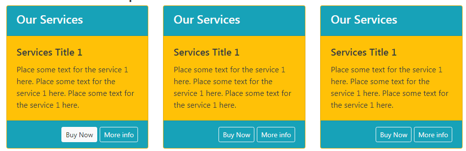
In this template, I just used some other classes for the background and colors in the header along with outline buttons. Have a look online where you may grab the complete code as well:
The markup:
<div class="container">

<h3>A demo of Bootstrap Card</h3>

<div class="row">

  <div class="col-sm-4">

    <div class="card text-dark bg-warning">

    <div class="card-header bg-info text-left text-light"><h4>Our Services</h4></div>

      <div class="card-body ">

        <h5 class="card-title">Services Title 1</h5>

        <p class="card-text text-left">Place some text for the service 1 here. </p>

      </div>

      <div class="card-footer bg-info text-right text-danger">

      <a href="#" class="btn btn-outline-light btn-sm">Buy Now</a> <a href="#" class="btn btn-outline-light btn-sm">More info</a>

      </div>

    </div>

  </div>

</div>

</div>
You may try various utility classes for background and text as per your liking. For learning more about Bootstrap color classes, go to the linked tutorial.
Create adjacent cards by card-group class
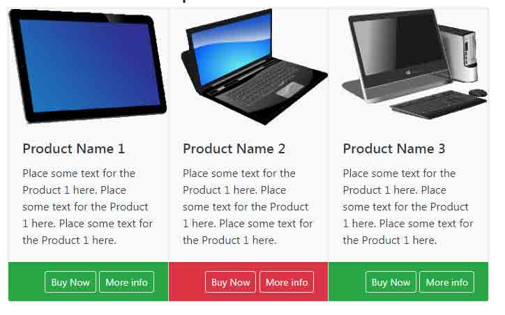
You may also create cards that are attached to each other and equal in height and width by using the card-group class. Underway, the card-group uses the display: flex. Have a look at three attached card templates where I displayed a product image and information along with a footer with button links:
See online demo and code
The code:
<div class="container">

<h3>A demo of Bootstrap Card</h3>

<div class="card-group">

    <div class="card text-dark bg-light">

    <img class="card-img-top" src="images/products/p4.png" alt="image alt text here">

      <div class="card-body ">

        <h5 class="card-title">Product Name 1</h5>

        <p class="card-text text-left">Place some text for the Product 1 here. </p>

      </div>

      <div class="card-footer bg-success text-right text-danger">

      <a href="#" class="btn btn-outline-light btn-sm">Buy Now</a> <a href="#" class="btn btn-outline-light btn-sm">More info</a>

      </div>

  </div>

    <div class="card text-dark bg-light">

    <img class="card-img-top" src="images/products/p3.png" alt="image alt text here">

      <div class="card-body ">

        <h5 class="card-title">Product Name 2</h5>

        <p class="card-text text-left">Place some text for the Product 1 here. </p>

      </div>

        <div class="card-footer bg-danger text-right text-danger">

      <a href="#" class="btn btn-outline-light btn-sm">Buy Now</a> <a href="#" class="btn btn-outline-light btn-sm">More info</a>

      </div>

  </div>

    <div class="card text-dark bg-light">

    <img class="card-img-top" src="images/products/p2.png" alt="image alt text here">

      <div class="card-body ">

        <h5 class="card-title">Product Name 3</h5>

        <p class="card-text text-left">Place some text for the Product 1 here. </p>

      </div>

        <div class="card-footer bg-success text-right text-danger">

      <a href="#" class="btn btn-outline-light btn-sm">Buy Now</a> <a href="#" class="btn btn-outline-light btn-sm">More info</a>

      </div>

  </div>

</div>

</div>

</div>
In that case, even if the footer content varies (one is larger than the others) then card-group will adjust the sizes so it always aligns the same. You can also notice this in the demo.
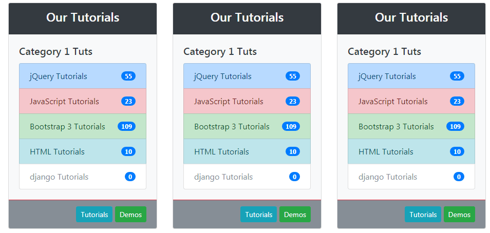
Using list group inside a card template
As mentioned earlier, the cards Bootstrap 4 enable us to use a variety of content. You may also use list groups along with other content.
You may customize the list groups fully as you would do as a separate component. Even, use badges in the list groups within the cards.
Have a look at such an example where I created cards and used list groups with badges for the demonstration:
See online demo and code
The markup for this card example (first card only):
<div class="container">

<h3>A demo of Bootstrap Card</h3>

<div class="row">

  <div class="col-sm-4">

    <div class="card text-dark bg-light">

    <div class="card-header bg-dark text-center text-light"><h4>Our Tutorials</h4></div>

      <div class="card-body ">

        <h5 class="card-title">Category 1 Tuts</h5>

        <!--Starting list group here -->

            <div class="list-group">

              <a href="https://www.jquery-az.com/jquery-tips/" class="list-group-item d-flex justify-content-between align-items-center list-group-item-action list-group-item-primary">jQuery Tutorials

              <span class="badge badge-primary badge-pill">55</span>

              </a>

              <a href="https://www.jquery-az.com/javascript-tutorials/" class="list-group-item d-flex justify-content-between align-items-center list-group-item-action list-group-item-danger">JavaScript Tutorials

              <span class="badge badge-primary badge-pill">23</span>

              </a>

              <a href="https://www.jquery-az.com/bootstrap-tips-tutorials/" class="list-group-item d-flex justify-content-between align-items-center list-group-item-action list-group-item-success">

                Bootstrap 3 Tutorials

                <span class="badge badge-primary badge-pill">109</span>

              </a>

              <a href="https://www.jquery-az.com/html-tutorials/" class="list-group-item d-flex justify-content-between align-items-center list-group-item-action list-group-item-info">HTML Tutorials

              <span class="badge badge-primary badge-pill">10</span>

              </a>

              <a href="#" class="list-group-item d-flex justify-content-between align-items-center list-group-item-action list-group-item-secondary disabled">django Tutorials

              <span class="badge badge-primary badge-pill">0</span>

              </a>

            </div>

          <!--Ends here -->

      </div>

      <div class="card-footer bg-secondary border-danger text-right">

      <a href="#" class="btn btn-info btn-sm">Tutorials</a> <a href="#" class="btn btn-success btn-sm">Demos</a>

      </div>

    </div>

  </div>

</div>
Grab the complete code from the demo page.