
The labels or badges can be used for showing some additional information, count etc. related to the specific content. For example, showing the count of inbox messages ahead of “Message” text. Similarly, showing a distinct “New Arrival” label ahead of new products launched on your website, etc.
In Bootstrap 4, the badges can be created by using .badge class and to color the badge or label, use the contextual classes of the badge e.g. .badge-success, badge-primary.
Keep reading the next section for a look at the live demos of creating badges in different colors and sizes and in various components.
The demo of a simple badge in Bootstrap 4
Let me start by creating simple badges ahead of text by using .badge class. The .badge class along with a contextual class is used in a <span> tag (an inline HTML element). So, the content/text used in the span appears inline with the main content and is styled as a rectangle box.
See the following example where badges are attached with the h1 to h6 headings:
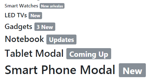
Did you notice in the example, all badges used the same classes, however, their size varies according to the size of parent elements. This is due to using relative font sizing and em units.
The markup of badges demo:
<!DOCTYPE html>
<html>
<head>
<link rel="stylesheet" href="https://maxcdn.bootstrapcdn.com/bootstrap/4.0.0-beta.3/css/bootstrap.min.css" integrity="sha384-Zug+QiDoJOrZ5t4lssLdxGhVrurbmBWopoEl+M6BdEfwnCJZtKxi1KgxUyJq13dy" crossorigin="anonymous">
</head>
<body>
<div class="container">
<h3>The Badges / Label Demo</h3>
<h6>Smart Watches <span class="badge badge-secondary">New arrivals</span></h6>
<h5>LED TVs <span class="badge badge-secondary">New</span></h5>
<h4>Gadgets <span class="badge badge-secondary">3 New</span></h4>
<h3>Notebook <span class="badge badge-secondary">Updates</span></h3>
<h2>Tablet Modal <span class="badge badge-secondary">Coming Up</span></h2>
<h1>Smart Phone Modal <span class="badge badge-secondary">New</span></h1>

</div>

</body>
</html>
Creating colored badges by using other contextual classes
The following example shows using the other built-in contextual classes for displaying badges in various colors. These contextual classes for badges include:
- badge-dark
- badge-secondary
- badge-warning
- badge-light
- badge-success
- badge-danger
- badge-primary
- badge-info
See the example below where all these classes are used:
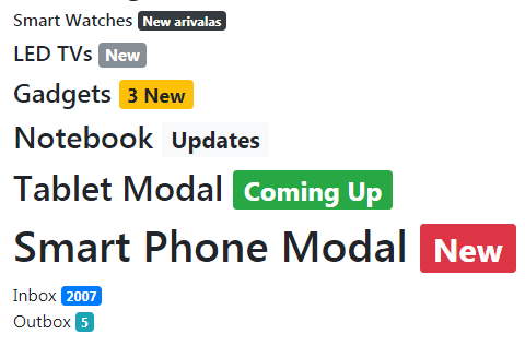
The markup:
<h6>Smart Watches <span class="badge badge-dark">New arrivals</span></h6>

<h5>LED TVs <span class="badge badge-secondary">New</span></h5>

<h4>Gadgets <span class="badge badge-warning">3 New</span></h4>

<h3>Notebook <span class="badge badge-light">Updates</span></h3>

<h2>Tablet Modal <span class="badge badge-success">Coming Up</span></h2>

<h1>Smart Phone Modal <span class="badge badge-danger">New</span></h1>

<div>Inbox <span class="badge badge-primary">2007</span><div>

<div>Outbox <span class="badge badge-info">5</span></div>
The example of creating rounded labels
The Bootstrap 4 has another built-in class for creating rounded badges. The class name is .badge-pill that you may use in addition to the .badge and .badge-[context] classes.
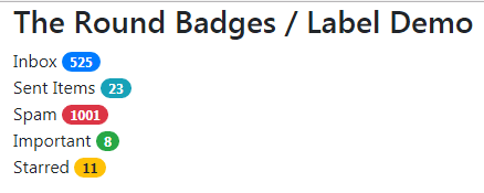
The markup with badge-pill class:
<div class="container">

<h3>The Round Badges / Label Demo</h3>

<div>Inbox <span class="badge badge-pill badge-primary">525</span><div>

<div>Sent Items <span class="badge badge-pill badge-info">23</span></div>

<div>Spam <span class="badge badge-pill badge-danger">1001</span></div>

<div>Important <span class="badge badge-pill badge-success">8</span></div>

<div>Starred <span class="badge badge-pill badge-warning">11</span></div>


</div>
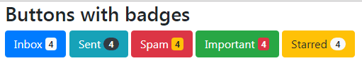
Until now, we have seen using badges in headings and <div> tags. You may also use Bootstrap badges in buttons and links.
In the buttons demo below, various buttons are given their own contextual classes while badges are created by <span> tags, as in the above examples. For each badge, the contextual class is also used along with .badge-pill in two buttons:
The code:
<div class="container">

<h3>Buttons with badges</h3>


<button type="button" class="btn btn-primary">

  Inbox <span class="badge badge-light">4</span>

</button>

<button type="button" class="btn btn-info">

  Sent <span class="badge badge-pill badge-dark">4</span>

</button>

<button type="button" class="btn btn-danger">

  Spam <span class="badge badge-warning">4</span>

</button>

<button type="button" class="btn btn-success">

  Important <span class="badge badge-danger">4</span>

</button>

<button type="button" class="btn btn-warning">

  Starred <span class="badge badge-pill  badge-light">4</span>

</button>

</div>
Similarly, you may use badges in the button dropdowns in Bootstrap. Have a look:
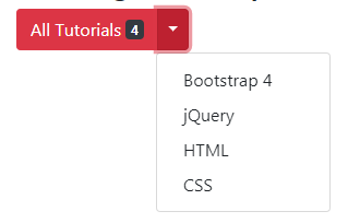
Code:
<body>
<div class="container">
<h3>The Badges in dropdown button</h3>
<div class="container">
<div class="btn-group">
  <button type="button" class="btn btn-danger">All Tutorials
  <span class="badge badge-dark">4</span>
  </button>
  <button type="button" class="btn btn-danger dropdown-toggle dropdown-toggle-split" data-toggle="dropdown" aria-haspopup="true" aria-expanded="false">
    <span class="sr-only">Toggle</span>
  </button>
  <div class="dropdown-menu" aria-labelledby="btnDropdownDemo">
    <a class="dropdown-item" href="https://www.jquery-az.com/bootstrap-4/">Bootstrap 4</a>
    <a class="dropdown-item" href="https://www.jquery-az.com/jquery-tips/">jQuery</a>
    <a class="dropdown-item" href="https://www.jquery-az.com/html-tutorials/">HTML</a>
    <a class="dropdown-item" href="https://www.jquery-az.com/css-tutorials/">CSS</a>
  </div>
</div>
</div>


</div>

</body>
Note: you need to include Bootstrap JS, popper.js along jQuery in order to create the dropdowns.
Using badge Bootstrap classes in links
You may also use badge classes in <a> links. In that case, you may create actionable badges with various colors and hovering effects.
Have a look at this example where I replaced <span> tags in one of the above examples with <a>s and used the badge classes:
The code:
<h3>The link badges demo</h3>

<div>Bootstrap Tutorials <a class="badge badge-info" href="https://www.jquery-az.com/bootstrap-4/">70</a></div>

<div>jQuery Tutorials <a class="badge badge-pill badge-danger" href="https://www.jquery-az.com/jquery-tips/">150</a></div>

<div>JavaScript <a class="badge badge-warning" href="https://www.jquery-az.com/javascript-tutorials/">19</a></div>

<div>CSS <a class="badge badge-dark" href="https://www.jquery-az.com/css-tutorials/">23</a></div>

<div>PHP Tutorials <a class="badge badge-pill badge-success" href="https://www.jquery-az.com/php-tutorials/">25</a></div>
See the links in action with complete code on the example page.
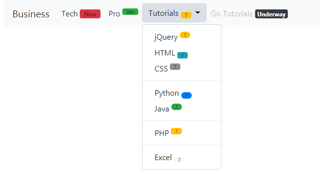
The badges can also be added to the navbar. This can be useful for different situations like adding a new menu item and showing it as “new” or “hot” or some other information.
Moreover, you may use the <sup> and <sub> tags of HTML for displaying badges as superscripts or subscripts and navbars can be an ideal place for that.
This is what I am going to show you in the next example. A navbar is created with a few menu items that contain badges with <sub> and <sup> tags:
See online demo and code
The markup for the navbar with badges:
<div class="container">

<h3>Demo of badges in navbar</h3>

<nav class="navbar navbar-expand-lg navbar-light bg-light">

  <a class="navbar-brand" href="#">Business</a>

  <button class="navbar-toggler" type="button" data-toggle="collapse" data-target="#navbarSupportedContent" aria-controls="navbarSupportedContent" aria-expanded="false" aria-label="Toggle navigation">

    <span class="navbar-toggler-icon"></span>

  </button>


  <div class="collapse navbar-collapse" id="navbarSupportedContent">

    <ul class="navbar-nav mr-auto">

      <li class="nav-item active">

        <a class="nav-link" href="#">Tech <span class="sr-only">(current)</span><span class="nav-link badge badge-danger">New</span></a>

      </li>


      <li class="nav-item active">

        <a class="nav-link" href="#">Pro <span class="sr-only">(current)</span><sup><span class="nav-link badge badge-success">Spe</span></sup></a>

      </li>


      <li class="nav-item dropdown">

  <button class="btn btn-light dropdown-toggle" type="button" id="btnDropdownDemo" data-toggle="dropdown" aria-haspopup="true" aria-expanded="false">

    Tutorials

   <sub><span class="nav-link badge badge-warning">7</span></sub>

  </button>

        <div class="dropdown-menu" aria-labelledby="navbarDropdown">

          <a class="dropdown-item" href="https://www.jquery-az.com/jquery-tips/">jQuery <sup><span class="nav-link badge badge-pill badge-warning">7</span></sup></a>

          <a class="dropdown-item" href="https://www.jquery-az.com/html-tutorials/">HTML <sub><span class="nav-link badge badge-info">7</span></sub></a>

          <a class="dropdown-item" href="#">CSS <sup><span class="nav-link badge badge-secondary">7</span></sup></a>

          <div class="dropdown-divider"></div>

          <a class="dropdown-item" href="https://www.jquery-az.com/python-tutorials/">Python <sub><span class="nav-link badge-pill badge badge-primary">7</span></sub></a>

          <a class="dropdown-item" href="https://www.jquery-az.com/java-tutorials/">Java <sup><span class="nav-link badge badge-pill badge-success">7</span></sup></a>

          <div class="dropdown-divider"></div>

          <a class="dropdown-item" href="https://www.jquery-az.com/php-tutorials/">PHP <sup><span class="nav-link badge badge-warning">7</span></sup></a>

          <div class="dropdown-divider"></div>

          <a class="dropdown-item" href="https://www.jquery-az.com/vba-excel-tutorials/">Excel <sub><span class="nav-link badge badge-pill badge-light">7</span></sub></a>


        </div>

      </li>

      <li class="nav-item">

        <a class="nav-link disabled" href="#">Go Tutorials <span class="badge badge-dark">Underway</span></a>

      </li>

    </ul>

  </div>

</nav>


</div>
See the output and code on the example page.
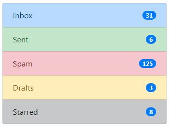
The example of badges in list groups
The final example shows using the badges in the Bootstrap list group. For that, a list is created by using various contextual classes of the list in Bootstrap. With each list item, a badge is also created with its own context class:
The code:
<!DOCTYPE html>
<html>
<head>
<link rel="stylesheet" href="https://maxcdn.bootstrapcdn.com/bootstrap/4.0.0-beta.3/css/bootstrap.min.css" integrity="sha384-Zug+QiDoJOrZ5t4lssLdxGhVrurbmBWopoEl+M6BdEfwnCJZtKxi1KgxUyJq13dy" crossorigin="anonymous">

</head>
<body>
<div class="container">
<h3>List Group with badges demo</h3>
<ul class="list-group">
  <li class="list-group-item d-flex justify-content-between align-items-center list-group-item-primary">
    Inbox
    <span class="badge badge-primary badge-pill">31</span>
  </li>
  <li class="list-group-item d-flex justify-content-between align-items-center list-group-item-success">
    Sent
    <span class="badge badge-primary badge-pill">6</span>
  </li>
  <li class="list-group-item d-flex justify-content-between align-items-center list-group-item-danger">
    Spam
    <span class="badge badge-primary badge-pill">125</span>
  </li>
  <li class="list-group-item d-flex justify-content-between align-items-center list-group-item-warning">
    Drafts
    <span class="badge badge-primary badge-pill">3</span>
  </li>
  <li class="list-group-item d-flex justify-content-between align-items-center list-group-item-dark">
    Starred
    <span class="badge badge-primary badge-pill">8</span>
  </li>
</ul>
</div>

</body>
</html>