
The Bootstrap 4 Tooltips are built by using CSS and JavaScript that uses CSS3 for animation.
The Tooltips can be displayed in various directions explicitly (left, right, top, and bottom). The positioning of tooltips is set by using the third-party library (popper.js) that must be included before the reference of Bootstrap 4 JS file.
In the following section, I will show you various examples of creating tooltips. These include simple with default direction, in all directions, tooltips with HTML content, customizing the appearance of tooltip, and more.
An example of basic tooltip
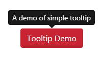
In the first example, the tooltip is associated with a button element. As you hover over the button, the tooltip displays in the default position – the top.
The button is given a unique ID which is referred in the jQuery code for initiating the tooltip as follows:
Complete code:
<!DOCTYPE html>
<html>
<head>
<link rel="stylesheet" href="https://maxcdn.bootstrapcdn.com/bootstrap/4.0.0/css/bootstrap.min.css" integrity="sha384-Gn5384xqQ1aoWXA+058RXPxPg6fy4IWvTNh0E263XmFcJlSAwiGgFAW/dAiS6JXm" crossorigin="anonymous">

<script src="https://code.jquery.com/jquery-3.2.1.slim.min.js" integrity="sha384-KJ3o2DKtIkvYIK3UENzmM7KCkRr/rE9/Qpg6aAZGJwFDMVNA/GpGFF93hXpG5KkN" crossorigin="anonymous"></script>
<script src="https://cdnjs.cloudflare.com/ajax/libs/popper.js/1.12.9/umd/popper.min.js" integrity="sha384-ApNbgh9B+Y1QKtv3Rn7W3mgPxhU9K/ScQsAP7hUibX39j7fakFPskvXusvfa0b4Q" crossorigin="anonymous"></script>
<script src="https://maxcdn.bootstrapcdn.com/bootstrap/4.0.0/js/bootstrap.min.js" integrity="sha384-JZR6Spejh4U02d8jOt6vLEHfe/JQGiRRSQQxSfFWpi1MquVdAyjUar5+76PVCmYl" crossorigin="anonymous"></script>


</head>
<body>
<div class="container">
<h3>Tooltip Demo</h3>
<br /><br /><br /><br />
<button type="button" id="tooltip-demo" class="btn btn-danger" title="A demo of simple tooltip">
  Tooltip Demo
</button>

</div>

<script>
$(function () {
  $('#tooltip-demo').tooltip()
})
</script>
</body>
</html>
You need to include dependency files in the <head> section that you can see on the code above.
Displaying tooltips in all directions
Use the data-placement attribute with any of the following values to display tooltip in the desired direction:
- top
- bottom
- left
- right
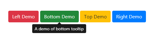
Besides, the demo uses data-toggle=”tooltip” attribute in the button tag which is also referred in the jQuery code for initiating all tooltips at a single call. Have a look at the demo with four buttons in all directions:
The markup:
<div class="container">

<h3 class="text-info">Tooltip Demo in all directions</h3>

<br /><br /><br /><br />

<button type="button" id="tooltip-demo" class="btn btn-danger" data-toggle="tooltip" data-placement="left" title="Left">

  Left Demo

</button>

<button type="button" id="tooltip-demo" class="btn btn-success" data-toggle="tooltip" data-placement="bottom" title="A demo of bottom tooltip">

  Bottom Demo

</button>

<button type="button" id="tooltip-demo" class="btn btn-warning" data-toggle="tooltip" data-placement="top" title="A demo of top tooltip">

  Top Demo

</button>

<button type="button" id="tooltip-demo" class="btn btn-primary" data-toggle="tooltip" data-placement="right" title="A demo of right tooltip">

  Right Demo

</button>


</div>
The script for initializing all tooltips:
<script>

$(function () {

  $('[data-toggle="tooltip"]').tooltip()

})

</script>
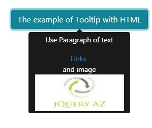
You may also create tooltips with HTML. Use <p> tags for text paragraph, links, images, heading etc. All you need to do is adding the data-html=”true” attribute and using the HTML tags inside the title attribute for the tooltip.
The following example shows using various tags:
body code including script:
<body>
<div class="container">
<h3>Tooltip with HTML demo</h3>
<br /><br /><br /><br />
<button type="button" class="btn btn-info" data-toggle="tooltip" data-html="true" title="<p>Use Paragraph of text</p> <a href='https://www.jquery-az.com/'>Links</a> <br/> and image <img src='https://www.jquery-az.com/wp-content/uploads/2015/10/logo.jpg' width='175'>"">
  The example of Tooltip with HTML
</button>

</div>

<script>
$(function () {
  $('[data-toggle="tooltip"]').tooltip()
})
</script>
</body>
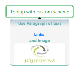
Customizing the tooltip appearance
Want to use some other color scheme for the tooltip than the default dark? For that, you may override the .tooltip and its related classes and apply your own style as per desire or to match with the theme of your website.
Precisely, the .tooltip-inner class defines the inner tooltip layout that I have overridden in the example below:
Online demo and code
The CSS used in the <style> section:
<style>

.tooltip-inner{


    padding:2px 7px;

    color:#55AAAA;

    text-align:center;

    font-weight:900;

    background: -webkit-gradient(linear, left top, left 25, from(#F4F4F4), color-stop(4%, #B4C8D6), to(#F4F4F4));

    background: -moz-linear-gradient(top, #F4F4F4, #B4C8D6 1px, #F4F4F4 25px);

    border: 1px solid #55AAAA;

    -webkit-border-radius:9px;

    -moz-border-radius:9px;

    border-radius:9px;

}

</style>
See the complete code and output on the demo page.
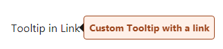
Associating custom tooltip with a link
You may associate a tooltip with different HTML elements. In all above examples, I used a tooltip with buttons. In this example, the tooltip will display as you hover over the link. This tooltip also uses a custom style with various data attributes:
The CSS placed in the <head>:
<style>
.tooltip-inner{

    padding:6px 7px;
    color:#912F00;
    text-align:center;
    font-weight:900;
    background: -webkit-gradient(linear, left top, left 25, from(#FFEEE6), color-stop(4%, #FFEEE6), to(#FFEEE6));
    background: -moz-linear-gradient(top, #F4F4F4, #B4C8D6 1px, #F4F4F4 25px);
    border: 1px solid #912F00;
    -webkit-border-radius:9px;
    -moz-border-radius:9px;
    border-radius:4px;
}

</style>
The markup:
<a class="text-dark" data-toggle="tooltip" data-html="true" data-placement="right" title="Custom Tooltip with a link">

  Tooltip in Link

</a>
Using tooltip in a form example
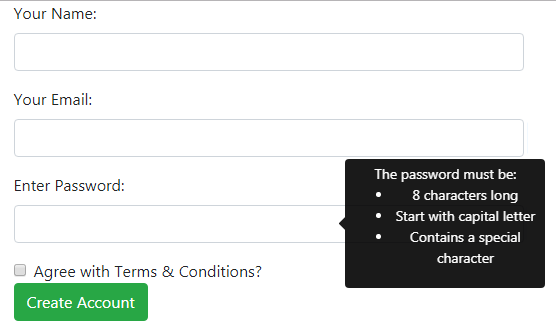
One other important use of tooltips is in Bootstrap 4 based forms. For example, if you have a password field, you may guide a user about the password requirement in a prominent tooltip with information in list format.
See this example online and bring the mouse over any textbox, especially the password to see how HTML tooltip appears:
See online demo and code
The markup of the form with tooltips:
<div class="container">

<form>


  <div class="form-group">

    <label for="NameDemo">Your Name:</label>

    <input type="text" class="form-control" id="NameDemo" data-toggle="tooltip" data-placement="left" aria-describedby="nameHelp" title="Please enter your full name">

  </div>

  <div class="form-group">

    <label for="EmailDemo">Your Email:</label>

    <input type="email" class="form-control" id="EmailDemo" data-toggle="tooltip" data-placement="left" aria-describedby="emailHelp" title="Please enter your email address">

  </div>

  <div class="form-group">

    <label for="passDemo">Enter Password:</label>

  <input type="password" class="form-control" id="passDemo" data-toggle="tooltip" data-html="true" data-placement="left" aria-describedby="passHelp" title="The password must be:<ul><li>8 characters long</li>

    <li>Start with capital letter</li><li>Contains a special character</li></ul>">

  </div>

  <div class="form-check">

    <input type="checkbox" class="form-check-input" id="CheckDemo">

    <label class="form-check-label" for="CheckDemo">Agree with Terms & Conditions?</label>

  </div>

  <button type="submit" class="btn btn-success">Create Account</button>

</form>

</div>
You can see, the title is used in the form control tags. In the password field, the data-html=”true” is also used and in the title attribute, the <ul> and <li> tags are used for creating bulleted information.
The same script is used for initializing the tooltips as in the above examples with data-toggle=”tooltip”.