
Like the Bootstrap 3 tables, Bootstrap 4 also has built-in classes with added styles and enhancements for creating HTML tables in your web projects.
By using these built-in CSS classes, you may easily create simple tables, tables with header styles, stripped rows, colored rows with contextual classes etc. I will show you examples along with overriding the CSS table classes in Bootstrap 4 for customizing as per the need of your projects.
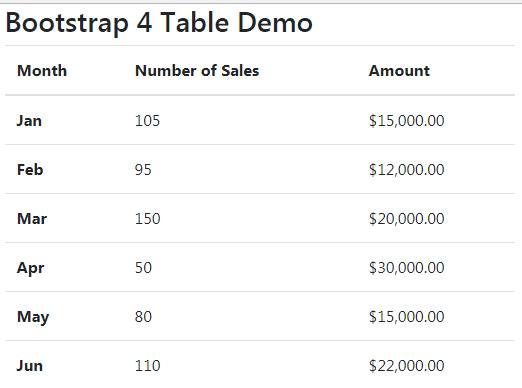
Creating first Bootstrap 4 table by .table class
Let us start with the basics. The Bootstrap 4 has .table class that you may use in the <table> tag. By default, the table is created with light-grey horizontal dividers as shown below:
Complete code:
<!DOCTYPE html>
<html>
<head>
<link rel="stylesheet" href="https://maxcdn.bootstrapcdn.com/bootstrap/4.0.0-beta.3/css/bootstrap.min.css" integrity="sha384-Zug+QiDoJOrZ5t4lssLdxGhVrurbmBWopoEl+M6BdEfwnCJZtKxi1KgxUyJq13dy" crossorigin="anonymous">

</head>
<body>
<div class="container">
  <h3>Bootstrap 4 Table Demo</h2>

<table class="table">
  <thead>
    <tr>
      <th>Month</th>
      <th>Number of Sales</th>
      <th>Amount</th>
    </tr>
  </thead>
  <tbody>
    <tr>
      <th scope="row">Jan</th>
      <td>105</td>
      <td>$15,000.00</td>
    </tr>
    <tr>
      <th scope="row">Feb</th>
      <td>95</td>
      <td>$12,000.00</td>
    </tr>
    <tr>
      <th scope="row">Mar</th>
      <td>150</td>
      <td>$20,000.00</td>
    </tr>
    <tr>
      <th scope="row">Apr</th>
      <td>50</td>
      <td>$30,000.00</td>
    </tr>
    <tr>
      <th scope="row">May</th>
      <td>80</td>
      <td>$15,000.00</td>
    </tr>
    <tr>
      <th scope="row">Jun</th>
      <td>110</td>
      <td>$22,000.00</td>
    </tr>
  </tbody>
</table>

</div>
</body>
</html>
For making month entries bold, these are given <th> tag with scope=”row”.
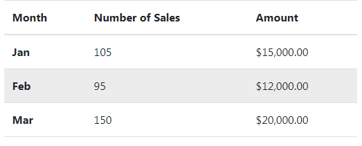
How to add hovering effect in rows?
By adding the table-hover class along with the .table class in the <table> tag, the hovering effect is added to the table. Open the example page by following the link below and hover over any row to see grey background:
Online demo and code
Only this line of code is changed than above example:
<table class=”table table-hover”>
See the complete code on the demo page.
Stand out the table header example
By using Bootstrap 4 thead-dark or thead-light classes in the <thead> tag that contains table headers, the table header will stand out with dark or light grey, respectively. Have a look at both styles:
Dark grey header:
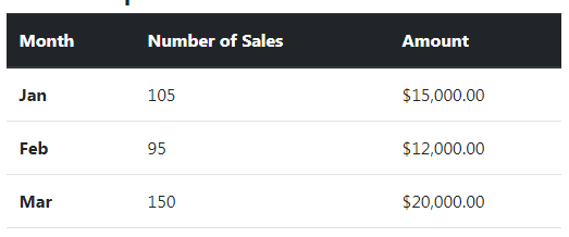
Following is the markup for dark header:
<table class="table table-hover">

  <thead class="thead-dark">

    <tr>

      <th>Month</th>

      <th>Number of Sales</th>

      <th>Amount</th>

    </tr>

  </thead>
The rest of the markup is the same as in the above demos.
Light grey header:
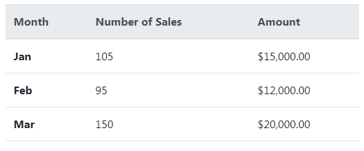
The <thead> tag:
<thead class=”thead-light”>
Customizing the table header classes’ example
If you want to change the color of table header from light grey to some other light color or dark color then you may override the built-in thead-light and thead-dark classes.
See the following example, where I changed the light grey to light orange background with a dark orange border and text:
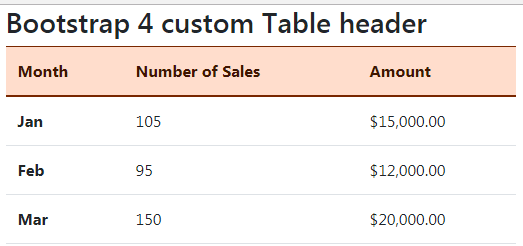
The following CSS is used in the <style> section:
<style>

.table .thead-light th {

  color: #401500;

  background-color: #FFDDCC;

  border-color: #792700;

}

</style>
Make sure to place the CSS after the reference of the Bootstrap CSS file for overriding the default class.
Overriding the thead-dark class example
For using some other darker theme for table header, override .thead-dark class as follows:
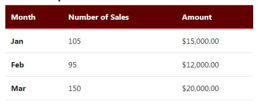
The CSS in style section after Bootstrap CSS:
<style>

.table .thead-dark th {

  color: #fff;

  background-color: #620000;

  border-color: #FF8888;

}

</style>
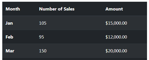
Using dark theme for the whole table
Use the table-dark built-in class for creating the table with a dark background and light colored text. Just place this class along with .table in the <table> tag:
<table class=”table table-dark”>
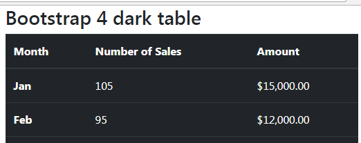
The markup for this example:
<div class="container">

  <h3>Bootstrap 4 dark table</h2>


<table class="table table-dark">

  <thead>

    <tr>

      <th>Month</th>

      <th>Number of Sales</th>

      <th>Amount</th>

    </tr>

  </thead>

  <tbody>

    <tr>

      <th scope="row">Jan</th>

      <td>105</td>

      <td>$15,000.00</td>

    </tr>

    <tr>

      <th scope="row">Feb</th>

      <td>95</td>

      <td>$12,000.00</td>

    </tr>

    <tr>

      <th scope="row">Mar</th>

      <td>150</td>

      <td>$20,000.00</td>

    </tr>

    <tr>

      <th scope="row">Apr</th>

      <td>50</td>

      <td>$30,000.00</td>

    </tr>

    <tr>

      <th scope="row">May</th>

      <td>80</td>

      <td>$15,000.00</td>

    </tr>

    <tr>

      <th scope="row">Jun</th>

      <td>110</td>

      <td>$22,000.00</td>

    </tr>

  </tbody>

</table>


</div>
Customizing the dark color theme example
Again, you may like to change the dark color of the whole table while using the built-in class names of Bootstrap 4. For customizing the color, get the table-dark and its border related classes as follows:
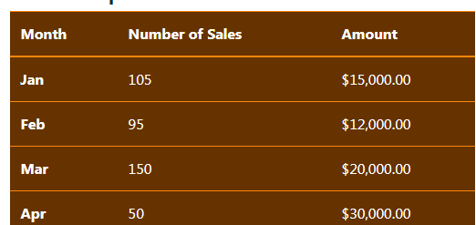
The CSS:
.table-dark {

  color: #fff;

  background-color: #663300;

}


.table-dark th,

.table-dark td,

.table-dark thead th {

  border-color: #FF860D;

}
A demo of creating a table with striped rows
For adding zebra-stripping to the table rows, add the .table-striped class in the <table> tag. By using that, every other row is given a little dark-grey background.
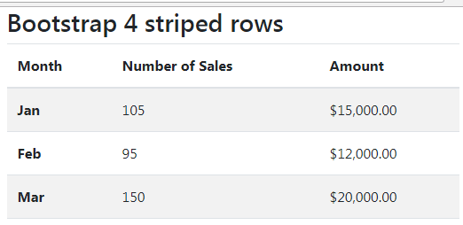
You just need to add the class to <table> tag:
<table class=”table table-striped”>
Similarly, you may use it with a dark theme:
<table class=”table table-striped table-dark”>
Also, try a mix of dark theme with stripped rows and hover effect by using all classes in the <table> tag:
<table class=”table table-striped table-dark table-hover”>
Online demo and code
Create table with borders
For adding borders around the table and in the cells, use the .table-bordered class in the <table> tag. This should add the grayish border to all sides of the table and in the cells as well (for the light theme).
Have a look at the demo below where I have created a table with borders, striped rows, and hover effect in rows:
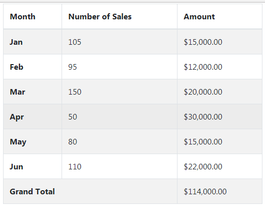
The table markup:
<div class="container">

  <h3>Bootstrap 4 table with borders</h2>


<table class="table table-bordered table-striped table-hover">

  <thead>

    <tr>

      <th>Month</th>

      <th>Number of Sales</th>

      <th>Amount</th>

    </tr>

  </thead>

  <tbody>

    <tr>

      <th scope="row">Jan</th>

      <td>105</td>

      <td>$15,000.00</td>

    </tr>

    <tr>

      <th scope="row">Feb</th>

      <td>95</td>

      <td>$12,000.00</td>

    </tr>

    <tr>

      <th scope="row">Mar</th>

      <td>150</td>

      <td>$20,000.00</td>

    </tr>

    <tr>

      <th scope="row">Apr</th>

      <td>50</td>

      <td>$30,000.00</td>

    </tr>

    <tr>

      <th scope="row">May</th>

      <td>80</td>

      <td>$15,000.00</td>

    </tr>

    <tr>

      <th scope="row">Jun</th>

      <td>110</td>

      <td>$22,000.00</td>

    </tr>


    <tr>

      <th colspan="2" scope="row">Grand Total</th>


      <td>$114,000.00</td>

    </tr>


  </tbody>

</table>


</div>
A small table example by .table-sm class
If you require a small table with less padding in cells then use the .table-sm class in the table tag. This will reduce the cell padding by half. See a demo of using the table-sm class:
The table tag is used as follows:
<table class=”table table-sm”>
Using contextual classes for coloring the rows or cells
To distinguish certain rows from others or just add style to your tables, you may use the built-in contextual classes in Bootstrap 4.
The following contextual classes are available:
- .table-primary adds a bluish background.
- .table-success adds a green background which context can be the success.
- table-secondary
- table-dark
- table-light
- table-info – light blue color
- table-warning – orange color
- table-danger – red color for a dangerous action or information.
You may use these classes at row level e.g.
<tr class=”table-primary”>
Or cell level:
<td class=”table-danger”>Your data</td>
See an example of using all context classes, first with rows:
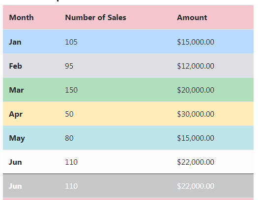
The markup:
<div class="container">

  <h3>Bootstrap 4 table Contextual classes</h2>


<table class="table table-hover">

  <thead>

    <tr class="table-danger">

      <th>Month</th>

      <th>Number of Sales</th>

      <th>Amount</th>

    </tr>

  </thead>

  <tbody>

    <tr class="table-primary">

      <th scope="row">Jan</th>

      <td>105</td>

      <td>$15,000.00</td>

    </tr>

    <tr class="table-secondary">

      <th scope="row">Feb</th>

      <td>95</td>

      <td>$12,000.00</td>

    </tr>

    <tr class="table-success">

      <th scope="row">Mar</th>

      <td>150</td>

      <td>$20,000.00</td>

    </tr>

    <tr class="table-warning">

      <th scope="row">Apr</th>

      <td>50</td>

      <td>$30,000.00</td>

    </tr>

    <tr class="table-info">

      <th scope="row">May</th>

      <td>80</td>

      <td>$15,000.00</td>

    </tr>

    <tr class="table-light">

      <th scope="row">Jun</th>

      <td>110</td>

      <td>$22,000.00</td>

    </tr>

    <tr class="table-dark">

      <th scope="row">Jun</th>

      <td>110</td>

      <td>$22,000.00</td>

    </tr>


    <tr class="table-danger">

      <th colspan="2" scope="row">Grand Total</th>


      <td>$114,000.00</td>

    </tr>


  </tbody>

</table>

</div>
The example of contextual classes at cell level
The following example shows using the contextual classes at the cell level:
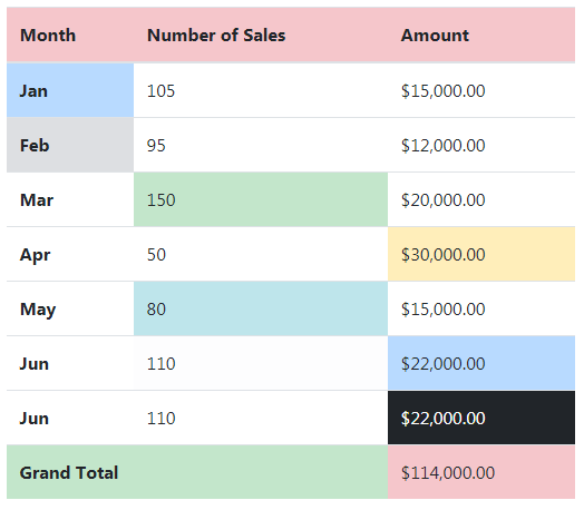
The markup:
<div class="container">

  <h3>Bootstrap 4 table Contextual classes</h2>


<table class="table table-hover">

  <thead>

    <tr class="table-danger">

      <th>Month</th>

      <th>Number of Sales</th>

      <th>Amount</th>

    </tr>

  </thead>

  <tbody>

    <tr>

      <th scope="row" class="table-primary">Jan</th>

      <td>105</td>

      <td>$15,000.00</td>

    </tr>

    <tr >

      <th scope="row" class="table-secondary">Feb</th>

      <td>95</td>

      <td>$12,000.00</td>

    </tr>

    <tr>

      <th scope="row">Mar</th>

      <td  class="table-success">150</td>

      <td>$20,000.00</td>

    </tr>

    <tr>

      <th scope="row">Apr</th>

      <td>50</td>

      <td  class="table-warning">$30,000.00</td>

    </tr>

    <tr>

      <th scope="row">May</th>

      <td class="table-info">80</td>

      <td>$15,000.00</td>

    </tr>

    <tr>

      <th scope="row">Jun</th>

      <td class="table-light">110</td>

      <td class="table-primary">$22,000.00</td>

    </tr>

    <tr>

      <th scope="row">Jun</th>

      <td>110</td>

      <td class="table-dark">$22,000.00</td>

    </tr>


    <tr>

      <th colspan="2" scope="row" class="table-success">Grand Total</th>


      <td class="table-danger">$114,000.00</td>

    </tr>


  </tbody>

</table>


</div>
I have also used the table-hover class in both examples, so you should also see darker contextual color as you hover mouse over any row or cell.
Adding caption for a table example
You may add captions to describe the purpose of the tabular data so a user may have an immediate idea of what this is about.
For that, use the caption tag under the <table> and it will be displayed towards the bottom of the table. Have a look at an example below:
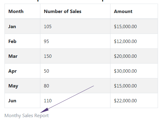
See online demo and code
The markup:
<body>
<div class="container">
  <h3>Bootstrap 4 Table with caption</h2>

<table class="table table-striped table-hover table-bordered">
<caption>Monthy Sales Report</caption>
  <thead>
    <tr>
      <th scope="col">Month</th>
      <th scope="col">Number of Sales</th>
      <th scope="col">Amount</th>
    </tr>
  </thead>
  <tbody>
    <tr>
      <th scope="row">Jan</th>
      <td>105</td>
      <td>$15,000.00</td>
    </tr>
    <tr>
      <th scope="row">Feb</th>
      <td>95</td>
      <td>$12,000.00</td>
    </tr>
    <tr>
      <th scope="row">Mar</th>
      <td>150</td>
      <td>$20,000.00</td>
    </tr>
    <tr>
      <th scope="row">Apr</th>
      <td>50</td>
      <td>$30,000.00</td>
    </tr>
    <tr>
      <th scope="row">May</th>
      <td>80</td>
      <td>$15,000.00</td>
    </tr>
    <tr>
      <th scope="row">Jun</th>
      <td>110</td>
      <td>$22,000.00</td>
    </tr>
  </tbody>
</table>
See the complete code and output on the demo page.
How to create Bootstrap 4 based responsive tables?
Add a container (div) with the table-responsive class that acts as the wrapper for the <table> and it will create a horizontal bar if your table contains more columns than the available space. So, the table is always responsive.
See the following demo where I created a few dummy records just for the demo. If it fits your screen, then resize it till you can see the horizontal scrollbar.
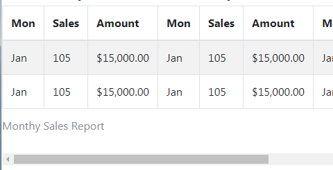
Online demo and code
The markup:
<div class="table-responsive">

<table class="table table-striped table-hover table-bordered">

<caption>Monthy Sales Report</caption>

  <thead>

    <tr>

          <th>Mon</th>

          <th>Sales</th>

          <th>Amount</th>

          <th>Mon</th>

          <th>Sales</th>

          <th>Amount</th>

          <th>Mon</th>

          <th>Sales</th>

          <th>Amount</th>

          <th>Mon</th>

          <th>Sales</th>

          <th>Amount</th>

    </tr>

  </thead>

  <tbody>

    <tr>

      <td>Jan</td>

      <td>105</td>

      <td>$15,000.00</td>

      <td>Jan</td>

      <td>105</td>

      <td>$15,000.00</td>

      <td>Jan</td>

      <td>105</td>

      <td>$15,000.00</td>

      <td>Jan</td>

      <td>105</td>

      <td>$15,000.00</td>

     </tr>

    <tr>

      <td>Jan</td>

      <td>105</td>

      <td>$15,000.00</td>

      <td>Jan</td>

      <td>105</td>

      <td>$15,000.00</td>

      <td>Jan</td>

      <td>105</td>

      <td>$15,000.00</td>

      <td>Jan</td>

      <td>105</td>

      <td>$15,000.00</td>

     </tr>


  </tbody>

</table>


</div>
Using breakpoint specific classes for responsive tables
You may also use following built-in classes for displaying scrollbar till a specific breakpoint. The classes are:
- .table-responsive-xl – Applies to less than 1200px
- .table-responsive-lg – for <992px
- .table-responsive-md – For less than 768px
- .table-responsive-sm – Applies to screens less than 576 pixels.