
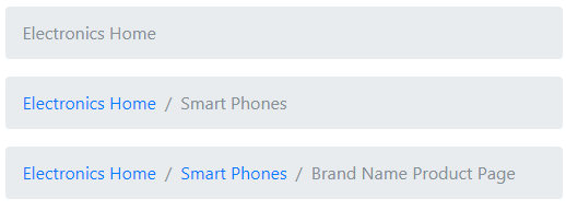
The breadcrumb is the type of navigation that shows user’s current location of the web page within the navigational hierarchy.
For example, you have a main category Electronics and Subcategory Smart-Phones. Within the smart phones, the product models with the brand name are created. If a user is on the product page then you may display the breadcrumb navigation like this:
Electronics >> Smart Phones >> Phone product page
In that way, not only users may know the current location but navigate back to the subcategory or main category pages as well.
Also see: Bootstrap 5 breadcrumbs
By using Bootstrap 4 Framework, you may create breadcrumbs navigation using built-in classes. In this tutorial, I will show you different styles using Bootstrap 4.
Generally, you will use <nav>, <ol> and <li> tags of HTML for creating breadcrumbs. In the <ol> tag, specify the .breadcrumb class whereas in the <li> tags use the .breadcrumb-item class.
To show the current page differently, you may use the .active class in the <li> tag.
Complete code:
<!DOCTYPE html>
<html>
<head>
<link rel="stylesheet" href="https://maxcdn.bootstrapcdn.com/bootstrap/4.0.0-beta.3/css/bootstrap.min.css" integrity="sha384-Zug+QiDoJOrZ5t4lssLdxGhVrurbmBWopoEl+M6BdEfwnCJZtKxi1KgxUyJq13dy" crossorigin="anonymous">


</head>
<body>
<div class="container">
<h3 class="text-success">Demo of Breadcrumbs</h3>
<nav aria-label="breadcrumb">
  <ol class="breadcrumb">
    <li class="breadcrumb-item active" aria-current="page">Electronics Home</li>
  </ol>
</nav>

<nav aria-label="breadcrumb">
  <ol class="breadcrumb">
    <li class="breadcrumb-item"><a href="#">Electronics Home</a></li>
    <li class="breadcrumb-item active" aria-current="page">Smart Phones</li>
  </ol>
</nav>

<nav aria-label="breadcrumb">
  <ol class="breadcrumb">
    <li class="breadcrumb-item"><a href="#">Electronics Home</a></li>
    <li class="breadcrumb-item"><a href="#">Smart Phones</a></li>
    <li class="breadcrumb-item active" aria-current="page">Brand Name Product Page</li>
  </ol>
</nav>
</div>


</body>
</html>
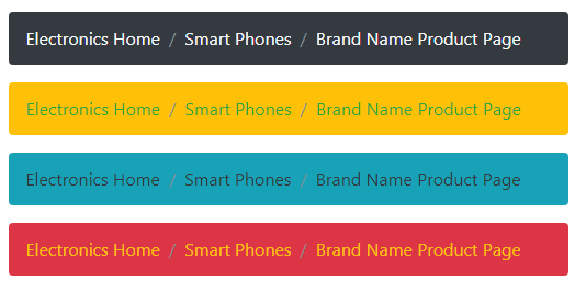
Bootstrap 4 Breadcrumb style number 2
By using background and text contextual classes built-into Bootstrap 4, you may color the breadcrumb navigation panel and text, etc. Have a look at the online example where I used various classes for styling breadcrumbs:
The markup:
<div class="container">

<h3 class="text-primary">Demo of Breadcrumbs</h3>

<nav aria-label="breadcrumb">

  <ol class="breadcrumb bg-dark ">

    <li class="breadcrumb-item "><a href="#" class="text-light">Electronics Home</a></li>

    <li class="breadcrumb-item "><a href="#" class="text-light">Smart Phones</a></li>

    <li class="breadcrumb-item text-light active" aria-current="page">Brand Name Product Page</li>

  </ol>

</nav>


<nav aria-label="breadcrumb">

  <ol class="breadcrumb bg-warning ">

    <li class="breadcrumb-item "><a href="#" class="text-success">Electronics Home</a></li>

    <li class="breadcrumb-item"><a href="#" class="text-success">Smart Phones</a></li>

    <li class="breadcrumb-item text-success active" aria-current="page">Brand Name Product Page</li>

  </ol>

</nav>


<nav aria-label="breadcrumb">

  <ol class="breadcrumb bg-info ">

    <li class="breadcrumb-item "><a href="#" class="text-dark">Electronics Home</a></li>

    <li class="breadcrumb-item"><a href="#" class="text-dark">Smart Phones</a></li>

    <li class="breadcrumb-item text-dark active" aria-current="page">Brand Name Product Page</li>

  </ol>

</nav>


<nav aria-label="breadcrumb">

  <ol class="breadcrumb bg-danger ">

    <li class="breadcrumb-item "><a href="#" class="text-warning">Electronics Home</a></li>

    <li class="breadcrumb-item"><a href="#" class="text-warning">Smart Phones</a></li>

    <li class="breadcrumb-item text-warning active" aria-current="page">Brand Name Product Page</li>

  </ol>

</nav>


</div>
Breadcrumb style number 3 with arrows
The following example uses the custom style with Bootstrap breadcrumbs. The custom CSS specifies the arrow style. Have a look at the demo and code:
Online demo and code
The CSS:
.arr-bread {

    height: 36px;

    padding: 0;

    line-height: 36px;

    list-style: none;

    background-color: #D5DAE1

}


.arr-bread li, .arr-bread li a, .arr-bread li span {

    display: inline-block;

    vertical-align: top

}

.arr-bread li:not(:first-child) {

    margin-left: 0px

}

.arr-bread li+li:before {

    padding: 0;

    content: ""

}

.arr-bread li span {

    padding: 0 10px

}

.arr-bread li a, .arr-bread li:not(:first-child) span {

    height: 36px;

    padding: 0 10px 0 25px;

    line-height: 36px

}

.arr-bread li:first-child a {

    padding: 0 10px

}

.arr-bread li a {

    position: relative;

    color: #fff;

    text-decoration: none;

    background-color: #DC3545;

    border: 1px solid #FFFF00

}

.arr-bread li:first-child a {

    padding-left: 10px

}

.arr-bread li a:after, .arr-bread li a:before {

    position: absolute;

    top: -1px;

    width: 0;

    height: 0;

    content: '';

    border-top: 18px solid transparent;

    border-bottom: 18px solid transparent

}

.arr-bread li a:before {

    right: -10px;

    z-index: 3;

    border-left-color: #DF4454;

    border-left-style: solid;

    border-left-width: 11px

}

.arr-bread li a:after {

    right: -11px;

    z-index: 2;

    border-left: 11px solid #FFFF00

}

.arr-bread li a:focus, .arr-bread li a:hover {

    background-color: #BD2130;

    border: 1px solid #BD2130

}

.arr-bread li a:focus:before, .arr-bread li a:hover:before {

    border-left-color: #BD2130

}

.arr-bread li a:active {

    background-color: #2494be;

    border: 1px solid #2494be

}

.arr-bread li a:active:after, .arr-bread li a:active:before {

    border-left-color: #2494be

}
The markup:
<div class="container">

    <ol class="breadcrumb arr-bread">

                                <li><a href="#">Electronics Home</a></li>

                                <li><a href="#">Smart Phones</a></li>

        <li class="active"><span>Brand Name Product Page</span></li>

                </ol>

</div>
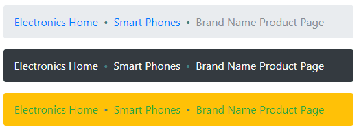
All above examples except the last with arrows used the slash for separating breadcrumb items. You may use some other separator like a dot between the items. For using a dot or other symbol, use the CSS content property as follows:
The markup of one breadcrumb component:
<nav aria-label="breadcrumb">

  <ol class="breadcrumb breadcrumb-dot bg-warning ">

    <li class="breadcrumb-item "><a href="#" class="text-success">Electronics Home</a></li>

    <li class="breadcrumb-item"><a href="#" class="text-success">Smart Phones</a></li>

    <li class="breadcrumb-item text-success active" aria-current="page">Brand Name Product Page</li>

  </ol>

</nav>
The CSS:
.breadcrumb-dot .breadcrumb-item+.breadcrumb-item::before {

    content: "•";

    color: #408080;

}
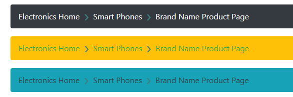
Using right arrows example
Similarly, you may use the right arrow in content property of CSS as follows:
The markup:
<nav aria-label="breadcrumb ">

  <ol class="breadcrumb arr-right bg-dark ">

    <li class="breadcrumb-item "><a href="#" class="text-light">Electronics Home</a></li>

    <li class="breadcrumb-item "><a href="#" class="text-light">Smart Phones</a></li>

    <li class="breadcrumb-item text-light active" aria-current="page">Brand Name Product Page</li>

  </ol>

</nav>
The CSS
<style>

.arr-right .breadcrumb-item+.breadcrumb-item::before {

  content: "›";

  vertical-align:top;

  color: #408080;

  font-size:35px;

  line-height:18px;

}

</style>