
Bootstrap 4 has a powerful grid system which is mobile-first and built with flexbox. Being mobile-first is a buzzword these days and one of the reasons of Bootstrap’s huge popularity across.
As more and more people are adapting to the smartphones and tablets for accessing the web. Also, searches on main search engines like Google, and Bing have surpassed desktops/laptops – so it became necessary to transfer to the responsive web.
So, whether you are developing a new website or have an existing one – building responsive websites that adapt to any device is very important. To add this, Google is moving its index to mobile-first (main announcement) index.
How does Bootstrap Grid System work?
The web page is divided up to 12 columns in Bootstrap grid system. If you require fewer columns, you may use the wider columns by using grid .col-*-* classes for grouping. However, you cannot exceed the twelve-column layout.
Have a look at a few examples of pre-defined .col and .row classes and I will explain how it works.
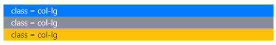
Three equal width columns in large and extra large devices only:

See online demo and code
The markup:
<div class="container">

  <div class="row">

    <div class="col-lg bg-primary text-light">

      class = col-lg

    </div>

    <div class="col-lg bg-secondary text-light">

      class = col-lg

    </div>

    <div class="col-lg bg-warning">

      class = col-lg

    </div>

  </div>

</div>
If you run this example in devices with screen greater than or equal to 992px then it will display equal sized three columns. For less than 992px (medium, small or extra small), it will stack as shown below:
Three equal columns in Small, Medium, Large, and Extra Large devices
Use the col-sm class for equal sized columns in screens greater than or equal to 576px.
The code:
<div class="container">

  <div class="row">

    <div class="col-sm bg-primary text-light">

      class = col-sm

    </div>

    <div class="col-sm bg-secondary text-light">

      class = col-sm

    </div>

    <div class="col-sm bg-warning">

      class = col-sm

    </div>

  </div>

</div>
You can see, only in extra small devices, the columns changed their position stacked like the above graphic.
Now, let us have a look at the available grid classes in Bootstrap 4:
- col-xl-* (for devices with screen greater than or equal to 1200px)
- col-lg-* (For devices with the screen greater than or equal to 992px)
- col-md-* (Medium devices; screens greater or equal to 768px)
- col-sm-* (Small devices; >= 576px)
- col-* (for extra small devices < 576px)
For the above examples, you may conclude that if you want to display equal-sized columns in medium, large, and extra devices then you should use col-md-* class.
If you require displaying equal-sized columns on all devices including extra small and small then use the col-* class.
The Example of different-sized columns
If you have content to display in different widths then you may organize this by using numbers in column grid classes that should equal 12. For example, create seven seven-column width by col-sm-7 and five-column width by col-sm-5 that is for small devices and scales automatically for extra large devices. Have a look at this example:

The markup:
<div class="container">

  <div class="row">

    <div class="col-sm-7 bg-danger text-light">

      class = col-sm-7

    </div>

    <div class="col-sm-5 bg-info text-light">

      class = col-sm-5

    </div>

  </div>

</div>
Exploring the code – how the grid system works?
As we have seen a few examples of using the grid system, now let me go through the code and explain why container, .row, and cols classes are used and the rules to follow when working with Bootstrap 4 framework.
- You may use .container class for padding the content of the site centrally and horizontally. The container is for responsive pixel width where you may place rows. You may also use the container-fluid class. The container-fluid is for full width (100%) across devices and viewports.
- In the example code, you can see the first <div> after the container is .row. The row acts as the wrapper for columns. You should use rows for creating the horizontal group of columns. For example, if you want to display three separate cards with the same width and horizontal line, you may use .row wrapper and use .cols inside it with card content. See an example here.
- As a Bootstrap rule, the content should be placed in columns. For example, the markup for cards, carousel, forms should be placed in columns.
- The columns can be the immediate children of rows.
- You may use columns with numbers e.g. col-sm-4, col-sm-8 (sum up to 12), or simply use col-sm, col-lg, col-lg, etc. In that case, due to the flexbox, the columns layout will be equally distributed.
- The Bootstrap has five grid breakpoints for being responsive. One for each responsive breakpoint i.e. extra large, large, medium, small, and extra small.
- The width of the columns is set in percentages. That is why they are sized in relation to their parent element and are always fluid.
- The gap between the column content is called gutter. This is done by using padding. You may remove the gutter by using .no-gutters in the .row. The gutter width is 30px; 15px on each side of the column.
An example of equal width in all devices
By using the .col or .col-*, you will make Bootstrap handle the layout automatically on all devices. Basically, you will use these classes when you want to maintain equal widths in columns from extra small to extra large devices.
See this example and resize from extra large to large, medium, small, and extra small and see how it maintains three columns unlike the above examples where columns became stacked in extra small devices:
The code:
<div class="container">

  <div class="row">

    <div class="col bg-secondary text-light">

      .col

    </div>

    <div class="col bg-primary text-light">

      .col

    </div>

    <div class="col bg-danger text-light">

      .col

    </div>

    <div class="col bg-success text-light">

      .col

    </div>

  </div>

</div>
You can see, that Bootstrap allocated equal widths to all columns automatically and that was maintained on all devices including smartphones.
Equal columns in multiple lines example
By using a single .row, you may break the columns into multiple lines by using width utility classes. For example:

The HTML:
<div class="container">

  <div class="row">

    <div class="col bg-secondary text-light">

      .col

    </div>

    <div class="col bg-primary text-light">

      .col

    </div>

<div class="w-100"></div>

    <div class="col bg-danger text-light">

      .col

    </div>

    <div class="col bg-success text-light">

      .col

    </div>

  </div>

</div>
This example also applies to all devices/viewports as we used .col classes for equal widths of columns.
The example of unequal-width columns in all devices
Practically, you will need unequal width columns in the web pages. For example, left navigation may require less space than the content in the middle of the page. Similarly, a third column may require more space for right navigation and a small column for subscription form, etc.
See the following example where four columns are used with the following grid classes:
- .col-1
- .col-4
- .col-3
- .col-4
So these became a total of 12. Please note that you are not necessarily required to use all the twelve columns. Have a look at the output of this:

The markup:
<div class="container">

<br />

  <div class="row">

    <div class="col-1 bg-danger text-light">

      col-1

    </div>

    <div class="col-4 bg-info text-light">

      col-4

    </div>

    <div class="col-3 bg-warning">

      col-3

    </div>

    <div class="col-4 bg-info text-light">

      col-4

    </div>

  </div>

</div>
Again, I used .col-* classes, so this applies to all devices i.e. extra small to extra large.
Setting one column number example
You may also choose to set the column width for one column and leave the other to adjust by Bootstrap automatically. This example uses the .col-md classes for setting the layout.
So, the columns appear horizontal in medium devices (from >= 768px) and stacked below this (small and extra small devices):

The code:
<div class="container">

  <div class="row">

    <div class="col-md-2 bg-danger text-light">

      col-md-2

    </div>

    <div class="col-md bg-info text-light">

      col-md

    </div>

    <div class="col-md-3 bg-success text-light">

      col-md-3

    </div>

  </div>

</div>
You can see in the output, the first column is given. col-md-2 (explicitly) and the last column . col-md-3. The remaining seven columns were allocated to the middle column where we did not provide any number i.e. col-md.
As I used .col-md-* classes, the columns should display horizontally in medium, large and extra-large devices. In small devices (less than 768px) like tablets, smart phones, it should appear stacked.
Mixing multiple grid classes
Let me extend the above example to explain how you may mix up the multiple grid classes for a single column. As you saw in the above example, the columns are stacked in small and extra small devices while horizontal on medium, large, and extra large devices.
What if we require displaying the same for medium, large, and extra large as in the above example while for the small and extra small devices, we require displaying all three columns equal in width rather than stacking?
For that, you may use multiple grid classes; one for medium to extra large and the other for small and extra small devices.
I simply added the .col class in all divs along with .col-md* classes in the example code below and now look at the smaller devices by executing this example:
The code:
<div class="container">

  <div class="row">

    <div class="col col-md-2 bg-danger text-light">

      .col .col-md-2

    </div>

    <div class="col col-md bg-info text-light">

      .col .col-md

    </div>

    <div class="col col-md-3 bg-success text-light">

      .col .col-md-3

    </div>

  </div>

</div>
The example of nested columns
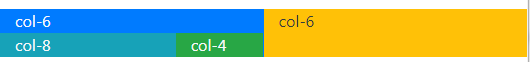
You may add rows and columns inside another column i.e. nested columns. For example, the main div with .row contains two columns with .col-6 grid classes.
In the first <div> with .col-6 class, you may create another <div> with .row and inside it two div(s) with .col-3 classes as shown below:
The markup:
<div class="container">

  <div class="row">

    <div class="col-6 bg-primary text-light">

      col-6

  <div class="row">

    <div class="col-8 bg-info text-light">

      col-8

    </div>

    <div class="col-4 bg-success text-light">

      col-4

    </div>

   </div>

  </div>

    <div class="col-6 bg-warning text-dark">

      col-6

    </div>

  </div>

</div>
You can see the first column is nested further by col-8 and col-4 classes in two div elements.
Organizing this for some real layout
On the basis of the above knowledge of using rows and columns of grid classes now let us move ahead to create some real layout with different Bootstrap 4 components like buttons, links, Jumbotron, cards etc.
I will go row by row for adding different components and you can see the live demo for various components added.
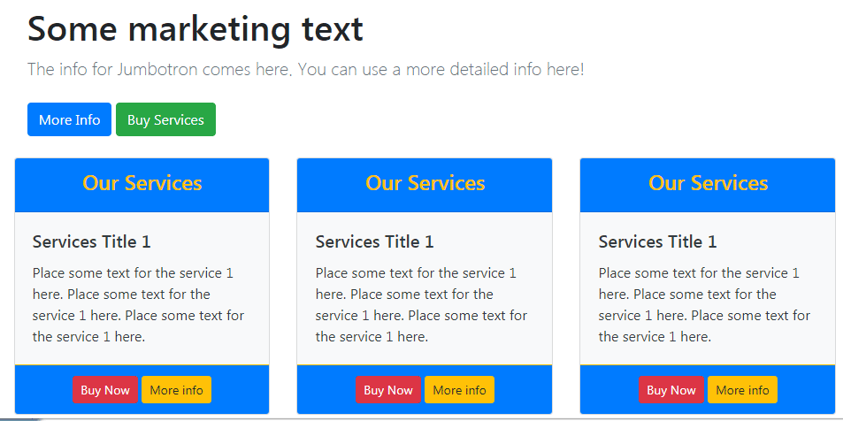
Let me begin by utilizing a complete row with a Jumbotron component in the first row. The main div is assigned the .container class. This is followed by using a .row and then another <div> element with .col-12 class – so this section takes full available width. Have a look at the code and output:

The markup:
<div class="container">

<!-- Content that takes complete width -->

  <div class="row">

   <div class="col-12">

    <div class="container">

      <h1 class="jumbotron-heading">Some marketing text</h1>

      <p class="lead text-muted">The info for Jumbotron comes here. You can use a more detailed info here!</p>

      <p>

        <a href="#" class="btn btn-primary my-2">More Info</a>

        <a href="#" class="btn btn-success my-2">Buy Services</a>

      </p>

   </div>

  </div>

 </div>

  <!--First row ends here -->


</div>
Adding three card components
By using col-sm-4 grid class, three cards are added after the Jumbotron. A new row is created in a <div> element which is followed by the markup for cards as follows:
See online demo and code
See the markup and output until now on the example page.
Also note that, as I used col-sm-4 grid class, from small to extra large devices, it will display the cards horizontally. In extra small viewports, it will stack.