
If you have an important marketing message regarding your products or services related to your website then you may present this in a light-weight and flexible component in Bootstrap 4 called as Jumbotron.
The Jumbotron generally appears as the header, just below the top navigation that takes the good width of the user’s device and optionally may expand to the full user’s screen.
In the coming sections, I will show you basic examples of creating Jumbotron by Bootstrap 4 classes along with custom templates that you may copy or further customize as per the need of your project.
A simple Bootstrap 4 Jumbotron example
A Jumbotron is created by using the .jumbotron class in the main <div> element. The Jumbotron may contain any HTML elements and Bootstrap classes. Have a look at the simple Jumbotron:
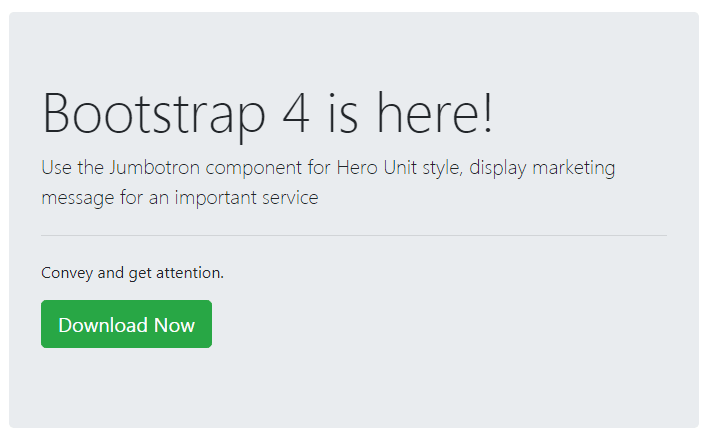
The markup/code:
<!DOCTYPE html>
<html>
<head>
<link rel="stylesheet" href="https://maxcdn.bootstrapcdn.com/bootstrap/4.0.0-beta.3/css/bootstrap.min.css" integrity="sha384-Zug+QiDoJOrZ5t4lssLdxGhVrurbmBWopoEl+M6BdEfwnCJZtKxi1KgxUyJq13dy" crossorigin="anonymous">

</head>
<body>
<div class="container">
<h3>A demo of Jumbotron</h3>
<div class="jumbotron">
  <h1 class="display-4">Bootstrap 4 is here!</h1>
  <p class="lead">Use the Jumbotron component for Hero Unit style, display marketing message for an important service</p>
  <hr class="my-4">
  <p>Convey and get attention.</p>
  <p class="lead">
    <a class="btn btn-success btn-lg" href="#" role="button">Download Now</a>
  </p>
</div>
</div>
</div>
</body>
</html>
Create full-width Jumbotron example
By using .jumbotron-fluid class along with .jumbotron, you may create a full-width Jumbotron according to the parent element width. For example:
<div class=”jumbotron jumbotron-fluid”>
See online demo and code
The Jumbotron custom template example
For this demo, a custom Jumbotron is created by using the custom CSS. Basically, it overrides the default class, jumbotron, and adds a linear gradient.
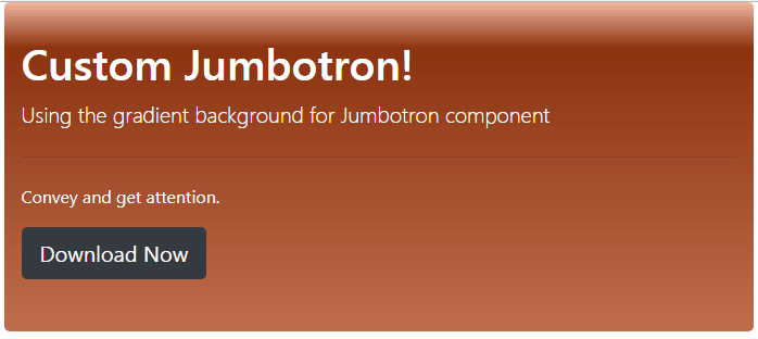
The style of this demo:
<style>

.jumbotron {

  padding: 2rem 1rem;

  margin-bottom: 2rem;

  background-color: #e9ecef;

  border-radius: 0.3rem;


    background: #f0b7a1; /* Old browsers */

    background: -moz-linear-gradient(top, #f0b7a1 0%, #8c3310 14%, #bf6e4e 100%); /* FF3.6-15 */

    background: -webkit-linear-gradient(top, #f0b7a1 0%,#8c3310 14%,#bf6e4e 100%); /* Chrome10-25,Safari5.1-6 */

    background: linear-gradient(to bottom, #f0b7a1 0%,#8c3310 14%,#bf6e4e 100%); /* W3C, IE10+, FF16+, Chrome26+, Opera12+, Safari7+ */

    filter: progid:DXImageTransform.Microsoft.gradient( startColorstr='#f0b7a1', endColorstr='#bf6e4e',GradientType=0 ); /* IE6-9 */

}

.hd1{

    color:#fff;

}

</style>
The markup:
<div class="container">

<div class="jumbotron">

  <h1 class="hd1">Custom Jumbotron!</h1>

  <p class="lead hd1">Using the gradient background for Jumbotron component</p>

  <hr class="my-4">

  <p class="hd1">Convey and get attention.</p>

  <p class="lead">

    <a class="btn btn-dark btn-lg" href="#" role="button">Download Now</a>

  </p>

</div>

</div>
Note: You must place this style after the reference of Bootstrap 4 CSS file either in the style section or your external CSS file.
Bootstrap 4 Jumbotron custom style number 2
Check out another style of the Jumbotron component with the lighter linear gradient.
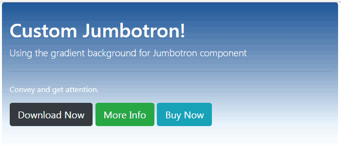
The CSS style:
<style>

.jumbotron {

  padding: 2rem 1rem;

  margin-bottom: 2rem;

  background-color: #e9ecef;

  border-radius: 0.3rem;


background: -moz-linear-gradient(top, rgba(30,87,153,1) 0%, rgba(30,87,153,0.54) 46%, rgba(125,185,232,0.18) 82%, rgba(125,185,232,0) 100%); /* FF3.6-15 */

background: -webkit-linear-gradient(top, rgba(30,87,153,1) 0%,rgba(30,87,153,0.54) 46%,rgba(125,185,232,0.18) 82%,rgba(125,185,232,0) 100%); /* Chrome10-25,Safari5.1-6 */

background: linear-gradient(to bottom, rgba(30,87,153,1) 0%,rgba(30,87,153,0.54) 46%,rgba(125,185,232,0.18) 82%,rgba(125,185,232,0) 100%); /* W3C, IE10+, FF16+, Chrome26+, Opera12+, Safari7+ */

filter: progid:DXImageTransform.Microsoft.gradient( startColorstr='#1e5799', endColorstr='#007db9e8',GradientType=0 ); /* IE6-9 */

}

.hd1{

    color:#fff;

}

</style>
The same markup is used as for the above example.
Jumbotron custom style 3
Again, a pure CSS styled Jumbotron component for Bootstrap 4:
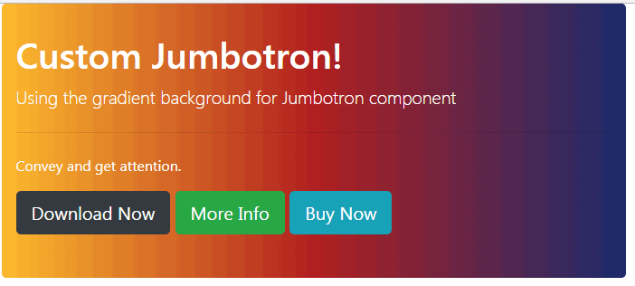
The CSS code:
.jumbotron {

  padding: 2rem 1rem;

  margin-bottom: 2rem;

  border-radius: 0.3rem;


  background: #1a2a6c;  /* fallback for old browsers */

  background: -webkit-linear-gradient(to right, #fdbb2d, #b21f1f, #1a2a6c);  /* Chrome 10-25, Safari 5.1-6 */

  background: linear-gradient(to right, #fdbb2d, #b21f1f, #1a2a6c); /* W3C, IE 10+/ Edge, Firefox 16+, Chrome 26+, Opera 12+, Safari 7+ */


}

.hd1{

    color:#fff;

}
Custom Jumbotron style No 4
This style uses a bluish theme with a linear gradient:
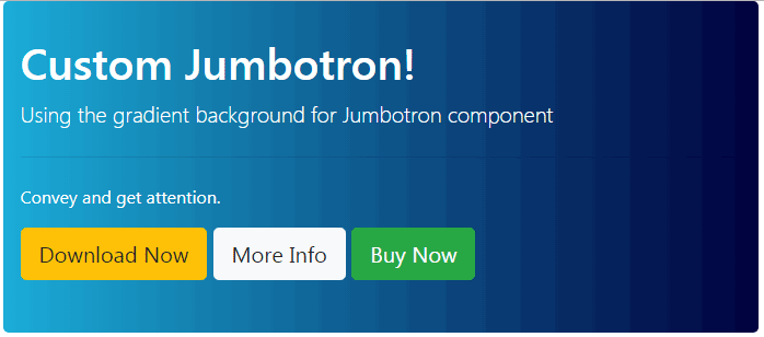
The CSS:
<style>

.jumbotron {

  padding: 2rem 1rem;

  margin-bottom: 2rem;

  border-radius: 0.3rem;


background: #000064;  /* old browsers fallback color*/

background: -webkit-linear-gradient(to right, #1BADD8, #00003E);

background: linear-gradient(to right, #1BADD8, #00003E);


}

.hd1{

    color:#fff;

}

</style>
Steel gray style Jumbotron
The last style is steel gray gradient style – pure CSS:
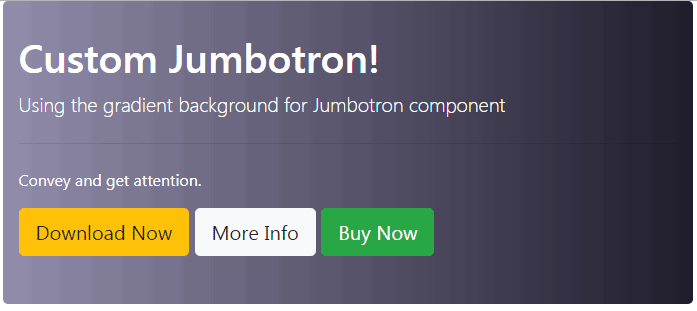
The CSS:
.jumbotron {

  padding: 2rem 1rem;

  margin-bottom: 2rem;

  border-radius: 0.3rem;


  background: #242134;

  background: -webkit-linear-gradient(to right, #9E9AB4, #242134);

  background: linear-gradient(to right, #9E9AB4, #242134);


}

.hd1{

    color:#fff;

}
Please share it if you like it!