
In Bootstrap 3, we may use glyph icons that are included as part of Bootstrap. It does not require adding any external links or library (CDN links) to be used in your projects. So, by adding the reference of Bootstrap, you could use the Glyph icons.
In Bootstrap version 4, it does not include any icon library; Bootstrap has dropped the Glyph icons. However, Bootstrap has some recommendations for external icon libraries that you may use in Bootstrap 4 based projects.
In this tutorial, I am going to share with you a few third-party icon libraries and online examples of using icons in various components like buttons.
The external libraries offer a number of formats that you may use, however, Bootstrap recommends and prefers using SVG implementation for accessibility and external support.
1- Open Iconic – A free and open icon set
Bootstrap has tested and used the Open Iconic themselves and this is on the preferred list recommended by Bootstrap.
How to use iconic icons?
Include the CDN link in the <head> section after the reference of Bootstrap 4 CSS file:
<link rel=”stylesheet” href=”https://cdnjs.cloudflare.com/ajax/libs/open-iconic/1.1.0/font/css/open-iconic-bootstrap.min.css” />
You may also download the iconic CSS file from the official website and host at your own.
After that, use the <span> tag for inline placement of an icon as follows:
<span class=”oi oi-data-transfer-download”>
You need to replace the name of the icon with the one you are intended to use. The list of the icons can be seen on the Iconic website (see above link). Select any icon and get the code for Bootstrap as shown below:
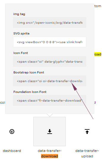
An example of using iconic icons in Bootstrap 4
In this example, four icons of the Iconic library are used. Two are placed in the buttons and the two in the <div> tag with text.
As said earlier, the icon markup is placed in the <span> tag, though you may use other tags as well. Have a look at the output and code:

The markup of this demo – includes required files:
<!DOCTYPE html>
<html>
<head>
<link rel="stylesheet" href="https://maxcdn.bootstrapcdn.com/bootstrap/4.0.0/css/bootstrap.min.css" integrity="sha384-Gn5384xqQ1aoWXA+058RXPxPg6fy4IWvTNh0E263XmFcJlSAwiGgFAW/dAiS6JXm" crossorigin="anonymous">
<link rel="stylesheet" href="https://cdnjs.cloudflare.com/ajax/libs/open-iconic/1.1.0/font/css/open-iconic-bootstrap.min.css" />

</head>
<body>
<div class="container">
<h3>A demo of Iconic icons in Bootstrap 4</h3>
  <div class="row">
    <div class="col-sm-6">
     <button type="button" class="btn btn-outline-primary">Download File <span class="oi oi-data-transfer-download"></span></button>
     <button type="button" class="btn btn-outline-secondary"><span class="oi oi-data-transfer-upload"></span> Upload File</button>
    </div>
    <div class="col-sm-5 bg-info text-light">
    <span class="oi oi-double-quote-serif-left"></span>
    Using with text
    <span class="oi oi-double-quote-serif-right"></span>
    </div>
  </div>

</div>
</body>
</html>
You can see, that the icon adapts the color of the containing element. For example, the .btn-outline-primary class is used for the first button and the color of the icon is also blue.
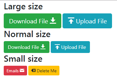
Creating various sized icons example
Just like the color of icons based on buttons in the above example, the size of the icons is also adapted as per the containing element. See the following example where I used three sizes of buttons with various Iconic icons:
The markup:
<div class="container">

  <div class="row">

    <div class="col">

    <h3>Large size</h3>

     <button type="button" class="btn btn-success btn-lg">Download File <span class="oi oi-data-transfer-download"></span></button>

     <button type="button" class="btn btn-info btn-lg"><span class="oi oi-data-transfer-upload iconic-lg"></span> Upload File</button>

    </div>

  </div>


  <div class="row">

    <div class="col">

    <h3>Normal size</h3>

     <button type="button" class="btn btn-success">Download File <span class="oi oi-data-transfer-download"></span></button>

     <button type="button" class="btn btn-info"><span class="oi oi-data-transfer-upload iconic-lg"></span> Upload File</button>

    </div>

  </div>


  <div class="row">

    <div class="col">

    <h3>Small size</h3>

     <button type="button" class="btn btn-danger btn-sm">Emails <span class="oi oi-envelope-closed"></span></button>

     <button type="button" class="btn btn-warning btn-sm"><span class="oi oi-delete"></span> Delete Me</button>

    </div>

  </div>


</div>
2- Using Google Material Icons
The second cool icon library on our list is Google Material Icons. It is a big icon library that you may easily use in your Bootstrap 4 based projects.
Just like the Iconic, you may include the CDN link for the Material Icon library into your web page and use the markup with icon code wherever you require it.
The material icons are not only usable on websites but also in Android and iOS projects.
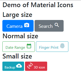
See the following example where I used Google Material Icons with a few buttons. Large, normal, and small sized buttons are created and material icon markup is used to attach icons as shown in the demo below:
The example code:
<!DOCTYPE html>
<html>
<head>
<link rel="stylesheet" href="https://maxcdn.bootstrapcdn.com/bootstrap/4.0.0/css/bootstrap.min.css" integrity="sha384-Gn5384xqQ1aoWXA+058RXPxPg6fy4IWvTNh0E263XmFcJlSAwiGgFAW/dAiS6JXm" crossorigin="anonymous">

<link href="https://fonts.googleapis.com/icon?family=Material+Icons" rel="stylesheet">

</head>
<body>
<div class="container">
<h3>Demo of Material Icons</h3>
  <div class="row">
    <div class="col">
    <h3>Large size</h3>
     <button type="button" class="btn btn-primary btn-lg">Camera <i class="material-icons">camera_enhance</i></button>
     <button type="button" class="btn btn-secondary btn-lg">Search <i class="material-icons">search</i></button>
    </div>
  </div>

  <div class="row">
    <div class="col">
    <h3>Normal size</h3>
     <button type="button" class="btn btn-outline-success">Date Range <i class="material-icons">date_range</i></button>
     <button type="button" class="btn btn-outline-info">Finger Print <i class="material-icons">fingerprint</i></button>
    </div>
  </div>

  <div class="row">
    <div class="col">
    <h3>Small size</h3>
     <button type="button" class="btn btn-info btn-sm">Backup <i class="material-icons">backup</i></button>
     <button type="button" class="btn btn-danger btn-sm"><i class="material-icons">3d_rotation</i> 3D icon</button>
    </div>
  </div>

</div>
</body>
</html>
For using the material icons on your web pages, you need to include the Google web fonts as follows:
<link href=”https://fonts.googleapis.com/icon?family=Material+Icons” rel=”stylesheet”>
There are other ways of installing the Material Icons as well e.g. self-hosted. For setting up material icons, read this guide.
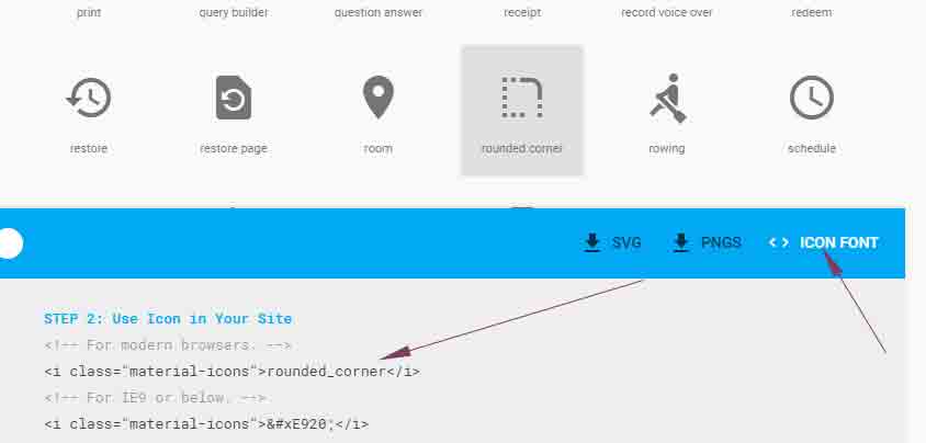
The next step is using the markup in the place where you intend to display the icons. In the example, I used the camera icon as follows:
<i class=”material-icons”>camera_enhance</i>
You may get the code of any icon by visiting the website and clicking on any icon that you require. A blue bar should display in the bottom where you can see < > ICON FONT caption. Click this and it will display the code that you may copy on your web page as shown below:
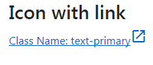
Using icons with links example
You may use icons with various components in Bootstrap. For example, using in form fields, links or simple text, navbar, etc.
The example below shows using an icon of the Material library with a link:
The code:
<!DOCTYPE html>
<html>
<head>
<link rel="stylesheet" href="https://maxcdn.bootstrapcdn.com/bootstrap/4.0.0/css/bootstrap.min.css" integrity="sha384-Gn5384xqQ1aoWXA+058RXPxPg6fy4IWvTNh0E263XmFcJlSAwiGgFAW/dAiS6JXm" crossorigin="anonymous">

<link href="https://fonts.googleapis.com/icon?family=Material+Icons" rel="stylesheet">

</head>
<body>
<div class="container">
<h3>Icon with link</h3>
  <div class="row">
    <div class="col">
    <div><a href="https://www.jquery-az.com" class="text-primary">Class Name: text-primary<i class="material-icons">launch</i></a></div>
    </div>
  </div>

</div>
</body>
</html>
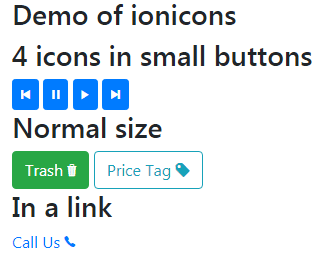
3- Using ionicons in Bootstrap
The ionicons is also a big icons library that you may easily use in your projects based on Bootstrap. All you need to do is refer to the CDN link or host the CSS on your own for ionicons library and use the icon code in a tag like <span> element.
The CDN link for ionicons:
http://code.ionicframework.com/ionicons/2.0.1/css/ionicons.min.css
An example of using ionicons in buttons
The following example shows using ionicons in buttons and a link.
The markup for this example:
<!DOCTYPE html>
<html>
<head>
<link rel="stylesheet" href="https://maxcdn.bootstrapcdn.com/bootstrap/4.0.0/css/bootstrap.min.css" integrity="sha384-Gn5384xqQ1aoWXA+058RXPxPg6fy4IWvTNh0E263XmFcJlSAwiGgFAW/dAiS6JXm" crossorigin="anonymous">
<link rel="stylesheet" href="https://maxcdn.bootstrapcdn.com/font-awesome/4.7.0/css/font-awesome.min.css">

</head>
<body>
<div class="container">
<h3>Font-awesome icons demo</h3>
<button type="button" class="btn btn-primary"><i class="fa fa-times" aria-hidden="true"></i>  Remove it</button>
<button type="button" class="btn btn-success"><i class="fa fa-binoculars" aria-hidden="true"></i>  Binoculars</button>
<button type="button" class="btn btn-info"><i class="fa fa-cart-plus" aria-hidden="true"></i>  Add to cart</button>
<button type="button" class="btn btn-warning"><i class="fa fa-calendar" aria-hidden="true"></i>  Calendar</button><br /><br />
<button type="button" class="btn btn-light"><i class="fa fa-trash" aria-hidden="true"></i>  Delete</button>
<button type="button" class="btn btn-outline-success"><i class="fa fa-wifi" aria-hidden="true"></i>  Wifi</button>
<button type="button" class="btn btn-dark"><i class="fa fa-upload" aria-hidden="true"></i>  Upload</button>
<button type="button" class="btn btn-outline-success"><i class="fa fa-download" aria-hidden="true"></i>  Download</button>


</div>
</body>
</html>
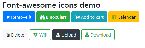
4- The font-awesome icons
The font-awesome is one of the most popular icons libraries around. Although, this is not listed on Bootstrap’s official website for the recommended (tested or untested) list yet this is used widely.
This is a big library of icons where you may access the code of a specific icon by clicking on any icon and going into its detail page. The icon code generally looks like this:
<i class=”fa fa-calendar” aria-hidden=”true”>
Using font-awesome icon library is also pretty simple on your websites.
The CDN of the font-awesome icons library:
<link rel=”stylesheet” href=”https://maxcdn.bootstrapcdn.com/font-awesome/4.7.0/css/font-awesome.min.css”>
You may learn more about font-awesome accessibility options here.
The example of using font-awesome icons
Almost in all examples, I used the buttons for demonstrating how to use icons for certain libraries. This is because it is simple to explain and learn while you may apply the icon code in various elements easily.
For font-awesome icons, I am using buttons again to demonstrate how to use them. See the demo online with code where I used different styles of buttons including .outline class with font-awesome icons:
The example code:
<!DOCTYPE html>
<html>
<head>
<link rel="stylesheet" href="https://maxcdn.bootstrapcdn.com/bootstrap/4.0.0/css/bootstrap.min.css" integrity="sha384-Gn5384xqQ1aoWXA+058RXPxPg6fy4IWvTNh0E263XmFcJlSAwiGgFAW/dAiS6JXm" crossorigin="anonymous">
<link rel="stylesheet" href="https://maxcdn.bootstrapcdn.com/font-awesome/4.7.0/css/font-awesome.min.css">

</head>
<body>
<div class="container">
<h3>Font-awesome icons demo</h3>
<button type="button" class="btn btn-primary"><i class="fa fa-times" aria-hidden="true"></i>  Remove it</button>
<button type="button" class="btn btn-success"><i class="fa fa-binoculars" aria-hidden="true"></i>  Binoculars</button>
<button type="button" class="btn btn-info"><i class="fa fa-cart-plus" aria-hidden="true"></i>  Add to cart</button>
<button type="button" class="btn btn-warning"><i class="fa fa-calendar" aria-hidden="true"></i>  Calendar</button><br /><br />
<button type="button" class="btn btn-light"><i class="fa fa-trash" aria-hidden="true"></i>  Delete</button>
<button type="button" class="btn btn-outline-success"><i class="fa fa-wifi" aria-hidden="true"></i>  Wifi</button>
<button type="button" class="btn btn-dark"><i class="fa fa-upload" aria-hidden="true"></i>  Upload</button>
<button type="button" class="btn btn-outline-success"><i class="fa fa-download" aria-hidden="true"></i>  Download</button>


</div>
</body>
</html>
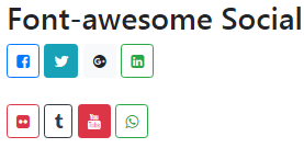
The following example shows using the social icons (Facebook, Twitter, Google Plus, Linkedin, etc.) by using the font-awesome library. Again, the buttons are used for displaying the icons:
The code:
<div class="container">

<h3>Font-awesome Social icons</h3>

<button type="button" class="btn btn-outline-primary btn-sm"><i class="fa fa-facebook-square" aria-hidden="true"></i>  </button>

<button type="button" class="btn btn-info btn-sm"><i class="fa fa-twitter" aria-hidden="true"></i>  </button>

<button type="button" class="btn btn-light btn-sm"><i class="fa fa-google-plus-official" aria-hidden="true"></i> </button>

<button type="button" class="btn btn-outline-success btn-sm"><i class="fa fa-linkedin-square" aria-hidden="true"></i>  </button><br /><br />

<button type="button" class="btn btn-outline-danger btn-sm"><i class="fa fa-flickr" aria-hidden="true"></i>  </button>

<button type="button" class="btn btn-outline-dark btn-sm"><i class="fa fa-tumblr" aria-hidden="true"></i>  </button>

<button type="button" class="btn btn-danger btn-sm"><i class="fa fa-youtube" aria-hidden="true"></i>  </button>

<button type="button" class="btn btn-outline-success btn-sm"><i class="fa fa-whatsapp" aria-hidden="true"></i>  </button>

</div>
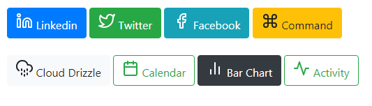
5- Using Feather Icons in Bootstrap 4
The feather is also an open-source collection of icons that are designed with an emphasis on readability, simplicity, and consistency.
You may see the collection of icons by visiting their website at the above link. With each icon, the code is given that you may use on your web page like this:
<i data-feather=”facebook”></i>
Unlike the class used in most above cases, you will use the data-feather attribute and the icon name in the markup.
You also require either hosting the feather.js file at your own or use the CDN link as given below:
Minified version:
<script src=”https://unpkg.com/feather-icons/dist/feather.min.js”></script>
Or
<script src=”https://cdn.jsdelivr.net/npm/feather-icons/dist/feather.min.js”></script>
An example of using Feather Icons
In this example, eight various icons including social icons (Facebook, Twitter, Linkedin) are used from the Feather icons library. Have a look at the code and the output:
The markup:
<!DOCTYPE html>
<html>
<head>
<link rel="stylesheet" href="https://maxcdn.bootstrapcdn.com/bootstrap/4.0.0/css/bootstrap.min.css" integrity="sha384-Gn5384xqQ1aoWXA+058RXPxPg6fy4IWvTNh0E263XmFcJlSAwiGgFAW/dAiS6JXm" crossorigin="anonymous">

<script src="https://unpkg.com/feather-icons/dist/feather.min.js"></script>

</head>
<body>
<div class="container">
<h3>Demo of Feather Icons</h3>

<button type="button" class="btn btn-primary"><i data-feather="linkedin"></i>  Linkedin</button>
<button type="button" class="btn btn-success"><i data-feather="twitter"></i>  Twitter</button>
<button type="button" class="btn btn-info"><i data-feather="facebook"></i>  Facebook</button>
<button type="button" class="btn btn-warning"><i data-feather="command"></i>  Command</button><br /><br />
<button type="button" class="btn btn-light"><i data-feather="cloud-drizzle"></i>  Cloud Drizzle</button>
<button type="button" class="btn btn-outline-success"><i data-feather="calendar"></i>  Calendar</button>
<button type="button" class="btn btn-dark"><i data-feather="bar-chart-2"></i>  Bar Chart</button>
<button type="button" class="btn btn-outline-success"><i data-feather="activity"></i>  Activity</button>

</div>

<script>
  feather.replace()
</script>
</body>
</html>
You may notice a little JS in above code:
<script>

  feather.replace()

</script>
That is it!