
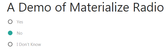
The radio buttons are used when you want users to select one option from the available group of options. The radio group is created by using the name attribute with the same name in a form.
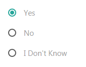
The materialize CSS makes simple looking radio buttons styled nicely with default green fill color. You may also create radio button with a gap by using a built-in class.
See the following section for live demos of different styles for radio buttons using the Materialize CSS framework.
Just like the ordinary radio button, the materialize radio is created by using the <input type=”radio”> tag. The style is applied automatically if you have included the materialize.min.css. To make a radio group, use the name tag with the same name for each radio button as in the following example:
The markup:
<!DOCTYPE html>
<html>
<head>
<link rel="stylesheet" href="https://cdnjs.cloudflare.com/ajax/libs/materialize/1.0.0-alpha.4/css/materialize.min.css">

</head>

<body>
<div class="container">
<h3>A Demo of Materialize Radio</h3>
  <form action="#">
    <p>
      <label>
        <input name="yourchoice" type="radio" checked />
        <span>Yes</span>
      </label>
    </p>
    <p>
      <label>
        <input name="yourchoice" type="radio" />
        <span>No</span>
      </label>
    </p>
    <p>
      <label>
        <input name="yourchoice" type="radio" />
        <span>I Don't Know</span>
      </label>
    </p>
  </form>
</div>

</body>
</html>
Just add the class=”with-gap” in the <input> tag for radio button for creating radio button with green circle and gap between the outer border. Have a look at the example where I applied this class in above example’s markup:
The code:
  <form action="#">

    <p>

      <label>

        <input class="with-gap" name="yourchoice" type="radio" checked />

        <span>Yes</span>

      </label>

    </p>

    <p>

      <label>

        <input class="with-gap" name="yourchoice" type="radio" />

        <span>No</span>

      </label>

    </p>

    <p>

      <label>

        <input class="with-gap" name="yourchoice" type="radio" />

        <span>I Don't Know</span>

      </label>

    </p>

  </form>
To make a radio button disabled, use the disabled=”disabled” attribute in the <input> tag of type=radio. For example:
<input class=”with-gap” name=”yourchoice” type=”radio” disabled=”disabled”/>
The code:
<div class="container">
<h3>A Demo of Materialize Radio</h3>
  <form action="#">
    <p>
      <label>
        <input class="with-gap" name="yourchoice" type="radio" checked />
        <span>Yes</span>
      </label>
    </p>
    <p>
      <label>
        <input class="with-gap" name="yourchoice" type="radio" />
        <span>No</span>
      </label>
    </p>
    <p>
      <label>
        <input class="with-gap" name="yourchoice" type="radio" disabled="disabled"/>
        <span>I Don't Know</span>
      </label>
    </p>
  </form>
</div>
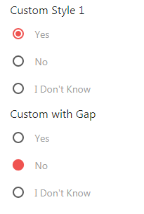
Modifying the circle and border color example
For changing the default green fill color for the radio for the gap or without gap style, you may override the existing CSS with your color properties.
The following example uses the red color for the fill color along with the border. The border is for radio with the gap. See both styles in this demo along with the complete code, particularly, the <style> section:
The CSS:
<style>

[type="radio"]:checked + span:after,

[type="radio"].with-gap:checked + span:before,

[type="radio"].with-gap:checked + span:after {

  border: 2px solid #ef5350;

}


[type="radio"]:checked + span:after,

[type="radio"].with-gap:checked + span:after {

  background-color: #ef5350;

}

</style>
The markup:
<div class="container">

<h6>Custom Style 1</h6>

  <form action="#">

    <p>

      <label>

        <input class="with-gap" name="yourchoice" type="radio" checked />

        <span>Yes</span>

      </label>

    </p>

    <p>

      <label>

        <input class="with-gap" name="yourchoice"  type="radio" />

        <span>No</span>

      </label>

    </p>

    <p>

      <label>

        <input class="with-gap" name="yourchoice" type="radio" />

        <span>I Don't Know</span>

      </label>

    </p>

  </form>


<h6>Custom with Gap</h6>

  <form action="#">

    <p>

      <label>

        <input name="style2" type="radio"  />

        <span>Yes</span>

      </label>

    </p>

    <p>

      <label>

        <input name="style2" type="radio" checked/>

        <span>No</span>

      </label>

    </p>

    <p>

      <label>

        <input  name="style2" type="radio" />

        <span>I Don't Know</span>

      </label>

    </p>

  </form>

</div>
Must place the CSS for overriding the default style after the reference of the materialize.min.css file.