
For creating accordion/collapsible in your web pages, you may utilize the built-in component of Materialize CSS easily.
The collapsible component allows you to hide the content within a webpage that a user does not want to interact with for the time being. The user may click on the header panel to display the content anytime.
That way, the space on a web page can be utilized smartly for sections/components that are more interesting to the user.
For creating collapsible/accordion on your webpage, use the <ul>, <li> tags with collapsible, collapsible-header, and collapsible-body classes as shown in the examples below.
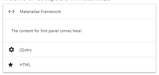
An example of simple Materialize Collapsible/Accordion
For creating a collapsible component, the <ul> tag is assigned the collapsible class. Inside the <li> tags, two <div> elements are used and assigned the collapsible-header and collapsible-body classes.
In the div with the collapsible-header class, you may place an icon with the title for each section in accordion/collapsible. Have a look at the example with three sections:
Online demo
The markup:
<div class="container">

<h5>A demo of Collapsible in Materialize</h5>

  <ul class="collapsible">

    <li>

      <div class="collapsible-header"><i class="material-icons">settings_ethernet</i>Materialize Framework</div>

      <div class="collapsible-body"><span>The content for first panel comes here!</span></div>

    </li>

    <li>

      <div class="collapsible-header"><i class="material-icons">settings</i>jQuery</div>

      <div class="collapsible-body"><span>The content for second panel comes here!</span></div>

    </li>

    <li>

      <div class="collapsible-header"><i class="material-icons">star_rate</i>HTML</div>

      <div class="collapsible-body"><span>The content for third panel comes here!</span></div>

    </li>

  </ul>

</div>
A little script for initializing the collapsible:
$(document).ready(function(){

    $('.collapsible').collapsible();

  });
You may also use simple JavaScript for that:
  var elem = document.querySelector('.collapsible');

  var instance = M.Collapsible.init(elem, options);
The example of preselected selection
In a certain scenario, you may require opening a specific section of content in the collapsible as the web page loads. For that, simply use the active class in the <li> tag that you want to preselect. See an example below:
The markup for the preselected panel:
<!DOCTYPE html>
<html>
<head>
<link rel="stylesheet" href="https://cdnjs.cloudflare.com/ajax/libs/materialize/1.0.0-alpha.4/css/materialize.min.css">
<link href="https://fonts.googleapis.com/icon?family=Material+Icons" rel="stylesheet">

  <script type = "text/javascript" src = "https://code.jquery.com/jquery-2.1.1.min.js"></script>
   <!-- Compiled and minified JavaScript -->
    <script src="https://cdnjs.cloudflare.com/ajax/libs/materialize/1.0.0-alpha.4/js/materialize.min.js"></script>


</head>

<body>
<div class="container">
<h5>A demo of Collapsible in Materialize</h5>
  <ul class="collapsible">
    <li>
      <div class="collapsible-header"><i class="material-icons">settings_ethernet</i>Materialize Framework</div>
      <div class="collapsible-body"><span>The content for first panel comes here!</span></div>
    </li>
    <li class="active">
      <div class="collapsible-header"><i class="material-icons">settings</i>jQuery (pre-selected)</div>
      <div class="collapsible-body"><span>The content for second panel comes here!</span></div>
    </li>
    <li>
      <div class="collapsible-header"><i class="material-icons">star_rate</i>HTML</div>
      <div class="collapsible-body"><span>The content for third panel comes here!</span></div>
    </li>
  </ul>
</div>

<script>
  $(document).ready(function(){
    $('.collapsible').collapsible();
  });
</script>
</body>
</html>
See the complete code on the demo page.
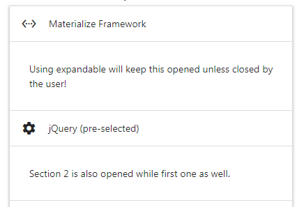
The example of Expandable
In above examples, you can see only one section can be opened at a time. If you want to keep all sections opened unless closed by the user after clicking on the panel (after opening it) then use the expandable class in the <ul> tag containing collapsible class.
The markup:
<div class="container">

<h5>A demo of Expandable</h5>

  <ul class="collapsible expandable">

    <li>

      <div class="collapsible-header"><i class="material-icons">settings_ethernet</i>Materialize Framework</div>

      <div class="collapsible-body"><span>Using expandable will keep this opened unless closed by the user!</span></div>

    </li>

    <li>

      <div class="collapsible-header"><i class="material-icons">settings</i>jQuery (pre-selected)</div>

      <div class="collapsible-body"><span>Section 2 is also opened while first one as well.</span></div>

    </li>

    <li>

      <div class="collapsible-header"><i class="material-icons">star_rate</i>HTML</div>

      <div class="collapsible-body"><span>All are opened</span></div>

    </li>

  </ul>

</div>
A little JavaScript as well for disabling the accordion:
var elem = document.querySelector('.collapsible.expandable');

var instance = M.Collapsible.init(elem, {

  accordion: false

});
That is it!
The Popout style example
The popout style also opens single section at a time that opens in a popout style as the section’s heading/panel is pressed. The image won’t speak itself so have a look at the live demo online to experience it yourself.
Online demo
The markup for <ul>:
<ul class=”collapsible popout”>
For popout style collapsible, just add the popout class in the <ul> with collapsible class.
Give some colors and other styles in collapsible
As you have seen in the above examples, the default collapsible is simple with white background and grayish borders.
You may want to change the default look to match with the theme of your website for the accordion or some other collapsible style. For that, you may override the existing CSS classes and provide your own values for different properties like background-color, border etc.
First, have a look at the following example where I changed the header look by overriding the collapsible-header class:
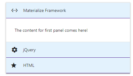
The CSS for the header:
.collapsible-header {

  display: -webkit-box;

  display: -webkit-flex;

  display: -ms-flexbox;

  display: flex;

  cursor: pointer;

  -webkit-tap-highlight-color: transparent;

  line-height: 1.5;

  padding: 1rem;

  background-color: #e3f2fd ;

  border-bottom: 1px solid #4a148c;

}
Must place this after the reference to materialize.min.css.
Complet code:
<!DOCTYPE html>
<html>
<head>
<link rel="stylesheet" href="https://cdnjs.cloudflare.com/ajax/libs/materialize/1.0.0-alpha.4/css/materialize.min.css">
<link href="https://fonts.googleapis.com/icon?family=Material+Icons" rel="stylesheet">

  <script type = "text/javascript" src = "https://code.jquery.com/jquery-2.1.1.min.js"></script>
   <!-- Compiled and minified JavaScript -->
    <script src="https://cdnjs.cloudflare.com/ajax/libs/materialize/1.0.0-alpha.4/js/materialize.min.js"></script>

<style>
.collapsible-header {
  display: -webkit-box;
  display: -webkit-flex;
  display: -ms-flexbox;
  display: flex;
  cursor: pointer;
  -webkit-tap-highlight-color: transparent;
  line-height: 1.5;
  padding: 1rem;
  background-color: #e3f2fd ;
  border-bottom: 1px solid #4a148c;
}
</style>
</head>

<body>
<div class="container">
<h5>A demo of Custom header</h5>
  <ul class="collapsible">
    <li>
      <div class="collapsible-header"><i class="material-icons">settings_ethernet</i>Materialize Framework</div>
      <div class="collapsible-body"><span>The content for first panel comes here!</span></div>
    </li>
    <li >
      <div class="collapsible-header"><i class="material-icons">settings</i>jQuery</div>
      <div class="collapsible-body"><span>The content for second panel comes here!</span></div>
    </li>
    <li>
      <div class="collapsible-header"><i class="material-icons">star_rate</i>HTML</div>
      <div class="collapsible-body"><span>The content for third panel comes here!</span></div>
    </li>
  </ul>
</div>

<script>
  $(document).ready(function(){
    $('.collapsible').collapsible();
  });
</script>
</body>
</html>
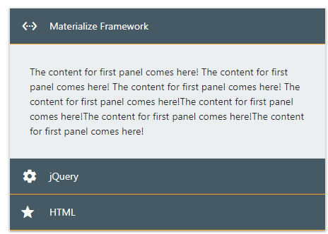
The demo of customizing the accordion body
For customizing the body of the accordion, you may override the collapsible-body class properties for background color, text color, and other properties.
Have a look at the demo for the accordion custom style; both for header and body.
CSS & Markup:
<!DOCTYPE html>
<html>
<head>
<link rel="stylesheet" href="https://cdnjs.cloudflare.com/ajax/libs/materialize/1.0.0-alpha.4/css/materialize.min.css">
<link href="https://fonts.googleapis.com/icon?family=Material+Icons" rel="stylesheet">

  <script type = "text/javascript" src = "https://code.jquery.com/jquery-2.1.1.min.js"></script>
   <!-- Compiled and minified JavaScript -->
    <script src="https://cdnjs.cloudflare.com/ajax/libs/materialize/1.0.0-alpha.4/js/materialize.min.js"></script>

<style>
.collapsible-header {
  display: -webkit-box;
  display: -webkit-flex;
  display: -ms-flexbox;
  display: flex;
  cursor: pointer;
  -webkit-tap-highlight-color: transparent;
  line-height: 1.5;
  padding: 1rem;
  background-color: #455a64;
  border-bottom: 1px solid #ffa726;
  color: #fff;
}
.collapsible-body {
  display: none;
  border-bottom: 1px solid #ddd;
  -webkit-box-sizing: border-box;
          box-sizing: border-box;
  padding: 2rem;
  background-color: #eceff1 ;
}
</style>
</head>

<body>
<div class="container">
<h5>A demo of Custom header</h5>
  <ul class="collapsible">
    <li>
      <div class="collapsible-header"><i class="material-icons">settings_ethernet</i>Materialize Framework</div>
      <div class="collapsible-body"><span>The content for first panel comes here! The content for first panel comes here! The content for first panel comes here!
      The content for first panel comes here!The content for first panel comes here!The content for first panel comes here!The content for first panel comes here!
      </span></div>
    </li>
    <li >
      <div class="collapsible-header"><i class="material-icons">settings</i>jQuery</div>
      <div class="collapsible-body"><span>The content for second panel comes here!</span></div>
    </li>
    <li>
      <div class="collapsible-header"><i class="material-icons">star_rate</i>HTML</div>
      <div class="collapsible-body"><span>The content for third panel comes here!</span></div>
    </li>
  </ul>
</div>

<script>
  $(document).ready(function(){
    $('.collapsible').collapsible();
  });
</script>
</body>
</html>