
The Materialize has built-in support for creating nicely styled checkboxes in your web forms. The standard HTML checkboxes are plain and boring with a simple black border in unchecked and with a tick mark in checked states.
Using Materialize, the border style is changed along with the tick mark color. You may also use a built-in class for creating the filled checkbox. Using disabled attribute also creates different looking checkbox than the standard one. I will also show you how to override the default colors for creating custom-style checkboxes in this tutorial.
An example of checked and unchecked state checkboxes
For creating a checkbox with the default style, you do not require referring any CSS class in the <input type=”checkbox”>. This markup automatically styles the checkbox with Materialize CSS.
However, for binding the custom checkbox with input, you are required to use the id of the checkbox as the value for the “for” attribute of the <label> tag.
Have a look at the demo with checked and unchecked states of the checkboxes:

The markup:
<!DOCTYPE html>
<html>
<head>
 <link rel="stylesheet" href="https://cdnjs.cloudflare.com/ajax/libs/materialize/1.0.0-alpha.4/css/materialize.min.css">

</head>

<body>
<div class="container">
<form action="#">
<h3>Your expertise</h3>
    <p>
      <label for="chk-demo1">
        <input type="checkbox" id="chk-demo1"/>
        <span>JavaScript</span>
      </label>
    </p>
    <p>
      <label for="chk-demo2">
        <input type="checkbox" id="chk-demo2" checked="checked" />
        <span>jQuery</span>
      </label>
    </p>
    <p>
      <label for="chk-demo3">
        <input type="checkbox" id="chk-demo3" checked="checked" />
        <span>HTML</span>
      </label>
    </p>
    <p>
      <label for="chk-demo4">
        <input type="checkbox" id="chk-demo4" />
        <span>CSS</span>
      </label>
    </p>

  </form>
</div>
</body>
</html>
A demo of filled-in style checkbox
For creating the checkbox that is filled with a color in the checked state, use the filled-in class in the <input> tag for the checkbox.
See an example with code:

The code with filled-in class:
<div class="container">

<form action="#">

<h3>Your expertise</h3>

    <p>

      <label for="chk-demo1">

        <input type="checkbox" class="filled-in" id="chk-demo1"/>

        <span>JavaScript</span>

      </label>

    </p>

    <p>

      <label for="chk-demo2">

        <input type="checkbox"  class="filled-in" id="chk-demo2" checked="checked" />

        <span>jQuery</span>

      </label>

    </p>

    <p>

      <label for="chk-demo3">

        <input type="checkbox" class="filled-in" id="chk-demo3" checked="checked" />

        <span>HTML</span>

      </label>

    </p>

    <p>

      <label for="chk-demo4">

        <input type="checkbox" class="filled-in" id="chk-demo4" />

        <span>CSS</span>

      </label>

    </p>


  </form>

</div>
Customizing the border and background colors for filled checkbox
In real time web applications based on materialize CSS, you may require changing the default colors for the checkbox filled style for matching with the rest of the form or website theme.
For modifying the fill color for border and background, you may override the filled-in class as shown in the example below with CSS code:

The CSS:
<style>

[type="checkbox"].filled-in:checked + span:not(.lever):after {

  top: 0;

  width: 20px;

  height: 20px;

  border: 2px solid #e6ee9c;

  background-color: #afb42b;

  z-index: 0;

}

</style>
Note: Must place this CSS after the reference to the materialize CSS file for overriding the default properties. After that, you may use your own colors and set other properties for customization.
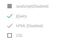
Creating disabled checkboxes example
Create the disabled checkboxes for both checked and unchecked states with default grayish color by using the disabled=”disabled” attribute. Have a look:
The Code:
<div class="container">

<form action="#">

<h3>Your expertise</h3>

    <p>

      <label for="chk-demo1">

        <input type="checkbox" disabled="disabled" id="chk-demo1"/>

        <span>JavaScript(Disabled)</span>

      </label>

    </p>

    <p>

      <label for="chk-demo2">

        <input type="checkbox"  id="chk-demo2" checked="checked" />

        <span>jQuery </span>

      </label>

    </p>

    <p>

      <label for="chk-demo3">

        <input type="checkbox" disabled="disabled" id="chk-demo3" checked="checked" />

        <span>HTML (Disabled)</span>

      </label>

    </p>

    <p>

      <label for="chk-demo4">

        <input type="checkbox" id="chk-demo4" />

        <span>CSS</span>

      </label>

    </p>


  </form>

</div>
Changing the border of unchecked state example
In the above section, I have shown changing the fill color by overriding the filled-in class. If you want to change the border color of unchecked checkbox then this is how it can be done. See the CSS in the <style> section below:

The CSS for 1px border and indigo color:
[type="checkbox"] + span:not(.lever):before,

[type="checkbox"]:not(.filled-in) + span:not(.lever):after {

  content: '';

  position: absolute;

  top: 0;

  left: 0;

  width: 18px;

  height: 18px;

  z-index: 0;

  border: 1px solid indigo;

  border-radius: 1px;

  margin-top: 3px;

  -webkit-transition: .2s;

  transition: .2s;

}
You can see 1px border for the unchecked state.