
The Materialize CSS has specific classes of CSS for creating beautiful looking buttons. You may create normal and large sized buttons simply or with icons (material icons etc) for making the message more clear.
In this tutorial, I will show you how to create materialize buttons by utilizing various built-in classes with live demos and code.
- Raised buttons
- Floating Circular Action (FCA) buttons
- Flat buttons
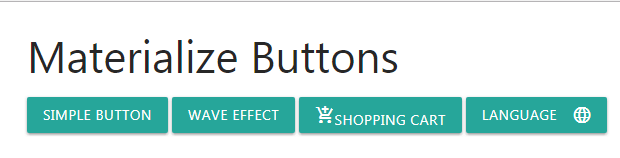
The raised buttons are the standard buttons that you may use in a flat web page for performing certain actions. For creating the standard button of normal size, use the btn class in the <a> or <button> tags.
If no color class is given then standard green button is created. You may optionally use wave effects as well.
The code:
<!DOCTYPE html>
<html>
 <head>
  <link rel="stylesheet" href="https://cdnjs.cloudflare.com/ajax/libs/materialize/1.0.0-alpha.4/css/materialize.min.css">
  <link href="https://fonts.googleapis.com/icon?family=Material+Icons" rel="stylesheet">

 </head>

<body>
<div class="container">
<h3>Materialize Buttons</h3>
<button class="btn">Simple Button</button>
<a class="waves-effect waves-light btn lighten-2">wave effect</a>
<a class="waves-effect waves-light btn"><i class="material-icons">add_shopping_cart</i>Shopping cart</a>
<button class="waves-effect waves-light btn"><i class="material-icons right">language</i>Language</button>
</div>
</body>
</html>
You can see, the first button is simply assigned the btn class. In the second button, waves-effect class is also used.
The third button is assigned a material icon towards the left of button’s text and the forth assigned icon towards the right of button’s text.
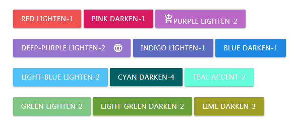
You may use custom colors or color palette based on material design colors for creating various colored buttons.
All you have to do is to refer the base color class in the button or <a> tag along with button classes. See the example below where I created a number of buttons with different colors:
The markup for buttons:
<button class="btn red lighten-1">red lighten-1</button>

<a class="waves-effect waves-light btn pink darken-1">pink darken-1</a>

<a class="purple lighten-2 btn"><i class="material-icons">add_shopping_cart</i>purple lighten-2</a><br /><br />

<button class="deep-purple lighten-2 btn"><i class="material-icons right">language</i>deep-purple lighten-2</button>

<button class="btn indigo lighten-1">indigo lighten-1</button>

<button class="btn blue darken-1">blue darken-1</button><br /><br />

<button class="btn light-blue lighten-2">light-blue lighten-2</button>

<button class="btn cyan darken-4">cyan darken-4</button>

<button class="btn teal accent-2">teal accent-2</button><br /><br />

<button class="btn green lighten-2">green lighten-2</button>

<button class="btn light-green darken-2">light-green darken-2</button>

<button class="btn lime darken-3">lime darken-3</button>
You can see color palettes with base class names here.
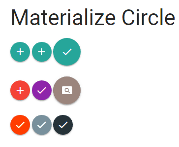
The floating circle button type in materialize framework is meant for buttons with very important functions.
For creating circle buttons, use the btn-floating class in the <a> or button tag. For adding the wave effect, you need adding the materialize.min.js along with jQuery library.
You also require adding the waves-effect class in the <a> tag along with button class.
Just like Raised buttons, the default color of the circle button is greenish. You may specify color classes as we used for raised buttons.
See the circle buttons demo for default color, wave effect, large and normal sizes and various colors.
The markup for circle floating buttons:
<a class="btn-floating"><i class="material-icons">add</i></a>

<a class="btn-floating waves-effect waves-light"><i class="material-icons">add</i></a>

<a class="btn-floating btn-large waves-effect waves-light"><i class="material-icons">done</i></a><br /><br />

<a class="btn-floating waves-effect waves-light red"><i class="material-icons">add</i></a>

<a class="btn-floating  purple darken-1"><i class="material-icons">done</i></a>

<a class="btn-floating btn-large waves-effect waves-light brown darken-1"><i class="material-icons">pageview</i></a><br /><br />

<a class="btn-floating waves-effect waves-dark deep-orange accent-3"><i class="material-icons">done</i></a>

<a class="btn-floating waves-effect blue-grey lighten-1"><i class="material-icons">done</i></a>

<a class="btn-floating waves-effect waves-dark blue-grey darken-4"><i class="material-icons">done</i></a>
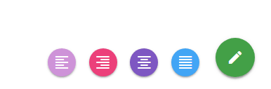
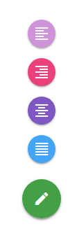
You may create a fixed action button on different places in a web page by using the fixed-action-btn class. Multiple action buttons can be attached for allowing visitors performing various actions that may open on mouse hover or click only.
Have a look at this demo and see the button towards the right bottom of the example page. As you hover over that button, the action buttons display in the horizontal direction.
The markup:
<div class="fixed-action-btn horizontal">

<a class="btn-floating btn-large green darken-1">

<i class="large material-icons">mode_edit</i>

</a>

<ul>

<li><a class="btn-floating  purple lighten-3"><i class="material-icons">format_align_left</i></a></li>

<li><a class="btn-floating pink lighten-1"><i class="material-icons">format_align_right</i></a></li>

<li><a class="btn-floating deep-purple lighten-1"><i class="material-icons">format_align_center</i></a></li>

<li><a class="btn-floating blue lighten-1"><i class="material-icons">format_align_justify</i></a></li>

</ul>

</div>
Just use the vertical class instead of horizontal class for displaying fixed action buttons in the vertical direction. Have a look at the demo online:
Only this piece is changed than the above demo:
<div class=”fixed-action-btn vertical”>
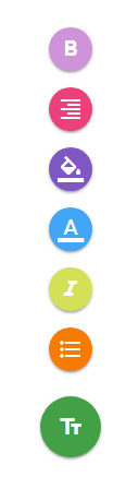
Rather than opening the action buttons on hover state, you may use the click-to-toggle class in the main div containing fixed-action-btn class for opening the action buttons upon clicking the main floating button.
The buttons will be toggleable, so if already opened – it will close all buttons as you click it. Have a look at the demo:
The markup:
<div class="fixed-action-btn vertical click-to-toggle">

<a class="btn-floating btn-large green darken-1">

<i class="material-icons">text_fields</i>

</a>

<ul>

<li><a class="btn-floating  purple lighten-3"><i class="material-icons">format_bold</i></a></li>

<li><a class="btn-floating pink lighten-1"><i class="material-icons">format_align_right</i></a></li>

<li><a class="btn-floating deep-purple lighten-1"><i class="material-icons">format_color_fill</i></a></li>

<li><a class="btn-floating blue lighten-1"><i class="material-icons">format_color_text</i></a></li>

<li><a class="btn-floating lime lighten-1"><i class="material-icons">format_italic</i></a></li>

<li><a class="btn-floating orange darken-2"><i class="material-icons">format_list_bulleted</i></a></li>

</ul>

</div>
Rather than expanding the action buttons horizontally or vertically that are separated, you may display action buttons as a toolbar that expands the available width. For that, just use the toolbar class in the FAB <div> and you are done.
Have a look at the demo and click on the button with TT icon to see how toolbar appears.

Online demo and code
The markup for buttons toolbar:
<div class="fixed-action-btn toolbar">

<a class="btn-floating btn-large red">

<i class="material-icons">text_fields</i>

</a>

<ul>

<li class="waves-effect waves-light"><a href="#!"><i class="material-icons">cloud</i></a></li>

<li class="waves-effect waves-light"><a href="#!"><i class="material-icons">cloud_circle</i></a></li>

<li class="waves-effect waves-light"><a href="#!"><i class="material-icons">cloud_done</i></a></li>

<li class="waves-effect waves-light"><a href="#!"><i class="material-icons">cloud_download</i></a></li>

<li class="waves-effect waves-light"><a href="#!"><i class="material-icons">cloud_off</i></a></li>

</ul>

</div>
For hiding the toolbar, simply click somewhere outside of the toolbar.
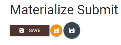
You may style the submit buttons as well as using the materialize CSS. For that, use the <button> tag and specify the type attribute as “submit”. In the button tag, you may specify the button classes with color as per the need of your project. See the demo below:
Example code:
<!DOCTYPE html>
<html>
 <head>
  <link rel="stylesheet" href="https://cdnjs.cloudflare.com/ajax/libs/materialize/0.100.2/css/materialize.min.css">

  <link href="https://fonts.googleapis.com/icon?family=Material+Icons" rel="stylesheet">
  <script type = "text/javascript" src = "https://code.jquery.com/jquery-2.1.1.min.js"></script>
  <script src="https://cdnjs.cloudflare.com/ajax/libs/materialize/0.100.2/js/materialize.min.js"></script>

 </head>

<body>
<div class="container">
<h3>Materialize Submit Button</h3>
<button class="btn brown darken-3 waves-effect waves-light" type="submit" name="action">Save
    <i class="material-icons left">save</i>
</button>

<button class="btn-floating  amber darken-3 waves-effect waves-light" type="submit" name="action">
    <i class="material-icons left">save</i>
</button>

<button class="btn-floating btn-large  blue-grey darken-3 waves-effect waves-light" type="submit" name="action">
    <i class="material-icons left">save</i>
</button>

</div>
</body>
</html>
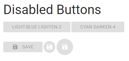
For creating buttons that are disabled by appearance as well as not clickable, add the disabled class. All button types; raised, floating and flat can be assigned the disabled class:
The code:
<a class="btn light-blue disabled lighten-2">light-blue lighten-2</a>

<a class="btn disabled cyan darken-4">cyan darken-4</a><br /><br />


<button class="btn disabled brown darken-3 waves-effect waves-light" type="submit" name="action">Save

<i class="material-icons left">save</i>

</button>


<button class="btn-floating disabled amber darken-3 waves-effect waves-light" type="submit" name="action">

<i class="material-icons left">save</i>

</button>


<button class="btn-floating disabled btn-large  blue-grey darken-3 waves-effect waves-light" type="submit" name="action">

<i class="material-icons left">save</i>

</button>