
The Materialize CSS framework has options to create the beautiful looking select box in your web forms. You may create simple select – option that enables visitors selecting an option from the select dropdown.
A select dropdown with option groups can also be created easily. Besides, multiple options can also be selected where a checkbox is visible along with option text.
The select dropdown, which is a jQuery plug-in, also enables you attaching images with the options. The next section shows you examples of these select dropdown along with code snippets.
The example of simple materialize select
The simple select dropdown can be created by using the ordinary HTML code i.e. <select> and <option> tags. The style is applied automatically to the select box.
As mentioned, you also need to initialize the plug-in in the jQuery code as shown in the example below:
Online demo
The markup:
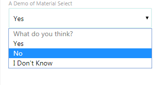
<div class="container">

  <div class="input-field col s12">

    <select>

      <option value="" disabled selected>What do you think?</option>

      <option value="yes">Yes</option>

      <option value="no">No</option>

      <option value="dont">I Don't Know</option>

    </select>

    <label>A Demo of Material Select</label>

  </div>

</div>
A little jQuery code:
<script>

(function($){

  $(function(){

    // Plugin initialization

    $('select').not('.disabled').formSelect();

  });

})(jQuery); // end of jQuery name space

</script>
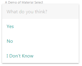
You can see, the first option is disabled that asks the question: What do you think?. The dropdown opens with a nice smooth effect. As the dropdown is opened, the first option becomes disabled by using the disabled attribute in the <option> tag.
Note: Make sure including the materialize.min.css, materialize.min.js and jQuery library to make select dropdown work.
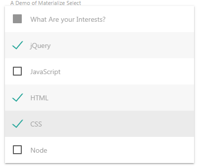
Allowing multiple selection of options example
Just add the multiple attribute in above example and Materialize select plug-in will display options with checkboxes. As an option is selected, the green tick mark is displayed while unselected options are displayed with a 2px bordered checkbox. Have a look:
The code:
<div class="container">

  <div class="input-field col s4">

    <select multiple>

      <option value="" disabled selected>What Are your Interests?</option>

      <option value="jQuery">jQuery</option>

      <option value="JavaScript">JavaScript</option>

      <option value="HTML">HTML</option>

      <option value="CSS">CSS</option>

      <option value="Node">Node</option>

    </select>

    <label>A Demo of Materialize Select</label>

  </div>

</div>
Learn more about Materialize checkboxes and how to customize
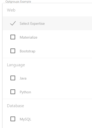
Create select dropdown with option groups
If your list of options in a select dropdown is category based then you may break up those into option groups. Just like the above examples, the select box with the option groups may be created simply with single option selection or by using multiple attribute, allow visitors selecting multiple options.
In the case of multiple attribute, the checkboxes appear just like above example. Have a look at the demo below with option groups with multiple attribute:
The markup:
<div class="container">

  <div class="input-field col s4">

    <select multiple>

      <optgroup label="Web">

        <option value="" disabled selected>Select Expertise</option>

        <option value="1">Materialize</option>

        <option value="2">Bootstrap</option>

      </optgroup>

      <optgroup label="Language">

        <option value="3">Java</option>

        <option value="4">Python</option>

      </optgroup>

      <optgroup label="Database">

        <option value="3">MySQL</option>

        <option value="4">MS SQL Server</option>

      </optgroup>

    </select>

    <label>Optgroups Example</label>

  </div>

</div>
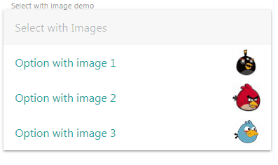
The select box with images
One of the cool features of the select in Materialize CSS is displaying the images with options in the select box. For specifying an image, use the data-icon attribute in the <option> tag and provide the image path for that specific option. For example:
<option value=”1″ data-icon=”images/some_image.png”>Option with image 1</option>
See the example online and screen shot below:
The markup with images:
<div class="container">

  <div class="input-field col s6 m6">

    <select class="icons">

      <option value="" disabled selected>Select with Images</option>

      <option value="1" data-icon="images/1.png">Option with image 1</option>

      <option value="2" data-icon="images/2.png">Option with image 2</option>

      <option value="3" data-icon="images/3.png">Option with image 3</option>

    </select>

    <label>Select with image demo</label>

  </div>

</div>
Creating select dropdown with browser defaults
For getting the browser default select dropdown, use the browser-default class in the <select> tag and this is how it opens and looks:
The markup for <select> tag:
<select class=”browser-default”>
Full code:
<!DOCTYPE html>
<html>
<head>
 <link rel="stylesheet" href="https://cdnjs.cloudflare.com/ajax/libs/materialize/1.0.0-alpha.4/css/materialize.min.css">

</head>

<body>
<div class="container">

    <label>A Demo of Material Select</label>
    <select class="browser-default">
      <option value="" disabled selected>What do you think?</option>
      <option value="yes">Yes</option>
      <option value="no">No</option>
      <option value="dont">I Don't Know</option>
    </select>

  </div>

<script src="https://code.jquery.com/jquery-3.2.1.min.js"></script>
   <!-- Compiled and minified JavaScript -->
    <script src="https://cdnjs.cloudflare.com/ajax/libs/materialize/1.0.0-alpha.4/js/materialize.min.js"></script>

<script>
(function($){
  $(function(){
    // Plugin initialization
    $('select').not('.disabled').formSelect();
  });
})(jQuery); // end of jQuery name space
</script>
</body>
</html>