
As Google is moving towards mobile-first index and more and more people across the globe are using mobiles/smartphones for surfing the internet, it becomes necessary that your content of the website adjusts according to the user screens; whether it is a desktop/notebook, a tablet or a smartphone.
The Bootstrap 4 framework has classes specific for making images responsive that ensure the images in your website adjust to the user screen and their width does not expand to the parent element containing those images.
In the next section, I will show you examples of Bootstrap responsive images using built-in classes, so keep reading.
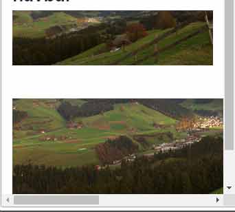
Difference between responsive and non-responsive images demo
To show the difference and how easy it is to create responsive images by using Bootstrap image classes; see the two images in the demo below. The first is made responsive by Bootstrap 4 class while the other is not assigned any class.
Resize the screen to look at how the top image adjusts for width and height while scroll bars appear for the second image.
So how is it done?
The Bootstrap has the .img-fluid class with max-width:100% and auto value for height that ensure images are scaled with parent element.
In the above demo, to make the image responsive, I simply used the .img-fluid class.
The markup for the above example:
<!DOCTYPE html>
<html>
<head>
<link rel="stylesheet" href="https://maxcdn.bootstrapcdn.com/bootstrap/4.0.0-beta.3/css/bootstrap.min.css" integrity="sha384-Zug+QiDoJOrZ5t4lssLdxGhVrurbmBWopoEl+M6BdEfwnCJZtKxi1KgxUyJq13dy" crossorigin="anonymous">

</head>
<body>
<div class="container">
<h3>Responsive Vs Non-responsive images</h3>
<img src="images/bs-resp-image.jpg" class="img-fluid" alt="Responsive image by Bootstrap"><br /><br /><br />
<img src="images/bs-resp-image.jpg" alt="A non responsive image">
</div>

</body>
</html>
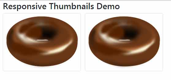
Making thumbnail images responsive
If you have a gallery of images with thumbnails then Bootstrap 4 has a specific class for this as well. Use the .img-thumbnail class that not only makes the thumbnail image responsive but also adds one pixel border radius around thumbnails.
See the following demo where I used four thumbnail images with .img-thumbnail class. Again, resize the screen to see how these adjust with the screen width and height along with round borders:
The markup:
<!DOCTYPE html>
<html>
<head>
<link rel="stylesheet" href="https://maxcdn.bootstrapcdn.com/bootstrap/4.0.0-beta.3/css/bootstrap.min.css" integrity="sha384-Zug+QiDoJOrZ5t4lssLdxGhVrurbmBWopoEl+M6BdEfwnCJZtKxi1KgxUyJq13dy" crossorigin="anonymous">

</head>
<body>
<div class="container">
<h3>Responsive Thumbnails Demo</h3>
<img src="images/donut.png" class="img-thumbnail" alt="Responsive Thumbnail image 1">   <img src="images/donut.png" class="img-thumbnail" alt="Responsive Thumbnail image 2"><br /><br /><br />
<img src="images/donut.png" class="img-thumbnail" alt="Responsive Thumbnail image 3">   <img src="images/donut.png" class="img-thumbnail" alt="Responsive Thumbnail image 4"><br /><br /><br />
</div>

</body>
</html>
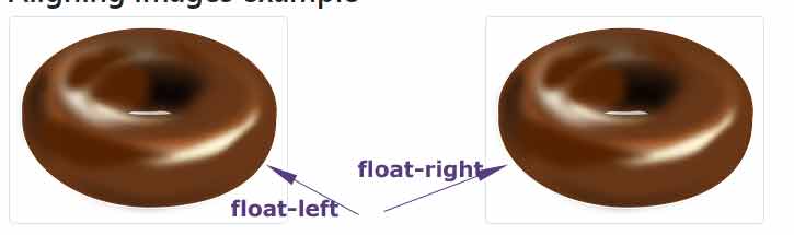
Aligning images towards left and right example
Use the .float-left and .float-left classes for aligning images towards the left and right of the parent element.
See this example where I used these classes in the <img> tag inside the parent div with container class.
In the wider screen, the images are aligned left and right. As the screen gets smaller (in smart phones), the images will adjust accordingly. Have a look:
See online demo and code
<div class="container">

<h3>Aligning images example</h3>

<img src="images/donut.png" class="img-thumbnail  float-left" alt="Left aligned image">

<img src="images/donut.png" class="img-thumbnail float-right" alt="Right aligned image">

</div>
Note: You may also use the text alignment classes e.g. .text-center for aligning images.
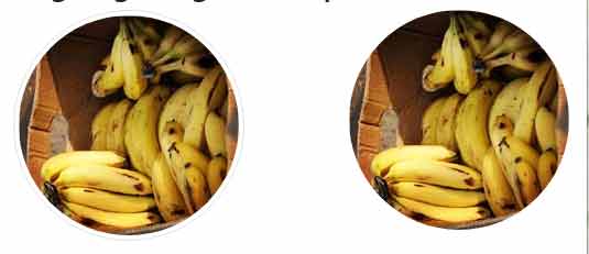
How to make images circular?
You may use the .rounded-circle class in the <img> tag for making images look rounded. If you add .img-thumbnail with .rounded-circle then the image is displayed with thin border line as well.
The example below shows making image circular with and without border lining:
The markup:
<div class="container">

<h3>Circle images example</h3>

<img src="images/banana-small.jpg" class="img-thumbnail  rounded-circle" alt="Left aligned circuular image">


<img src="images/banana-small.jpg" class="rounded-circle float-right" alt="Right aligned circular image">

</div>
You can see, the left image is displayed as a circle with a thin border line. The right image is only given the .rounded-circle class along with .float-right.
The rounded edges of thumbnails example
Make image edges rounded by using the .rounded class of Bootstrap 4. Unlike the rounded-circle, it makes only edges rounded:
The markup:
<div class="container">

<h3>Rounded edges image example</h3>

<img src="images/banana-small.jpg" class="rounded" alt="Rounded image">

</div>