
Bootstrap 4 has built-in classes for dealing with text alignments as the center, right, and left along with text-weight (bold), wrapping, overflow, transform, and italic text.
In this tutorial, I am going to show you live demos of aligning text center, right, and left. I will also show you how to use float helper classes along with text alignment classes for images.
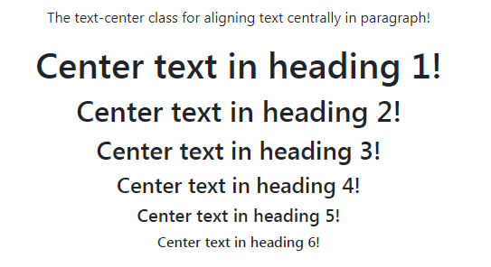
Bootstrap center text example
To make the text aligned center, use the .text-center class. In the following example, this class is applied in a paragraph and h1 to h6 headings to make the text aligned centered:
BS4 markup:
<!DOCTYPE html>
<html>
<head>
<link rel="stylesheet" href="https://maxcdn.bootstrapcdn.com/bootstrap/4.0.0-beta.3/css/bootstrap.min.css" integrity="sha384-Zug+QiDoJOrZ5t4lssLdxGhVrurbmBWopoEl+M6BdEfwnCJZtKxi1KgxUyJq13dy" crossorigin="anonymous">

</head>
<body>
<div class="container">
<h3>Demo of Text Alignment in Bootstrap 4</h3>
<p class="text-center">The text-center class for aligning text centrally in paragraph!</p>
<h1 class="text-center">Center text in heading 1!</h1>
<h2 class="text-center">Center text in heading 2!</h2>
<h3 class="text-center">Center text in heading 3!</h3>
<h4 class="text-center">Center text in heading 4!</h4>
<h5 class="text-center">Center text in heading 5!</h5>
<h6 class="text-center">Center text in heading 6!</h6>
</div>
</body>
</html>
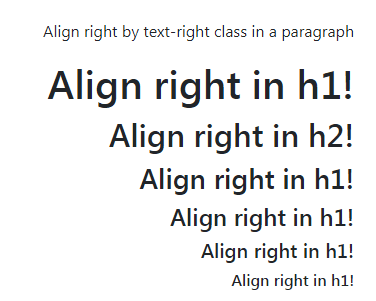
The example of aligning text right
To align text right, use the .text-right class in the element. Like the above example, I have applied the .text-right class in a paragraph and h1 to h6 headings for the demo:
The code for aligning right example
<p class="text-right">Align right by text-right class in a paragraph</p>

<h1 class="text-right">Align right in h1!</h1>

<h2 class="text-right">Align right in h2!</h2>

<h3 class="text-right">Align right in h1!</h3>

<h4 class="text-right">Align right in h1!</h4>

<h5 class="text-right">Align right in h1!</h5>

<h6 class="text-right">Align right in h1!</h6>
The example of using text-left class
Similarly, you may use the .text-left class for aligning the text towards the left. This is the default behavior applied in the text. For showing the difference, I have used paragraphs and headings with and without using the .text-left class.
Have a look at the output and code by visiting the demo page:
See online demo and code
The markup for using text-left class:
<p  class="text-left">Align left by text-left class in a paragraph</p>

<h1 class="text-left">Align left in h1!</h1>

<h2 class="text-left">Align left in h2!</h2>

<h3 class="text-left">Align left in h1!</h3>

<h4 class="text-left">Align left in h1!</h4>

<h5 class="text-left">Align left in h1!</h5>

<h6 class="text-left">Align left in h1!</h6>
Dealing text alignment with viewports
If you want to keep text aligned center or right for large or small devices specifically as per viewports then use the text-align property as explained below with examples.
For making text aligned centered in large devices only, use the text-lg-center class. To test this, copy the code from the example page in your editor and run the code. Now, look at the screen size >=1200px and in small size to see how it changes its alignment:
See online demo and code
The code:
<div class="container">

<h3>Demo of Text Alignment in Bootstrap 4</h3>

<p class="text-lg-center">Aligned center in large viewport and left in small viewports</p>

<h1 class="text-lg-center">h1: centered in large screen and left in med/smaller</h1>

<h4 class="text-lg-center">h4: centered in large screen and centered in med/smaller</h4>

<h5 class="text-lg-center">h5: centered in large screen and centered in med/smaller</h5>

<h6 class="text-lg-center">h6: centered in large screen and centered in med/smaller</h6>

</div>
Align center in medium and large viewports only
For making text aligned centered in medium and large viewports only while left aligned in small viewports, use the .text-md-center class in elements like <p>, <h1>, <h2> etc.
Have a look at the usage and try it with various screen sizes:
See online demo and code
The code:
<div class="container">

<h3>Demo of text-md-center class</h3>

<p class="text-md-center">Aligned center in medium/large viewports and left in small viewports</p>

<h1 class="text-md-center">h1: centered in medium/large screen and left in smaller</h1>

<h4 class="text-md-center">h4: centered in medium/large screen and centered in smaller</h4>

<h5 class="text-md-center">h5: centered in medium/large screen and centered in smaller</h5>

<h6 class="text-md-center">h6: centered in medium/large screen and centered in smaller</h6>

</div>
The text-sm-center class demo
For center alignment of text in all devices/viewports except the extra small (less than 576px) use the text-sm-center class. The demo code is shown below:
The code to try:
<div class="container">

<h3>Demo of text-sm-center class</h3>

<p class="text-sm-center">Align center in small/medium/large viewports except extra small</p>

<h1 class="text-sm-center">h1: centered in small/medium/large except extra small</h1>

<h4 class="text-sm-center">h4: centered in small/medium/large except extra small</h4>

<h5 class="text-sm-center">h5: centered in small/medium/large except extra small</h5>

<h6 class="text-sm-center">h6: centered in small/medium/large except extra small</h6>

</div>
Using text grid classes for right and left alignment
Similarly, Bootstrap 4 has built-in classes for aligning right or left (specifically) for various screens/viewports. The following classes are available:
For aligning right:
- text-sm-right
- text-md-right
- text-lg-right
For left alignment:
- text-sm-left
- text-md-left
- text-lg-left
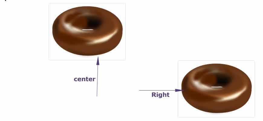
Aligning image centrally by text-center class
Not only you may use the .text-center or other text classes for aligning texts but images as well. In the following example, two images are aligned right and center by using the Bootstrap 4 text alignment classes as follows:
Online demo and code
The markup for right and center-aligned images by text classes:
<div class="text-center">

<img src="images/donut.png" class="img-thumbnail" alt="Center aligned image">

</div>

<div class="text-right">

<img src="images/donut.png" class="img-thumbnail" alt="Right aligned image">

</div>
Aligning images with float classes
You may also use helper float classes for aligning images to left or right. The following float classes are used in the example below:
- float-left
- float-right
See online demo and code
The example code:
<div class="container">

<h3>Aligning images example</h3>

<img src="images/donut.png" class="img-fluid float-left" alt="Left aligned">


<img src="images/donut.png" class="img-fluid float-right" alt="Right aligned">

</div>
See the output and get complete code from the demo page.