
In this tutorial, a jQuery and CSS based menu is shared that will be fixed on top as you scroll down the page.
That way, your main content may appear on the top with the menu bar afterward. As the user scrolls down the page and passes the main content, the menu bar will be fixed on top.
In the next section, you can see a live demo of the fixed menu which is based on jQuery and CSS.
Click on the link or image below for opening the demo of fixed menu. You may change the look and feel of the menu by accessing and changing the properties in the fixed-menu class (placed under style section of the demo).
In the jQuery code, the addClass and removeClass class methods are used for adding and removing this class on the scroll. These methods are associated with the <nav> tag in the web page. Have a look:
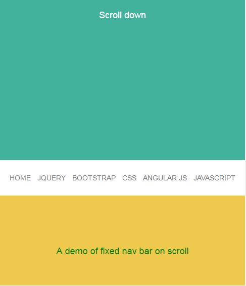
See online demo and code
The CSS used for the demo:
<style>

* {margin: 0; padding: 0;}


a {text-decoration: none;}


/* This class is added on scroll */

.fixed-menu {

                position: fixed;

                top: 0;

                height: 60px;

                z-index: 1;

    background-color: #B6DADA !important;

}


body {

                color: #fff;

                font-family: 'open-sans-bold', AvenirNext-Medium, sans-serif;

                font-size: 18px;

                text-align: center;

}


/* Navigation Settings */

nav {

                position: absolute;

                bottom: 0;

                width: 100%;

                height: 60px;

                background: #CFCFCF;

}


nav li {

                display: inline-block;

                padding: 24px 10px;

}


nav li a {

                color: #9398AE;

}


section {

                height: 100vh;

}


/* Content for demo */

#content1 {

                background: #60C4AF;

}


#content1 p {

                padding-top: 200px;

}


#content2 {

                background: #EBBD21;

}


#content2 p {

                padding-top: 100px;

    color:green;

}


#content3 {

                background: #E89766;

}


@media only screen and (max-width: 520px) {


                nav li {

                                padding: 24px 4px;

                }


                nav li a {

                                font-size: 14px;

                }


}

</style>
The markup:
<section id="content1">


                <p>Scroll down</p>


<nav>

 <ul>

   <li><a href="https://www.jquery-az.com/">Home</a></li>

                                                  <li><a href="https://www.jquery-az.com/jquery-tips/">jQuery</a></li>

                                                  <li><a href="https://www.jquery-az.com/bootstrap-tips-tutorials/">Bootstrap</a></li>

                                                  <li><a href="https://www.jquery-az.com/css-tutorials/">CSS</a></li>

                                                  <li><a href="https://www.jquery-az.com/angularjs-tutorials/">Angular JS</a></li>

              <li><a href="https://www.jquery-az.com/javascript-tutorials/">JavaScript</a></li>

 </ul>

</nav>


</section>


<section id="content2">

<p>A demo of fixed nav bar on scroll</p>

</section>


<section id="content3"></section>
A few lines of code of jQuery:
<script>

   $(document).ready(function(){

                   $(window).bind('scroll', function() {

                   var navHeight = $( window ).height() - 60;

                                                 if ($(window).scrollTop() > navHeight) {

                                                                 $('nav').addClass('fixed-menu');

                                                 }

                                                 else {

                                                                 $('nav').removeClass('fixed-menu');

                                                 }

                                });

                });

</script>
That’s is it!
As the demo page loads, the .nav CSS class will apply to the menu bar. You may change the properties there like the background color of the navigation bar, font weight, font- family, size, color of text etc. Find these classes under the style tag for changing the look of menu bar as web page loads:
nav, nav li, nav li a
As mentioned earlier, as the page is scrolled down and up, the addClass and removeClass methods are used to attach and remove the fixed-menu CSS class.
You may get the complete code in the demo page’s code section.
As such, this fixed solution is based on jQuery, so you have to include the jQuery library from CDN or host on your own.
No other dependency.
Simply use the style and adjust the markup according to the design or layout of your website!
Credit: atelierbram