
The Collapse component of Bootstrap 4 is useful when you have content to show/hide upon the user’s action.
For example, you have information on panels or accordion that has a heading and detailed text (maybe images as well). You may enable your visitors to expand the content by clicking the panel or heading and if not interested collapse the content.
Bootstrap 4 has built-in classes and JS plug-in that you may use to accomplish this task. In the next section, you can see live examples of using Bootstrap collapse related classes in action with complete code.
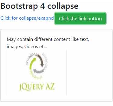
An example of collapse/expand the content via links in card (panels)
In the first example of using the collapse component, I have used two links that toggle the content visibility as you click on them. Have a look at the output and code and I will explain how it works:
Complete code:
<!DOCTYPE html>
<html>
<head>
<link rel="stylesheet" href="https://maxcdn.bootstrapcdn.com/bootstrap/4.0.0-beta.3/css/bootstrap.min.css" integrity="sha384-Zug+QiDoJOrZ5t4lssLdxGhVrurbmBWopoEl+M6BdEfwnCJZtKxi1KgxUyJq13dy" crossorigin="anonymous">

 <script src="https://ajax.googleapis.com/ajax/libs/jquery/3.2.1/jquery.min.js"></script>
<script src="https://cdnjs.cloudflare.com/ajax/libs/popper.js/1.12.6/umd/popper.min.js"></script>
  <script src="https://maxcdn.bootstrapcdn.com/bootstrap/4.0.0-beta.2/js/bootstrap.min.js"></script>

</head>
<body>
<div class="container">
<p>
  <a data-toggle="collapse" href="#democollapseLink" aria-expanded="false" aria-controls="democollapseLink">
    Click for collapse/exapnd
  </a>
  <a class="btn btn-success" data-toggle="collapse" href="#democollapseimg" role="button" aria-expanded="false" aria-controls="democollapseimg">
    Click the link button
  </a>
</p>
<div class="collapse" id="democollapseLink">
  <div class="card card-body">
    The demo of collapse/expand content by Bootstrap 4 collapse classes.
  </div>
</div>

<div class="collapse" id="democollapseimg">
  <div class="card card-body">
    May contain different content like text, images, videos etc. <br />
    <img src="https://www.jquery-az.com/wp-content/uploads/2017/10/logo.jpg" width="200" height="150">

  </div>
</div>

</div>
</body>
</html>
In the link tag, the data-toggle=”collapse” is the required data attribute. In the href attribute, I specified the democollapseLink, which is the ID of <div> tag where a card is created. So, this is linked to the card that collapses or expands as you click on the link.
The main <div> is given the .collapse class i.e.
<div class=”collapse” id=”democollapseLink”>
I will explain how this .collapse class works after the examples.
Similarly, the other link is assigned the button classes with role=”button” attribute. This expands or collapses its own card where I also used an image to show that you may use various types of content.
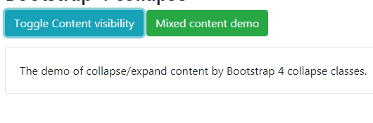
The following example shows using buttons to collapse and expand the Bootstrap card’s content. Like the link, the data-toggle=”collapse” attribute is required for buttons as well.
The code:
<div class="container">

<h3>Bootstrap 4 collapse</h3>

<p>

  <button class="btn btn-info" type="button" data-toggle="collapse" data-target="#democollapseBtn" aria-expanded="false" aria-controls="democollapseBtn">

    Toggle Content visibility

  </button>

  <button class="btn btn-success" type="button" data-toggle="collapse" data-target="#democollapseimg" aria-expanded="false" aria-controls="democollapseimg">

    Mixed content demo

  </button>

</p>

<div class="collapse" id="democollapseBtn">

  <div class="card card-body">

    The demo of collapse/expand content by Bootstrap 4 collapse classes.

  </div>

</div>


<div class="collapse" id="democollapseimg">

  <div class="card card-body">

    May contain different content like text, images, videos etc. <br />

    <img src="https://www.jquery-az.com/wp-content/uploads/2017/10/logo.jpg" width="200" height="150">


  </div>

</div>

</div>
How to show a specific content container at startup
If you desire to show the content of a collapsible container as the web page loads then use the .show class along with .collapse class.
See the following example where the second div content is displayed as the example page loads:
See online demo and code
I have only changed this line of code than the above example:
<div class=”collapse show” id=”democollapseimg”>
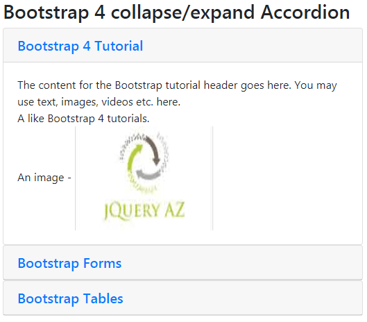
The example of collapse Bootstrap with accordion
In the following example, an accordion is created by using Bootstrap 4 classes. By default, the first panel’s content is visible by using the .show class in the <div> containing first accordion panel content.
See online demo and code
The code of collapsible accordion:
<div class="container">

<h3>Bootstrap 4 collapse/expand Accordion</h3>

<div id="demo-accordion-collapse" role="tablist">

  <div class="card">

    <div class="card-header" role="tab" id="accord1">

      <h5 class="mb-0">

        <a data-toggle="collapse" href="#collapse-pane-1" role="button" aria-expanded="true" aria-controls="collapse-pane-1">

          Bootstrap 4 Tutorial

        </a>

      </h5>

    </div>


    <div id="collapse-pane-1" class="collapse show" role="tabpanel" aria-labelledby="accord1" data-parent="#demo-accordion-collapse">

      <div class="card-body">

        The content for the Bootstrap tutorial header goes here. You may use text, images, videos etc. here.<br />

        A like Bootstrap  4 tutorials. <br />

        An image - <img src="https://www.jquery-az.com/wp-content/uploads/2017/10/logo.jpg" width="200" height="150">

      </div>

    </div>

  </div>

  <div class="card">

    <div class="card-header" role="tab" id="accord2">

      <h5 class="mb-0">

        <a class="collapsed" data-toggle="collapse" href="#collapse-pane-2" role="button" aria-expanded="false" aria-controls="collapse-pane-2">

          Bootstrap Forms

        </a>

      </h5>

    </div>

    <div id="collapse-pane-2" class="collapse" role="tabpanel" aria-labelledby="accord2" data-parent="#demo-accordion-collapse">

      <div class="card-body">

        The content for form pane

      </div>

    </div>

  </div>

  <div class="card">

    <div class="card-header" role="tab" id="accord3">

      <h5 class="mb-0">

        <a class="collapsed" data-toggle="collapse" href="#collapse-pane-3" role="button" aria-expanded="false" aria-controls="collapse-pane-3">

          Bootstrap Tables

        </a>

      </h5>

    </div>

    <div id="collapse-pane-3" class="collapse" role="tabpanel" aria-labelledby="accord3" data-parent="#demo-accordion-collapse">

      <div class="card-body">

        The Bootstrap has classes for creating and styling the tables beautifully.

      </div>

    </div>

  </div>

</div>


</div>
In the code, the data-parent=”#demo-accordion-collapse” attribute is used. This ensures that as one accordion panel is opened, all others are closed. If you want to keep all panes open unless the user closes it by clicking the header then simply remove that attribute.
For example, in the above demo code, if you just remove the data-parent attribute and you open the second and third panels, the first remains open.
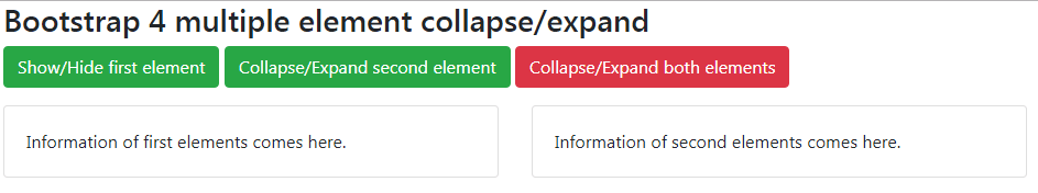
Collapse/Expand multiple elements example
You may also show or hide multiple elements upon clicking a link or button.
The markup:
<div class="container">

<h3>Bootstrap 4 multiple element collapse/expand</h3>

<p>

  <a class="btn btn-success" data-toggle="collapse" href="#Collapse-demo-multipl-1" role="button" aria-expanded="false" aria-controls="Collapse-demo-multipl-1">Show/Hide first element</a>

  <button class="btn btn-success" type="button" data-toggle="collapse" data-target="#Collapse-demo-multipl-2" aria-expanded="false" aria-controls="Collapse-demo-multipl-1">Collapse/Expand second element</button>

  <button class="btn btn-danger" type="button" data-toggle="collapse" data-target=".multi-collapse-example" aria-expanded="false" aria-controls="Collapse-demo-multipl-1 Collapse-demo-multipl-1">Collapse/Expand both elements</button>

</p>

<div class="row">

  <div class="col">

    <div class="collapse multi-collapse-example" id="Collapse-demo-multipl-1">

      <div class="card card-body">

        Information of first elements comes here.


      </div>

    </div>

  </div>

  <div class="col">

    <div class="collapse multi-collapse-example" id="Collapse-demo-multipl-2">

      <div class="card card-body">

        Information of second elements comes here.

      </div>

    </div>

  </div>

</div>

</div>
You see, the second button with “Collapse/Expand both elements” used the data-target, and its value is assigned as a class to both main div containing .collapse class. That is:
<div class=”collapse multi-collapse-example” id=”Collapse-demo-multipl-1″>
And
<div class=”collapse multi-collapse-example” id=”Collapse-demo-multipl-2″>
How does Bootstrap 4 collapse work?
As you press a button or link, the .collapse class hides the content of the element. The .collapsing is assigned during transitions while .collapse .show shows the content.