
The margin property adds spacing between the elements while CSS padding between the content and container boundary.
Bootstrap 4 has built-in utility responsive classes for margin and padding that you may use easily in various elements to manage the spacing.
A few quick examples
Syntax of using shorthand margin and padding
You may use the padding and margin shorthand Bootstrap 4 classes as follows:
For extra small devices i.e. xs:
{property}{sides}-{size}
For other devices/viewports (small, medium, large and extra large):
{property}{sides}-{breakpoint}-{size}
Where:
property = m for margin and p for padding
Following are sides shorthand meanings:
- l = defines the left-margin or left-padding
- r = defines the right-margin or right-padding
- t = defines the top-margin or top-padding
- b = defines the bottom-margin or right-padding
- x = For setting left and right padding and margins by the single call
- y = For setting top and bottom margins
- blank = margin and padding for all sides
The size can be from value 0 to 5 and auto. I will show you examples for seeing the difference.
The breakpoint = sm, md, lg, and xl.
Combining all the above, the left padding complete code can be (for example):
For left padding in extra small devices:
pl-2
or for medium to extra large:
pl-md-2
Now, let me show you the usage of these padding and margin shorthand utility classes in action in Bootstrap 4.
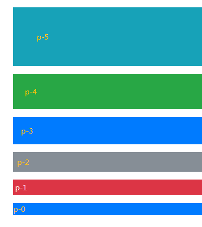
The example of Bootstrap padding classes for all directions
In this example, the padding classes are used in paragraphs as follows:
- p-5
- p-4
- p-3
- p-2
- p-1
- p-0
As such no breakpoint is used, so this applies to viewports from extra small to extra large. That means, if you resize the example page, the padding maintains for all viewports. Have a look:
Online demo and code
The markup:
<div class="container">

<h3 class="p-3 text-primary">The demo of padding classes</h3>

<p class="p-5 bg-info text-warning">p-5</p>

<p class="p-4 bg-success text-warning">p-4</p>

<p class="p-3 bg-primary text-warning">p-3</p>

<p class="p-2 bg-secondary text-warning">p-2</p>

<p class="p-1 bg-danger text-white">p-1</p>

<p class="p-0 bg-primary text-warning">p-0</p>


</div>
You can see, the p-0 is adjacent to the container div element and the difference of padding in all directions for different utility classes.
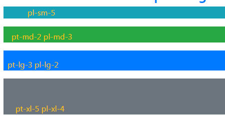
Using the left and top padding classes example
In the following example, four paragraphs are given different individual padding classes. The first applies from the small devices by using pl-sm-5 class. That is, only the left padding will apply.
In the second <p> tag, the pt-md-2 and pl-md-3 classes are used. That means from medium viewports, the top padding will be two points and left padding is 3.
For the third paragraph, pt-lg-3 and pl-lg-2 class are applied. By .lg, it means from large devices/viewports. The left padding is 2 and top padding is 3.
Finally, the last paragraph is given the padding classes for extra large viewports. The classes are pt-xl-5 and pl-xl-4.
For all above paragraphs, for extra small viewports, the padding remains zero.
COmplete code:
<!DOCTYPE html>
<html>
<head>
<link rel="stylesheet" href="https://maxcdn.bootstrapcdn.com/bootstrap/4.0.0/css/bootstrap.min.css" integrity="sha384-Gn5384xqQ1aoWXA+058RXPxPg6fy4IWvTNh0E263XmFcJlSAwiGgFAW/dAiS6JXm" crossorigin="anonymous">

</head>
<body>

<div class="container">
<h3 class="text-primary">The demo of individual padding classes</h3>
<p class="pl-sm-5 bg-info text-warning">pl-sm-5</p>
<p class="pt-md-2 pl-md-3 bg-success text-warning">pt-md-2 pl-md-3</p>
<p class="pt-lg-3 pl-lg-2 bg-primary text-warning">pt-lg-3 pl-lg-2</p>
<p class="pt-xl-5 pl-xl-4 bg-secondary text-warning">pt-xl-5 pl-xl-4</p>

</div>

</body>
</html>
Similarly, you may use the bottom and right padding individually in different elements. For example:
Bottom padding:
- pb-sm-5
- pb-md-4
- pb-lg-2
Right padding:
- pr-sm-1
- pr-md-3
- etc.
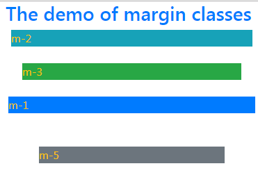
A demo of using margin classes for all directions
In the same way, you may use the Bootstrap margin utility classes for adding the space between elements. Just like padding, you may use a single class for all directions or individual classes for each direction.
The following example applies padding in all directions in four paragraphs for all viewports:
The code:
<!DOCTYPE html>
<html>
<head>
<link rel="stylesheet" href="https://maxcdn.bootstrapcdn.com/bootstrap/4.0.0/css/bootstrap.min.css" integrity="sha384-Gn5384xqQ1aoWXA+058RXPxPg6fy4IWvTNh0E263XmFcJlSAwiGgFAW/dAiS6JXm" crossorigin="anonymous">

</head>
<body>

<div class="container">
<h3 class="text-primary">The demo of margin classes</h3>
<p class="m-2 bg-info text-warning">m-2 </p>
<p class="m-4 bg-success text-warning">m-3</p>
<p class="m-1 bg-primary text-warning">m-1</p>
<p class="m-5 bg-secondary text-warning">m-5</p>

</div>

</body>
</html>
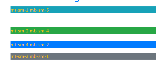
Applying margin top and bottom example
The example below shows applying different margins on top and bottom between the elements. For the top margin, following classes are used:
- mt-sm-3
- mt-sm-2
- mt-sm-4
for the bottom, these classes are used:
- mb-sm-5
- mb-sm-4
- mb-sm-2
- mb-sm-1
As .sm breakpoint is used in all these classes, so it applies to small to extra large devices. Have a look:
The HTML code:
<div class="container">

<h3 class="text-primary">The demo of margin classes</h3>

<p class="mt-sm-3 mb-sm-5 bg-info text-warning">mt-sm-1 mb-sm-5 </p>

<p class="mt-sm-2 mb-sm-4 bg-success text-warning">mt-sm-2 mb-sm-4</p>

<p class="mt-sm-4 mb-sm-2 bg-primary text-warning">mt-sm-4 mb-sm-2</p>

<p class="mt-sm-3 mb-sm-1 bg-secondary text-warning">mt-sm-3 mb-sm-1</p>


</div>
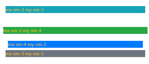
Using x and y for margins
This example shows using the x and y for the margin sides. Just to remind the ‘x’ side will set the margin for left and right whereas the ‘y’ side sets the margins for top and bottom. Use these if you require setting the same margins for respective sides. See the usage below:
The code:
<div class="container">

<h3 class="text-primary">The demo of margin classes</h3>

<p class="mx-sm-3 my-sm-5 bg-info text-warning">mx-sm-3 my-sm-5</p>

<p class="mx-sm-2 my-sm-4 bg-success text-warning">mx-sm-2 my-sm-4</p>

<p class="mx-sm-4 my-sm-2 bg-primary text-warning">mx-sm-4 my-sm-2</p>

<p class="mx-sm-3 my-sm-1 bg-secondary text-warning">mx-sm-3 my-sm-1</p>


</div>