

In this tutorial, I am going to show you examples of built-in Bootstrap color classes for various elements. Bootstrap has specific classes for coloring the text, links, buttons, etc.
text example background links navbar
Generally, the class names use the context that may reflect the purpose of the text or some other element. For example, by using the red colored text or button, the class name contains the word “–danger” reflecting some dangerous or critical information or action. Similarly, -warning is the orange color for the context where you are alarming a visitor for a certain action.
In the same way, Bootstrap 4 has the standard pattern for using class names e.g. –success, -primary, -secondary, -light, -dark, -warning etc.
These names are preceded by element’s names or shortcodes. For example, text- for text, btn- for buttons, bg- for backgrounds.
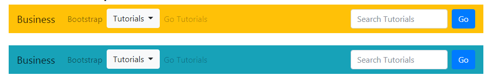
In the last section, you can also see an example of setting navbar colors.
Bootstrap 4 classes for coloring text
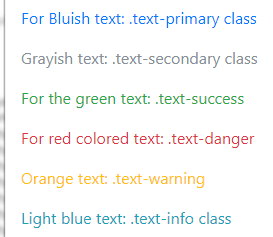
First, have a look at the example of all built-in classes for coloring the simple text in Bootstrap 4.
Complete code for this example:
<!DOCTYPE html>
<html>
<head>
<link rel="stylesheet" href="https://maxcdn.bootstrapcdn.com/bootstrap/4.0.0-beta.3/css/bootstrap.min.css" integrity="sha384-Zug+QiDoJOrZ5t4lssLdxGhVrurbmBWopoEl+M6BdEfwnCJZtKxi1KgxUyJq13dy" crossorigin="anonymous">

</head>
<body>

<div class="container">
<h3 class="text-success">The text color classes demo</h3>
<p class="text-primary">For Bluish text: .text-primary class</p>
<p class="text-secondary">Grayish text: .text-secondary class</p>
<p class="text-success">For the green text: .text-success</p>
<p class="text-danger">For red colored text: .text-danger</p>
<p class="text-warning">Orange text: .text-warning</p>
<p class="text-info">Light blue text: .text-info class</p>
<p class="text-light bg-dark">Light colored text with dark background .text-light</p>
<p class="text-dark">dark text: .text-dark</p>
<p class="text-muted">.text-muted</p>
<p class="text-white bg-dark">White colored text: .text-white</p>
</div>

</body>
</html>
The following classes for coloring the text are available:
- text-dark /*Blackish*/
- text-white
- text-light
- text-primary /*The standard blue color*/
- text-secondary /*Grayish color*/
- text-warning /*Orange color*/
- text-success /* Green Color */
- text-danger /*Red color*/
- text-info /*Light blue color*/
- text-muted
Using background color contextual classes example
Similarly, you may use the background color standard classes for setting the background of various elements.
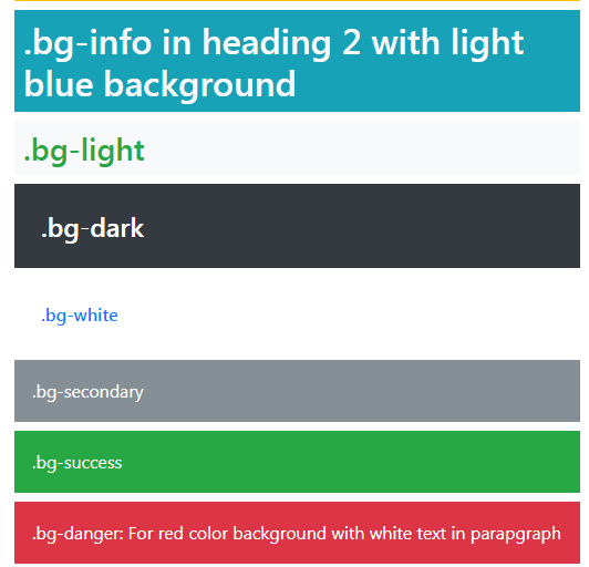
The following example shows using the contextual background color classes in paragraphs, div, and different headings (h1-h6) elements. Along with background color, contextual text color classes are also used.
The markup:
<p class="p-3 mb-2 bg-primary text-warning">.bg-primary for blue background in a paragraph</p>

<h1 class="p-2  bg-warning text-success">.bg-warning for orange background in H1 heading</h1>

<h2 class="p-2 bg-info text-light">.bg-info in heading 2 with light blue background</h2>

<h3 class="p-2 bg-light text-success">.bg-light</h3>

<h4 class="p-4 bg-dark text-white">.bg-dark</h4>

<h6 class="p-4 bg-white text-primary">.bg-white</h6>

<p class="p-3 mb-2 text-white bg-secondary">.bg-secondary</p>

<div class="p-3 mb-2 bg-success text-light">.bg-success</div>

<p class="p-3 mb-2 bg-danger text-white">.bg-danger: For red color background with white text in paragraph</p>
Until now, you can see the pattern of coloring in Bootstrap. We have seen that the text can be colored by using contextual names by using text-[context class]. Similarly, replace the “text” by “bg” for setting the background colors.
The buttons can also be colored in the same way in Bootstrap. Just replace the “text” or “bg” in the above classes with “btn” and the same standard colors will be applied to buttons.
The following button classes are available in Bootstrap version 4:
- btn-primary
- btn-secondary
- btn-success
- btn-info
- btn-light
- btn-dark
- btn-danger
- btn-warning
See a demo online by clicking the link below for normal sized buttons:
See online demo and code
Learn more about the Bootstrap 4 buttons with 15 examples.
Coloring the list items example
Just like the text, backgrounds, and buttons standard built-in classes, the pattern that can be used for coloring the list items is similar.
Use the contextual Bootstrap 4 classes for creating lists with colors as follows:
- list-group-item-primary
- list-group-item-danger
- list-group-item-success
- list-group-item-info
- list-group-item-secondary
- list-group-item-warning
- list-group-item-dark
- list-group-item-light
See the example of using these classes:
Online demo and code
You can see the detailed tutorial of Bootstrap list here: Bootstrap 4 lists
Coloring the links example
If you want to color the links by using Bootstrap classes then simply assign the contextual text classes to the <a> tags. For example:
<a href=”https://www.jquery-az.com/” class=”text-primary”>Blue color link</a>
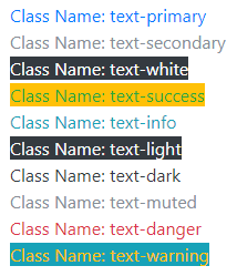
See an example where I used all available text classes for creating links with colors:
The markup:
<h3>Bootstrap 4 link colors</h3>

<div><a href="https://www.jquery-az.com" class="text-primary">Class Name: text-primary</a></div>

<div><a href="https://www.jquery-az.com" class="text-secondary">Class Name: text-secondary</a></div>

<div><a href="https://www.jquery-az.com" class="text-white bg-dark">Class Name: text-white</a></div>

<div><a href="https://www.jquery-az.com" class="text-success bg-warning">Class Name: text-success</a></div>

<div><a href="https://www.jquery-az.com" class="text-info">Class Name: text-info</a></div>

<div><a href="https://www.jquery-az.com" class="text-light bg-dark">Class Name: text-light</a></div>

<div><a href="https://www.jquery-az.com" class="text-dark">Class Name: text-dark</a></div>

<div><a href="https://www.jquery-az.com" class="text-muted">Class Name: text-muted</a></div>

<div><a href="https://www.jquery-az.com" class="text-danger">Class Name: text-danger</a></div>

<div><a href="https://www.jquery-az.com" class="text-warning bg-info">Class Name: text-warning</a></div>
You can see, in a few links, the background color classes are also used.
Using text and background colors in Bootstrap 4 table example
Though, Bootstrap 4 has built-in contextual classes for coloring the table headers (thead-dark or thead-light) and table rows by using contextual classes etc.
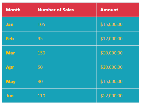
You may also use the background and text color classes in the table as well. In the following example, the background color is set at the table level that applies to the whole table. The color of the text is also set by using text contextual class.
Besides, the table header is given a separate background and text color. Have a look:
Online demo and code
The markup:
<table class="table table-hover bg-info text-warning table-bordered">

  <thead class="bg-danger text-white">

    <tr>

      <th>Month</th>

      <th>Number of Sales</th>

      <th>Amount</th>

    </tr>

  </thead>

  <tbody>

    <tr>

      <th scope="row">Jan</th>

      <td >105</td>

      <td>$15,000.00</td>

    </tr>

    <tr>

      <th scope="row">Feb</th>

      <td>95</td>

      <td>$12,000.00</td>

    </tr>

    <tr>

      <th scope="row">Mar</th>

      <td>150</td>

      <td>$20,000.00</td>

    </tr>

    <tr>

      <th scope="row">Apr</th>

      <td>50</td>

      <td>$30,000.00</td>

    </tr>

    <tr>

      <th scope="row">May</th>

      <td>80</td>

      <td>$15,000.00</td>

    </tr>

    <tr>

      <th scope="row">Jun</th>

      <td>110</td>

      <td>$22,000.00</td>

    </tr>

  </tbody>

</table>
For learning more about the table’s contextual classes and other features, visit the Bootstrap 4 tables tutorial.
You may use the background color classes for setting the background of navbar in Bootstrap 4. For that, simply use the background class in the <nav> tag containing your navigation bar. For example:
<nav class=”navbar navbar-expand-lg navbar-light bg-warning”>
The code:
<!DOCTYPE html>
<html>
<head>
<link rel="stylesheet" href="https://maxcdn.bootstrapcdn.com/bootstrap/4.0.0-beta.3/css/bootstrap.min.css" integrity="sha384-Zug+QiDoJOrZ5t4lssLdxGhVrurbmBWopoEl+M6BdEfwnCJZtKxi1KgxUyJq13dy" crossorigin="anonymous">

  <script src="https://ajax.googleapis.com/ajax/libs/jquery/3.2.1/jquery.min.js"></script>
  <script src="https://cdnjs.cloudflare.com/ajax/libs/popper.js/1.12.6/umd/popper.min.js"></script>
  <script src="https://maxcdn.bootstrapcdn.com/bootstrap/4.0.0-beta.3/js/bootstrap.min.js"></script>
</head>
<body>
<div class="container">
<h3>A demo of dropdown in navbar</h3>
<nav class="navbar navbar-expand-lg navbar-light bg-warning">
  <a class="navbar-brand" href="#">Business</a>
  <button class="navbar-toggler" type="button" data-toggle="collapse" data-target="#navbarSupportedContent" aria-controls="navbarSupportedContent" aria-expanded="false" aria-label="Toggle navigation">
    <span class="navbar-toggler-icon"></span>
  </button>

  <div class="collapse navbar-collapse" id="navbarSupportedContent">
    <ul class="navbar-nav mr-auto">
      <li class="nav-item">
        <a class="nav-link" href="https://www.jquery-az.com/bootstrap-tips-tutorials/">Bootstrap</a>
      </li>
      <li class="nav-item dropdown">
  <button class="btn btn-light dropdown-toggle" type="button" id="btnDropdownDemo" data-toggle="dropdown" aria-haspopup="true" aria-expanded="false">
    Tutorials
  </button>
        <div class="dropdown-menu" aria-labelledby="navbarDropdown">
          <a class="dropdown-item" href="https://www.jquery-az.com/jquery-tips/">jQuery</a>
          <a class="dropdown-item" href="https://www.jquery-az.com/html-tutorials/">HTML</a>
          <a class="dropdown-item" href="#">CSS</a>
          <div class="dropdown-divider"></div>
          <a class="dropdown-item" href="https://www.jquery-az.com/python-tutorials/">Python</a>
          <a class="dropdown-item" href="https://www.jquery-az.com/java-tutorials/">Java</a>
          <div class="dropdown-divider"></div>
          <a class="dropdown-item" href="https://www.jquery-az.com/php-tutorials/">PHP</a>
          <div class="dropdown-divider"></div>
          <a class="dropdown-item" href="https://www.jquery-az.com/vba-excel-tutorials/">Excel</a>

        </div>
      </li>
      <li class="nav-item">
        <a class="nav-link disabled" href="#">Go Tutorials</a>
      </li>
    </ul>
    <form class="form-inline my-2 my-lg-0">
      <input class="form-control mr-sm-2" type="search" placeholder="Search Tutorials" aria-label="Search">
      <button class="btn btn-primary my-2 my-sm-0" type="submit">Go</button>
    </form>
  </div>
</nav>
<br />
<nav class="navbar navbar-expand-lg navbar-light bg-info">
  <a class="navbar-brand" href="#">Business</a>
  <button class="navbar-toggler" type="button" data-toggle="collapse" data-target="#navbarSupportedContent" aria-controls="navbarSupportedContent" aria-expanded="false" aria-label="Toggle navigation">
    <span class="navbar-toggler-icon"></span>
  </button>

  <div class="collapse navbar-collapse" id="navbarSupportedContent">
    <ul class="navbar-nav mr-auto">
      <li class="nav-item">
        <a class="nav-link" href="https://www.jquery-az.com/bootstrap-tips-tutorials/">Bootstrap</a>
      </li>
      <li class="nav-item dropdown">
  <button class="btn btn-light dropdown-toggle" type="button" id="btnDropdownDemo" data-toggle="dropdown" aria-haspopup="true" aria-expanded="false">
    Tutorials
  </button>
        <div class="dropdown-menu" aria-labelledby="navbarDropdown">
          <a class="dropdown-item" href="https://www.jquery-az.com/jquery-tips/">jQuery</a>
          <a class="dropdown-item" href="https://www.jquery-az.com/html-tutorials/">HTML</a>
          <a class="dropdown-item" href="#">CSS</a>
          <div class="dropdown-divider"></div>
          <a class="dropdown-item" href="https://www.jquery-az.com/python-tutorials/">Python</a>
          <a class="dropdown-item" href="https://www.jquery-az.com/java-tutorials/">Java</a>
          <div class="dropdown-divider"></div>
          <a class="dropdown-item" href="https://www.jquery-az.com/php-tutorials/">PHP</a>
          <div class="dropdown-divider"></div>
          <a class="dropdown-item" href="https://www.jquery-az.com/vba-excel-tutorials/">Excel</a>

        </div>
      </li>
      <li class="nav-item">
        <a class="nav-link disabled" href="#">Go Tutorials</a>
      </li>
    </ul>
    <form class="form-inline my-2 my-lg-0">
      <input class="form-control mr-sm-2" type="search" placeholder="Search Tutorials" aria-label="Search">
      <button class="btn btn-primary my-2 my-sm-0" type="submit">Go</button>
    </form>
  </div>
</nav>


</div>

</body>
</html>
Just copy/paste the code into your editor to see the full view of navbars.