
You may add a cross icon in different Bootstrap 4 components like modals and alerts to allow visitors to dismiss the content or close the component.
The close button can be added by using the simple markup with CSS class. The main container for the close button is the <button> tag with .close class.
Within the button, a span tag is added with cross icon code i.e. ×
Have a look at the examples of simply creating a close button along with different Bootstrap 4 components.
The following example simply displays the cross button without any action by using this markup:
The markup:
<!DOCTYPE html>
<html>
<head>
<link rel="stylesheet" href="https://maxcdn.bootstrapcdn.com/bootstrap/4.0.0/css/bootstrap.min.css" integrity="sha384-Gn5384xqQ1aoWXA+058RXPxPg6fy4IWvTNh0E263XmFcJlSAwiGgFAW/dAiS6JXm" crossorigin="anonymous">
</head>
<body>

<div class="container">
<div class="container">
<h3>A Demo of cross button</h3>
<button type="button" class="close" aria-label="Close">
  <span aria-hidden="true">×</span>
</button>

</div>

</div>

</body>
</html>
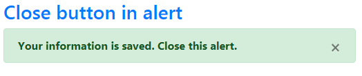
This example shows using this cross button in a Bootstrap 4 alert. This cross button is for display only; so no action is done as you press it.
The markup:
<div class="container"> <h3 class="text-primary">Close button in alert</h3> <div class="alert alert-success" role="alert"> <strong>Your information is saved. Close this alert. <button type="button" class="close" data-dismiss="alert" aria-label="Close"> <span aria-hidden="true">×</span> </button> </div>
Closing the alert example
Now, add some action as the cross button is pressed. See the example below where I added jQuery library along with Bootstrap JS file.
As you press the close button towards the right side of the alert, it will close the alert:
The code:
<!DOCTYPE html>
<html>
<head>
<link rel="stylesheet" href="https://maxcdn.bootstrapcdn.com/bootstrap/4.0.0/css/bootstrap.min.css" integrity="sha384-Gn5384xqQ1aoWXA+058RXPxPg6fy4IWvTNh0E263XmFcJlSAwiGgFAW/dAiS6JXm" crossorigin="anonymous">
<script src="https://code.jquery.com/jquery-3.2.1.slim.min.js" integrity="sha384-KJ3o2DKtIkvYIK3UENzmM7KCkRr/rE9/Qpg6aAZGJwFDMVNA/GpGFF93hXpG5KkN" crossorigin="anonymous"></script>
<script src="https://cdnjs.cloudflare.com/ajax/libs/popper.js/1.12.9/umd/popper.min.js" integrity="sha384-ApNbgh9B+Y1QKtv3Rn7W3mgPxhU9K/ScQsAP7hUibX39j7fakFPskvXusvfa0b4Q" crossorigin="anonymous"></script>
<script src="https://maxcdn.bootstrapcdn.com/bootstrap/4.0.0/js/bootstrap.min.js" integrity="sha384-JZR6Spejh4U02d8jOt6vLEHfe/JQGiRRSQQxSfFWpi1MquVdAyjUar5+76PVCmYl" crossorigin="anonymous"></script>

</head>
<body>

<div class="container">
<h3 class="text-primary">Close button in alert</h3>
<div class="alert alert-danger" role="alert">
  <strong>The record is deleted permanently. Dismiss!.
  <button type="button" class="close" data-dismiss="alert" aria-label="Close">
    <span aria-hidden="true">×</span>
  </button>
</div>

</body>
</html>
In this example, a modal with the close button is created using the Bootstrap 4 framework. The close button markup is placed after the modal-title in the modal-content div.
So, the cross button displays towards the top right bar of the modal window. Have a look at this online example and launch the modal by pressing the button:
The markup of the modal with the close button:
<div class="modal fade" id="Modal-simple-demo" tabindex="-1" role="dialog" aria-labelledby="Modal-simple-demo-label" aria-hidden="true"> <div class="modal-dialog" role="document"> <div class="modal-content"> <div class="modal-header"> <h5 class="modal-title" id="Modal-simple-demo-label">Heading for the Modal</h5> <button type="button" class="close" data-dismiss="modal" aria-label="Close"> <span aria-hidden="true">×</span> </button> </div> <div class="modal-body"> The modal can closed by cross button. <br /> </div> <div class="modal-footer"> <button type="button" class="btn btn-danger" data-dismiss="modal">Close</button> <button type="button" class="btn btn-success">Yes</button> <button type="button" class="btn btn-warning">No</button> </div> </div> </div> </div>
Get the complete code from the example page.