Creating HTML tables with style by using Bulma CSS framework is pretty simple. Not only you may use the built-in table classes for a table with basic style, stripped table, hovering effect etc. but you may also use the Sass variables for allowing easy customization like table coloring, table background color, header background color and many more.
In the following section, I will show you how easy the process of creating and styling the table with customization as using the Bulma CSS.
An example of a simple table in Bulma
You just need to assign the .table class in the main table tag for applying the basic styling by Bulma for HTML tables.
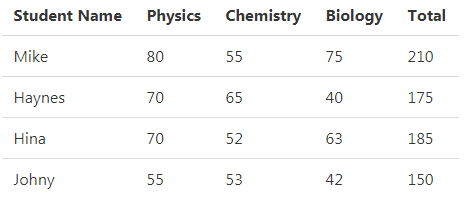
See online demo and code
<!DOCTYPE html>

<html>

<head>

<title>A Demo of Basic Bulma Table</title>

<link rel="stylesheet" href="https://cdn.jsdelivr.net/npm/bulma@0.8.0/css/bulma.min.css">

</head>

<body>

<div class="container">

<table class="table">

  <tr class="th">

      <th>Student Name</th>

      <th>Physics</th>

      <th>Chemistry</th>

      <th>Biology</th>

      <th>Total</th>

  </tr>

  <tr>

      <td>Mike</td>

      <td>80</td>

      <td>55</td>

      <td>75</td>

      <td>210</td>

  </tr>

  <tr>

      <td>Haynes</td>

      <td>70</td>

      <td>65</td>

      <td>40</td>

      <td>175</td>

  <tr>

      <td>Hina</td>

      <td>70</td>

      <td>52</td>

      <td>63</td>

      <td>185</td>

  </tr>

  <tr>

      <td>Johny</td>

      <td>55</td>

      <td>53</td>

      <td>42</td>

      <td>150</td>

  </tr>

</table>

</div>


</body>

</html>
The example of a stripped table
The stripped table is the one where one row is different from the other like the stripes of a zebra. The stripped table is easy to create by simply adding the is-stripped class along with the main .table class as shown in the example below:
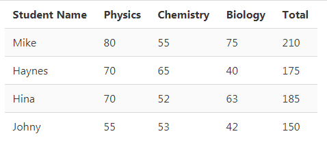
See online demo and code
<table class=”table is-striped”>
The rest of the code is the same as in the above demo.
How to create a table with hovered rows?
In the above two examples, the rows remain the same as you hover the mouse of the rows. To add the hovering effect in each row, you may add the .is-hoverable class as follows:
See online demo and code
<table class=”table is-striped is-hoverable”>
Creating full width table example
For creating the full available width table, simply use the .is-fullwidth class:

See online demo and code
<table class=”table is-striped is-fullwidth”>
The full width table is fully responsive and adjusts the available screen width accordingly.
An example of narrow table
Similarly, you may create a narrow table by using the is-narrow class as shown below:
See online demo and code
<table class=”table is-striped is-narrow”>
How to distinguish a row example
Sometimes, you need to make one or more rows prominent or distinct from others. For that, you may simply add a modifier is-selected on those rows. The example below shows making one row distinctive than others:
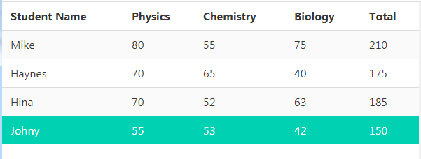
See online demo and code
<!DOCTYPE html>

<html>

<head>

<title>A Demo of Distinct row in a table</title>

<link rel="stylesheet" href="https://cdn.jsdelivr.net/npm/bulma@0.8.0/css/bulma.min.css">

</head>

<body>

<div class="container">

<table class="table is-striped is-fullwidth">

  <tr class="th">

      <th>Student Name</th>

      <th>Physics</th>

      <th>Chemistry</th>

      <th>Biology</th>

      <th>Total</th>

  </tr>

  <tr>

      <td>Mike</td>

      <td>80</td>

      <td>55</td>

      <td>75</td>

      <td>210</td>

  </tr>

  <tr>

      <td>Haynes</td>

      <td>70</td>

      <td>65</td>

      <td>40</td>

      <td>175</td>

  <tr>

      <td>Hina</td>

      <td>70</td>

      <td>52</td>

      <td>63</td>

      <td>185</td>

  </tr>

  <tr class="is-selected">

      <td>Johny</td>

      <td>55</td>

      <td>53</td>

      <td>42</td>

      <td>150</td>

  </tr>

</table>

</div>


</body>

</html>
You can see the last row is green.
A bordered table example
Add the .is-bordered modifier for a table with borders. The example below is a bordered table with the first row selected. Also, it will uses the full available width:
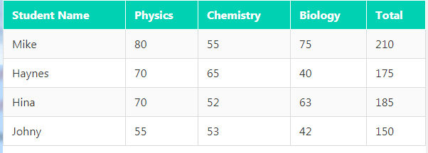
See online demo and code
The code for table and first rows tags:
<table class="table is-bordered is-striped is-fullwidth">

  <tr class="th is-selected">

      <th>Student Name</th>

      <th>Physics</th>

      <th>Chemistry</th>

      <th>Biology</th>

      <th>Total</th>

  </tr>
See the full code and output in the demo page.
Creating the scrollable table example
In certain cases, your table may contain lots of cells in a row that can’t be accommodated in the available width. In that case, you may create a scrollable table by using the .table-container class in the container with the table:
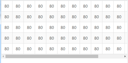
See online demo and code
How to customize tables as using Bulma?
For customizing the table element e.g. changing the border default color, table background, hovering color etc. you may use the variables as given in the Bulma documentation.
For that, you need to have an idea how Sass works. A few variables include:
- $table-background-color
- $table-color
- $table-cell-heading-color
- $table-head-background-color
- $table-row-hover-background-color
And many more.
