
Tags are phrases or words that describe the content of your website. The tags can be used with any type of content; text, images, videos, etc.
The Bulma framework makes it quite easy for creating tags with various features. For example, you may create simple tags anywhere on the web page. A tag can be created with the cross close button.
The examples below show creating simple and other tags.
How to create a basic tag in Bulma?
A tag can be created by using the “tag” class attached to an element like a span HTML tag. By default, a Bulma tag is 1.5 rem high label as shown in the example below:
See online demo and code
<!DOCTYPE html>

<html>

<head>

<link rel="stylesheet" href="https://cdn.jsdelivr.net/npm/bulma@0.8.0/css/bulma.min.css">


</head>

<body>

<div class="container">

<span class="tag">

  Bulma Tags

</span>

</div>


</body>

</html>
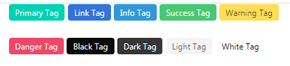
As with other elements, you may customize the tag color as required by using the Sass variables. However, Bulma has plenty of available colors that you may apply by using the contextual class.
For example, in order to create a red color tag, just add the is-danger class along with tag class. Twelve colors are available:
See online demo and code
<!DOCTYPE html>

<html>

<head>

<link rel="stylesheet" href="https://cdn.jsdelivr.net/npm/bulma@0.8.0/css/bulma.min.css">

</head>

<body>

<div class="container">


<span class="tag is-primary">Primary Tag</span>

<span class="tag is-link">Link Tag</span>

<span class="tag is-info">Info Tag</span>

<span class="tag is-success">Success Tag</span>

<span class="tag is-warning">Warning Tag</span>

<br /><br />

<span class="tag is-danger">Danger Tag</span>

<span class="tag is-black">Black Tag</span>

<span class="tag is-dark">Dark Tag</span>

<span class="tag is-light">Light Tag</span>

<span class="tag is-white">White Tag</span>


</div>


</body>

</html>
Tags with light colors
Just add the is-light class in addition to the above example classes for creating the tags with lighter colors. For example, “tag is-danger is-light” will create a light red color tag:
See online demo and code
<!DOCTYPE html>

<html>

<head>

<link rel="stylesheet" href="https://cdn.jsdelivr.net/npm/bulma@0.8.0/css/bulma.min.css">


</head>

<body>

<div class="container">


<span class="tag is-primary is-light">Primary Light Tag</span>

<span class="tag is-link is-light">Link Light Tag</span>

<span class="tag is-info is-light">Info Light Tag</span>

<span class="tag is-success is-light">Success Light Tag</span>

<span class="tag is-warning is-light">Warning Light Tag</span>

<span class="tag is-danger is-light">Danger Light Tag</span>


</div>


</body>

</html>
To allow your visitors to close a tag, you may add a delete button with each tag. For that, use a button tag combination as in the code below:

See online demo and code
<!DOCTYPE html>

<html>

<head>

<link rel="stylesheet" href="https://cdn.jsdelivr.net/npm/bulma@0.8.0/css/bulma.min.css">

<script src = "https://ajax.googleapis.com/ajax/libs/jquery/2.1.1/jquery.min.js"></script>


</head>

<body>

<span class="tag is-success is-large">

  Bulma

  <button class="delete is-small"></button>

</span>

<span class="tag is-danger is-large">

  HTML

  <button class="delete is-small"></button>

</span>


<span class="tag is-primary is-large">

  CSS

  <button class="delete is-small"></button>

</span>


</div>

</body>

</html>
As such, Bulma does not provide any JavaScript for its components or wherever this is required; you have to do it yourself or find a solution. For example, in the above tag with the close button, the “delete” button does not work. You have to add some JavaScript to make it actionable.
In the following example, we used jQuery code to achieve that.
See online demo and code
<!DOCTYPE html>

<html>

<head>

<link rel="stylesheet" href="https://cdn.jsdelivr.net/npm/bulma@0.8.0/css/bulma.min.css">

<script src = "https://ajax.googleapis.com/ajax/libs/jquery/2.1.1/jquery.min.js"></script>


</head>

<body>

<span class="tag is-success is-medium">

  Bulma

  <button class="delete is-small"></button>

</span>

<span class="tag is-danger is-medium">

  HTML

  <button class="delete is-small"></button>

</span>


<span class="tag is-primary is-medium">

  CSS

  <button class="delete is-small"></button>

</span>


</div>


<script>

$(document).on('click', '.tag > button.delete', function() {

    $(this).parent().addClass('is-hidden');

    return false;

});

</script>

</body>

</html>
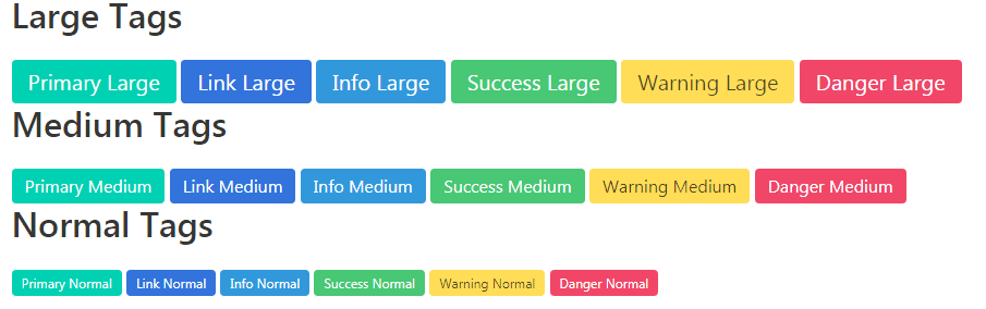
Following three sizes are available for creating tags:
- is-normal
- is-medium
- is-large
The default size is normal, however, the is-normal modifier is still available (in case you require to set the tag size to normal).
See the example below for various sized tags:
See online demo and code
<!DOCTYPE html>

<html>

<head>

<link rel="stylesheet" href="https://cdn.jsdelivr.net/npm/bulma@0.8.0/css/bulma.min.css">


</head>

<body>

<div class="container">

<h1 class="title">Large Tags</h1>

<span class="tag is-primary is-large">Primary Large</span>

<span class="tag is-link is-large">Link Large</span>

<span class="tag is-info is-large">Info Large</span>

<span class="tag is-success is-large">Success Large</span>

<span class="tag is-warning is-large">Warning Large</span>

<span class="tag is-danger is-large">Danger Large</span>


<h2 class="title">Medium Tags</h2>

<span class="tag is-primary is-medium">Primary Medium</span>

<span class="tag is-link is-medium">Link Medium</span>

<span class="tag is-info is-medium">Info Medium</span>

<span class="tag is-success is-medium">Success Medium</span>

<span class="tag is-warning is-medium">Warning Medium</span>

<span class="tag is-danger is-medium">Danger Medium</span>


<h3 class="title">Normal Tags</h3>

<span class="tag is-primary is-normal">Primary Normal</span>

<span class="tag is-link is-normal">Link Normal</span>

<span class="tag is-info is-normal">Info Normal</span>

<span class="tag is-success is-normal">Success Normal</span>

<span class="tag is-warning is-normal">Warning Normal</span>

<span class="tag is-danger is-normal">Danger Normal</span>


</div>


</body>

</html>
Just add the is-rounded modifier class for making the tags rounded. Have a look:

See online demo and code
<!DOCTYPE html>

<html>

<head>

<link rel="stylesheet" href="https://cdn.jsdelivr.net/npm/bulma@0.8.0/css/bulma.min.css">


</head>

<body>


<h3 class="title">Rounded Tags</h3>

<span class="tag is-primary is-rounded">Primary Rounded</span>

<span class="tag is-link is-rounded">Link Rounded</span>

<span class="tag is-info is-rounded">Info Rounded</span>

<span class="tag is-success is-rounded">Success Rounded</span>

<span class="tag is-warning is-rounded">Warning Rounded</span>

<span class="tag is-danger is-rounded">Danger Rounded</span>


</div>


</body>

</html>
The list of tags that are evenly spaced can be created by using the tags class in the container. This can be useful for blogs that show tags in the left navigation or footer of the website:

See online demo and code
<!DOCTYPE html>

<html>

<head>

<link rel="stylesheet" href="https://cdn.jsdelivr.net/npm/bulma@0.8.0/css/bulma.min.css">


</head>

<body>


<h3 class="title">List of Tags</h3>

<div class="tags">

  <span class="tag">HTML</span>

  <span class="tag">JavaScript</span>

  <span class="tag">CSS</span>

  <span class="tag">Bulma</span>

  <span class="tag">Bootstrap</span>

  <span class="tag">Angular</span>

  <span class="tag">Materialize</span>

  <span class="tag">Java</span>

  <span class="tag">Python</span>

  <span class="tag">PHP</span>

  <span class="tag">C#</span>

  <span class="tag">Swift</span>

  <span class="tag">MS SQL Server</span>

  <span class="tag">Oracle</span>

  <span class="tag">MySQL</span>

  <span class="tag">NoSQL</span>

  <span class="tag">MS Excel</span>

  <span class="tag">Github</span>

  <span class="tag">HTML</span>

  <span class="tag">JavaScript</span>

  <span class="tag">CSS</span>

  <span class="tag">Bulma</span>

</div>


</body>

</html>
Available list of variables
For customizing the tags – text color, background color, radius, and delete margin, you may use the Sass variables. Following variables are available:
- $tag-background-color
- $tag-color
- $tag-radius
- $tag-delete-margin
You may learn about how to use these variables here.