Setting background colors by Tailwind background utility classes
For controlling the background color of web page elements, you may use the background utility classes of Tailwind. These classes:
- Start with the prefix bg
- This is followed by a dash (–)
- Then use the color name and its number
For example:
bg-gray-50
bg-gray-500
bg-zinc-50
bg-zinc-950
bg-neutral-50
bg-neutral-950
bg-red-50
bg-red-950
bg-orange-50
bg-orange-950
and so on.
See the complete list on the official website:
https://tailwindcss.com/docs/background-color
The examples below show using background color classes in various HTML elements.
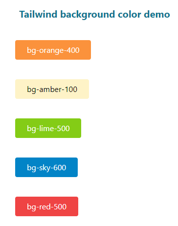
In the first example of demonstrating usage of Tailwind background color classes, we will use these in controlling the button colors.
For that, we have created six buttons where we set the Tailwind width, padding, and background colors of the buttons.
See online demo and code
Code:
<!DOCTYPE html>

<html>

<head>

<script src="https://cdn.tailwindcss.com"></script>
</head>

<body>

<h1 class="text-cyan-700 text-xl mx-10 mt-10 font-bold ">


 Tailwind background color demo

</h1>

<div class="flex flex-5 mx-8 mt-10  justify-between gap-2">


<div class="max-w-xs">


<p class="mb-10">

<button class="bg-orange-400 text-white py-2 px-6 w-50 rounded focus:shadow-outline" type="button">

bg-orange-400

      </button>

</p>

<p class="mb-10">

<button class="bg-amber-100 text-black  py-2 px-6 w-50 rounded focus:shadow-outline" type="button">

bg-amber-100

      </button>

</p>

<p class="mb-10">

<button class="bg-lime-500 text-white py-2 px-6 w-50 rounded focus:shadow-outline" type="button">

bg-lime-500

      </button>

</p>

<p class="mb-10">

<button class="bg-sky-600 text-white py-2 px-6 w-50 rounded focus:shadow-outline" type="button">

bg-sky-600

      </button>

</p>

<p class="mb-10">

<button class="bg-red-500 text-white py-2 px-6 w-50 rounded focus:shadow-outline" type="button">

bg-red-500

      </button>

</p>

</div>

</body>
</html>
Output:
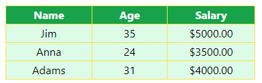
Using background color in a table example
In the demo below, we used background color in the HTML table. Again, we styled the table by other tailwind classes and also used background color for the table head and data as shown below:
See online demo and code
<!DOCTYPE html>

<html>

<head>

<script src="https://cdn.tailwindcss.com"></script>

</head>

<body>

<h1 class="text-cyan-700 text-lg mx-10 ">

 Tailwind background color - Table

</h1>

<div class="flex flex-5 mx-8 mt-10  justify-between gap-2">

<table class="border-collapse border border-slate-400 ">

  <thead>

    <tr class="bg-green-600 text-white">

      <th class="border border-yellow-300 px-10">Name</th>

      <th class="border border-yellow-300 px-10">Age</th>

      <th class="border border-yellow-300 px-10">Salary</th>

    </tr>

  </thead>

  <tbody>

    <tr class="bg-green-100 text-center ">

      <td class="border border-yellow-300 ">Jim</td>

      <td class="border border-yellow-300 ">35</td>

      <td class="border border-yellow-300 ">$5000.00</td>

    </tr>

    <tr class="bg-green-100 text-center ">

      <td class="border border-yellow-300 ">Anna</td>

      <td class="border border-yellow-300 ">24</td>

      <td class="border border-yellow-300 ">$3500.00</td>

    </tr>

    <tr class="bg-green-100 text-center ">

      <td class="border border-yellow-300 ">Adams</td>

      <td class="border border-yellow-300 ">31</td>

      <td class="border border-yellow-300 ">$4000.00</td>

    </tr>

  </tbody>

</table>

</div>

</div>

</body>

</html>
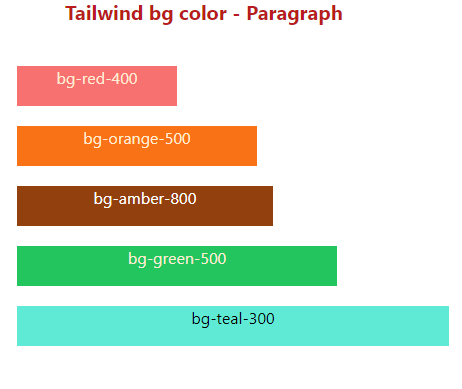
Using background color in paragraph example
Now we are using background color and other classes in the paragraphs.
Five paragraphs are created where we applied different bg colors, margins, width, text colors and alignments as follows:
See online demo and code
<!DOCTYPE html>

<html>

<head>

<script src="https://cdn.tailwindcss.com"></script>

</head>

<body>

<h1 class="text-red-700 text-xl mx-20 font-bold ">

 Tailwind bg color - Paragraph

</h1>

<div class="flex flex-5 mx-8 mt-10  justify-between gap-2">

<div class="max-w-xs w-96">

<p class="mb-5 h-10 w-40 bg-red-400 text-orange-100  text-center">bg-red-400</p>

<p class="mb-5 h-10 w-60 bg-orange-500   text-orange-100 text-center">bg-orange-500</p>

<p class="mb-5 h-10 w-[16rem] bg-amber-800   text-white  text-center">bg-amber-800</p>

<p class="mb-5 h-10 w-90 bg-green-500    text-orange-100  text-center">bg-green-500</p>

<p class="mb-5 h-10 w-[27rem] bg-teal-300 text-black-100  text-center">bg-teal-300</p>

</div>

</body>
</html>
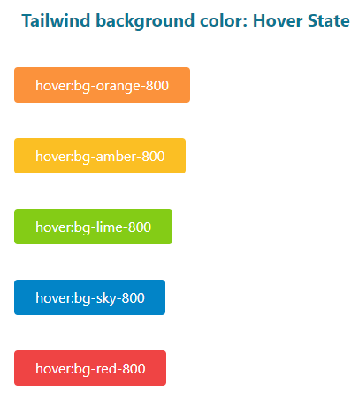
Tailwind has the ability to apply different utility classes in various states including hover.
For that, you may use the variant modifiers. For example, you may use the following for applying the background color on the hover state to an element like button:
hover:bg-orange-600
See the example below where we extended the above button example and added classes for the hover state.
After opening the demo page, bring the mouse over any button to see how the background color changes.
See online demo and code
<!DOCTYPE html>

<html>

<head>

<script src="https://cdn.tailwindcss.com"></script>

</head>

<body>

<h1 class="text-cyan-700 text-xl mx-10 mt-10 font-bold ">

 Tailwind background color: Hover State

</h1>

<div class="flex flex-5 mx-8 mt-10  justify-between gap-2">

<div class="max-w-xs">

<p class="mb-10">

<button class="bg-orange-400 hover:bg-orange-800 text-white py-2 px-6 w-50 rounded focus:shadow-outline" type="button">

hover:bg-orange-800

      </button>

</p>

<p class="mb-10">

<button class="bg-amber-400 hover:bg-amber-800 text-white  py-2 px-6 w-50 rounded focus:shadow-outline" type="button">

hover:bg-amber-800

      </button>

</p>

<p class="mb-10">

<button class="bg-lime-500 hover:bg-lime-800 text-white py-2 px-6 w-50 rounded focus:shadow-outline" type="button">

hover:bg-lime-800

      </button>

</p>

<p class="mb-10">

<button class="bg-sky-600 hover:bg-sky-800 text-white py-2 px-6 w-50 rounded focus:shadow-outline" type="button">

hover:bg-sky-800

      </button>

</p>

<p class="mb-10">

<button class="bg-red-500 hover:bg-red-800 text-white py-2 px-6 w-50 rounded focus:shadow-outline" type="button">

hover:bg-red-800

      </button>

</p>


</div>

</body>
</html>
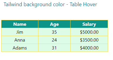
Hover state example in a table
In the example below, we used different background colors in the hover state of the table. As you bring the mouse over the table header or table data (th and td), the background and text color change.
Click on the demo link to have a look yourself:
See online demo and code
<!DOCTYPE html>

<html>

<head>

<script src="https://cdn.tailwindcss.com"></script>
</head>

<body>

<h1 class="text-cyan-700 text-lg mx-10 ">

 Tailwind background color - Table Hover

</h1>

<div class="flex flex-5 mx-8 mt-10  justify-between gap-2">

<table class="border-collapse border border-slate-400 ">

  <thead>

    <tr class="bg-teal-600 hover:bg-sky-500 text-white">

      <th class="border border-yellow-300 px-10">Name</th>

      <th class="border border-yellow-300 px-10">Age</th>

      <th class="border border-yellow-300 px-10">Salary</th>

    </tr>

  </thead>

  <tbody>

    <tr class="bg-green-100 hover:bg-orange-800 text-center hover:text-white ">

      <td class="border border-yellow-300 ">Jim</td>

      <td class="border border-yellow-300 ">35</td>

      <td class="border border-yellow-300 ">$5000.00</td>

    </tr>

    <tr class="bg-green-100 hover:bg-orange-800 text-center hover:text-white">

      <td class="border border-yellow-300 ">Anna</td>

      <td class="border border-yellow-300 ">24</td>

      <td class="border border-yellow-300 ">$3500.00</td>

    </tr>

    <tr class="bg-green-100 hover:bg-orange-800 text-center hover:text-white">

      <td class="border border-yellow-300 ">Adams</td>

      <td class="border border-yellow-300 ">31</td>

      <td class="border border-yellow-300 ">$4000.00</td>

    </tr>

  </tbody>

</table>

</div>

</div>

</body>

</html>
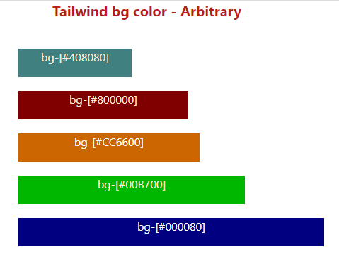
How to use a custom background color in Tailwind
In situations where you need to use some other color than available in the Tailwind pre-defined classes while still using Tailwind – you can do this as follows.
An example of using arbitrary value:
<p class=”bg-[#408080]”>
So, you can use square brackets to generate the value on the fly.
See an example below we use this in the paragraph’s background colors:
See online demo and code
<!DOCTYPE html>

<html>

<head>

<script src="https://cdn.tailwindcss.com"></script>

</head>

<body>

<h1 class="text-red-700 text-xl mx-20 font-bold ">

 Tailwind bg color - Arbitrary

</h1>

<div class="flex flex-5 mx-8 mt-10  justify-between gap-2">

<div class="max-w-xs w-96">

<p class="bg-[#408080] mb-5 h-10 w-40  text-orange-100  text-center">bg-[#408080]</p>

<p class="bg-[#800000] mb-5 h-10 w-60   text-orange-100 text-center">bg-[#800000] </p>

<p class="bg-[#CC6600] mb-5 h-10 w-[16rem]    text-white  text-center">bg-[#CC6600]</p>

<p class="bg-[#00B700] mb-5 h-10 w-90    text-orange-100  text-center">bg-[#00B700] </p>

<p class="bg-[#000080] mb-5 h-10 w-[27rem]  text-black-100  text-center text-white">bg-[#000080]</p>

</div>

</body>

</html>
Output:
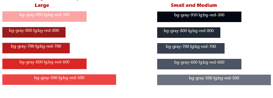
Using different background colors for various devices
Tailwind also enables you to utilize variant modifiers for targeting media queries.
For example, you may use a different background color for a desktop/notebook and some other for a smartphone or tablet – quite easily.
Similarly, you may use different colors for light or dark modes for the same elements.
How to do this? An example is below:
bg-gray-600 lg:bg-red-700
That means, using red color for large screen and gray-600 in small and medium screens.
For quickly viewing a demo, click on the link below and see the demo page on large screen and resize to a small size to see how its color change:
See online demo and code
<!DOCTYPE html>

<html>

<head>

<script src="https://cdn.tailwindcss.com"></script>

</head>

<body>

<h1 class="text-red-700 text-xl mx-20 font-bold ">

 Tailwind bg color - Breakpoints

</h1>

<div class="flex flex-5 mx-8 mt-10  justify-between gap-2">

<div class="max-w-xs w-96">

<p class="bg-gray-950 lg:bg-red-300   mb-5 h-10 w-50  text-white  text-center">bg-gray-950 lg:bg-red-300</p>

<p class="bg-gray-800 lg:bg-red-800 mb-5 h-10 w-60   text-orange-100 text-center">bg-gray-800 lg:bg-red-800</p>

<p class="bg-gray-700 lg:bg-red-700 mb-5 h-10 w-[16rem]    text-white  text-center">bg-gray-700 lg:bg-red-700</p>

<p class="bg-gray-600 lg:bg-red-600 mb-5 h-10 w-90    text-orange-100  text-center">bg-gray-600 lg:bg-red-600 </p>

<p class="bg-gray-500 lg:bg-red-500 mb-5 h-10 w-[27rem]  text-black-100  text-center text-white">bg-gray-500 lg:bg-red-500</p>

</div>

</body>

</html>
Output: