Tailwind CSS Box Shadow
CSS has box shadow property which is used to add shadows around the frame of an element.
By using Tailwind CSS, you may use the utility classes for controlling the box shadow of an element.
Classes for box shadow in Tailwind CSS
The following classes are available in Tailwind for box-shadow:
- shadow-sm
- shadow
- shadow-md
- shadow-lg
- shadow-xl
- shadow-2xl
- shadow-inner
- shadow-none
The first six shadow utility classes are for outer shadow. Whereas .shadow-inner is for inner shadow (as the name reflects).
The last, shadow-none is for removing existing shadows.
The section below shows using these classes for creating box shadow in HTML elements.
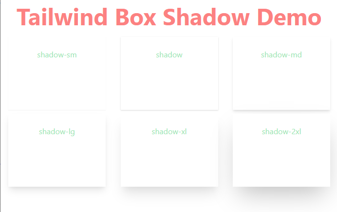
An example of using outer shadow utilities
In the example below, we created a box of 200px width and 150px height. Then we applied various Tailwind classes of box shadow to that box element. We used all outer shadow classes for that:
Code
<!DOCTYPE html>

<html>

<head>

    <link href="https://unpkg.com/tailwindcss@^1.0/dist/tailwind.min.css" rel="stylesheet">

<style>

.box {

    width: 200px;

    height: 150px;

    background-color: #FFF;
}

</style>

</head>

<body class="text-center mx-4 space-y-2">

    <h1 class="text-red-400 text-5xl font-bold ">

        Tailwind Box Shadow Demo

    </h1>

<div class="flex flex-1 flex-wrap justify-between gap-2 dark:text-neutral-800">

<div class="p-6 shadow-sm text-green-300 box" >shadow-sm</div>

<div class="p-6 shadow text-green-300 box" >shadow</div>

<div class="p-6 shadow-md text-green-300 box" >shadow-md</div>

</div>

<div class="flex flex-1 flex-wrap justify-between gap-2 dark:text-neutral-800">


<div class="p-6 shadow-lg text-green-300 box" >shadow-lg</div>

<div class="p-6 shadow-xl text-green-300 box" >shadow-xl</div>

<div class="p-6 shadow-2xl text-green-300 box" >shadow-2xl</div>

</div>

</body>
</html>
Output:
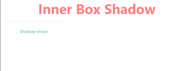
An example of applying inner shadow (shadow-inner) utility
In the example below, we used the only inner shadow utility class for the same sized box.
Code:
<!DOCTYPE html>
<html>

<head>
  <link href="https://unpkg.com/tailwindcss@^1.0/dist/tailwind.min.css" rel="stylesheet">

<style>

.box {

    width: 200px;

    height: 150px;

    background-color: #FFF;

}

</style>

</head>

<body class="text-center mx-4 space-y-2">

  <h1 class="text-red-400 text-5xl font-bold ">

  Inner Box Shadow

  </h1>


<div class="flex flex-1 flex-wrap justify-between gap-2 dark:text-neutral-800">

<div class="p-6 shadow-inner text-green-500 box" >shadow-inner</div>

</div>

</div>

</body>
</html>
Output:
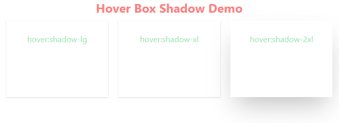
Adding shadow in hover state example
As such, Tailwind includes modifiers for pseudo-classes including hover state. For the hover pseudo-class, use the hover modifier.
You may also use the shadow classes in the hover state.
In the example below, we added a normal outer class (shadow) to three boxes.
In each box, we added a different utility for the shadow box as you hover the mouse over that box element. In the first box, we applied:
hover:shadow-lg
In the second box:
hover:shadow-xl
In the third box:
hover:shadow-2xl
See the code and output by clicking the link below. Hover the mouse over any box and see the shadow in place.
Code:
<!DOCTYPE html>

<html>

<head>

  <link href="https://unpkg.com/tailwindcss@^1.0/dist/tailwind.min.css" rel="stylesheet">


<style>

.box {

    width: 200px;

    height: 150px;

    background-color: #FFF;

}

</style>

</head>

<body class="text-center mx-4 space-y-2">

  <h1 class="text-red-400 text-2xl font-bold ">

    Hover Box Shadow Demo

  </h1>

<div class="flex flex-1 flex-wrap justify-between gap-2 dark:text-neutral-800">

<div class="p-6 shadow hover:shadow-lg text-green-300 box" >hover:shadow-lg</div>

<div class="p-6 shadow hover:shadow-xl text-green-300 box" >hover:shadow-xl</div>

<div class="p-6 shadow hover:shadow-2xl text-green-300 box" >hover:shadow-2xl</div>

</div>

</div>

</body>
</html>
Output:
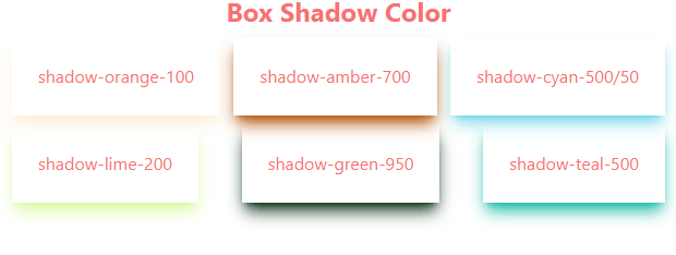
Colorizing the outer shadow example
In order to use some other color than the default (as in the above examples), you may use the utilities for controlling the box shadow color.
A few classes are:
- shadow-black
- shadow-white
- shadow-slate-50
- shadow-slate-100
- —
- shadow-slate-950
- shadow-zinc-50
- shadow-zinc-100
- —
- shadow-zinc-950
- shadow-red-50
- shadow-red-100
- —
- shadow-red-100
In the demo below, we have used a few of these classes in our box shadows. Have a look:
Code:
<!DOCTYPE html>

<html>

<head>

  <script src="https://cdn.tailwindcss.com"></script>

<style>

.box {

    width: 200px;

    height: 150px;

    background-color: #FFF;

}

</style>

</head>

<body class="text-center mx-4 space-y-2">

  <h1 class="text-red-400 text-2xl font-bold ">

    Box Shadow Color

  </h1>

<div class="flex flex-1 flex-wrap justify-between gap-2">

<div class="p-6 shadow shadow-lg shadow-orange-100  text-red-400 " >shadow-orange-100</div>

<div class="p-6 shadow shadow-lg shadow-amber-700  text-red-400 " >shadow-amber-700</div>

<div class="p-6 shadow shadow-lg shadow-cyan-500/50 text-red-400 " >shadow-cyan-500/50</div>


<div class="p-6 shadow shadow-lg shadow-lime-200  text-red-400" >shadow-lime-200</div>

<div class="p-6 shadow shadow-lg shadow-green-950 text-red-400" >shadow-green-950</div>

<div class="p-6 shadow shadow-lg shadow-teal-500   text-red-400" >shadow-teal-500 </div>


</div>

</body>

</html>
Output:
See the complete available list here.
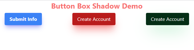
In the example below, we created three buttons by using the utility classes of Tailwind.
There, we also applied box shadow classes to the button elements. Along with using different box shadow utilities for size, we also used shadow colors.
Code:
<!DOCTYPE html>

<html>

<head>

  <script src="https://cdn.tailwindcss.com"></script>

</head>

<body class="text-center mx-4 space-y-2">

  <h1 class="text-red-400 text-2xl font-bold ">

    Button Box Shadow Demo

  </h1>


<div class="flex flex-1 flex-wrap justify-between gap-2">

<button class="bg-blue-500 hover:bg-blue-700 text-white font-bold py-2 px-4 rounded shadow-lg shadow-indigo-500/50">Submit Info</button>

<button class="bg-red-700 hover:bg-red-400 text-white py-2 px-4 rounded shadow-xl shadow-red-500/50">Create Account</button>

<button class="bg-green-950 hover:bg-green-300 text-white py-2 px-4 rounded shadow-2xl shadow-green-500/50">Create Account</button>

</div>

</body>

</html>
Output: