
The HTML checkbox as switch
In this tutorial, a jQuery plug-in is used to convert a simple HTML checkbox into the beautiful switch by using jQuery and CSS.
It’s a light-weight plug-in, just 3 Kb JS file and requires a few lines of code in the <script> section.
So, let me start by showing online demos and setting up guide.
A demo of checkbox as switch
First, the CSS file that comes with the package (download from credit link) has to be included in the <head> section of the web page where you want to create that switch.
In the markup section, create an ordinary checkbox by using HTML syntax and just assign it a class name. Just above the </body> tag, place the jQuery library link and JS file of
Just above the </body> tag, place the jQuery library link and JS file of the plug-in. Finally, initiate the plug-in. See the demo and code online:
See online demo and code
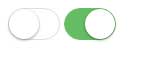
You can see two switches; one as checked in green and the other unchecked.
The CSS file in head section:
<link href=”css/simple-switch.css” rel=”stylesheet” />
The markup:
<input type="checkbox" class="switchdemo" >

<input type="checkbox" class="switchdemo" checked>
The libraries and jQuery code:
<script src=”http://cdnjs.cloudflare.com/ajax/libs/jquery/2.0.0/jquery.min.js”></script>
<script src=”js/simpleswitch/jquery.simpleswitch.js”></script>
<script>

$(".switchdemo").simpleSwitch();

</script>
A demo of changing the look of checkbox switch
In your professional website, you definitely need to match or change the color scheme or may be other properties of the checkbox switch.
By finding and modifying the CSS classes, you can easily do that. In this demo, I will override a few default properties to show you how you can change the look of the switch box. See a demo online and then I will explain which classes are changed:

See online demo and code
Only the checked state properties are changed in this demo. For that, I simply picked the checked properties from the main CSS file of plug-in and changed the properties in <style> section.
For the border and box-shadow properties of left circle, this class is changed:
.simple-switch-outter.checked {

border-color: #62B0FF;

box-shadow: #004080 0px 0px 0px 16px inset;

transition: border 0.4s, box-shadow 0.4s, background-color 1.2s;

background-color: #408080;

}
While for the right or outer circle, this class is modified:
.simple-switch-outter.checked .simple-switch-circle {

background-color: #BFDFFF;

}
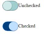
You may also change the unchecked state of the switch as shown in the example below.
A demo of changing unchecked state
In this demo, both checked and unchecked look is changed to the custom look. See the demo online:
See online demo and code
To modify unchecked properties, these properties are overridden in the <style> section:
.simple-switch-outter.unchecked {

box-shadow: #dfdfdf 0px 0px 0px 0px inset;

border-color: #356A6A;

background-color: #A0CFCF;

}

.simple-switch-outter.unchecked .simple-switch-circle {

background-color: #D1E9E9;

}
Get the complete code in the demo page.
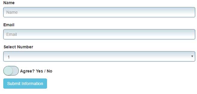
A demo of using switch in a Bootstrap form
Let me show you a demo of using this switch in an actual form that is based at the Bootstrap framework. To match the theme of the switch to the rest of form, I have overridden the default switch classes.
See online demo and code
Get the complete code in the demo page.