
Buttons are generally with hefty background colors that are used in web forms or for the navigation purpose etc.
The outline button style removes all background images or colors from a button and gives it a lighter look.
The outline style buttons can be used for various purposes, for example:
- Indicating the secondary action complementing the primary action.
- If you have many buttons then it may help in reducing the “noise”
In this tutorial, I will show you how to create Outline buttons by using custom CSS as well as using the Bootstrap 4 and other frameworks.
You Should Read: Bootstrap 4 Buttons
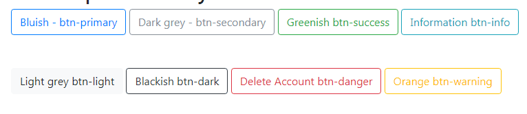
In Bootstrap 4, the outline button CSS classes are something new than the previous version buttons. All you have to do is giving the main .btn class along with btn-outline-* contextual class for specifying the desired style.
Bootstrap 4 has the following contextual classes for creating the outline style buttons:
- btn-outline-primary
- btn-outline-secondary
- btn-outline-success
- btn-outline-info
- btn-outline-light
- btn-outline-dark
- btn-outline-danger
- btn-outline-warning
The demo below shows using all these classes for creating the outline buttons.
See online demo and code
The complete code of this demo:
<!DOCTYPE html>

<html>

<head>

<link rel="stylesheet" href="https://maxcdn.bootstrapcdn.com/bootstrap/4.0.0-beta.3/css/bootstrap.min.css" integrity="sha384-Zug+QiDoJOrZ5t4lssLdxGhVrurbmBWopoEl+M6BdEfwnCJZtKxi1KgxUyJq13dy" crossorigin="anonymous">


</head>

<body>

<div class="container">

<h3>Bootstrap 4 buttons with outline class</h3>

<button type="button" class="btn btn-outline-primary">btn btn-outline-primary</button>

<button type="button" class="btn btn-outline-secondary">btn btn-outline-secondary</button>

<button type="button" class="btn btn-outline-success">btn btn-outline-success</button>

<button type="button" class="btn btn-outline-info">btn btn-outline-info</button> <br /><br /><br />

<button type="button" class="btn btn-outline-light">btn btn-outline-light</button>

<button type="button" class="btn btn-outline-dark">btn btn-outline-dark</button>

<button type="button" class="btn btn-outline-danger">btn btn-outline-danger</button>

<button type="button" class="btn btn-outline-warning">btn btn-outline-warning</button>


</div>

</body>

</html>
You have to include the reference to the Bootstrap 4 CSS file; as you can see in the above code.
What if I don’t want to include whole Bootstrap CSS file?
So, if your project is not based on Bootstrap but you still want to use those beautifully styled outline buttons?
No problems, you may get the only CSS for outline buttons rather than whole Bootstrap CSS file that contains the style for each component or element.
For that, you have to find and copy/paste the .btn class and required contextual button classes.
The demo below shows the same output as in the above example, however, if you look at the code section under the head tag, it contains CSS code for all outline buttons.
See complete code and demo
You can see the .btn and .btn-outline-primary classes code below while the demo page contains the code of all the buttons:
.btn class code:
.btn {

  display: inline-block;

  font-weight: 400;

  color: #212529;

  text-align: center;

  vertical-align: middle;

  -webkit-user-select: none;

  -moz-user-select: none;

  -ms-user-select: none;

  user-select: none;

  background-color: transparent;

  border: 1px solid transparent;

  padding: 0.375rem 0.75rem;

  font-size: 1rem;

  line-height: 1.5;

  border-radius: 0.25rem;

  transition: color 0.15s ease-in-out, background-color 0.15s ease-in-out, border-color 0.15s ease-in-out, box-shadow 0.15s ease-in-out;

}
.btn-outline-primary CSS code:
.btn-outline-primary {

  color: #007bff;

  border-color: #007bff;

}


.btn-outline-primary:hover {

  color: #fff;

  background-color: #007bff;

  border-color: #007bff;

}


.btn-outline-primary:focus, .btn-outline-primary.focus {

  box-shadow: 0 0 0 0.2rem rgba(0, 123, 255, 0.5);

}


.btn-outline-primary.disabled, .btn-outline-primary:disabled {

  color: #007bff;

  background-color: transparent;

}


.btn-outline-primary:not(:disabled):not(.disabled):active, .btn-outline-primary:not(:disabled):not(.disabled).active,

.show > .btn-outline-primary.dropdown-toggle {

  color: #fff;

  background-color: #007bff;

  border-color: #007bff;

}


.btn-outline-primary:not(:disabled):not(.disabled):active:focus, .btn-outline-primary:not(:disabled):not(.disabled).active:focus,

.show > .btn-outline-primary.dropdown-toggle:focus {

  box-shadow: 0 0 0 0.2rem rgba(0, 123, 255, 0.5);

}
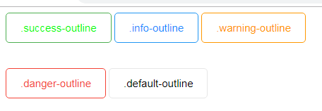
Again, if your project is not Bootstrap based then you may want using the custom CSS included in your main CSS file for creating the outline style buttons.
While you may name the classes as you want, for the demo I am using almost similar names for custom classes:
See online demo and code
The complete code:
<!DOCTYPE html>

<html lang="en">

<head>

<meta charset="utf-8">

<title>A demo of custom outline buttons</title>

<style type="text/css">

/*Main button class - to be referred for each button*/

.btn {

  background-color: #ffffff;

  border: 1px solid black;

  border-radius: 5px;

  color: #000;

  padding: 12px 20px;

  font-size: 15px;


}


/* Default button with gray */

.default-outline {

  border-color: #e7e7e7;

  color: #000;

}


.default-outline:hover {

  border-color: #818181;

  background-color: #818181;

  color: #fff;

}


/* Primary button with blue */

.info-outline {

  border-color: #2196F3;

  color: #1e90ff;

}


.info-outline:hover {

  border-color: #2196F3;

  background-color: #053D69;

  color: #fff;

}


/*Success - Green */

.success-outline {

  border-color: #4CAF50;

  color: #00FB00;

}


.success-outline:hover {

  border-color: #4CAF50;

  background-color: #1E4620;

  color: #fff;

}


/* Warning - Orange */

.warning-outline {

  border-color: #ff9800;

  color: #ff9800;

}


.warning-outline:hover {

  border-color: #ff9800;

  background-color: #9D5F00;

  color: #fff;

}


/* Danger - Red */

.danger-outline {

  border-color: #f44336;

  color: #f44336;

}


.danger-outline:hover {

  border-color: #f44336;

  background-color: #8B1107;

  color: #fff;

}


</style>

</head>

<body>

 <div>

    <button class="btn success-outline">.success-outline</button>

    <button class="btn info-outline">.info-outline</button>

    <button class="btn warning-outline">.warning-outline</button><br /><br /><br />

    <button class="btn danger-outline">.danger-outline</button>

    <button class="btn default-outline">.default-outline</button>

 </div>

</body>

</html>
You can play with your own color scheme for the outline as well as hover effects.