
The Bulma checkbox class does not add any style to the checkbox form control. The reason is to keep browser compatibility.
However, you may use third party solutions for styling the checkbox while using the Bulma framework. I will explain this with examples in the coming section. Let us first look at a few basic checkbox examples in Bulma.
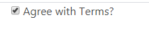
A simple checkbox using Bulma
In the example below, we have a checkbox input type and the label is given the checkbox class (which is Bulma framework class):
See online demo and code
<!DOCTYPE html>

<html>

<head>

<link rel="stylesheet" href="https://cdn.jsdelivr.net/npm/bulma@0.8.0/css/bulma.min.css">


</head>

<body>

<div class="container">

<label class="checkbox">

  <input type="checkbox">

  Agree with Terms?

</label>

</div>

</body>

</html>
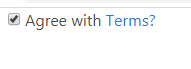
Adding a link to a checkbox example
This is generally required in cases where you ask users, for example, “do you agree to the T&C”? There, the “Terms and Conditions” or any other text is linked to the specific page.
Bulma can handle this as shown in an example below:
See online demo and code
<!DOCTYPE html>

<html>

<head>

<link rel="stylesheet" href="https://cdn.jsdelivr.net/npm/bulma@0.8.0/css/bulma.min.css">


</head>

<body>

<div class="container">

<label class="checkbox">

  <input type="checkbox">

  Agree with <a href="#">Terms?</a>

</label>

</div>

</body>

</html>
The example of a disabled checkbox
For disabling a checkbox to allow users to tick/untick, simply add the disabled attribute to the checkbox control.
See online demo and code
<!DOCTYPE html>

<html>

<head>

<link rel="stylesheet" href="https://cdn.jsdelivr.net/npm/bulma@0.8.0/css/bulma.min.css">


</head>

<body>

<div class="container">

<label class="checkbox disabled">

  <input type="checkbox" disabled>

  Agree with <a href="#">Terms?</a>

</label>

</div>

</body>

</html>
You may notice that the checkbox, as well as label/link, is also disabled.
Styling the checkbox example
As mentioned earlier, you may use third party solution e.g. a plug-in for styling the checkboxes. For example, coloring the checkbox, making checkbox look circular etc.
If you have got time and skills, you may style it yourself. In the example below, I am sharing a cool solution for creating colorful as well as circular checkboxes.
Credit: The solution in Github.
First, have a look at the example by clicking the demo link below and then you can see how to set up this.
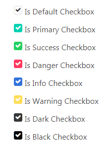
The first example shows various contextual color checkboxes. For example, is-warning to create orange, is-danger for red, and so on. Have a look:
See online demo and code
<!DOCTYPE html>

<html>

<head>

<link rel="stylesheet" href="https://cdn.jsdelivr.net/npm/bulma@0.8.0/css/bulma.min.css">

<link rel="stylesheet" href="https://maxcdn.bootstrapcdn.com/font-awesome/4.7.0/css/font-awesome.min.css">

<link rel="stylesheet" href="css/bulma-checkbox/bulma-radio-checkbox.css">


</head>

<body>

<div class="container">


        <div class="container">

            <div class="columns">

                <div class="column">

                    <p class="title is-4">Cool Checkboxes</p>

                    <div class="field">

                        <div class="b-checkbox">

                            <input id="checkbox1" class="styled" checked type="checkbox">

                            <label for="checkbox1">

                                Is Default Checkbox

                            </label>

                        </div>

                    </div>

                    <div class="field">

                        <p class="control">

                            <div class="b-checkbox is-primary">

                                <input id="checkbox2" class="styled" checked type="checkbox">

                                <label for="checkbox2">

                                    Is Primary Checkbox

                                </label>

                            </div>

                        </p>

                    </div>

                    <div class="field">

                        <p class="control">

                            <div class="b-checkbox is-success">

                                <input id="checkbox3" class="styled" checked type="checkbox">

                                <label for="checkbox3">

                                    Is Success Checkbox

                                </label>

                            </div>

                        </p>

                    </div>

                    <div class="field">

                        <p class="control">

                            <div class="b-checkbox is-danger">

                                <input id="checkbox4" class="styled" checked type="checkbox">

                                <label for="checkbox4">

                                    Is Danger Checkbox

                                </label>

                            </div>

                        </p>

                    </div>

                    <div class="field">

                        <p class="control">

                            <div class="b-checkbox is-info">

                                <input id="checkbox5" class="styled" checked type="checkbox">

                                <label for="checkbox5">

                                    Is Info Checkbox

                                </label>

                            </div>

                        </p>

                    </div>

                    <div class="field">

                        <p class="control">

                            <div class="b-checkbox is-warning">

                                <input id="checkbox6" class="styled" checked type="checkbox">

                                <label for="checkbox6">

                                    Is Warning Checkbox

                                </label>

                            </div>

                        </p>

                    </div>

                    <div class="field">

                        <p class="control">

                            <div class="b-checkbox is-dark">

                                <input id="checkbox7" class="styled" checked type="checkbox">

                                <label for="checkbox7">

                                    Is Dark Checkbox

                                </label>

                            </div>

                        </p>

                    </div>

                    <div class="field">

                        <p class="control">

                            <div class="b-checkbox is-black">

                                <input id="checkbox8" class="styled" checked type="checkbox">

                                <label for="checkbox8">

                                    Is Black Checkbox

                                </label>

                            </div>

                        </p>

                    </div>

                </div>


        </div>

    </section>

</div>

</body>

</html>
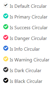
The example of circular checkboxes in Bulma
This example shows circular checkboxes by using the same plug-in. Have a look:
See online demo and code
<!DOCTYPE html>

<html>

<head>

<link rel="stylesheet" href="https://cdn.jsdelivr.net/npm/bulma@0.8.0/css/bulma.min.css">

<link rel="stylesheet" href="https://maxcdn.bootstrapcdn.com/font-awesome/4.7.0/css/font-awesome.min.css">

<link rel="stylesheet" href="css/bulma-checkbox/bulma-radio-checkbox.css">


</head>

<body>

<div class="container">


        <div class="container">

            <div class="columns">

              <div class="column">

                    <p class="title is-4">Cool Circular Checkboxes</p>

                    <div class="field">

                        <div class="b-checkbox is-circular">

                            <input id="ccheckbox1" class="styled" checked type="checkbox">

                            <label for="ccheckbox1">

                                Is Default Circular

                            </label>

                        </div>

                    </div>

                    <div class="field">

                        <p class="control">

                            <div class="b-checkbox is-circular is-primary">

                                <input id="ccheckbox2" class="styled" checked type="checkbox">

                                <label for="ccheckbox2">

                                    Is Primary Circular

                                </label>

                            </div>

                        </p>

                    </div>

                    <div class="field">

                        <p class="control">

                            <div class="b-checkbox is-circular is-success">

                                <input id="ccheckbox3" class="styled" checked type="checkbox">

                                <label for="ccheckbox3">

                                    Is Success Circular

                                </label>

                            </div>

                        </p>

                    </div>

                    <div class="field">

                        <p class="control">

                            <div class="b-checkbox is-circular is-danger">

                                <input id="ccheckbox4" class="styled" checked type="checkbox">

                                <label for="ccheckbox4">

                                    Is Danger Circular

                                </label>

                            </div>

                        </p>

                    </div>

                    <div class="field">

                        <p class="control">

                            <div class="b-checkbox is-circular is-info">

                                <input id="ccheckbox5" class="styled" checked type="checkbox">

                                <label for="ccheckbox5">

                                    Is Info Circular

                                </label>

                            </div>

                        </p>

                    </div>

                    <div class="field">

                        <p class="control">

                            <div class="b-checkbox is-circular is-warning">

                                <input id="ccheckbox6" class="styled" checked type="checkbox">

                                <label for="ccheckbox6">

                                    Is Warning Circular

                                </label>

                            </div>

                        </p>

                    </div>

                    <div class="field">

                        <p class="control">

                            <div class="b-checkbox is-circular is-dark">

                                <input id="ccheckbox7" class="styled" checked type="checkbox">

                                <label for="ccheckbox7">

                                    Is Dark Circular

                                </label>

                            </div>

                        </p>

                    </div>

                    <div class="field">

                        <p class="control">

                            <div class="b-checkbox is-circular is-black">

                                <input id="ccheckbox8" class="styled" checked type="checkbox">

                                <label for="ccheckbox8">

                                    Is Black Circular

                                </label>

                            </div>

                        </p>

                    </div>

                </div>


        </div>

    </section>

</div>

</body>

</html>
How to set up cool checkbox for Bulma
In order to create these cool checkboxes, you need to include the bulma-radio-checkbox.css file in the head section of the web page. You may get this file by “view source” the demo page (above two demos) or download it from the above credit link (Github website).
You also need to include the font-awesome library (if not already used).