
The Bootstrap accordion
In this tutorial, the accordion in Bootstrap is created by using the panel-related classes along with the collapse class; these are built-in Bootstrap framework classes.
In addition, the toggle icon is also added on the panels of the accordion to open and collapse the content of the accordion.
Setting up Bootstrap for creating accordion
For creating the accordion, first of all, you need to include the Bootstrap CSS library. Add its reference in the <head> section of your webpage where you intend to create the accordion.
You also need to include the JS libraries of Bootstrap and jQuery for creating the accordion. (See this in the demo code below).
After including the references, use the markup where you need to add a few built-in classes like panel-group, panel, panel-heading, etc.
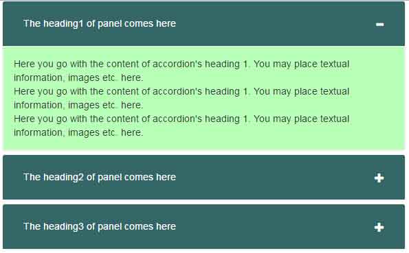
A demo of the accordion with a toggle icon
In this example, the accordion with three panels is created. The main div is assigned the panel-group class. The role data attribute is set as tablist while aria-multiselectable is set as true.
The panel with content div is assigned the panel and panel-default classes while its inner div contains the classes for panel heading, title, and content of the panel. The div showing the panel content is given the panel-body class along with collapse and panel-collapse classes. It will make the panel body collapsed as the web page loads.
The icon of the panel (plus for collapsed and minus for open) is dealt there as well. Its functionality is done by using the jQuery code. Have a look at the live demo and code by clicking the image or link below:
In the style section, a few CSS classes built on Bootstrap framework are overridden, following is the CSS used:
.panel-group .panel {
border-radius: 5px;
border-color: #EEEEEE;
padding:0;
}

.panel-default > .panel-heading {
color: #fff;
background-color: #346767;
border-color: #EEEEEE;
}

.panel-title {
font-size: 14px;
}

.panel-title > a {
display: block;
padding: 15px;
text-decoration: none;
}

.short-full {
float: right;
color: #fff;
}

.panel-default > .panel-heading + .panel-collapse > .panel-body {
border: solid 1px #EEEEEE;
background-color: #B7FFB7;

}
The markup for creating accordion Bootstrap:
<div class="container demo">


<div class="panel-group" id="accordion" role="tablist" aria-multiselectable="true">

<div class="panel panel-default">
<div class="panel-heading" role="tab" id="headingOne">
<h4 class="panel-title">
<a role="button" data-toggle="collapse" data-parent="#accordion" href="#collapseOne" aria-expanded="true" aria-controls="collapseOne">
<i class="short-full glyphicon glyphicon-plus"></i>
The heading1 of panel comes here
</a>
</h4>
</div>
<div id="collapseOne" class="panel-collapse collapse" role="tabpanel" aria-labelledby="headingOne">
<div class="panel-body">
Here you go with the content of accordion's heading 1. You may place textual information, images etc. here. <br />
Here you go with the content of accordion's heading 1. You may place textual information, images etc. here. <br />
Here you go with the content of accordion's heading 1. You may place textual information, images etc. here.
</div>
</div>
</div>

<div class="panel panel-default">
<div class="panel-heading" role="tab" id="headingTwo">
<h4 class="panel-title">
<a class="collapsed" role="button" data-toggle="collapse" data-parent="#accordion" href="#collapseTwo" aria-expanded="false" aria-controls="collapseTwo">
<i class="short-full glyphicon glyphicon-plus"></i>
The heading2 of panel comes here
</a>
</h4>
</div>
<div id="collapseTwo" class="panel-collapse collapse" role="tabpanel" aria-labelledby="headingTwo">
<div class="panel-body">
Here you go with the content of accordion's heading 2. You may place textual information, images etc. here.
</div>
</div>
</div>

<div class="panel panel-default">
<div class="panel-heading" role="tab" id="headingThree">
<h4 class="panel-title">
<a class="collapsed" role="button" data-toggle="collapse" data-parent="#accordion" href="#collapseThree" aria-expanded="false" aria-controls="collapseThree">
<i class="short-full glyphicon glyphicon-plus"></i>
The heading3 of panel comes here
</a>
</h4>
</div>
<div id="collapseThree" class="panel-collapse collapse" role="tabpanel" aria-labelledby="headingThree">
<div class="panel-body">
Here you go with the content of accordion's heading 3. You may place textual information, images etc. here.
</div>
</div>
</div>

</div><!-- panel-group -->


</div><!-- container -->
The small jQuery code for dealing with toggle:
     function toggleIcon(e) {

        $(e.target)

            .prev('.panel-heading')

            .find(".short-full")

            .toggleClass('glyphicon-plus glyphicon-minus');

    }

    $('.panel-group').on('hidden.bs.collapse', toggleIcon);

    $('.panel-group').on('shown.bs.collapse', toggleIcon);
As this is based on Bootstrap, so accordion is responsive and mobile friendly, by default.
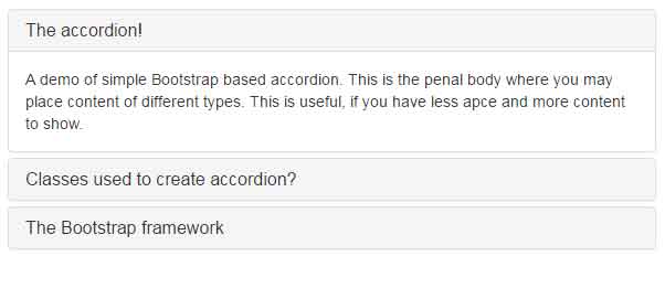
A demo of simple accordion with links in panel headings
In this demo, a simple accordion based on Bootstrap is created by using the built-in classes. It uses the default style where headings in panels appear as links. By default, the panel body is collapsed.
The markup for this accordion:
<div class="container">

<h1>A simple accordion</h1>


<div class="panel-group" id="accordion">

  <div class="panel panel-default">

    <div class="panel-heading">

      <h4 class="panel-title">

        <a data-toggle="collapse" data-parent="#accordion" href="#collapseOne">

          The accordion!

        </a>

      </h4>

    </div>

    <div id="collapseOne" class="panel-collapse collapse in">

      <div class="panel-body">

        A demo of simple Bootstrap based accordion. This is the penal body where you may place content of different types. This is useful, if you have less space and more content to show.

      </div>

    </div>

  </div>

  <div class="panel panel-default">

    <div class="panel-heading">

      <h4 class="panel-title">

        <a data-toggle="collapse" data-parent="#accordion" href="#collapseTwo">

          Classes used to create accordion?

        </a>

      </h4>

    </div>

    <div id="collapseTwo" class="panel-collapse collapse">

      <div class="panel-body">

        You may include the complete Bootstrap framework or simply include the collapse.js component. You may use panel-group, panel, panel-heading, panel-collapse, collapse and other classes.

      </div>

    </div>

  </div>

  <div class="panel panel-default">

    <div class="panel-heading">

      <h4 class="panel-title">

        <a data-toggle="collapse" data-parent="#accordion" href="#collapseThree">

          The Bootstrap framework

        </a>

      </h4>

    </div>

    <div id="collapseThree" class="panel-collapse collapse">

      <div class="panel-body">

        Bootstrap is a mobile first web framework!

      </div>

    </div>

  </div>

</div>


</div>
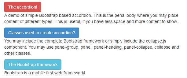
For the titles of accordions, you may use buttons as well rather than links in panels. Have a look at this demo where different buttons built on Bootstrap framework are used for opening and closing the content of the accordion:
Complete code:
<!DOCTYPE html>

<head>
</style>
    <link rel="stylesheet" href="//netdna.bootstrapcdn.com/bootstrap/3.1.1/css/bootstrap.min.css">
    <script src="https://ajax.googleapis.com/ajax/libs/jquery/1.8.3/jquery.min.js"></script>
    <script src="https://netdna.bootstrapcdn.com/bootstrap/3.0.3/js/bootstrap.min.js"></script>


</head>
<body>
<div class="container">
<h1>A Bootstrap accordion example</h1>

<div>
<button type="button" class="btn btn-danger" data-toggle="collapse" data-target="#btn-accord-danger">The accordion!</button>
<!-- Collapsible Content -->
<div class="collapse in" id="btn-accord-danger"><p>A demo of simple Bootstrap based accordion. This is the penal body where you may place content of different types. This is useful, if you have less space and more content to show..</p></div>
</div>
<div>
<button type="button" class="btn btn-primary" data-toggle="collapse" data-target="#btn-accord-primary">Classes used to create accordion?</button>
<!-- Collapsible Content -->
<div class="collapse" id="btn-accord-primary"><p>You may include the complete Bootstrap framework or simply include the collapse.js component. You may use panel-group, panel, panel-heading, panel-collapse, collapse and other classes.</p></div>
</div>
<div>
<button type="button" class="btn btn-info" data-toggle="collapse" data-target="#btn-accord-info">The Bootstrap framework</button>
<!-- Collapsible Content -->
<div class="collapse" id="btn-accord-info"><p>Bootstrap is a mobile first web framework!</p></div>
</div>

</div>

</body>

</html>
Again, the built-in classes to style the accordion are used. You may use the custom classes for adding borders, colors, and other properties or override the existing ones.