
The panel component in Bootstrap
The panel, which is a built-in component in Bootstrap, can be used to present content in a box. You may specify different styles for panels by using various built-in classes.
The panel may contain the heading for a content box while you may add content below it within that panel.
By using JavaScript / jQuery code, you may even create collapsible panels in Bootstrap. I will show you simple and collapsible panel demos in this tutorial.
A demo of creating a simple panel
A panel can be created by using the main panel class. You may use this in a <div> element where you may also specify the style of that panel. See the following demo, where div is assigned the panel and panel-default classes. The panel is simple and does not contain any other content than the heading:
You only need to add the CSS reference of Bootstrap in the <head> section. Following is the markup used for creating this basic panel:
<!DOCTYPE html>
<html>
<head>
<link rel="stylesheet" href="https://maxcdn.bootstrapcdn.com/bootstrap/3.3.4/css/bootstrap.min.css">
<style>
body{
padding: 60px;
}
</style>
</style>
</head>
<body>
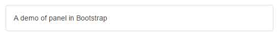
<div class="panel panel-default">
<div class="panel-body">
A demo of panel in Bootstrap
</div>
</div>
</body>
</html>
The div with panel-body class contains the heading of that panel. If you want other standard colors in panels then (for example) use the panel-danger for red, panel-info for light blue, panel-primary for blue, panel-success for green, etc. in place of panel-default classes. See the demonstration of this below after an example of the panel with the content.
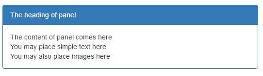
A demo of panel with heading and content
In this example, the panel is created with a heading and content inside it. For that, the main div contains the panel class along with panel class. The next div is given the panel-heading class and after that comes the panel-body class in another div element.
The markup:
<div class="panel panel-primary">

    <div class="panel-heading">The heading of panel</div>

    <div class="panel-body">

    The content of panel comes here <br />

    You may place simple text, HTML tables, lists etc. here <br />

    You may also place images here <br />

    </div>

</div>
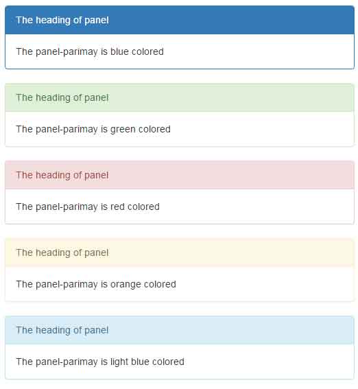
A demo of various colored panels
In this demo, a number of panels are created by using contextual classes like panel-danger, panel-info, etc. Have a look:
See online demo and code
Following is the markup used for creating contextual panels:
<div class="panel panel-primary">

    <div class="panel-heading">The heading of panel</div>

    <div class="panel-body">

    The panel-primary  is blue colored

    </div>

</div>


<div class="panel panel-success">

    <div class="panel-heading">The heading of panel</div>

    <div class="panel-body">

    The panel-success is green colored

    </div>

</div>


<div class="panel panel-danger">

    <div class="panel-heading">The heading of panel</div>

    <div class="panel-body">

    The panel-danger  is red colored

    </div>

</div>


<div class="panel panel-warning">

    <div class="panel-heading">The heading of panel</div>

    <div class="panel-body">

    The panel-warning is orange colored

    </div>

</div>


<div class="panel panel-info">

    <div class="panel-heading">The heading of panel</div>

    <div class="panel-body">

    The panel-info is light blue colored

    </div>

</div>
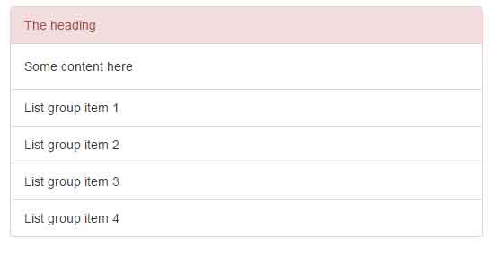
A demo of panel with a list group
As mentioned earlier, you may use different piece of content inside the panel. In this example, the panel is created with group-list. See the demo output and code below:
The markup:
<div class="panel panel-danger">

    <div class="panel-heading">The heading</div>

    <div class="panel-body">

    Some content here

    </div>

  <!-- List group inside the panel-->

  <ul class="list-group">

    <li class="list-group-item">List group item 1</li>

    <li class="list-group-item">List group item 2</li>

    <li class="list-group-item">List group item 3</li>

    <li class="list-group-item">List group item 4</li>


  </ul>


</div>
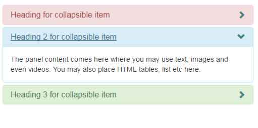
A demo of collapsible panels
In this demo, a Bootstrap collapsible panel is created by using the CSS. However, you need to include jQuery and Bootstrap’s JS libraries unlike the above examples.
The glyph icon is used on the right side of the panel that will toggle the panel current state. So, if it is opened, upon clicking the icon, the content panel will hide and vice versa. Have a look:
The CSS:
body{

  padding: 60px;

}

.panel-heading .colpsible-panel:after {


    font-family: 'Glyphicons Halflings';

    content: "\e114";

    float: right;

    color: #408080;

}

.panel-heading .colpsible-panel.collapsed:after {

    content: "\e080";

}
The markup:
<div class = "container">

  <div class="panel-group" id="accordion">

  <div class="panel panel-danger">

    <div class="panel-heading">

      <h4 class="panel-title">

        <a class="colpsible-panel" data-toggle="collapse" data-parent="#accordion" href="#collapseOne">

          Heading for collapsible item

        </a>

      </h4>

    </div>

    <div id="collapseOne" class="panel-collapse collapse in">

      <div class="panel-body">

        The panel content comes here where you may use text, images and even videos. You may also place HTML tables, list etc here.

      </div>

    </div>

  </div>

  <div class="panel panel-info">

    <div class="panel-heading">

      <h4 class="panel-title">

        <a class="colpsible-panel" data-toggle="collapse" data-parent="#accordion" href="#collapseTwo">

          Heading 2 for collapsible item

        </a>

      </h4>

    </div>

    <div id="collapseTwo" class="panel-collapse collapse">

      <div class="panel-body">

        The panel content comes here where you may use text, images and even videos. You may also place HTML tables, list etc here.

      </div>

    </div>

  </div>

  <div class="panel panel-success">

    <div class="panel-heading">

      <h4 class="panel-title">

        <a class="colpsible-panel" data-toggle="collapse" data-parent="#accordion" href="#collapseThree">

          Heading 3 for collapsible item

        </a>

      </h4>

    </div>

    <div id="collapseThree" class="panel-collapse collapse">

      <div class="panel-body">

        The panel content comes here where you may use text, images and even videos. You may also place HTML tables, list etc here.

      </div>

    </div>

  </div>

</div>


</div> <!-- end container -->