
The modal carousel
In their respective tutorials, I explained how you can create modals and carousels by using the built-in components of the Bootstrap framework.
In certain scenarios, you may need a modal window that dims the underlying content and yet enables us to behave like a carousel i.e. 2, 3, or more sliding images, videos, etc with information or captions.
In this tutorial, I will show you how to create modal carousels by using the Bootstrap framework.
A demo of using carousel component inside modal
The idea is to create a modal dialog first by using built-in Bootstrap classes. Inside the modal markup, rather than using the simple modal code, we can place the carousel component with the required number of sliding images or videos, etc.
See a demonstration and I will explain section by section how it is being done:
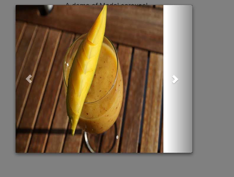
In the demo, you can see a modal carousel with three sliding images that also include controls to move next and previous slides.
So how it is done? First of all, the markup for modal is written:
<div class="modal fade" id="ModalCarousel" tabindex="-1" role="dialog" aria-labelledby="ModalCarouselLabel">

<div class="modal-dialog" role="document">

<div class="modal-content">
This is just like the simple demos that I explained in the modal plug-in tutorial.
Inside the modal-content div, the code for carousel component is written:
 <div id="carousel-modal-demo" class="carousel slide" data-ride="carousel">

<!-- Sliding images starting here -->

<div class="carousel-inner">

<div class="item">

<img src="images/banana.jpg" alt="banana">

</div>

<div class="item">

<img src="images/currant.jpg" alt="currant">

</div>

<div class="item">

<img src="images/mango.jpg" alt="mango">

</div>

<div class="item active">

<img src="images/strawberries.jpg" alt="strawberries">

</div>


</div>
Finally, the controls for moving the slides next/previous are given.
Complete code:
<!DOCTYPE html>
<html>
<head>
    <link rel="stylesheet" href="//netdna.bootstrapcdn.com/bootstrap/3.1.1/css/bootstrap.min.css">
        <script src="//code.jquery.com/jquery.js"></script>
        <script src="//maxcdn.bootstrapcdn.com/bootstrap/3.3.4/js/bootstrap.min.js"></script>

<script>
jQuery(document).ready(function() {

    jQuery('.carousel[data-type="multi"] .item').each(function(){
        var next = jQuery(this).next();
        if (!next.length) {
            next = jQuery(this).siblings(':first');
        }
        next.children(':first-child').clone().appendTo(jQuery(this));

        for (var i=0;i<2;i++) {
            next=next.next();
            if (!next.length) {
                next = jQuery(this).siblings(':first');
            }
            next.children(':first-child').clone().appendTo($(this));
        }
    });

});
</script>
<style>
.carousel-control.left, .carousel-control.right {
    background-image:none;
}

.img-responsive{
    width:100%;
    height:auto;
}

@media (min-width: 992px ) {
    .carousel-inner .active.left {
        left: -25%;
    }
    .carousel-inner .next {
        left:  25%;
    }
    .carousel-inner .prev {
        left: -25%;
    }
}

@media (min-width: 768px) and (max-width: 991px ) {
    .carousel-inner .active.left {
        left: -33.3%;
    }
    .carousel-inner .next {
        left:  33.3%;
    }
    .carousel-inner .prev {
        left: -33.3%;
    }
    .active > div:first-child {
        display:block;
    }
    .active > div:first-child + div {
        display:block;
    }
    .active > div:last-child {
        display:none;
    }
}

@media (max-width: 767px) {
    .carousel-inner .active.left {
        left: -100%;
    }
    .carousel-inner .next {
        left:  100%;
    }
    .carousel-inner .prev {
        left: -100%;
    }
    .active > div {
        display:none;
    }
    .active > div:first-child {
        display:block;
    }
}
</style>

</head>
<body>
<div class="container text-center">

<!-- Button trigger modal -->
<button type="button" class="btn btn-info btn-lg" data-toggle="modal" data-target="#ModalCarousel">
  Launch multi-item modal carousel
</button>

<!-- Modal -->
<div class="modal fade" id="ModalCarousel" tabindex="-1" role="dialog" aria-labelledby="ModalCarouselLabel">
  <div class="modal-dialog" role="document">
    <div class="modal-content">

<!--The main div for carousel-->
<!--The main div for carousel-->
<div class="carousel slide row" data-ride="carousel" data-type="multi" data-interval="2000" id="fruitscarousel">

    <div class="carousel-inner">
        <div class="item active">
            <div class="col-md-3 col-sm-4 col-xs-12"><a href="#"><img src="images/banana.jpg" class="img-responsive"></a></div>
        </div>
        <div class="item">
            <div class="col-md-3 col-sm-4 col-xs-12"><a href="#"><img src="images/currant.jpg" class="img-responsive"></a></div>
        </div>
        <div class="item">
            <div class="col-md-3 col-sm-4 col-xs-12"><a href="#"><img src="images/mango.jpg" class="img-responsive"></a></div>
        </div>
        <div class="item">
            <div class="col-md-3 col-sm-4 col-xs-12"><a href="#"><img src="images/strawberries.jpg" class="img-responsive"></a></div>
        </div>
        <div class="item">
            <div class="col-md-3 col-sm-4 col-xs-12"><a href="#"><img src="images/banana.jpg" class="img-responsive"></a></div>
        </div>
        <div class="item">
            <div class="col-md-3 col-sm-4 col-xs-12"><a href="#"><img src="images/currant.jpg" class="img-responsive"></a></div>
        </div>
    </div>

    <a class="left carousel-control" href="#fruitscarousel" data-slide="prev"><i class="glyphicon glyphicon-chevron-left"></i></a>
    <a class="right carousel-control" href="#fruitscarousel" data-slide="next"><i class="glyphicon glyphicon-chevron-right"></i></a>

</div>

    </div>
  </div>
</div>
</div>


</body>
</html>
A demo of modal carousel with captions
As such, the content area of the modal allows you to write a variety of code for the carousel. You may use multiple images or present information by using carousel classes with HTML tags.
See this example, where text information is given along with sliding images:
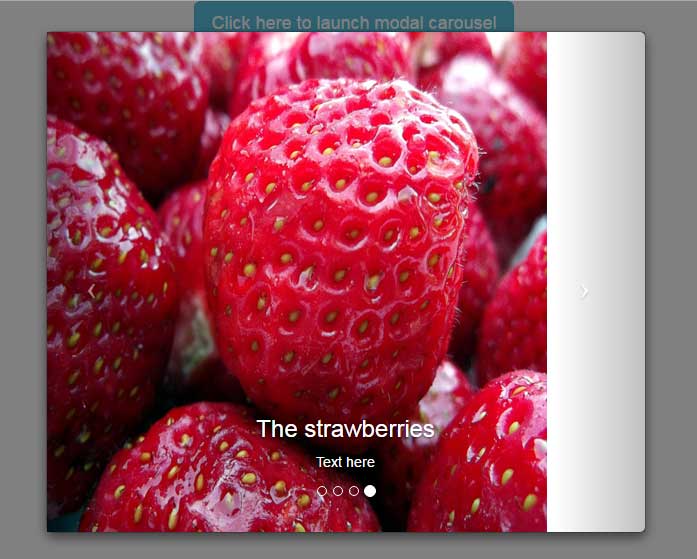
In the demo, you can see the sliding images with caption and other information as well. Apart from that, the carousel indicators are also added:
<!-- Indicators -->

<ol class="carousel-indicators">

<li data-target="#carousel-modal-demo" data-slide-to="0" class="active"></li>

<li data-target="#carousel-modal-demo" data-slide-to="1"></li>

<li data-target="#carousel-modal-demo" data-slide-to="2"></li>

<li data-target="#carousel-modal-demo" data-slide-to="3"></li>

</ol>
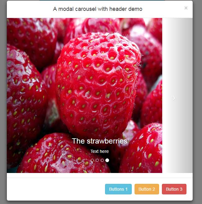
Adding more controls in modal-carousel example
You may also use the modal related classes before or after using the carousel classes. So, adding the header or footer section by using Bootstrap’s built-in modal-header and modal-footer classes.
See the following example, where I added the header and footer in the above example. The header contains just text information while footer is given a few built-in buttons for the sake of demonstration.
The markup:
<div class="container text-center">

<!-- Button trigger modal -->
<button type="button" class="btn btn-info btn-lg" data-toggle="modal" data-target="#ModalCarousel">
  Launch modal carousel with header and footer
</button>

<!-- Modal -->
<div class="modal fade" id="ModalCarousel" tabindex="-1" role="dialog" aria-labelledby="ModalCarouselLabel">
  <div class="modal-dialog" role="document">
    <div class="modal-content">
 <div class="modal-header">
        <button type="button" class="close" data-dismiss="modal" aria-label="Close"><span aria-hidden="true">�</span></button>
        <h4 class="modal-title" id="myModalLabel">A modal carousel with header demo</h4>
      </div>
<!--The main div for carousel-->
<div id="carousel-modal-demo" class="carousel slide" data-ride="carousel" data-interval="2000">
 <!-- Indicators -->
  <ol class="carousel-indicators">
    <li data-target="#carousel-modal-demo" data-slide-to="0" class="active"></li>
    <li data-target="#carousel-modal-demo" data-slide-to="1"></li>
    <li data-target="#carousel-modal-demo" data-slide-to="2"></li>
    <li data-target="#carousel-modal-demo" data-slide-to="3"></li>
  </ol>

  <!-- Sliding images statring here -->
   <div class="carousel-inner">
    <div class="item active">
      <img src="images/banana.jpg" alt="banana">
      <div class="carousel-caption">
       <h3>The Banana slide</h3>
       <p>Banana is useful for health</p>
      </div>
    </div>
    <div class="item">
      <img src="images/currant.jpg" alt="currant">
      <div class="carousel-caption">
       <h3>The currant slide</h3>
       <p>Text here</p>
      </div>
   </div>
    <div class="item">
      <img src="images/mango.jpg" alt="mango">
      <div class="carousel-caption">
       <h3>The Mangos</h3>
       <p>Text here</p>
      </div>
    </div>
    <div class="item">
      <img src="images/strawberries.jpg" alt="strawberries">
      <div class="carousel-caption">
       <h3>The strawberries</h3>
       <p>Text here</p>
      </div>
    </div>

  </div>

  <!-- Next / Previous controls here -->
  <a class="left carousel-control" href="#carousel-modal-demo" data-slide="prev">
    <span class="icon-prev"></span>
  </a>
  <a class="right carousel-control" href="#carousel-modal-demo" data-slide="next">
    <span class="icon-next"></span>
  </a>

</div>
<div class="modal-footer">
        <button type="button" class="btn btn btn-info" data-dismiss="modal">Buttons 1</button>
        <button type="button" class="btn btn btn-warning" data-dismiss="modal">Button 2 </button>
        <button type="button" class="btn btn-danger" data-dismiss="modal">Button 3</button>
      </div>
    </div>
  </div>
</div>
</div>
		<script src="//code.jquery.com/jquery.js"></script>
		<script src="//maxcdn.bootstrapcdn.com/bootstrap/3.3.4/js/bootstrap.min.js"></script>


</body>
In the code section above, you can see the carousel code is placed between the header and footer of the modal component. So you may get the benefit of both components to accomplish a certain task.
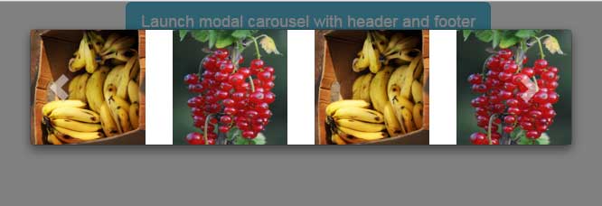
An example of multi-item modal carousel
In this demo, multiple sliding images are visible at a time in the modal carousel. See the demo and code online:
To ensure the carousel is responsive, the CSS code is used along with managing in the <script> section. This is explained in the carousel component tutorial.
Complete code for this example (to run it locally, adjust the image paths):
<!DOCTYPE html>
<html>
<head>
    <link rel="stylesheet" href="//netdna.bootstrapcdn.com/bootstrap/3.1.1/css/bootstrap.min.css">
		<script src="//code.jquery.com/jquery.js"></script>
		<script src="//maxcdn.bootstrapcdn.com/bootstrap/3.3.4/js/bootstrap.min.js"></script>

<script>
jQuery(document).ready(function() {

	jQuery('.carousel[data-type="multi"] .item').each(function(){
		var next = jQuery(this).next();
		if (!next.length) {
			next = jQuery(this).siblings(':first');
		}
		next.children(':first-child').clone().appendTo(jQuery(this));

		for (var i=0;i<2;i++) {
			next=next.next();
			if (!next.length) {
				next = jQuery(this).siblings(':first');
			}
			next.children(':first-child').clone().appendTo($(this));
		}
	});

});
</script>
<style>
.carousel-control.left, .carousel-control.right {
	background-image:none;
}

.img-responsive{
	width:100%;
	height:auto;
}

@media (min-width: 992px ) {
	.carousel-inner .active.left {
		left: -25%;
	}
	.carousel-inner .next {
		left:  25%;
	}
	.carousel-inner .prev {
		left: -25%;
	}
}

@media (min-width: 768px) and (max-width: 991px ) {
	.carousel-inner .active.left {
		left: -33.3%;
	}
	.carousel-inner .next {
		left:  33.3%;
	}
	.carousel-inner .prev {
		left: -33.3%;
	}
	.active > div:first-child {
		display:block;
	}
	.active > div:first-child + div {
		display:block;
	}
	.active > div:last-child {
		display:none;
	}
}

@media (max-width: 767px) {
	.carousel-inner .active.left {
		left: -100%;
	}
	.carousel-inner .next {
		left:  100%;
	}
	.carousel-inner .prev {
		left: -100%;
	}
	.active > div {
		display:none;
	}
	.active > div:first-child {
		display:block;
	}
}
</style>

</head>
<body>
<div class="container text-center">

<!-- Button trigger modal -->
<button type="button" class="btn btn-info btn-lg" data-toggle="modal" data-target="#ModalCarousel">
  Launch multi-item modal carousel
</button>

<!-- Modal -->
<div class="modal fade" id="ModalCarousel" tabindex="-1" role="dialog" aria-labelledby="ModalCarouselLabel">
  <div class="modal-dialog" role="document">
    <div class="modal-content">

<!--The main div for carousel-->
<!--The main div for carousel-->
<div class="carousel slide row" data-ride="carousel" data-type="multi" data-interval="2000" id="fruitscarousel">

    <div class="carousel-inner">
        <div class="item active">
            <div class="col-md-3 col-sm-4 col-xs-12"><a href="#"><img src="images/banana.jpg" class="img-responsive"></a></div>
        </div>
        <div class="item">
            <div class="col-md-3 col-sm-4 col-xs-12"><a href="#"><img src="images/currant.jpg" class="img-responsive"></a></div>
        </div>
        <div class="item">
            <div class="col-md-3 col-sm-4 col-xs-12"><a href="#"><img src="images/mango.jpg" class="img-responsive"></a></div>
        </div>
        <div class="item">
            <div class="col-md-3 col-sm-4 col-xs-12"><a href="#"><img src="images/strawberries.jpg" class="img-responsive"></a></div>
        </div>
        <div class="item">
            <div class="col-md-3 col-sm-4 col-xs-12"><a href="#"><img src="images/banana.jpg" class="img-responsive"></a></div>
        </div>
        <div class="item">
            <div class="col-md-3 col-sm-4 col-xs-12"><a href="#"><img src="images/currant.jpg" class="img-responsive"></a></div>
        </div>
    </div>

    <a class="left carousel-control" href="#fruitscarousel" data-slide="prev"><i class="glyphicon glyphicon-chevron-left"></i></a>
    <a class="right carousel-control" href="#fruitscarousel" data-slide="next"><i class="glyphicon glyphicon-chevron-right"></i></a>

</div>

    </div>
  </div>
</div>
</div>


</body>
</html>