
The accordion plugin in jQuery UI
The accordion plugin by jQuery UI is just like tabs plugin that allows collapsible information section on your web page. The accordion plugin is particularly useful if you have long information that can be divided into different sections in a web page. The accordion helps in reducing the space required that otherwise will be occupied.
Creating accordion by the jQuery plugin is merely the matter of including jQuery UI library and calling an accordion in JavaScript section where it is associated with an element like div, paragraph, etc. that will act as an accordion.
In this tutorial, I will explore different options provided by jQuery UI accordion plugin as well. For different options, examples are also given that can be seen online along with the demo code.
A basic example of using jQuery accordion
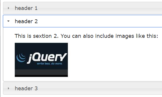
In this example, I will create a basic accordion with three sections. Although you can use your own styling to match accordion to the rest of the site theme. For this example, I will use the default CSS, just to show how accordion looks.
See online demo and code
First of all, you have to include jQuery library. This is followed by jQuery UI library. Though we included whole as using the CDN, you can create your own lighter weight jQuery UI JS file based on the required component.
In that case, as only the accordion widget is required so you can create a customized download if you do not need any other component, here: http://jqueryui.com/download/
The main accordion is created using a div tag. You can place arbitrary tags in the header section where the example uses <h3> tags. For instance, you can use the h1, h2 there, or even span tag, however, ensure that each panel is next sibling after its associated header.
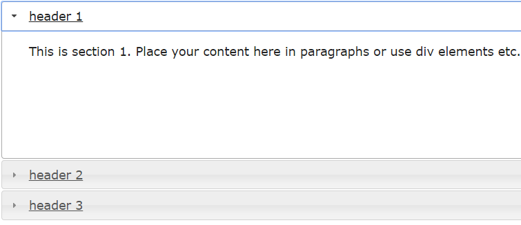
<div id="jQuery_accordion">
<h3>header 1</h3>
<p>
This is section 1. Place your content here in paragraphs or use div elements etc.
</p>
<h3>header 2</h3>
<p>
This is sextion 2. You can also include images like this:
<img src="jquery.jpg" />
</p>
<h3>header 3</h3>
<div>
<p>
This is section 3. Content can include listing as well.
<ol>
<li>item 1</li>
<li>Item 2</li>
<li>Item 3</li>
</ol>
</p>
</div>
</div>
The script section simply calls div with accordion:
$( "#jQuery_accordion" ).accordion();
The collapsible accordion jQuery example
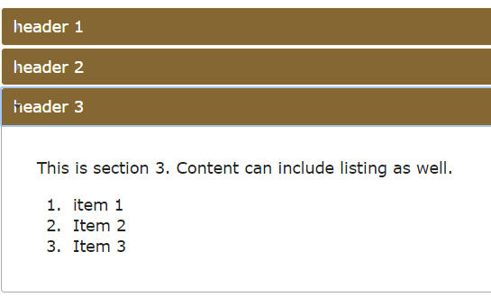
In the following example of jQuery UI accordion widget, I am going to create a collapsible content panel option. That means unlike in the above example where one content panel has to be opened. By using the collapsible option as true, you can open and close a panel by clicking on it. At the same time, all panels can be closed as well.
Just add this line in script section to the first example:
collapsible: true
or see the example in action by clicking the link below:
See online demo and code
The jQuery code:
<script>
$(function() {
$( "#jQuery_accordion" ).accordion({
collapsible: true
});
});
</script>
The CSS for this accordion:
.ui-accordion .ui-accordion-header {
display: block;
cursor: pointer;
position: relative;
margin: 2px 0 0 0;
padding: .5em .5em .5em .7em;
min-height: 0; /* support: IE7 */
font-size: 100%;
border:1px solid #FDF8E4;
background:#846733;
color:#fff;
}
An accordion example with custom CSS
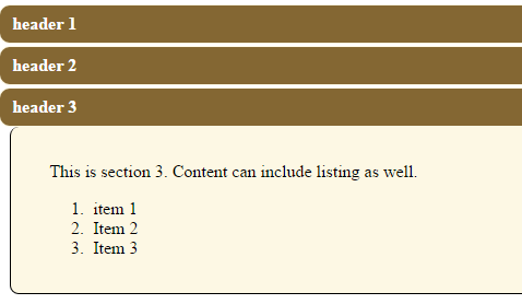
The default color scheme of the accordion jQuery UI plugin is the grayish type. However, for your web projects, you would want to match it to the rest of the site’s theme. In this example, I will show you how to change the style, color, background, and text in the accordion by using classes/ids inside a web page.
You can simply use jQuery-UI accordion CSS classes and override as per need to match your theme. Also, you can add style/properties as well.
The classes needed to change headers and content are:
.ui-accordion .ui-accordion-header

ui-accordion .ui-accordion-content
Besides it also include classes related to the icon used with headers (if you want so). These are:
ui-accordion .ui-accordion-icons

ui-accordion .ui-accordion-icons .ui-accordion-icons

ui-accordion .ui-accordion-header .ui-accordion-header-icon
Rather including the whole CSS file, you can simply extract these classes to use the jQuery accordion widget. You can also amend these that will override the default style.
In the following example, I have created an accordion with three content panels with customized CSS. This is how it looks along with code:
See online demo and code
The CSS:
.ui-accordion .ui-accordion-header {
display: block;
cursor: pointer;
position: relative;
margin: 2px 0 0 0;
padding: .5em .5em .5em .7em;
min-height: 0; /* support: IE7 */
font-size: 100%;
border:1px solid #FDF8E4;
background:#846733;
color:#fff;
border-radius:10px;
}
.ui-accordion .ui-accordion-icons {
padding-left: 2.2em;
}
.ui-accordion .ui-accordion-icons .ui-accordion-icons {
padding-left: 2.2em;
}
.ui-accordion .ui-accordion-header .ui-accordion-header-icon {
position: absolute;
left: .5em;
top: 50%;
margin-top: -8px;
}
.ui-accordion .ui-accordion-content {
padding: 1em 2.2em;
overflow: auto;
background:#FDF8E4;
border: 1px solid black;
border-top: 0;
border-radius:8px;
width:93%;
margin-left:10px;
}
The Markup:
<div id="jQuery_accordion">
<h3>header 1</h3>
<div>
<p>
This is section 1. Place your content here in paragraphs or use div elements etc.
</p>
</div>
<h3>header 2</h3>
<div>
<p>
This is sextion 2. You can also include images
</p>
</div>
<h3>header 3</h3>
<div>
<p>
This is section 3. Content can include listing as well.
<ol>
<li>item 1</li>
<li>Item 2</li>
<li>Item 3</li>
</ol>
</p>
</div>
</div>
The jQuery
<script>
$(function() {
$( "#jQuery_accordion" ).accordion({
collapsible: true
});
});
</script>
You can see accordion uses background color with border-radius for headers while content panels also use a lighter background with the border except the top border; all specified in particular CSS classes.
The accordion with animate option example
In this example, I will use the animate option in the jQuery accordion. The animate option specifies how the content panel should open or close. You can define duration as well as the style of easing for animation. See the following examples of using the animate option with different easing and duration.
See online demo and code
The jQuery code for this demo:
<script>
$(function() {
$( "#jQuery_accordion" ).accordion();
$( "#jQuery_accordion" ).accordion( "option", "animate", "easeInOutBounce");
});
</script>
In this example, I used the animate option with easeInOutBounce easing type.
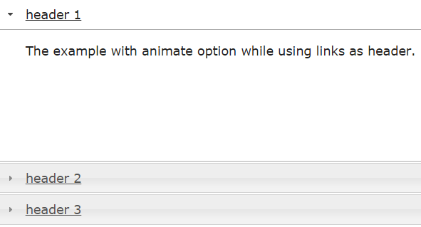
Accordion animation with easeInOutQuad value
In the following accordion example, I will use easeInOutQuad value for easing. In the example, I used <a> tag for headers with underline rather than the h3 tag.
See online demo and code
To see the complete list of available easing values go to this link: http://api.jqueryui.com/easings/
Accordion example with duration in animation
Following example uses the animate option with a duration value of 1500 milliseconds. This will make content panels open by a specified time with animation.
See online demo and code
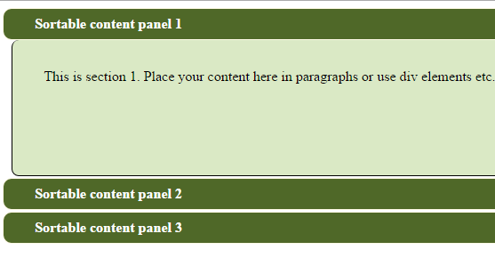
A sortable accordion example
While using accordion on different sites, you might have seen the content panels are sortable. For example, panels in a website’s dashboard that you can customize as per preferences. Next time you log in, you will see the same settings as where you left last time. Allowing users to sort content panels or re-arrange as per their liking is quite easier to do in jQuery UI accordion.
Following example shows how to create an accordion by using the widget that contains three panels that you can rearrange.
See online demo and code
The code:
<script>
$(function() {
$( "#jQuery_accordion" )
.accordion({
collapsible:true,
header: "> div > h3"
})
.sortable({
axis: "y",
handle: "h3",
stop: function( event, ui ) {
// IE doesn't register the blur when sorting
// so trigger focusout handlers to remove .ui-state-focus
ui.item.children( "h3" ).triggerHandler( "focusout" );

// Refresh accordion to handle new order
$( this ).accordion( "refresh" );
}
});
});
</script>
The accordion is kept collapsible as well.
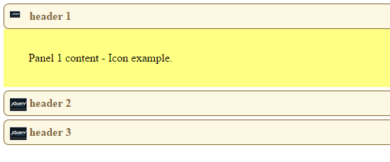
An accordion example with icons in header
You can also customize icons in the header section of content panels in the accordion jQuery UI plugin. You need to use the icon classes. Though, the default classes are provided. If you include jQuery-UI CSS file, you can also create customized CSS classes with the background image.
In the following example, I have created an accordion of jQuery UI with custom icon classes. One class is used for the active panel, in which the content panel is opened. The other is for closed panels with larger size icon. See the example online by clicking the demo link or image below:
See online demo and code
jQuery code:
<script>
$(function() {
var icons = {
header: "PanelClosedicon",
activeHeader: "PanelOpenicon"
};
$( "#jQuery_accordion" ).accordion({
icons: icons

});
});
</script>
The CSS:
.ui-accordion .ui-accordion-header {
display: block;
cursor: pointer;
position: relative;
margin: 5px 0 0 0;
padding: .5em .5em .5em .7em;
min-height: 0; /* support: IE7 */
font-size: 100%;
background:#FDF8E4;
color:#846733;
border:1px solid #846733;
border-radius: 7px;
}
.ui-accordion .ui-accordion-icons {
padding-left: 2.2em;
}

.ui-accordion .ui-accordion-header .ui-accordion-header-icon {
position: absolute;
left: .5em;
top: 50%;
margin-top: -8px;
}

.ui-icon.PanelOpenicon {
padding-left: 2em;
background:url('jquery.jpg') no-repeat;
background-size:15px;
width:20px;
height:20px;
}
.ui-icon.PanelClosedicon {
padding-left: 2em;
background:url('jquery.jpg') no-repeat -5px;
background-size:30px;
width:20px;
height:20px;
}

.ui-accordion .ui-accordion-content {
padding: 1em 2.2em;
border-top: 0;
overflow: auto;
background:#FFFF84;
}
The Markup:
<div id="jQuery_accordion">
<h3>header 1</h3>
<div>
<p>
Panel 1 content - Icon example.
</p>
</div>
<h3>header 2</h3>
<div>
<p>
Panel 2 content - Icon example.
</p>
</div>
<h3>header 3</h3>
<div>
<p>
Panel 3 content - Icon example.
</p>
</div>
</div>
See the live demo by clicking the above links.