The product listing template based on Bootstrap
In this post, the Bootstrap classes are used along with custom CSS for creating the product listing page for an e-commerce website.
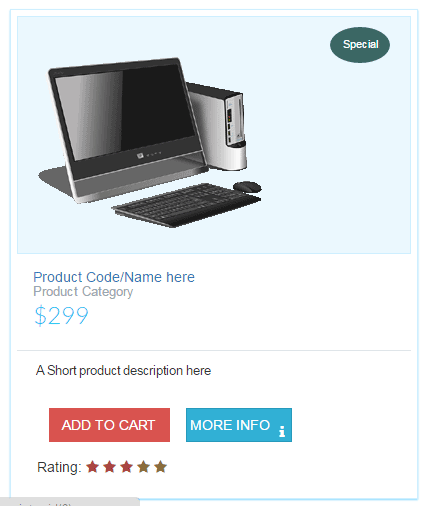
The features include displaying the product image along with optional “Special” or Hot” etc. tags. A small product description along with its category is also displayed.
With each product, the current star rating is displayed. You may use this with the database to allow users to rate the product upfront.
The typical “Add to cart” and “More info” buttons are also given that use Bootstrap’s btn-info and btn-danger classes.
A demo of listing with six products
See the following demo and get the complete code by clicking the link or image below. The left pane contains the code; navigate to the right for properly displaying the product listings.
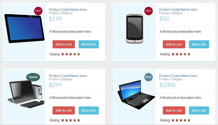
See online demo and code
The CSS:
.prod-info-main {

    border: 1px solid #CEEFFF;

    margin-bottom: 20px;

    margin-top: 10px;

    background: #fff;

    padding: 6px;

    -webkit-box-shadow: 0 1px 4px 0 rgba(21,180,255,0.5);

    box-shadow: 0 1px 1px 0 rgba(21,180,255,0.5);

}


.prod-info-main .product-image {

    background-color: #EBF8FE;

    display: block;

    min-height: 238px;

    overflow: hidden;

    position: relative;

    border: 1px solid #CEEFFF;

    padding-top: 40px;

}


.prod-info-main .product-deatil {

    border-bottom: 1px solid #dfe5e9;

    padding-bottom: 17px;

    padding-left: 16px;

    padding-top: 16px;

    position: relative;

    background: #fff

}


.product-content .product-deatil h5 a {

    color: #2f383d;

    font-size: 15px;

    line-height: 19px;

    text-decoration: none;

    padding-left: 0;

    margin-left: 0

}


.prod-info-main .product-deatil h5 a span {

    color: #9aa7af;

    display: block;

    font-size: 13px

}


.prod-info-main .product-deatil span.tag1 {

    border-radius: 50%;

    color: #fff;

    font-size: 15px;

    height: 50px;

    padding: 13px 0;

    position: absolute;

    right: 10px;

    text-align: center;

    top: 10px;

    width: 50px

}


.prod-info-main .product-deatil span.sale {

    background-color: #21c2f8

}


.prod-info-main .product-deatil span.discount {

    background-color: #71e134

}


.prod-info-main .product-deatil span.hot {

    background-color: #fa9442

}


.prod-info-main .description {

    font-size: 12.5px;

    line-height: 20px;

    padding: 10px 14px 16px 19px;

    background: #fff

}


.prod-info-main .product-info {

    padding: 11px 19px 10px 20px

}


.prod-info-main .product-info a.add-to-cart {

    color: #2f383d;

    font-size: 13px;

    padding-left: 16px

}


.prod-info-main name.a {

    padding: 5px 10px;

    margin-left: 16px

}


.product-info.smart-form .btn {

    padding: 6px 12px;

    margin-left: 12px;

    margin-top: -10px

}


.load-more-btn {

    background-color: #21c2f8;

    border-bottom: 2px solid #037ca5;

    border-radius: 2px;

    border-top: 2px solid #0cf;

    margin-top: 20px;

    padding: 9px 0;

    width: 100%

}


.product-block .product-deatil p.price-container span,

.prod-info-main .product-deatil p.price-container span,

.shipping table tbody tr td p.price-container span,

.shopping-items table tbody tr td p.price-container span {

    color: #21c2f8;

    font-family: Lato, sans-serif;

    font-size: 24px;

    line-height: 20px

}


.product-info.smart-form .rating label {

    margin-top:15px;


}


.prod-wrap .product-image span.tag2 {

    position: absolute;

    top: 10px;

    right: 10px;

    width: 36px;

    height: 36px;

    border-radius: 50%;

    padding: 10px 0;

    color: #fff;

    font-size: 11px;

    text-align: center

}


.prod-wrap .product-image span.tag3 {

    position: absolute;

    top: 10px;

    right: 20px;

    width: 60px;

    height: 36px;

    border-radius: 50%;

    padding: 10px 0;

    color: #fff;

    font-size: 11px;

    text-align: center

}


.prod-wrap .product-image span.sale {

    background-color: #57889c;

}


.prod-wrap .product-image span.hot {

    background-color: #a90329;

}


.prod-wrap .product-image span.special {

    background-color: #3B6764;

}

.shop-btn {

    position: relative

}


.shop-btn>span {

    background: #a90329;

    display: inline-block;

    font-size: 10px;

    box-shadow: inset 1px 1px 0 rgba(0, 0, 0, .1), inset 0 -1px 0 rgba(0, 0, 0, .07);

    font-weight: 700;

    border-radius: 50%;

    padding: 2px 4px 3px!important;

    text-align: center;

    line-height: normal;

    width: 19px;

    top: -7px;

    left: -7px

}


.product-deatil hr {

    padding: 0 0 5px!important

}


.product-deatil .glyphicon {

    color: #3276b1

}


.product-deatil .product-image {

    border-right: 0px solid #fff !important

}


.product-deatil .name {

    margin-top: 0;

    margin-bottom: 0

}


.product-deatil .name small {

    display: block

}


.product-deatil .name a {

    margin-left: 0

}


.product-deatil .price-container {

    font-size: 24px;

    margin: 0;

    font-weight: 300;


}


.product-deatil .price-container small {

    font-size: 12px;


}


.product-deatil .fa-2x {

    font-size: 16px!important

}


.product-deatil .fa-2x>h5 {

    font-size: 12px;

    margin: 0

}


.product-deatil .fa-2x+a,

.product-deatil .fa-2x+a+a {

    font-size: 13px

}


.product-deatil .certified {

    margin-top: 10px

}


.product-deatil .certified ul {

    padding-left: 0

}


.product-deatil .certified ul li:not(first-child) {

    margin-left: -3px

}


.product-deatil .certified ul li {

    display: inline-block;

    background-color: #f9f9f9;

    padding: 13px 19px

}


.product-deatil .certified ul li:first-child {

    border-right: none

}


.product-deatil .certified ul li a {

    text-align: left;

    font-size: 12px;

    color: #6d7a83;

    line-height: 16px;

    text-decoration: none

}


.product-deatil .certified ul li a span {

    display: block;

    color: #21c2f8;

    font-size: 13px;

    font-weight: 700;

    text-align: center

}


.product-deatil .message-text {

    width: calc(100% - 70px)

}


@media only screen and (min-width:1024px) {

    .prod-info-main div[class*=col-md-4] {

        padding-right: 0

    }

    .prod-info-main div[class*=col-md-8] {

        padding: 0 13px 0 0

    }

    .prod-wrap div[class*=col-md-5] {

        padding-right: 0

    }

    .prod-wrap div[class*=col-md-7] {

        padding: 0 13px 0 0

    }

    .prod-info-main .product-image {

        border-right: 1px solid #dfe5e9

    }

    .prod-info-main .product-info {

        position: relative

    }

}
The Markup for Bootstrap product listings:
<div class="container">
<div class="col-xs-12 col-md-6">

                <!-- First product box start here-->
                <div class="prod-info-main prod-wrap clearfix">

                      <div class="row">

                           <div class="col-md-5 col-sm-12 col-xs-12">

                            <div class="product-image">

                             <img src="images/products/p4.png" class="img-responsive">

                               <span class="tag2 hot">

                                 SPECIAL

                               </span>

                       </div>

                  </div>

     <div class="col-md-7 col-sm-12 col-xs-12">

                  <div class="product-deatil">

                               <h5 class="name">

                               <a href="#">

                                Product Code/Name here

                               </a>

                               <a href="#">

                               <span>Product Category</span>

                               </a>

                        </h5>

                            <p class="price-container">

                             <span>$199</span>

                           </p>

              <span class="tag1"></span>

   </div>

   <div class="description">

      <p>A Short product description here </p>

   </div>

      <div class="product-info smart-form">

         <div class="row">

         <div class="col-md-12">

          <a href="#" class="btn btn-danger">Add to cart</a>

             <a href="javascript:void(0);" class="btn btn-info">More info</a>

       </div>

      <div class="col-md-12">

         <div class="rating">Rating:

          <label for="stars-rating-5"><i class="fa fa-star text-danger"></i></label>

          <label for="stars-rating-4"><i class="fa fa-star text-danger"></i></label>

          <label for="stars-rating-3"><i class="fa fa-star text-danger"></i></label>

          <label for="stars-rating-2"><i class="fa fa-star text-warning"></i></label>

          <label for="stars-rating-1"><i class="fa fa-star text-warning"></i></label>

         </div>

       </div>

    </div>

   </div>

  </div>

  </div>
 </div>

 <!-- end product -->

</div>
</div>

</div>
Practically, you will most probably pull the data from the database for the product listings. In that case, place the loop just above the comment:
<div class=”col-xs-12 col-md-6″>
<!– First product box start here–>
to the end of respective </div>.
In this demo, a few animations are added in the product listings. First of all, by using the rotate CSS 3 property, as you bring the mouse over any image, it will rotate to 360 degrees. You may change this by accessing the rotprod:hover class in the <style> section.
Secondly, in the “Add to cart” and “More info” buttons, the effects are added to the Bootstrap buttons by using custom CSS with font-awesome icons. As a user brings the mouse over any button, the button will animate with certain CSS properties and respective icon; a basket for “Add to Cart” and “i” for “More info” button will appear with animation.
In the <style> section, btn-cart and btn-info are dealing with these buttons effects. Have a look at the demo and code:
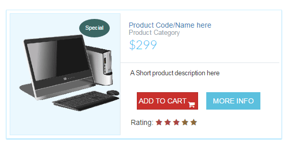
See online demo and code
The complete CSS used in the above demo is:
<style>

.prod-info-main {

    border: 1px solid #CEEFFF;

    margin-bottom: 20px;

    margin-top: 10px;

    background: #fff;

    padding: 6px;

    -webkit-box-shadow: 0 1px 4px 0 rgba(21,180,255,0.5);

    box-shadow: 0 1px 1px 0 rgba(21,180,255,0.5);

}


.prod-info-main .product-image {

    background-color: #EBF8FE;

    display: block;

    min-height: 238px;

    overflow: hidden;

    position: relative;

    border: 1px solid #CEEFFF;

    padding-top: 40px;

}


.rotprod{

    -webkit-transition-duration: 0.8s;

    -moz-transition-duration: 0.8s;

    -o-transition-duration: 0.8s;

    transition-duration: 0.8s;

    }


.rotprod:hover

{

    -webkit-transform:rotate(360deg);

    -moz-transform:rotate(360deg);

    -o-transform:rotate(360deg);

}


.prod-info-main .product-deatil {

    border-bottom: 1px solid #dfe5e9;

    padding-bottom: 17px;

    padding-left: 16px;

    padding-top: 16px;

    position: relative;

    background: #fff

}


.product-content .product-deatil h5 a {

    color: #2f383d;

    font-size: 15px;

    line-height: 19px;

    text-decoration: none;

    padding-left: 0;

    margin-left: 0

}


.prod-info-main .product-deatil h5 a span {

    color: #9aa7af;

    display: block;

    font-size: 13px

}


.prod-info-main .product-deatil span.tag1 {

    border-radius: 50%;

    color: #fff;

    font-size: 15px;

    height: 50px;

    padding: 13px 0;

    position: absolute;

    right: 10px;

    text-align: center;

    top: 10px;

    width: 50px

}


.prod-info-main .product-deatil span.sale {

    background-color: #21c2f8

}


.prod-info-main .product-deatil span.discount {

    background-color: #71e134

}


.prod-info-main .product-deatil span.hot {

    background-color: #fa9442

}


.prod-info-main .description {

    font-size: 12.5px;

    line-height: 20px;

    padding: 10px 14px 16px 19px;

    background: #fff

}


.prod-info-main .product-info {

    padding: 11px 19px 10px 20px

}


.prod-info-main .product-info a.add-to-cart {

    color: #2f383d;

    font-size: 13px;

    padding-left: 16px

}


.prod-info-main name.a {

    padding: 5px 10px;

    margin-left: 16px

}


.product-info.smart-form .btn {

    padding: 6px 12px;

    margin-left: 12px;

    margin-top: -10px

}


.load-more-btn {

    background-color: #21c2f8;

    border-bottom: 2px solid #037ca5;

    border-radius: 2px;

    border-top: 2px solid #0cf;

    margin-top: 20px;

    padding: 9px 0;

    width: 100%

}


.product-block .product-deatil p.price-container span,

.prod-info-main .product-deatil p.price-container span,

.shipping table tbody tr td p.price-container span,

.shopping-items table tbody tr td p.price-container span {

    color: #21c2f8;

    font-family: Lato, sans-serif;

    font-size: 24px;

    line-height: 20px

}


.product-info.smart-form .rating label {

    margin-top:15px;


}


.prod-wrap .product-image span.tag2 {

    position: absolute;

    top: 10px;

    right: 10px;

    width: 36px;

    height: 36px;

    border-radius: 50%;

    padding: 10px 0;

    color: #fff;

    font-size: 11px;

    text-align: center

}


.prod-wrap .product-image span.tag3 {

    position: absolute;

    top: 10px;

    right: 20px;

    width: 60px;

    height: 36px;

    border-radius: 50%;

    padding: 10px 0;

    color: #fff;

    font-size: 11px;

    text-align: center

}


.prod-wrap .product-image span.sale {

    background-color: #57889c;

}


.prod-wrap .product-image span.hot {

    background-color: #a90329;

}


.prod-wrap .product-image span.special {

    background-color: #3B6764;

}

.shop-btn {

    position: relative

}


.shop-btn>span {

    background: #a90329;

    display: inline-block;

    font-size: 10px;

    box-shadow: inset 1px 1px 0 rgba(0, 0, 0, .1), inset 0 -1px 0 rgba(0, 0, 0, .07);

    font-weight: 700;

    border-radius: 50%;

    padding: 2px 4px 3px!important;

    text-align: center;

    line-height: normal;

    width: 19px;

    top: -7px;

    left: -7px

}


.product-deatil hr {

    padding: 0 0 5px!important

}


.product-deatil .glyphicon {

    color: #3276b1

}


.product-deatil .product-image {

    border-right: 0px solid #fff !important

}


.product-deatil .name {

    margin-top: 0;

    margin-bottom: 0

}


.product-deatil .name small {

    display: block

}


.product-deatil .name a {

    margin-left: 0

}


.product-deatil .price-container {

    font-size: 24px;

    margin: 0;

    font-weight: 300;


}


.product-deatil .price-container small {

    font-size: 12px;


}


.product-deatil .fa-2x {

    font-size: 16px!important

}


.product-deatil .fa-2x>h5 {

    font-size: 12px;

    margin: 0

}


.product-deatil .fa-2x+a,

.product-deatil .fa-2x+a+a {

    font-size: 13px

}


.product-deatil .certified {

    margin-top: 10px

}


.product-deatil .certified ul {

    padding-left: 0

}


.product-deatil .certified ul li:not(first-child) {

    margin-left: -3px

}


.product-deatil .certified ul li {

    display: inline-block;

    background-color: #f9f9f9;

    padding: 13px 19px

}


.product-deatil .certified ul li:first-child {

    border-right: none

}


.product-deatil .certified ul li a {

    text-align: left;

    font-size: 12px;

    color: #6d7a83;

    line-height: 16px;

    text-decoration: none

}


.product-deatil .certified ul li a span {

    display: block;

    color: #21c2f8;

    font-size: 13px;

    font-weight: 700;

    text-align: center

}


.product-deatil .message-text {

    width: calc(100% - 70px)

}

/*--Button effect classes for add to cart*/

.btn-cart{

    border-radius: 0;

    position: relative;

    color: #fff;

    border:1px solid transparent;

    text-transform: uppercase;

    transition: all 0.40s ease 0s;

}

.btn-cart:after{

    content: "\f07a";

    font-family: fontawesome;

    position: absolute;

    right: 6px;

    top: -4px;

    opacity: 0;

    color: #fff;

    transition: all 0.40s ease 0s;

}

.btn-cart:hover:after{

    top:40%;

    opacity: 5;

}

.btn-cart span{

    display: block;

    transition: all 0.70s linear 0s;

}

.btn-cart:hover span{

    transform: translate(-9px);

}


/*--Button effect classes for More info*/

.btn-info{

    border-radius: 0;

    position: relative;

    color: #fff;

    border:1px solid transparent;

    text-transform: uppercase;

    transition: all 0.40s ease 0s;

}

.btn-info:after{

    content: "\f129";

    font-family: fontawesome;

    position: absolute;

    right: 6px;

    top: -4px;

    opacity: 0;

    color: #fff;

    transition: all 0.40s ease 0s;

}

.btn-info:hover:after{

    top:40%;

    opacity: 5;

}

.btn-info span{

    display: block;

    transition: all 0.70s linear 0s;

}

.btn-info:hover span{

    transform: translate(-9px);

}


@media only screen and (min-width:1024px) {

    .prod-info-main div[class*=col-md-4] {

        padding-right: 0

    }

    .prod-info-main div[class*=col-md-8] {

        padding: 0 13px 0 0

    }

    .prod-wrap div[class*=col-md-5] {

        padding-right: 0

    }

    .prod-wrap div[class*=col-md-7] {

        padding: 0 13px 0 0

    }

    .prod-info-main .product-image {

        border-right: 1px solid #dfe5e9

    }

    .prod-info-main .product-info {

        position: relative

    }

}

</style>
Get the complete code from the demo page.
And this is how it will appear on smart phones or other small screens: