
In the navbar tutorial of Bootstrap, the menus were created with just one level down by using built-in component.
In certain scenarios, you may need multiple levels of menu, for example, having four levels of categories and sub-categories that you want to reflect in the navigation bar as well.
By using a simple add-on, which is available on the GitHub website, you may create as many levels as you want while using the Bootstrap navbar plug-in.
This is just 1Kb of the file for CSS and 1Kb for JavaScript that you need to include and refer the caret-right class; I will show you how with live examples.
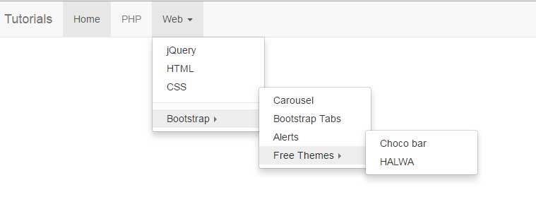
In this example, a navigation bar is created by using navbar component of Bootstrap. As you click the third menu item, Web, it will open a dropdown menu. Inside the dropdown, you can see a right arrow with Bootstrap menu item. The second level menu will be opened as you click on it. The second level contains four menu items where the fourth one, Free themes, also contains right arrow. Clicking on it will open its menu as well.
See the demo and code online:
So, how is it done?
First of all, as you are working with Bootstrap framework, I am assuming you have included these libraries:
<link rel=”stylesheet” href=”https://maxcdn.bootstrapcdn.com/bootstrap/3.3.6/css/bootstrap.min.css” integrity=”sha384-1q8mTJOASx8j1Au+a5WDVnPi2lkFfwwEAa8hDDdjZlpLegxhjVME1fgjWPGmkzs7″ crossorigin=”anonymous”>
<script src=”http://ajax.googleapis.com/ajax/libs/jquery/1.10.2/jquery.min.js”></script>
<script src=”https://maxcdn.bootstrapcdn.com/bootstrap/3.3.6/js/bootstrap.min.js” integrity=”sha384-0mSbJDEHialfmuBBQP6A4Qrprq5OVfW37PRR3j5ELqxss1yVqOtnepnHVP9aJ7xS” crossorigin=”anonymous”></script>
That is, Bootstrap JS and CSS plus jQuery libraries. Apart from that, two other files are also included to deal with child menus:
<link href=”css/navbar.css” rel=”stylesheet”>
<script src=”js/navbar.js”></script>
These are only 1 KB files.
In the markup section, you have to use the caret-right class on children dropdowns. For example:
 <li>

<a href="#" class="dropdown-toggle" data-toggle="dropdown">Bootstrap <b class="caret caret-right"></b></a>

<ul class="dropdown-menu">

<li><a href="https://www.jquery-az.com/bootstrap-carousel-5-single-multiple-horizontal-and-vertical-sliding-demos/">Carousel</a></li>

<li><a href="https://www.jquery-az.com/bootstrap-tabs-with-default-and-customized-css-4-online-demos/">Bootstrap Tabs</a></li>

<li><a href="https://www.jquery-az.com/bootstrap-alert-with-5-online-demos/">Alerts</a></li>

<li>

<a href="#" class="dropdown-toggle" data-toggle="dropdown">Free Themes <b class="caret caret-right"></b></a>

<ul class="dropdown-menu">

<li><a href="https://www.jquery-az.com/choco-bar-free-bootstrap-landing-page-theme/">Choco bar</a></li>

<li><a href="https://www.jquery-az.com/a-free-one-page-bootstrap-website-halwa/">HALWA</a></li>

</ul>

</li>

</ul>

</li>
See the complete code at the demo page.
You may use the navbar’s CSS classes for overriding the default look. The process is explained in the navbar component tutorial, for selecting and modifying the classes.
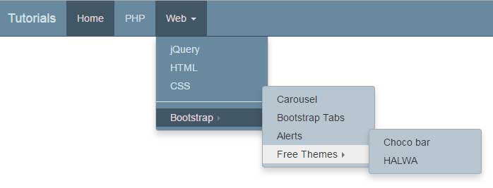
In this example, I will show you changing the look of sub-menus along with the main navbar. First, have a look at a demo which is followed by how you can do it:
Complete code:
<!DOCTYPE html>
<html>
<head>
    <title>navbar example</title>
    <link rel="stylesheet" href="https://maxcdn.bootstrapcdn.com/bootstrap/3.3.6/css/bootstrap.min.css" integrity="sha384-1q8mTJOASx8j1Au+a5WDVnPi2lkFfwwEAa8hDDdjZlpLegxhjVME1fgjWPGmkzs7" crossorigin="anonymous">
    <script src="https://ajax.googleapis.com/ajax/libs/jquery/1.10.2/jquery.min.js"></script>
    <script src="https://maxcdn.bootstrapcdn.com/bootstrap/3.3.6/js/bootstrap.min.js" integrity="sha384-0mSbJDEHialfmuBBQP6A4Qrprq5OVfW37PRR3j5ELqxss1yVqOtnepnHVP9aJ7xS" crossorigin="anonymous"></script>

    <link href="css/navbar.css" rel="stylesheet">
    <script src="js/navbar-custom.js"></script>

<style>
.navbar-default {
  background-color: #69899f;
  border-color: #425766;
}
.navbar-default .navbar-brand {
  color: #d7e2e9;
}
.navbar-default .navbar-brand:hover, .navbar-default .navbar-brand:focus {
  color: #e5dbdb;
}
.navbar-default .navbar-text {
  color: #d7e2e9;
}
.navbar-default .navbar-nav > li > a {
  color: #d7e2e9;
}
.navbar-default .navbar-nav > li > a:hover, .navbar-default .navbar-nav > li > a:focus {
  color: #e5dbdb;
}
.navbar-default .navbar-nav > li > .dropdown-menu {
  background-color: #69899f;
}
.navbar-default .navbar-nav > li > .dropdown-menu > li > a {
  color: #d7e2e9;
}
.navbar-default .navbar-nav > li > .dropdown-menu > li > a:hover,
.navbar-default .navbar-nav > li > .dropdown-menu > li > a:focus {
  color: #e5dbdb;
  background-color: #425766;
}
.navbar-default .navbar-nav > li > .dropdown-menu > li > .divider {
  background-color: #69899f;
}
.navbar-default .navbar-nav > .active > a, .navbar-default .navbar-nav > .active > a:hover, .navbar-default .navbar-nav > .active > a:focus {
  color: #e5dbdb;
  background-color: #425766;
}
.navbar-default .navbar-nav > .open > a, .navbar-default .navbar-nav > .open > a:hover, .navbar-default .navbar-nav > .open > a:focus {
  color: #e5dbdb;
  background-color: #425766;
}
.navbar-default .navbar-toggle {
  border-color: #425766;
}
.navbar-default .navbar-toggle:hover, .navbar-default .navbar-toggle:focus {
  background-color: #425766;
}
.navbar-default .navbar-toggle .icon-bar {
  background-color: #d7e2e9;
}
.navbar-default .navbar-collapse,
.navbar-default .navbar-form {
  border-color: #d7e2e9;
}
.navbar-default .navbar-link {
  color: #d7e2e9;
}
.navbar-default .navbar-link:hover {
  color: #e5dbdb;
}
.open{
    background-color: black;
}

@media (max-width: 767px) {
  .navbar-default .navbar-nav .open .dropdown-menu > li > a {
    color: #d7e2e9;
  }
  .navbar-default .navbar-nav .open .dropdown-menu > li > a:hover, .navbar-default .navbar-nav .open .dropdown-menu > li > a:focus {
    color: #e5dbdb;
  }
  .navbar-default .navbar-nav .open .dropdown-menu > .active > a, .navbar-default .navbar-nav .open .dropdown-menu > .active > a:hover, .navbar-default .navbar-nav .open .dropdown-menu > .active > a:focus {
    color: #e5dbdb;
    background-color: #425766;
  }
}
</style>

</head>
    <body>

        <div class="navbar navbar-default navbar-fixed-top" role="navigation">
            <div class="container">
                <div class="navbar-header">
                    <button type="button" class="navbar-toggle" data-toggle="collapse" data-target=".navbar-collapse">
                        <span class="sr-only">Toggle navigation</span>
                        <span class="icon-bar"></span>
                        <span class="icon-bar"></span>
                        <span class="icon-bar"></span>
                    </button>
                    <a class="navbar-brand" href="#">Tutorials</a>
                </div>
                <div class="collapse navbar-collapse">
                    <ul class="nav navbar-nav">
                        <li class="active"><a href="#">Home</a></li>
                        <li><a href="https://www.jquery-az.com/php-tutorials/" target="_blank">PHP</a></li>
                        <li>
                            <a href="#" class="dropdown-toggle" data-toggle="dropdown">Web <b class="caret"></b></a>
                            <ul class="dropdown-menu">
                                <li><a href="https://www.jquery-az.com/jquery-tips/">jQuery</a></li>
                                <li><a href="https://www.jquery-az.com/html-tutorials/">HTML</a></li>
                                <li><a href="https://www.jquery-az.com/css-tutorials/">CSS</a></li>
                                <li class="divider"></li>
                                <li>
                                    <a href="#" class="dropdown-toggle" data-toggle="dropdown">Bootstrap <b class="caret caret-right"></b></a>
                                    <ul class="dropdown-menu">
                                        <li><a href="https://www.jquery-az.com/bootstrap-carousel-5-single-multiple-horizontal-and-vertical-sliding-demos/">Carousel</a></li>
                                        <li><a href="https://www.jquery-az.com/bootstrap-tabs-with-default-and-customized-css-4-online-demos/">Bootstrap Tabs</a></li>
                                        <li><a href="https://www.jquery-az.com/bootstrap-alert-with-5-online-demos/">Alerts</a></li>
                                        <li>
                                            <a href="#" class="dropdown-toggle" data-toggle="dropdown">Free Themes <b class="caret caret-right"></b></a>
                                            <ul class="dropdown-menu">
                                                        <li><a href="https://www.jquery-az.com/choco-bar-free-bootstrap-landing-page-theme/">Choco bar</a></li>
                                                        <li><a href="https://www.jquery-az.com/a-free-one-page-bootstrap-website-halwa/">HALWA</a></li>
                                                    </ul>
                                         </li>
                                      </ul>
                                  </li>
                                    </ul>
                                </li>
                            </ul>
                        </li>
                    </ul>
                </div><!--/.nav-collapse -->
            </div>
        </div>
</body>
</html>
The markup section remains the same as in the above example. The only change you will notice is the name of the JS file of the plug-in, navbar-custom.js. Apart from that, the <style> section is given the navbar properties to override the default style. The property names are the same as in the framework. Just a few properties are changed to modify the look of the navbar.
In the sub-menu plug-in’s JS file, the jQuery code is written where CSS properties are set. I just added the background CSS property to change the background color of the sub-menus.
Credit: @ GitHub